Pushing boundaries and exploring creative ways to tell stories through the web can be a challenging task. Follow me as I dive into the mind of Mike L. Murphy.
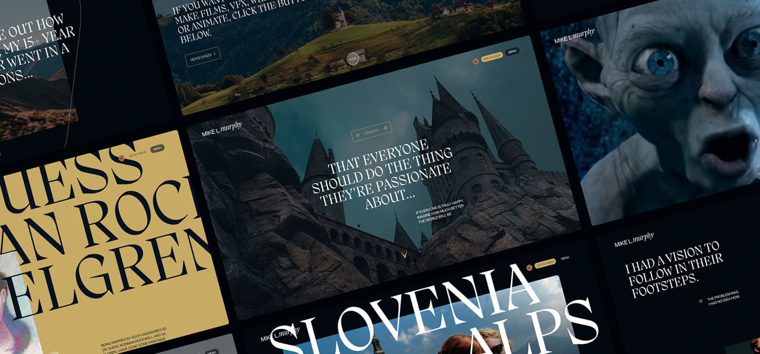
Mike has worked across films such a Lord of the Rings, Harry Potter, Fast & Furious and Iron Man to name a few, so it was destined to be a magical affair. Mike's plan was to build a story around his previous work and current business offerings. The story was filled with lots of content and ideas, but how did I break the story down into an engaging immersive web experience?
The storyline
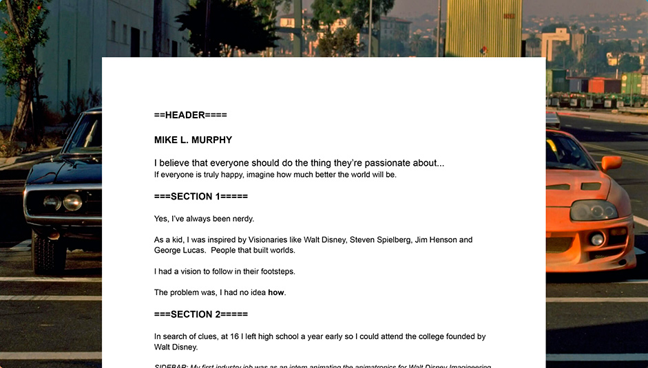
The storyline was at the heart of the project and it needed to be right, we definitely didn't want it to drag on like a bad sequel. The initial word doc that was sent to me had a few too many sections and as I went through the story I started to see areas that got repetitive. We worked together to map the story out further and as we progressed through the story we started to talk about ideas, assets and how things could come together. Having these early workshops and discussions really gave me an idea for what Mike was looking for.
Moodboards
My process has always been super simple. Don't overcomplicate things and just focus on the key deliverables that will help you achieve the best results. I had some very simple and clear directions: mystery, magical and Inspirational. With this in mind and with our earlier conversations I already felt I knew where the direction would go. With heavy ties to Lord of the Rings and Harry Potter, the tone was set from the start. Moodboards for me are all about making sure you're on the same page with your client, creating reactions, feelings and building up ideas.
Concepts
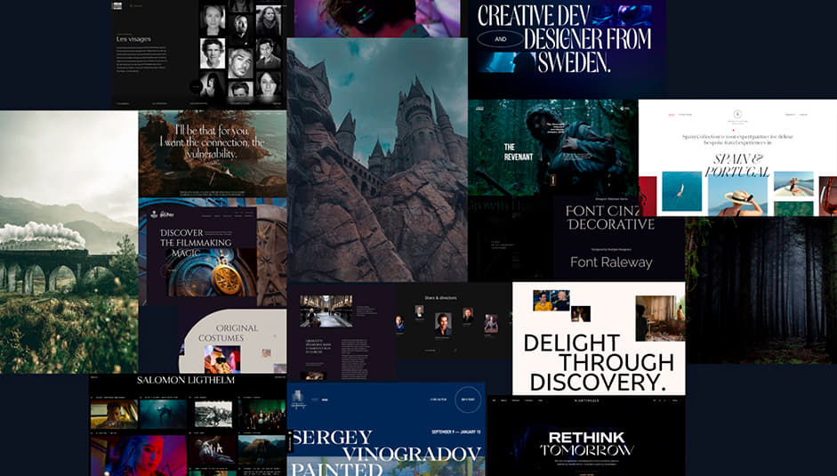
Now we have a good sense of where we want to go visually it's now about designing out some concepts. The key part of this phase is to explore layouts, images, fonts, colours and art directions. I try not to fixate on designing the perfect concept straight away, but rather to create some feelings and ideas of elements coming together on the page. Keeping things granular and moving through the early stages bit by bit really helped me create well-informed design decisions.
I try not to fixate on designing the perfect concept straight away, but rather to create some feelings and ideas of elements coming together on the page.
I provided a video presentation to walk through my 3 concepts, I also included some initial animation ideas. For me, I find presenting my work this way is more effective and helps give the client time to really digest what's been shown. With all 3 options getting the thumbs up we had one clear winner. With a few rounds of changes and tweaks we created the final concept.
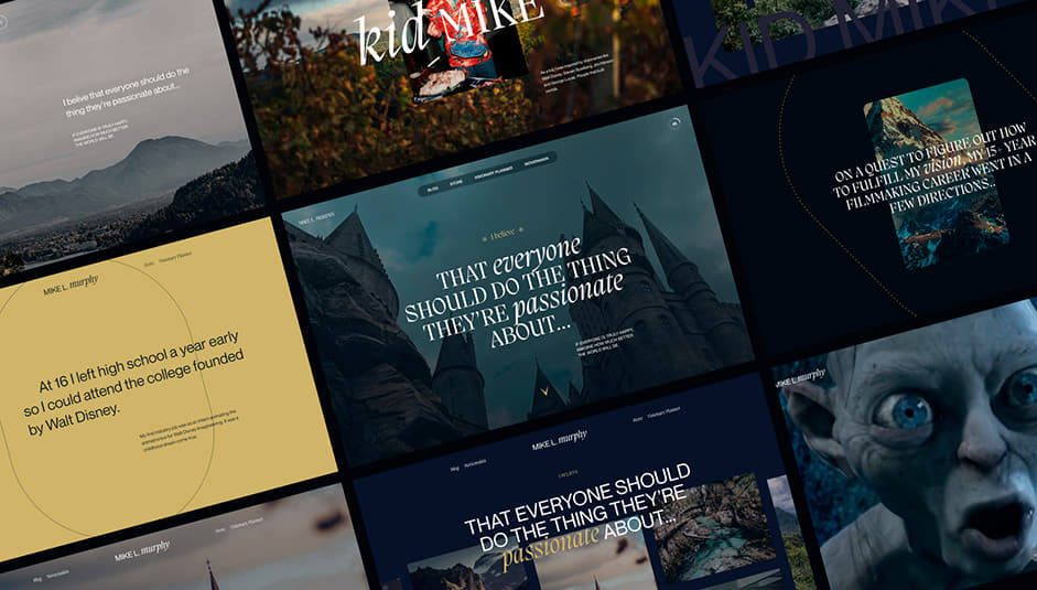
The Full Story
The easy part was creating the direction. The hard part was breaking down the story in a creative way. As all creatives we find inspiration in many places but the key for many of us is to consume ourselves in other people's work, building up our own ideas and using references. In the same granular fashion, I broke down each section of the story and started to explore layout ideas, in conjunction with this I was mapping out animation ideas in my head and also in my Figma file. Thinking about how the elements move, transition through sections and come together to tell our story.
Mike gave me full creative freedom and this defiantly helped me create something truly unique. As we moved through the design phase we began to refine the design, assets, copy and flow into the finished article.
Bringing life to a static story
My weapon of choice has always been Webflow and as a creative at heart, being able to bring my ideas to life is the ultimate goal for me. As I start to build out my designs I can really start to understand how my design works in context. Context is key! With Webflow I have the ability to make further improvements to my UX and UI as well as explore my animation ideas further. I start again in the very same way. Build out the first section and start to create my animation style. This is where Webflow comes into its own, I can explore, play around with ideas and really test what works. For me, when I build very dynamic websites I have to build and animate at the same time, this is so I can really get into the flow of the page. This is the most important thing for me.
As I move through the page I keep going back and forth making further tweaks and adjustments. I need to fully immerse myself in the page. This helps me focus on timings, transitions, elements, and page consistency.
When I build very dynamic websites I have to build and animate at the same time.
Some ideas I had worked really well and some needed further refinements but again with Webflow I'm able to react effectively. With the page coming to its final run I turn my attention to some performance fixes. Compressing images and applying lazy-load really helped improve the overall performance, making sure the page ran smoothly and effectively as possible
Finishing up with the final round of tweaks and refinements I added the final touches of magic.
Designer's Info
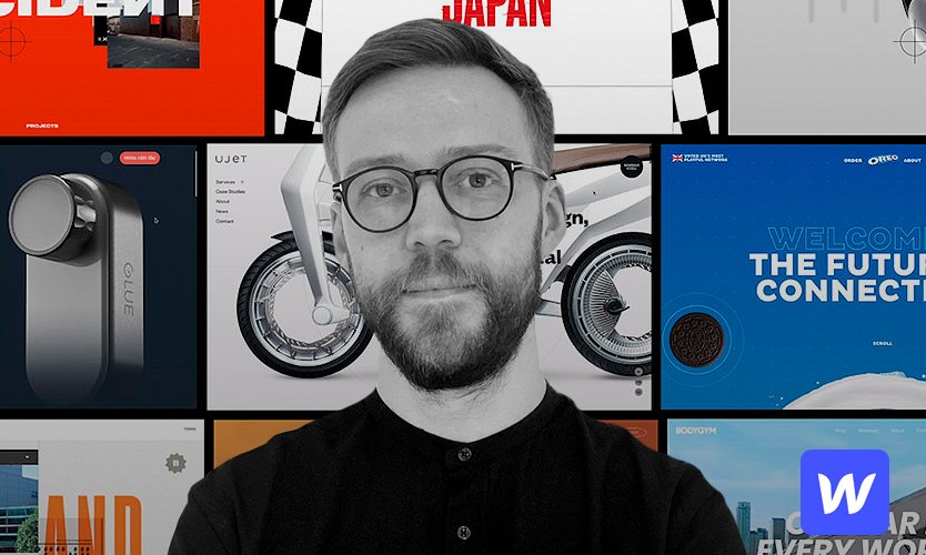
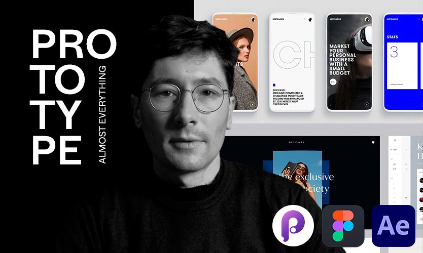
Joseph Berry is an independent freelance experience designer with over a decade of experience. Joseph has worked with a number of global brands and he specialises in brand, digital, and all things in between.
More about Joseph here.