From online stores to social media sites, cards are fast becoming a popular web design pattern. One of the most obvious reasons is that card design is ideally suited to all sorts of screen sizes.
Cards can come in all manner of shapes, colors, and forms, but generally they’ll all include an image or icon, plus basic information, such as a title, user name, or occasionally text.
However, the key is simplicity. A card is seldom complex, and its purpose is to entice the user to click through.
How can you benefit from using cards and what should you keep in mind when using them? Let's find out!
What Makes Cards So Irresistible
When it comes to practical and slick results, the card design takes some beating. Here’s a few reasons why it works so well in website design.
Responsive.We all know how important it is to make your site look and perform equally well across all popular devices. Cards were designed for this purpose. They help reposition and reorder content quickly and easily depending on the size of the screen.
Organized.Cluttered websites are a headache, and card design offers fantastic precision when it comes to organizing content from varying sources. This can be really appealing to both the designer and user. Kelsey Drake’s site ordered and organized to perfection.
Easy to read. One of the most important features of cards is that they don’t contain much information. This not only makes them intriguing and enticing, but it also makes them easy to browse through. Take a site like NamesForChange.org, each card is easy to read and interact.
It's suitable for social media.Think about how the social media sites are set up. They’re sharp, accessible and speedy. Now think of card design. Can you see a connection? The most famous card design examples are Pinterest and Dribble
Rank-free.In card design, equality is everything. Each card carries equal weight, so there’s no need to meticulously rank all the content.
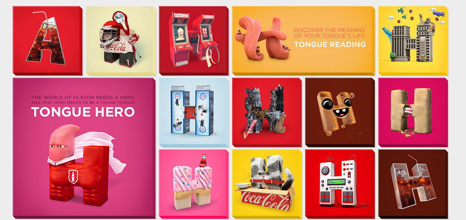
Universal. Card design is hugely flexible and works for almost any content type you can think of. There’s no specific rules when it comes to a design style either, which means there’s plenty of room for creativity. Take Futurefabric.co.uk, which utilizes card design to showcase his many different styles of work.
Stay positive with negative (space, that is…). The first thing you should avoid is a cluttered feel, so you should use the white space or negative space wisely. Danish company Helbak ceramics uses white space to perfection with their smooth, stylish site.
Pay attention to details.Remember, card design is about keeping things simple, but that means that every detail counts. Silk Tricky achieves a good balance with informative text and appealing images. It also uses ‘view’ icons, which provide clear visual instructions for the viewer, inspiring them to click through.
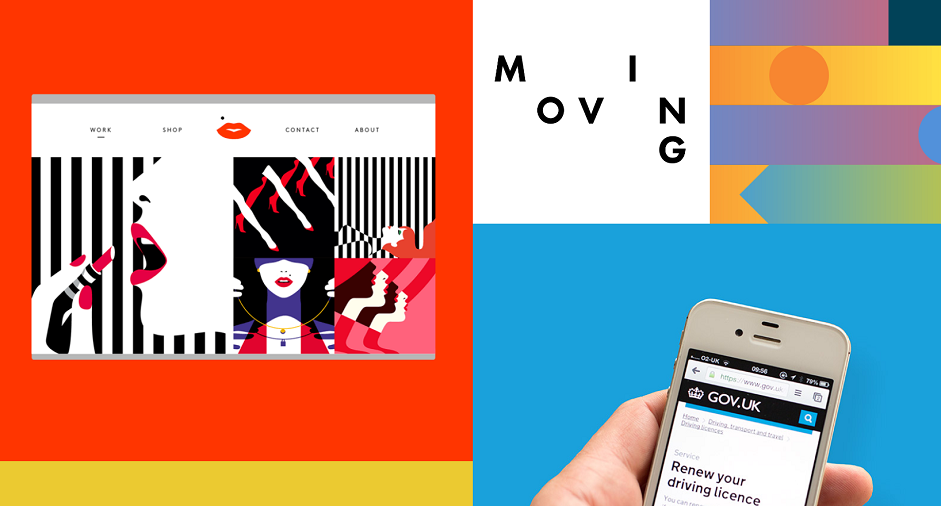
Spice it up. Just because cards are ordered, doesn’t mean they should be boring. Don’t be afraid to add something that makes it personal to your business. Steer clear of over-used concepts and make it your own by using eye-catching animations, unique color palettes, or fancy fonts. We love how White Frontier does it on their site.
Use a grid.It's a simple rule to stick to. This will help to align things correctly, will keep your design consistent, and will also ensure that the content realigns smoothly whatever the screen size.
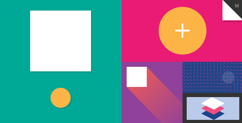 Source: Material.cmiscm.com
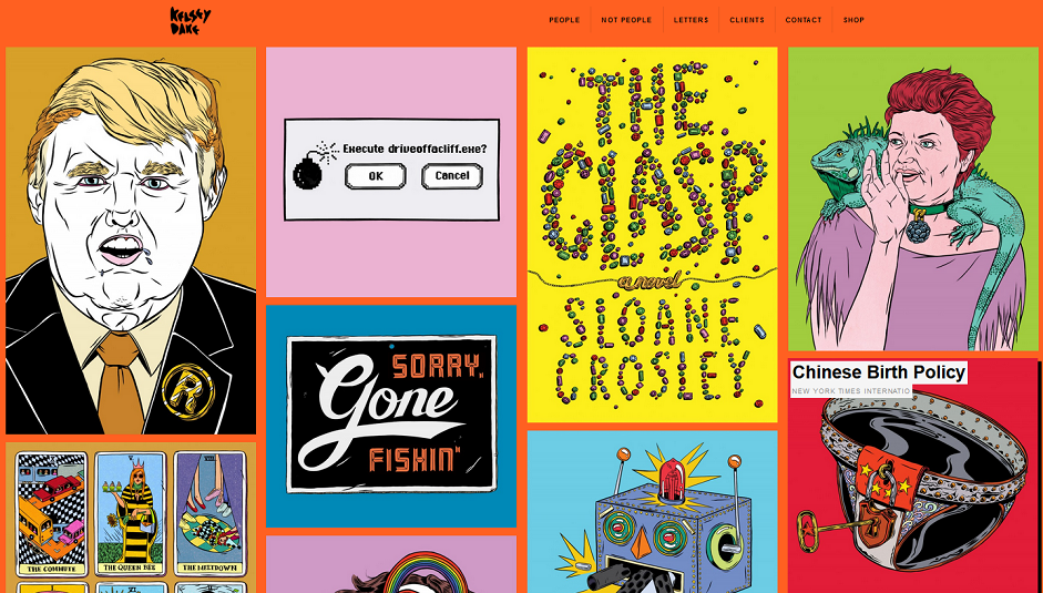 Source: Kelsey Drake
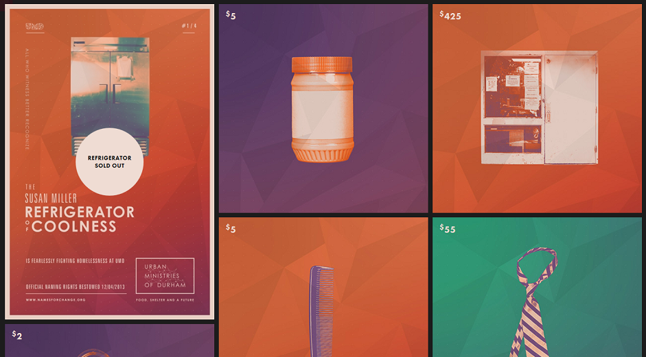 Source: Names for Change
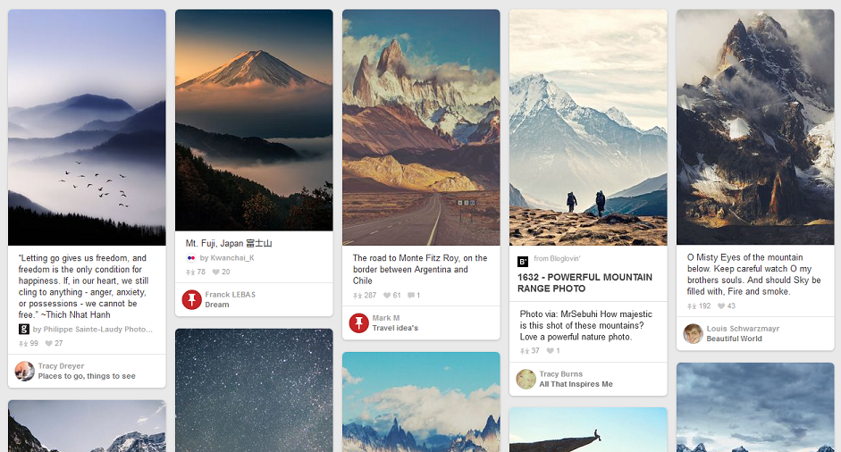 Source: Pinterest
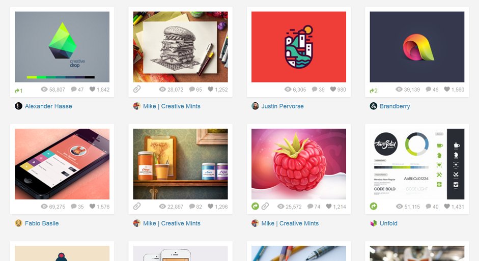 Source: Dribbble
 Source: Ahh
 Source: Future Fabric
How to Make It Work
If you want to use card design in your work, there are a few things you need to know in order to get it right.
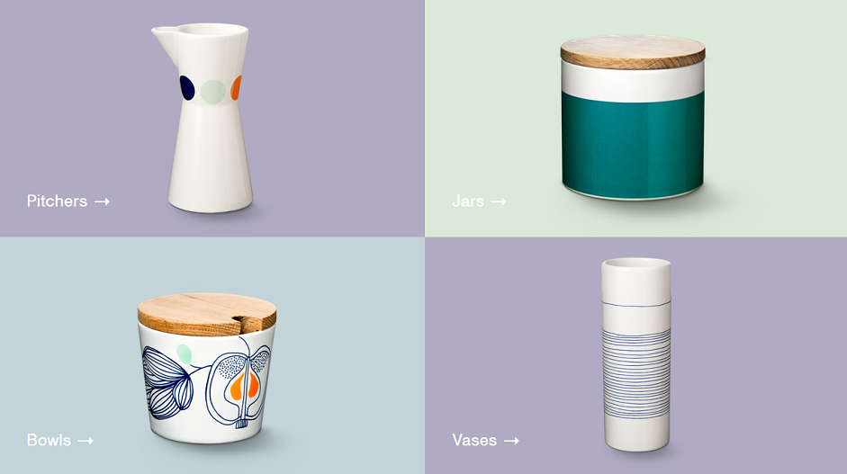 Source: Helbak
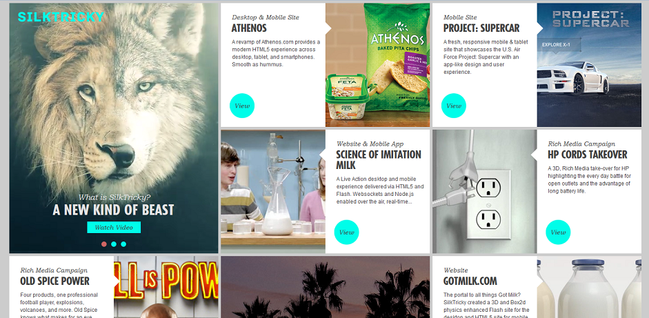 Source: Silk Tricky
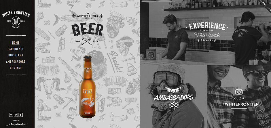 Source: White Frontier
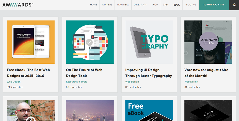 source:Awwwards
11. Think of your users. Style is nice, but usability should always be your top priority. Keep your cards clean and easy to read. Avoid fancy fonts and focus on call to actions. Theclymb.com uses a clean layout that is simple to understand and easy to navigate.
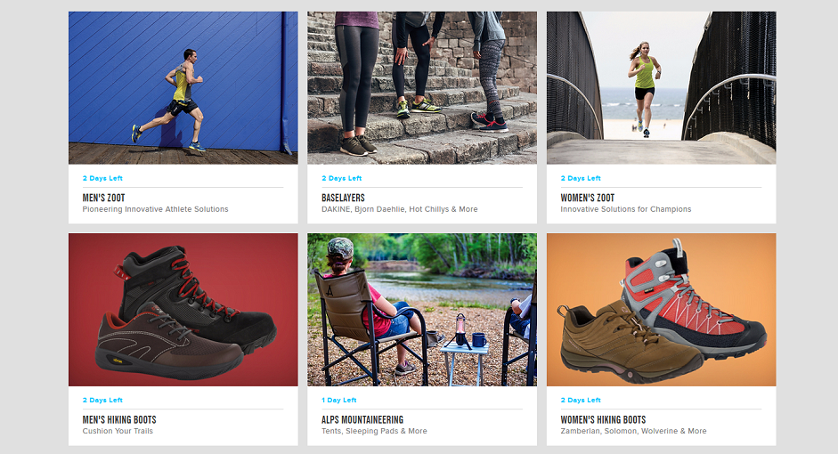 Source: The Clymb
Getting Creative with Cards
Have you got any tips for card design that you’d like to share? If so, leave your comment below – we’d love to hear your inspirational suggestions!
Written by Anna Lisnyak - Art Director at PSD2HTML.com, the leading PSD to HTML and web development company. With over 8 years of graphic design experience, Anna is an avid reader and blogger. She has an exceptional eye for details and enjoys everything related to typography, web and UI/UX design.