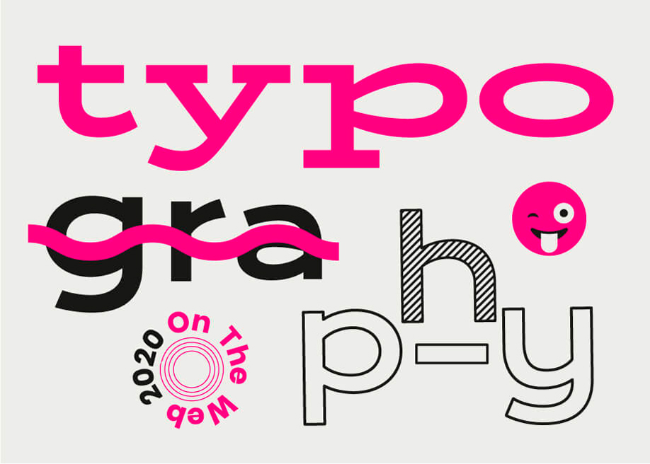
In the world of web design we have been experiencing a long process of incorporating typography effects in sites, which years ago was technically impossible, or at least could only be supported by a few browsers. Luckily this situation has changed and we are now enjoying an explosion of creativity in the use of web typography and communication, whilst still maintaining high levels of accessibility. The last few months have seen an increase in the richness of typefaces, decoration styles and hover effects, while icons and emojis are emphasizing the expressiveness of texts even more.
Hero fonts and bold typefaces
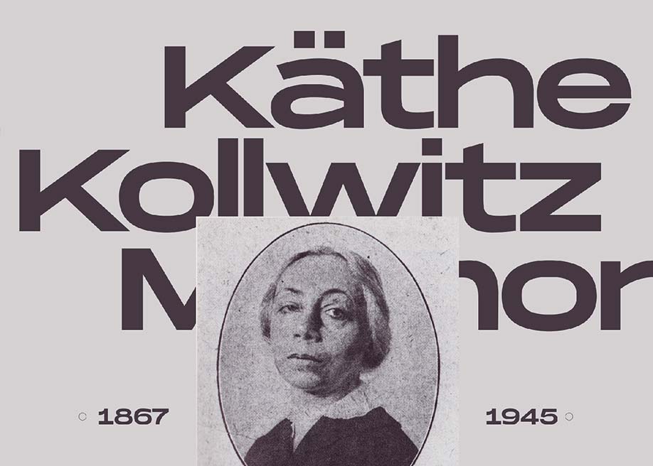
The use of bold typefaces is a trend that gives personality to texts and is overtaking images as the main design element. The creative use of typography is taking centre stage and, to a large extent, overtaking hero images and videos - which are multimedia elements that can have less than favorable effects on mobile browsing.
Serifs ARE BACK
Serifs are anything but new, nevertheless, they have clawed their way back to the forefront enough that they are no longer seen as belonging to the past: bold + serif = 2019. So, polish up that amazing Clarendon, you’re gonna need it!
Expressive typography in broken grid layouts
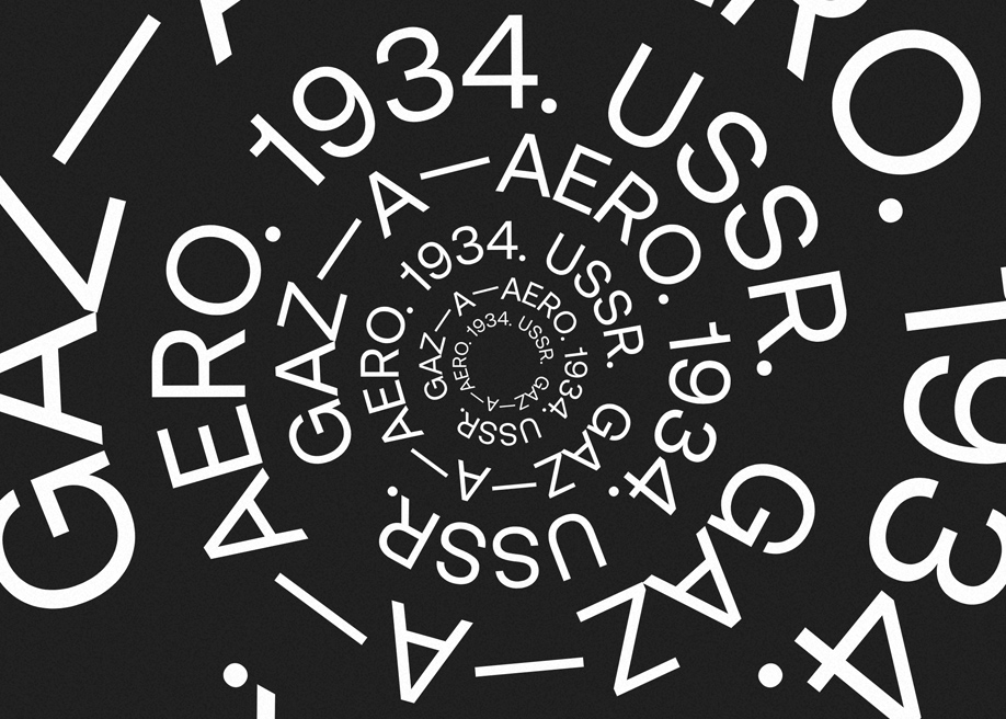
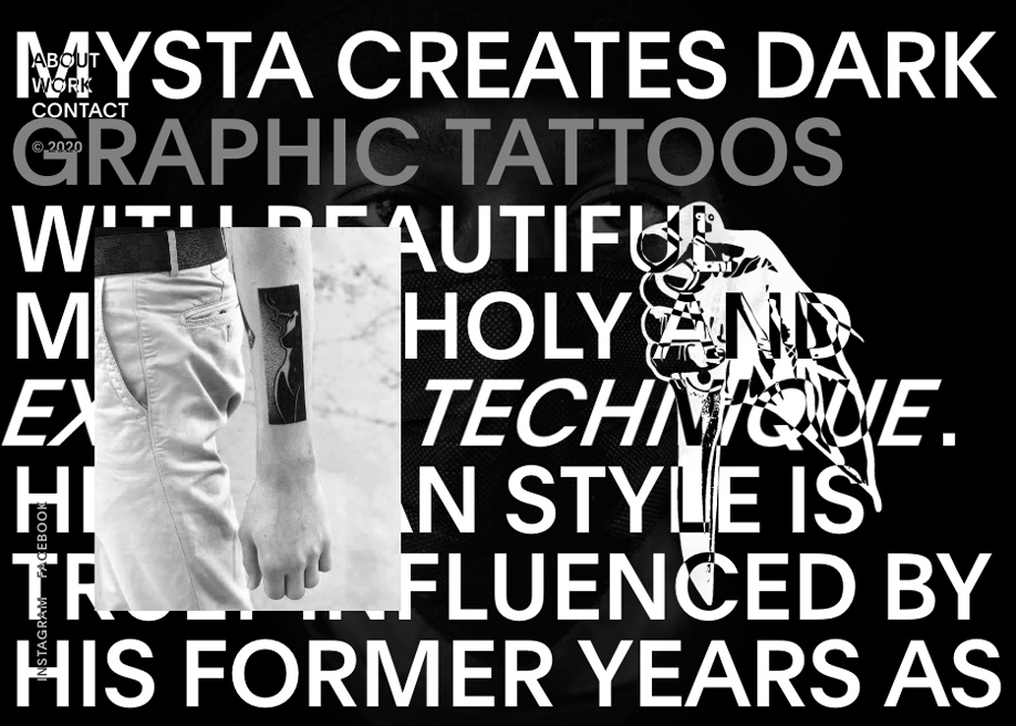
Within the creative use of typography, we’ll see a decrease in brush lettering and an increase in 3D and illustrated types, cropped and manipulated fonts with animated and more “alive” letters. In terms of layout, we will break away from classical grid based layouts without a second thought, allowing texts to adopt compositions more similar to an editorial design. Let’s not forget that this situation is in part due to the progressive standardisation of Flexbox and CSS Grids and will grow even more with the advent of variable fonts.
Hero fonts and large letter sizes in paragraphs
The texts on a website serve more of a purpose than a purely visual one, they are a way of expressing the personality of a product whilst forming part of the “Voice and Tone” of the communication. Right now we are incorporating all the visual resources we can get our hands on including icons, emojis, pictograms, audio and overlaid images. The copy now commands so much respect that paragraphs feature as principle elements, sometimes even appearing as big as the titles.
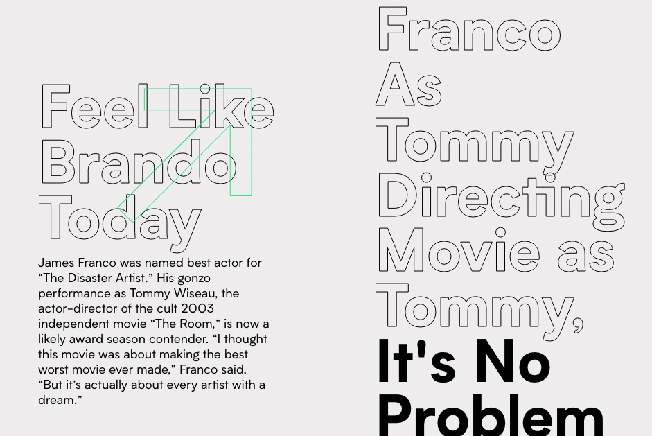
Pictograms, icons and emojis decorate our paragraphs
There are many typical (and not so typical) ways of text decoration that can coexist in the same paragraph, such as the classical underlines and italics of different weights to express or reinforce ideas. All this, together with numerous and peculiar hovers, colorful underlined blocks, outlined fonts, changes in typography, switching between serif and san serif (even in the same sentence), pictograms, icons and emojis are now scattered through the texts for decorative and semantic purposes. The desired outcome - to make the text more dynamic. The combinations are endless, many of them the result of visual experiments of Brutalism and Maximalism in web design.
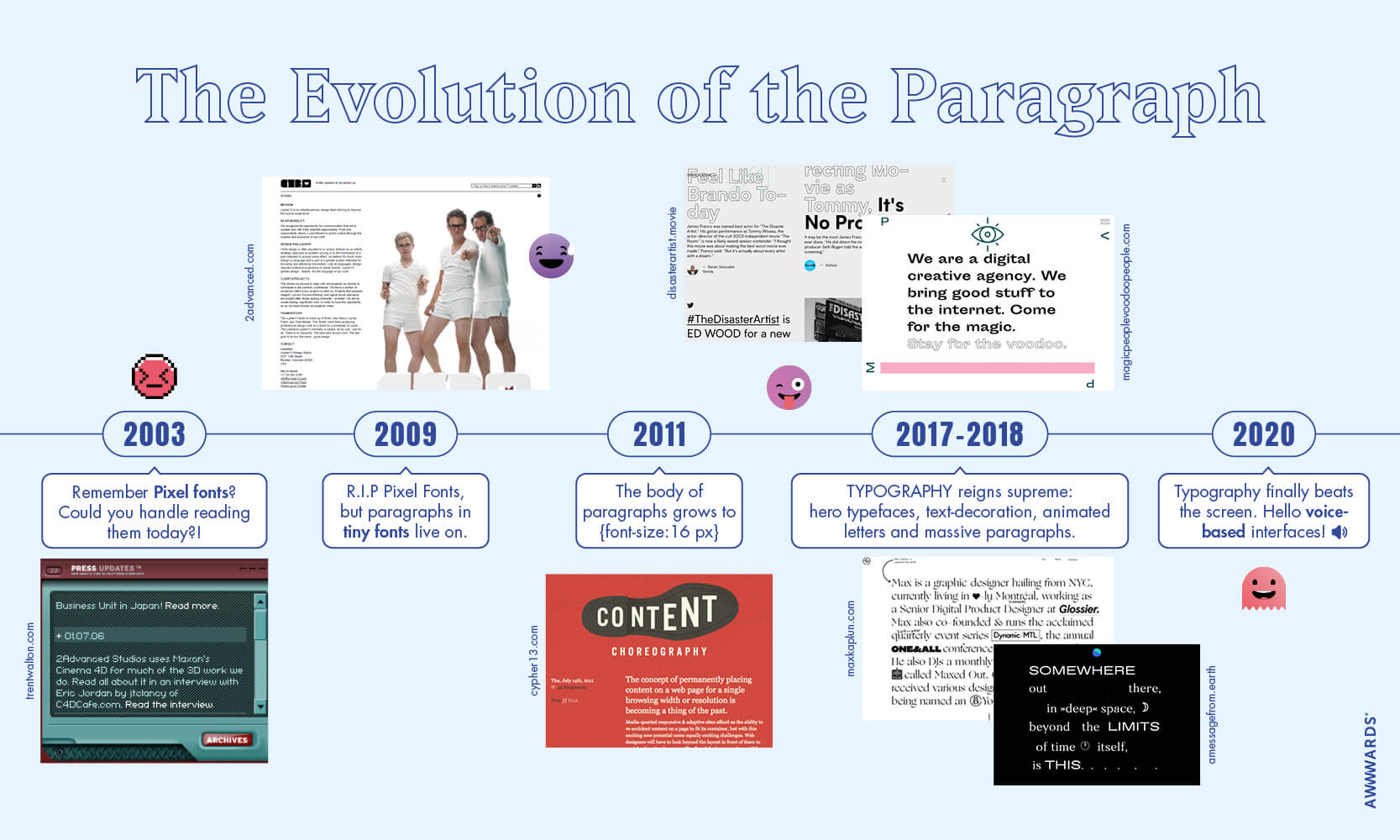
The evolution of the paragraph in web design
The size of fonts and length of paragraphs have been growing at such an increasing speed over the last few months, so we could not resist making the following graphic to illustrate the evolution of paragraphs in the history of web design.
Typography Trends 2020
30. Examples of Typography Trends 2020 ☆彡
Here's a collection of some of the typography trends we'll see in 2020. This is only a tiny selection, but if you want to explore more examples, go to our collection Typography in Web Design.
-
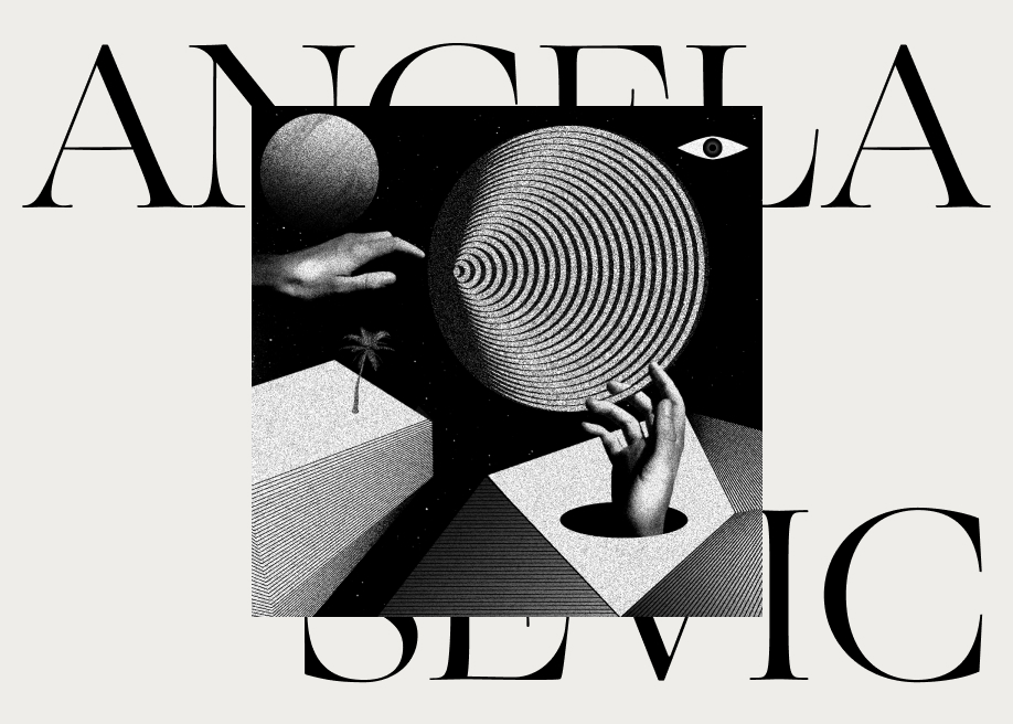
mē-lo / Angela Milosevic by milo and Cody in H.M -
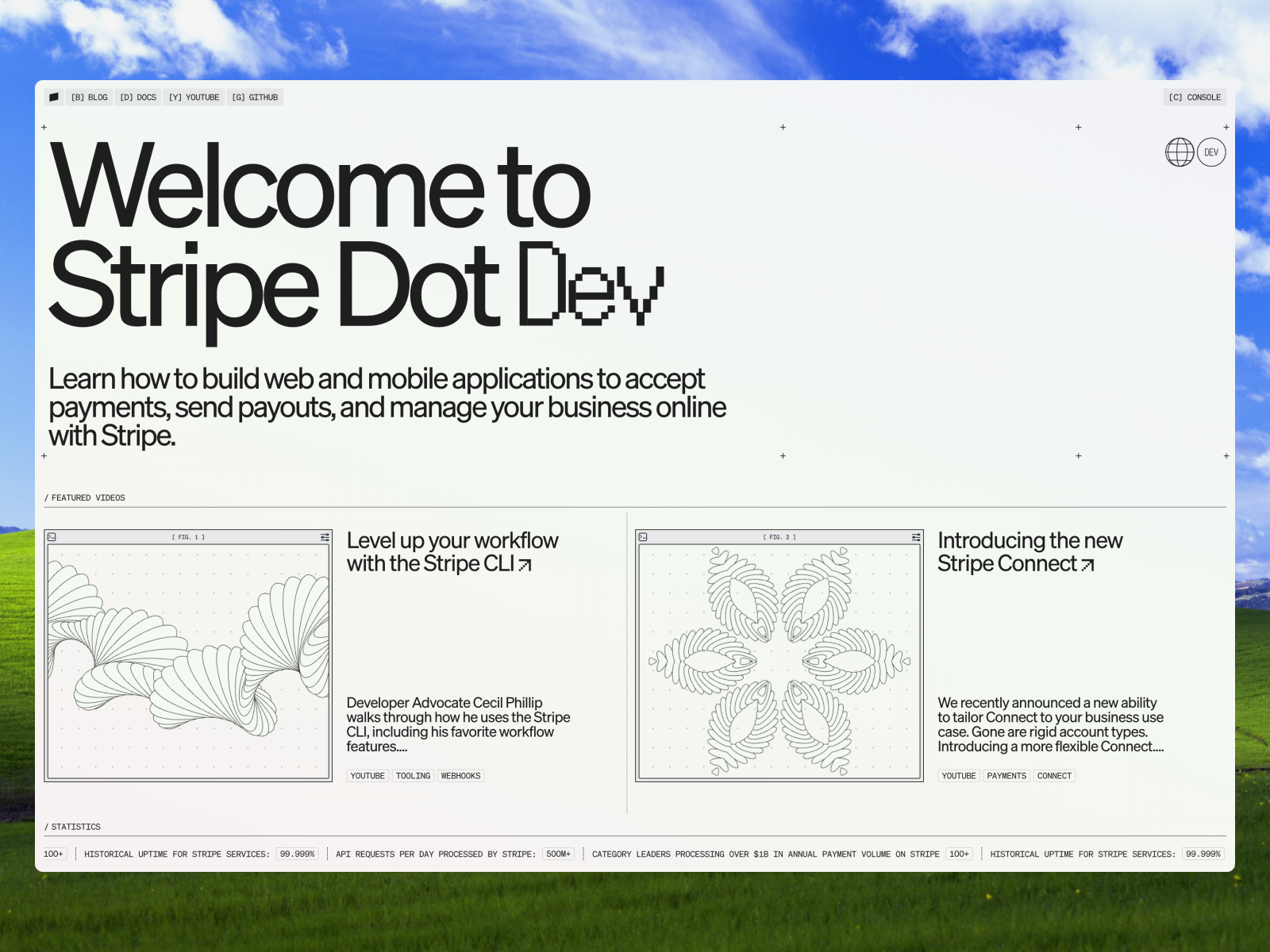
Desktop from Stripe Dot Dev -
About Us from Local Studio -
Mouse Fluid from Slosh Seltzer -
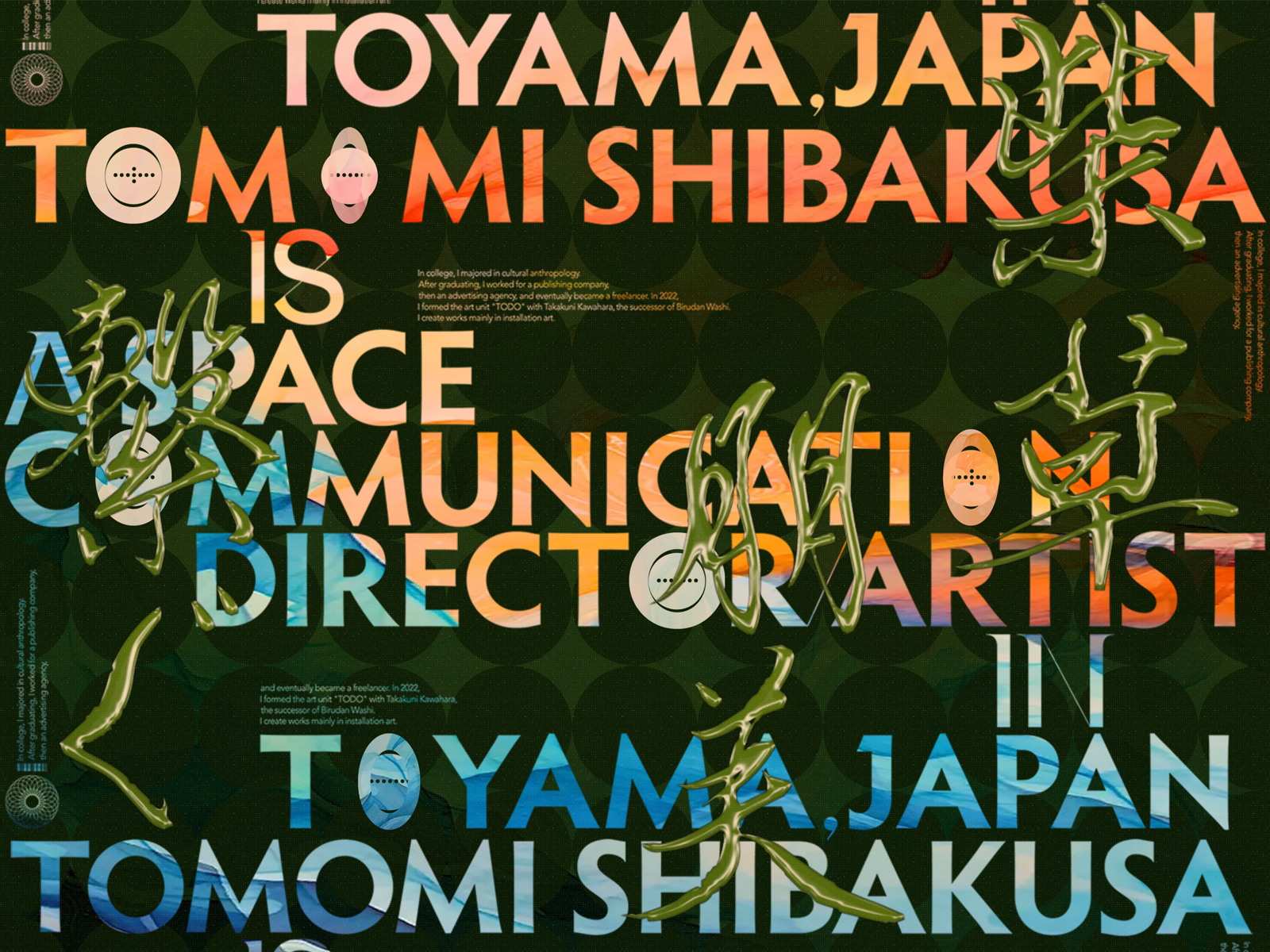
Desktop from TOMOMI SHIBAKUSA -
Hero Section Video from CO&IN -
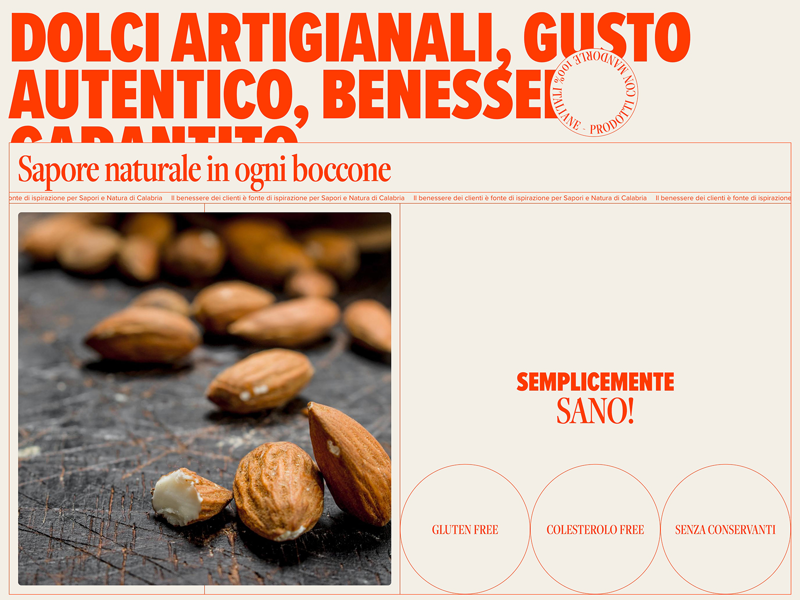
About from Sapori e Natura -
Typeface Gallery from FROST

