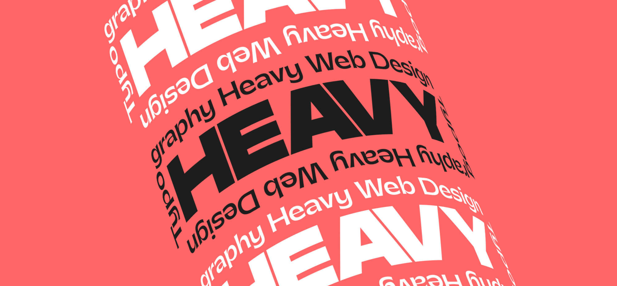
This year’s stand out trend can be summed up with the term: TYPOGRAPHY-HEAVY DESIGN. Recent improvements in CSS related to the manipulation and animation of texts allows us to experiment with characters and paragraphs in a way never before seen in web design, and sees typography playing a central role in layout design.
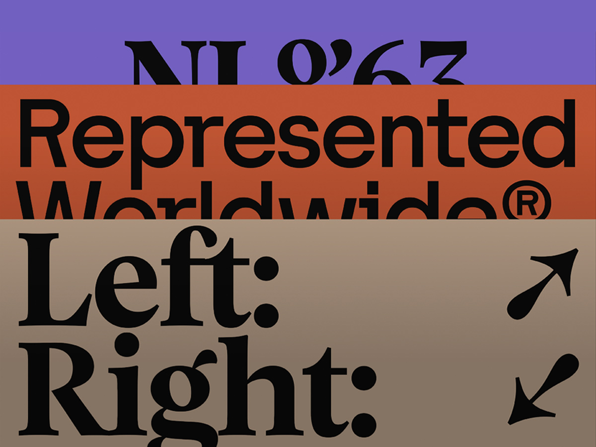
The desire to move away from classic GRID BASED LAYOUTS, has finally become a reality, proliferating a much more creative use of text and allowing us to adopt compositions more similar to EDITORIAL DESIGN. Coming up we’ll look at the main characteristics that represent the use of typography in the current web design scene. The physical structure of type is a leading graphic element in the compositions, and incorporating typography with big personality, especially serif and display fonts, adds rhythm and contrast.
📗 Check out our new book Hot Right Now Vol. 3, which dives into the latest trends in visual design, a must read for digital creatives.
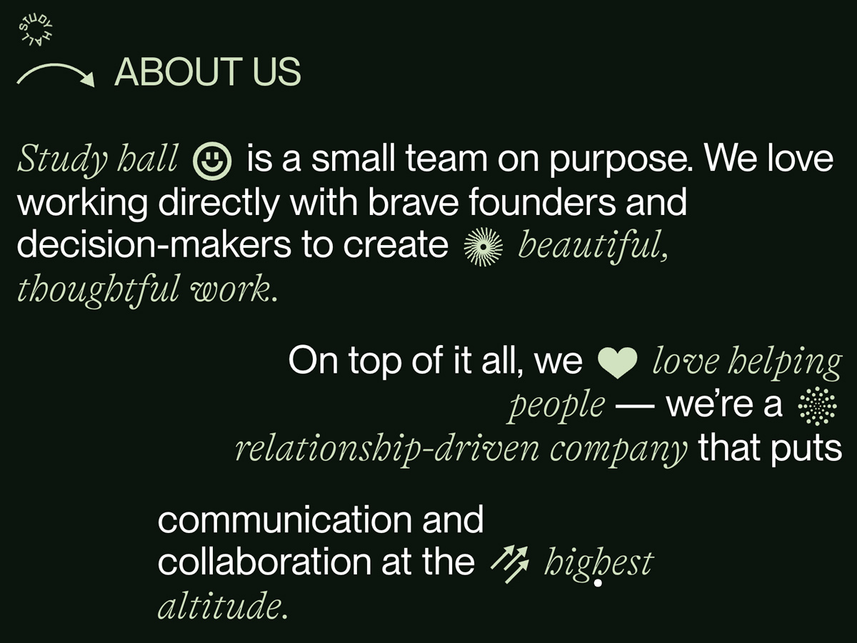
Mixing typefaces with very different qualities and structures is another of the fundamental practices of the trend. You can see how serif, sans-serif, decorative typefaces with different weights, widths and styles, and especially outline styles are now all working together. Paragraphs have gained aesthetic value and are an essential part of the design, with the size of the font in paragraphs being unusually big. They are decorated with a wide variety of CSS Styles and graphic elements like icons, emojis and images displayed inline with the text.
We’re seeing a revisit to historic styles, emulating compositions inspired by the Swiss style, using clean and modern sans-serif typefaces, as well as layouts inspired by postmodern compositions with powerful display typefaces.
The Great Evolution Of Text In Web Design
Variable Fonts, CSS Shapes, FlexBox and CSS Grids are definitively changing the way we lay out texts and liven up typography in web design. Both Flexbox and CSS Grid give us more control over the distribution of paragraphs and columns, allowing the creation of complex responsive layouts in a consistent and simple way.
CSS Shapes allows the transformation of text layouts, into non-rectangular layouts - wrapping content round shapes like circles, triangles, polygons, or custom paths. For a long time in web design we’ve been forced to contain the text within rectangles, which can be very limiting when it comes to creating complex layouts or imitating styles like we see in the editorial world.
CSS Shapes is currently implemented in 91.38 % of browsers, while nearly 100% of browsers implement FlexBox and CSS Grid. Finally, Variable Fonts is already implemented in 87.58%, meaning its use could still be slightly problematic, especially on mobile browsers.
An OpenType variable font is a file that contains only a single set of glyph outlines representing the regular weight and width of the typeface. Variable fonts have a series of defined properties that allow us to modify the width, weight, slant, optical size and other characteristics established by the font designer. In this way we can have just one binary file containing every variation of the font family:
Regular, Light, Bold, Extended, etc...and of course, all these properties can be “jazzed up” with CSS to create interesting animations.
The advert for the new Google Font API is big news, as the API will allow the use of variable fonts, including a varied set of 10 high quality serifs, sans, rounded, slab, and monospaced typefaces.
Playful Typography
There are many examples of experiments animating different properties of Variable Fonts or making use of CSS Shapes to wrap text into a shape or arrange the glyphs to follow a path.
Experiments that animate a variable font and split the characters can be really impressive but they present accessibility problems, especially for screen readers, as the integrity of the HTML semantics is affected by split text. However, this problem can be very easily fixed with WAI-ARIA. You only have to add the label “aria-label” with the complete text, to allow screen readers to find the content semantically comprehensible. Even in very experimental projects aimed at professional designers we shouldn’t lose sight of accessibility, because sometimes the solution is simple.
Typography in Web Design Collection
To discover more examples of Typography being bold and beautiful, see the websites in our "Typography in Web Design " collection, or buy our new book Hot Right Now Vol. 3, which dives into the latest trends in visual design, a must read for digital creatives.
-
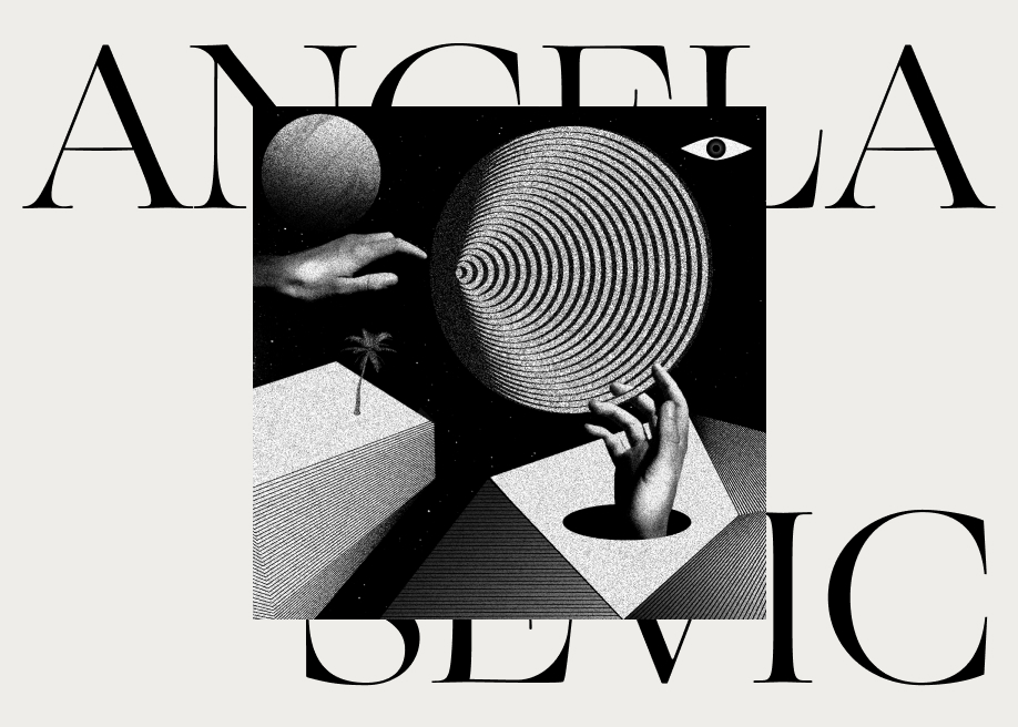
mē-lo / Angela Milosevic by milo and Cody in H.M -
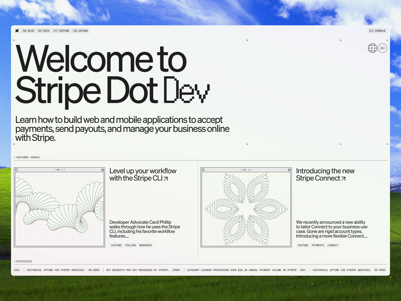
Desktop from Stripe Dot Dev -
About Us from Local Studio -
Mouse Fluid from Slosh Seltzer -
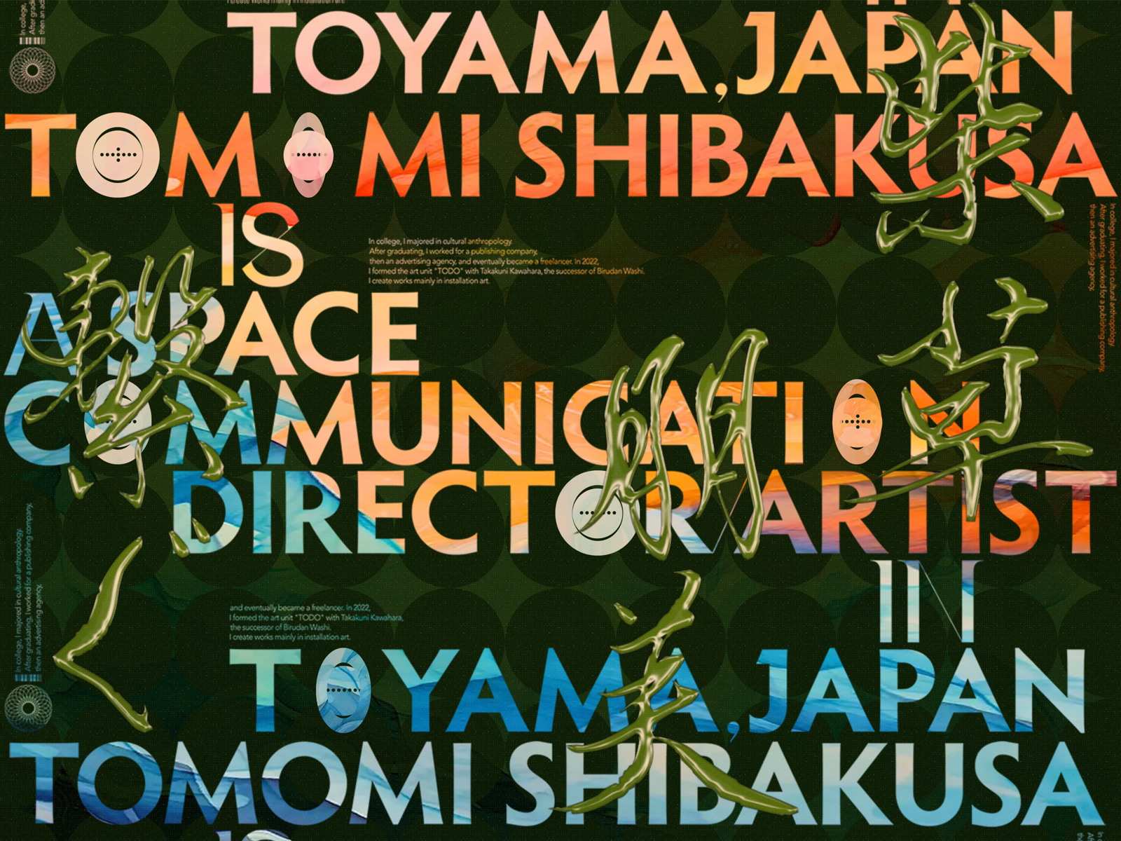
Desktop from TOMOMI SHIBAKUSA -
Hero Section Video from CO&IN -
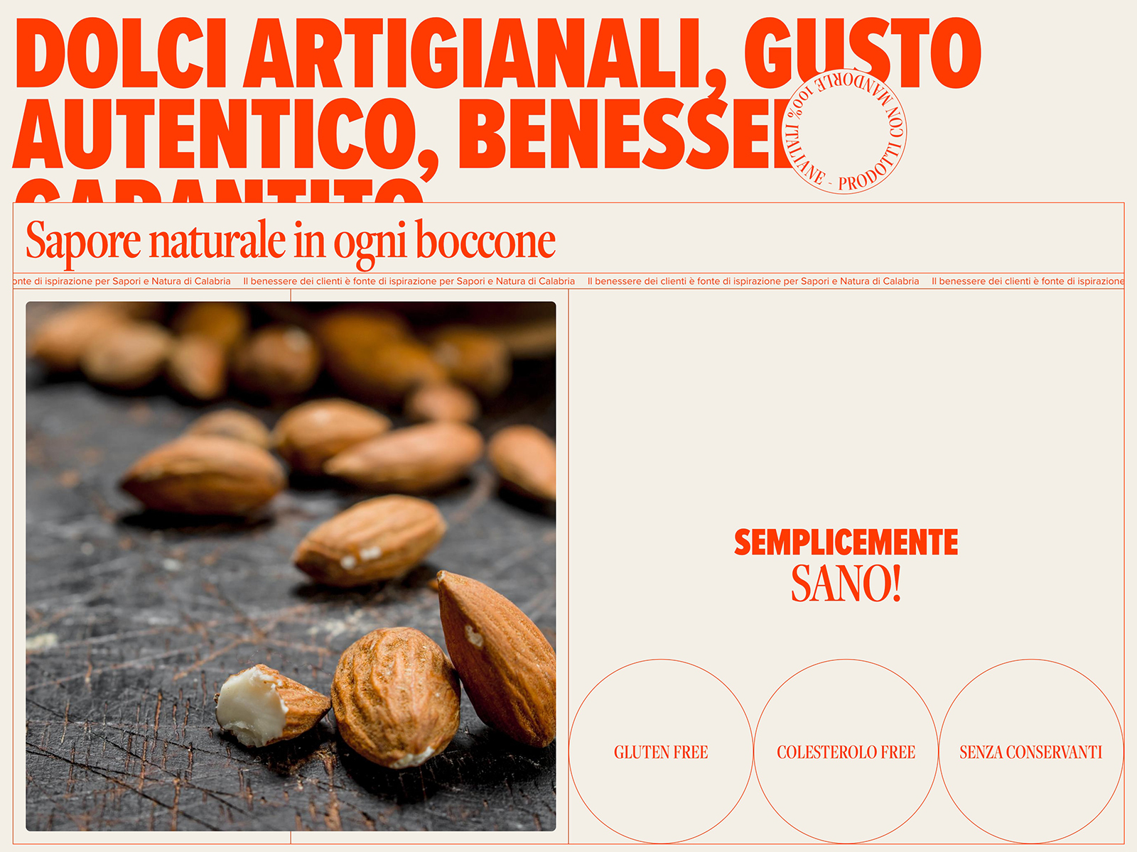
About from Sapori e Natura -
Typeface Gallery from FROST -
Typographic layout from NSSC18