In 2020, TUX launched the TUX Karma Foundation, using its profits to tackle big world issues in creative ways. Central to this endeavour was the launch of a slick new website that showcases the ongoing and accomplished projects of the foundation.
Our goal was to show how small actions can make a big difference, like throwing a pebble in a pond and watching the ripples spread. This website? It's not just an information dump — it's a spark for folks to get pumped up about making a difference, one small yet mighty move at a time.
About Tux Karma
The Tux Karma Foundation originated from this itch to give something back. After a solid decade in advertising, TUX had this lightbulb moment — we gotta walk the talk, ya know? That's how this whole thing kicked off, to get our gang and the whole industry jazzed about making a real dent in social issues. Allocating $500,000 over five years, the foundation is focused on projects addressing societal issues like the environment, education, and inequalities in race and gender.
“Our employees are gifted with immense talent that goes beyond meeting our clients' needs. We are eager for change and Tux Karma will be the catalyst for our true intention." - Dominic Tremblay, Tux CEO and Co-founder
As a certified B Corporation®, TUX felt a responsibility, especially in today's global landscape, to empower its team to leverage their skills for positive change. We're all about raising awareness and getting folks moving toward a world where everyone feels at home. Teaming up with communities and other groups, Tux Karma's out here trying to take small bites out of these big challenges. You can discover our first few projects on this all-new website.
Objectives
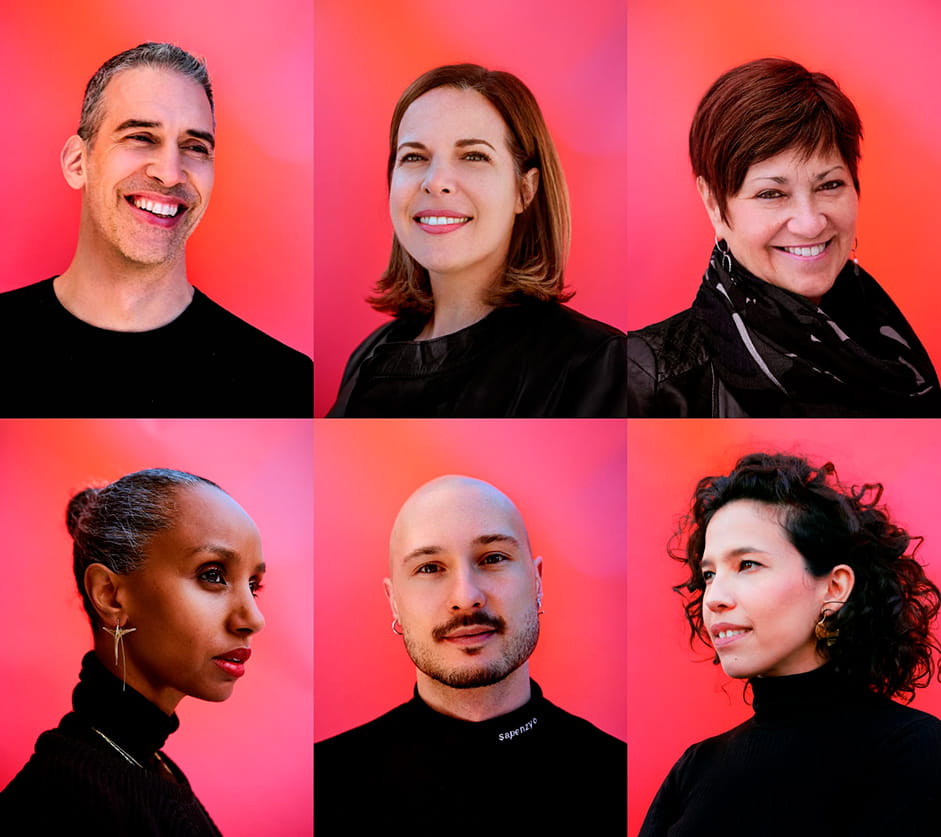
The main objective of the website was to showcase Tux Karma's awesome projects! We wanted each project to tell its story — from its beginnings to where it's at now. We made sure to highlight what each project was all about, the good changes they were aiming for, and the problems they were tackling head-on. Plus, we put faces to the projects, giving shoutouts to the incredible teams behind each one.
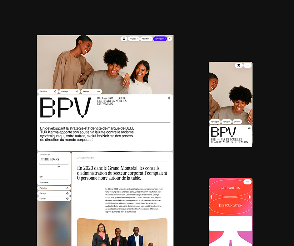
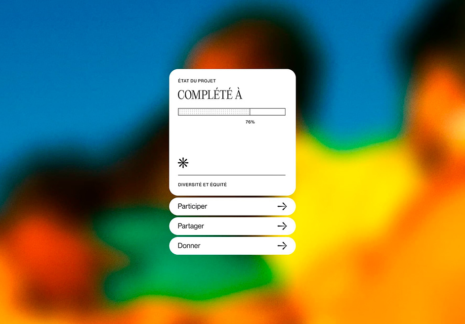
We didn't want anyone scratching their heads trying to figure things out. So, we made the website super easy to use. Wanna hop on board? We made sure you could do that pronto! Sections like "Participate," "Share the Projects," and "Donate" were right there, easy to find. We wanted folks to dive in and show their support without any hassle.
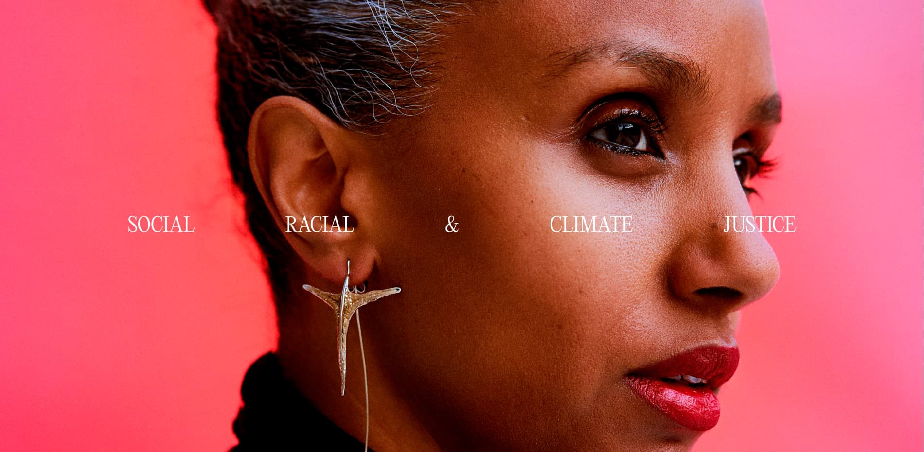
We wanted to be crystal clear about why Tux Karma exists. We're all about making moves in lots of areas: LGBTQIA2+ rights, women's rights, anti-racism, climate justice, social justice, equity, diversity, and education. We put those front and center, telling our story in a way that connects with folks who care about these causes.
Visual concept
Imagine a website that’s a burst of vibrant colours, not your typical foundation site, but one that screams hope for the future. We aimed to evoke that sense of change and inspiration.
Our core concept? Ripples. We wanted to showcase how small actions can create significant impacts. Picture this: a fluid, ripple-like mouse trail, creating waves as you move your cursor. And as you scroll, elements glide up and down, leaving ripples against a colourful backdrop—a scroll effect that’s nothing short of mesmerising.
“The intention was to explore the concept of ripples, as every small action we take has the potential to create significant impacts." - Louis Paquet, Creative Direction at Tux.
Handling tons of info about each project was no joke. We needed the right mix of fonts and a clean, organised grid layout. Our goal? Ensuring every detail about the foundation's work was presented clearly and in a way that was easy to absorb.
Coding some ripples
Crafting these ripples required more than off-the-shelf solutions; it called for custom code and some inspiration from this YouTube tutorial by Yuri Artiukh. So, how did we make it happen? Let's peel back the digital curtain and delve into the technical stuff.
As soon as the mouse moves, we create a 2D plane into our canvas that affects the background video with some displacement. To replicate the propagation of a real water drop, we randomly rotate the plane and slowly scale it up before fading it away.
We aimed to push the boundaries of this effect by creating ripples that are not only related to the mouse but also influenced by the page composition and scrolling. To do so, we ended up observing the positions of the elements that affect our WebGL background shader. As soon as one of those DOM elements enters the viewport, we calculate the origin, the translation, and the scale of a new ripple. We repeated this operation every time our canvas was rendered. Eventually, you can observe ripples propagating from different elements as soon as you scroll through the pages.
Elevating Experience
You know those small things you might not consciously notice on a website? We had some fun tweaking those to add a dash of uniqueness. Ever selected text and it's just that plain old blue? We spiced it up — now, when you select something, it's this evolving burst of colors, a gradient that dances around. It’s a tiny detail, but for those who catch it, it's a wink from us to say, "Enjoy the little surprises!" Creating this effect was a little tricky. After a few attempts, we noticed that color animations don't work on selected content. We had to find a way to recreate the fluid ambiance we liked so much on our website. To achieve this, our solution was to rapidly update simple class names as soon as something was selected. This way, we managed to fake a classic background color smooth transition.
And hey, ever noticed a favicon that changes colors like a shifting gradient? Yeah, we cooked that up too. These subtle touches, like the evolving text selection and the shapeshifting favicon, might not be the star of the show, but they add that extra sprinkle of craft. It’s all about having a bit of fun, even in the small stuff — it might not change the world, but it surely brings some charm. To create this tiny effect, we followed the same process as the color selection effect. This time, we dynamically update the path of our favicon at a very short interval.
We also had some fun with the page transitions. We wanted to make them as seamless and fluid as possible and maintain that visual continuity between pages. Making the journey from one page to the next as smooth as silk. To fully customize our transitions, we didn’t use any existing library. Instead, we opted for a homemade transition script. This code allows us to preload the next page's content and decide exactly what to animate depending on the current page and where the user wants to go. For example, when the user chooses to see a project from the homepage, the whole composition moves: the main image of the project appears while some text content is translated to the background of the screen. To enable this transition, some elements from the original page are duplicated. Eventually, this temporary content is deleted once we fully land on our new page.
“We put a lot of love into our transition so it looks as seamless as possible. The content of the current and next page basically blend during a transition." - Michaël Garcia, Creative Developer at Tux
Finally, we didn’t want to settle for ordinary image sliders. We took it up a notch, using SVG morphing masks to create an image slider that's a bit of a shape-shifter. Each image transition morphs elegantly into the next, adding a touch of whimsy to showcase the projects. On a technical note, GSAP’s morphing properties were a great help in achieving those movements. They allowed us to smoothly animate the current shape of our slider to the next one. Additionally, images are not rendered using the classic markup. Instead, images are rendered directly inside the global SVG using
elements so the mask of the shape affects its content.
Front-end Stack
WebGL: Three.js
Motion: GSAP + CSS
Smooth-scrolling: Lenis
About Tux Creative House
Obsessed with creativity that has been growing businesses since 2010, Tux Creative House is dedicated to producing work that cuts through the clutter, rises above the commonplace, and challenges consumer indifference. Tux has launched international campaigns, repositioned major players and built brands from scratch to break through the noise in virtually every category. Since 2019, Tux is a certified B Corporation® and is proudly accountable for doing business in a better way. Actively pursuing the well-being of its staff, communities, and the environment, Tux helps the brands they work with do so as well.
Credits
Brand Art Direction: Charlène Sepentzis
Digital Art Direction: Louis Paquet
Motion: Astrid Tessier and Louis Paquet
Web Development: Michaël Garcia
Client Partnership: Marie-Laurence Choinière