I hadn't had a fresh portfolio for over six years, and the functionality of this latest site was in my head, in some form, for the last three or four years.
It was well overdue. I wanted to create a place for my work that I felt encompassed me as a designer, with a distinct use of typography and simplicity along with ease of use. I also wanted the site to get out of the way of itself when the user views the projects, so focus was on the work, not the website.
Background
At the time of building this website - Tom Sears Personal Portfolio, I had been working at Squarespace for around 6 years. I led a team at one point called ‘web design’ (shoutout to some of the most talented people I have ever worked with).
Essentially, our day to day was understanding the web implicitly and breaking down any website into modules that could be translated into building blocks for the web. In doing this, the team is able to figure out which modules we can already make using our existing platform, and which modules would either require a piece of additional functionality from a pre-existing component within the platform, or which would be a completely new feature in order to achieve a desired design. We would notice trends within the world of web design and have a backlog of features that we could add into the platform, along with nice-to-haves that would in theory allow any user to be able to achieve a very specific and custom looking website for themselves.
We would notice trends within the world of web design and have a backlog of features that we could add into the platform .
We would then categorize many of these modules into specific ‘verticals’. Essentially allocating them to a type of website in order to give our users the best starting points possible for their websites; an example would be that a brick and mortar shop should have a location module and potentially a map, whereas this type of module would not be needed on a personal portfolio where there is no need for a location, and instead a different collection of modules could be offered up for people wanting to create portfolios.
During my time with this team, I could see similarities of both features and modules within the portfolio vertical and essentially distilled down underlying features that I wanted to use to create my website. At the time, the team had so many ideas for every module that we wanted to create, and I used them to inspire some ideas that I felt worked best for me.
Modules & Features
The features that I chose for my portfolio were as follows:
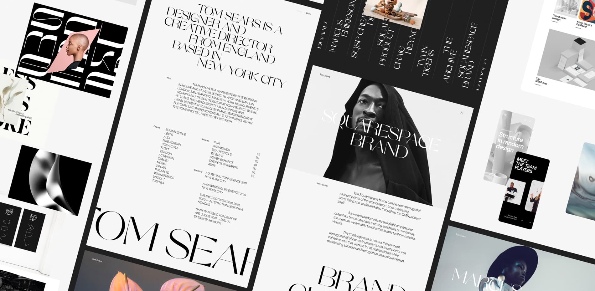
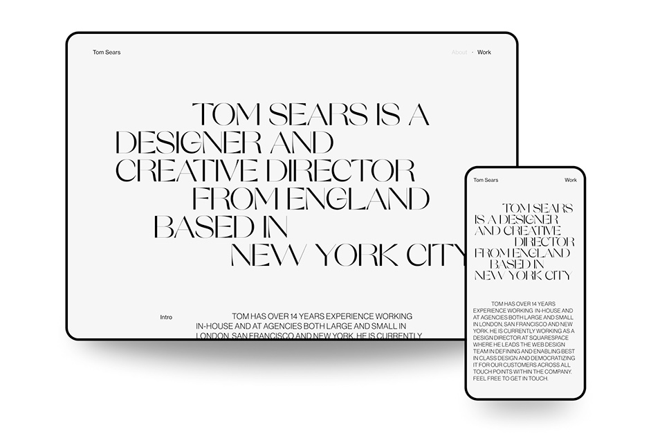
About as the Homepage
In breaking down what a portfolio is to its simplest form, a portfolio website is essentially a resume, along with some work to peruse through, and as such I felt that having a traditional homepage with a rich web experience project preview on it for the sake of navigating to the work would be overkill.
Instead, I thought of it more like a piece of print. Just have a resume one pager front and center with all my information and background, and use only layout and typography to make it compelling. That way, it avoids an extra click to go to more details from an unneeded homepage.
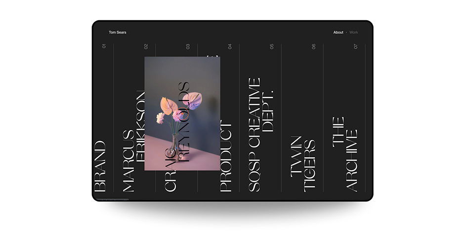
Project Index
Having About as the homepage meant that there was the option to have only one link in the navigation to point towards the projects. One of the aforementioned modules that we were heavily looking into at my previous job was what we called “index” — a list of links with an image attached to that link that reveals on hover. Something that is common with portfolios, as it gives a glimpse into a project without taking up much space.
As many people would view my portfolio via phone, I wanted the experience to be just as compelling.
The main issue I find with this type of feature is that it does not translate to mobile well, and as many people would view my portfolio via phone, I wanted the experience to be just as compelling. I therefore decided to flip the index to be vertical rather than horizontal. This allows the feature to be swiped on mobile, and the image to still reveal when the list item is centered, thereby feeling much like the desktop version. The thing I kept referencing with this was the haptic feedback you receive when setting an alarm on IOS; something is always targeted, and in this case it is the center most project.
Index
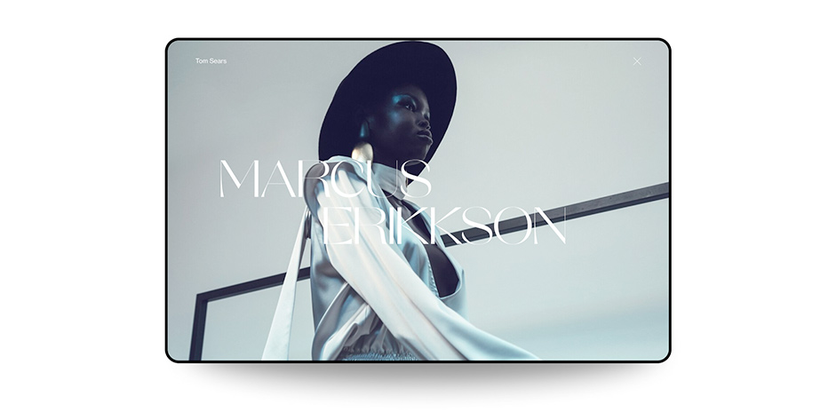
Lightbox style project pages
The next step from the project index was getting into the project pages. I wanted the transition to feel like an application, with smooth transitions in and out of any given page, with a simple ‘X’ in the top right to get back to the index.
Project open
Magnetic Custom Cursor
This is a less needed feature, but I wanted every part of the site design to feel considered. The functionality behind this cursor is that it expands and ‘magnetises’ to any link or call to action, making it easier to find what is interactive and gives the user a ‘cushion’ of space when interacting with elements such as the top navigation.
Typography & Grid
I feel that many designers have a few ‘go to’ fonts, and I am a huge fan of Neue Haas Grotesk. It’s a font that I have used again and again and never get bored of using it in different ways. I felt that if this site was to ‘feel like me’, then I had to use it, and therefore decided to use it on all the body copy.
I wanted something a little more ownable for the display type, and my wife Elena (also an amazing designer) and I started looking at some options. After much deliberation, I settled on Orelo by Pizza Typefaces. A perfect choice as it was recognizable and also took cues from classic beautiful typefaces having high contrast elements like a classic serif but otherwise quite a modern twist. Just what I wanted to pair with my sans.
The layout is all aligned to a simple 12 column grid through all devices except phones, and then the count readjusts to an 8 column grid at that point. Through ‘css grid’ this made it very easy to mimic the exact designs with offset content by simply allocating any image span a certain number of columns and then simply setting an offset. This could be adjusted for any media query, giving endless control.
Animation
We kept the animation extremely simple. In my mind, animation should mostly inform inputs, not be something that is there for the sake of having something move. The main animation on the site happens on the projects page when changing through projects on mouseover with a skew dependent on speed, and then the transition to the individual project page, helping the user to understand where they came from and how to get back there. Any other animation is there to elevate the design and add a premium feel to the site in a nuanced and subtle way so as not to distract the user.
Any other animation is there to elevate the design and add a premium feel to the site.
Technologies
First of all, I’d like to send a huge thank you to Jonas Leubbers, a former colleague of mine who I reached out to in order to build my site, and he killed it. We had a great initial chat together around the Figma I had created and talked about what we wanted to do, what would be harder, and how we could achieve a certain level of fidelity that we both wanted out of the site.
I have a (somewhat limited) knowledge of how to code websites from a different era when flash ruled the roost, and the exciting part of this for me is that we decided not to use a traditional CMS with a back end, but instead for saving time, costs and adding flexibility, built everything in .svelte in github. I had never used a react style framework before and it was nice to somewhat jump back in and add content and copy in code. Things have come a long way since I was last really involved in that world, and it was great to just dip my toe in again with the help of Jonas guiding me through. Now if I want to add a project, I copy an existing page and add in all the relevant static code. It's a bit of a process, but I’m happy for a refresher.
For the deployments specifically, we used Vercel, and photo and video uploads and hosting is handled by Sanity. We also use Mux for the actual streaming of the video to the site without the UI.
Tools
Development & Launch
Github, Svelte, Sanity, Vercel, Mux
Design
Figma, Photoshop, After Effects
Credits
Tom Sears — Design & Art Direction
Jonas Leubbers — Creative Development and Front End