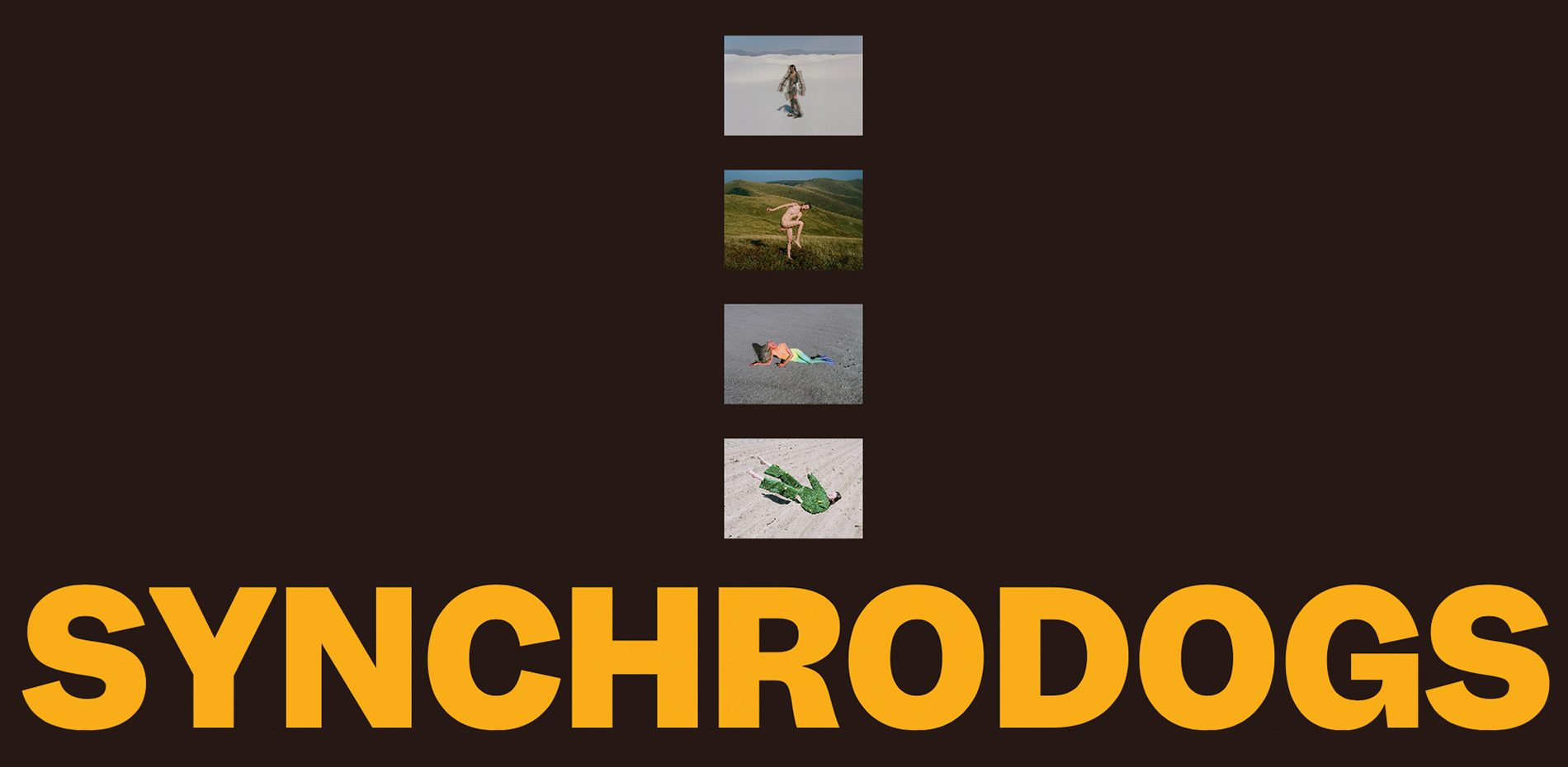
Massive congratulations to JASON BRADLEY & ZHENYA RYNZHUK for winning Site of the Month June with SYNCHRODOGS PORTFOLIO, thanks for all the votes and tweets.
Online presence is just as important as real-life presence nowadays. With that in mind, Synchrodogs tasked us (Zhenya Rynzhuk & Jason Bradley) with ideating a website that is both enticing and showcases their work in a visual manner. As a result, a unique and immersive website was created to reflect their personality as artists.
While developing the concept the main goal was to let the work speak for itself while sparsely sprinkling some fancy motion and interaction where applicable. Fluidity became the main sticking point. Interactions should be seamless and hassle-free and going back and forth between transition states needed to be fluent and make sense.
Design Concept
Aided by visual elements, colors, fonts, and motion, the idea behind this website was to create a digital space that perfectly encapsulates Synchrodogs' artistic vision and creative ethos. We also considered that this website had to combine both art and commercial projects that despite having some things in common are quite different and unique on their own: the artwork is more striking and emotionally evocative, while the commercial work is more relaxed and curated. However, both disciplines of their work are based on what they stand for: exploring the everlasting tension between man and nature unveiling layers of meaning that challenge our perceptions; so the challenge here was to ensure both directions are presented digitally in the best light.
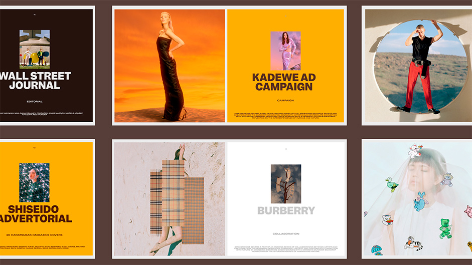
To achieve that, the artwork on the homepage is presented in a bold and brave manner by using a bright color palette specifically selected to match the artists' work in combination with the gradient that gets unveiled as the user scrolls down the page. The commercial work grid in its turn is more down to earth and provides great control of handpicking a specific color for each project through the CMS.
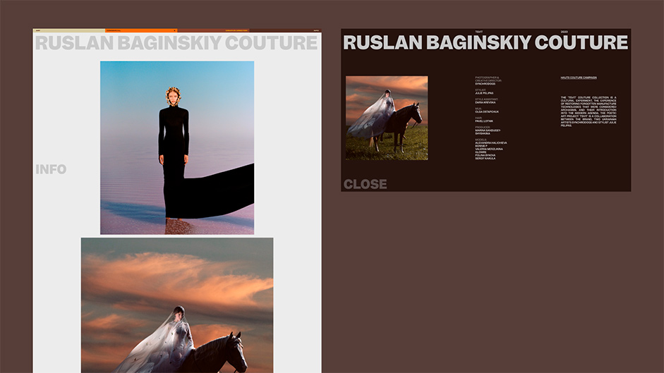
Each inner page of the website plays its own role in the overarching digital experience: the work grid is entirely focused on representing the fine art pieces following the content-first approach, while the project's inner page is designed to be plain to achieve the feeling of the artist’s work being showcased in a physical museum or an art center with all the attention given to the work itself. The secondary project info is hidden in the pop-up which is easily accessible so that people can learn more about each project and check credits. The info page is rather different from the other pages of the website with the main focus dedicated to various typography treatments, tables, and layout experiments to make it memorable yet well-structured to tell the story about the duo, their work approach as well as outline numerous books, interviews, publications, exhibitions, and awards.
Fluidity
As fluidity became the main focus, we started to map out what part of the design naturally tells a motion story based on aspects such as layout positioning and field of view. From there, ideas started to flow and small motion experiments were developed.
The editorial, swiss layout for the home page portrays the close-up feeling of the art pieces, but on most screens, it wasn’t possible to get a full view of the art piece. This is where the full-screen mode of the home page was born. The full-screen mode provides a seamless transition between the close-up-state-of-the-art piece and the full-view counterpart. To keep interactions fluid, we allowed the user to cycle through all the art pieces and exit the full-screen mode while staying at the art piece the user left off. For ease of use, these interactions are controllable with the cursor and keyboard.
“Motion and interaction should make sense and feel fluid"
Motion should tell a story. For websites, page transitions provide a great opportunity to do so. We posed to do exactly that with the page transitions in the following navigation journey: home page →commercial page → project page. In each stage the motion of elements guides the eye to parts of the screen that become the most important for each page.
In order to achieve a seamless experience for the info panel on the project pages it was vital to calculate the angle relative to the end position in the info panel. The motion is an angular wipe in the direction of the movement of the asset. It needed to have the exact same behavior relative to the progress value regardless of the aspect ratio in order to maintain consistency and a seamless handoff.
Technologies
Frontend Framework: Nuxt.js
Motion: GSAP
WebGL: Three.js
CMS: Sanity IO
Company Info
Jason Bradley, a creative developer, specializes in motion, interactions, and WebGL. Aiming to fuse seamless animations and engaging user interactions, he crafts captivating web experiences.
Zhenya Rynzhuk, an award-winning art director and co-founder of Synchronized Studio focused on creating unique digital experiences that bring strategic value and make partners’ businesses thrive.