
-
-
Massive congratulations to Active Theory and GPJ, winners of Site of the Month July for The Harmonic State. Thanks to all of you who voted - the winner of the Pro Plan is named at the end of the article.
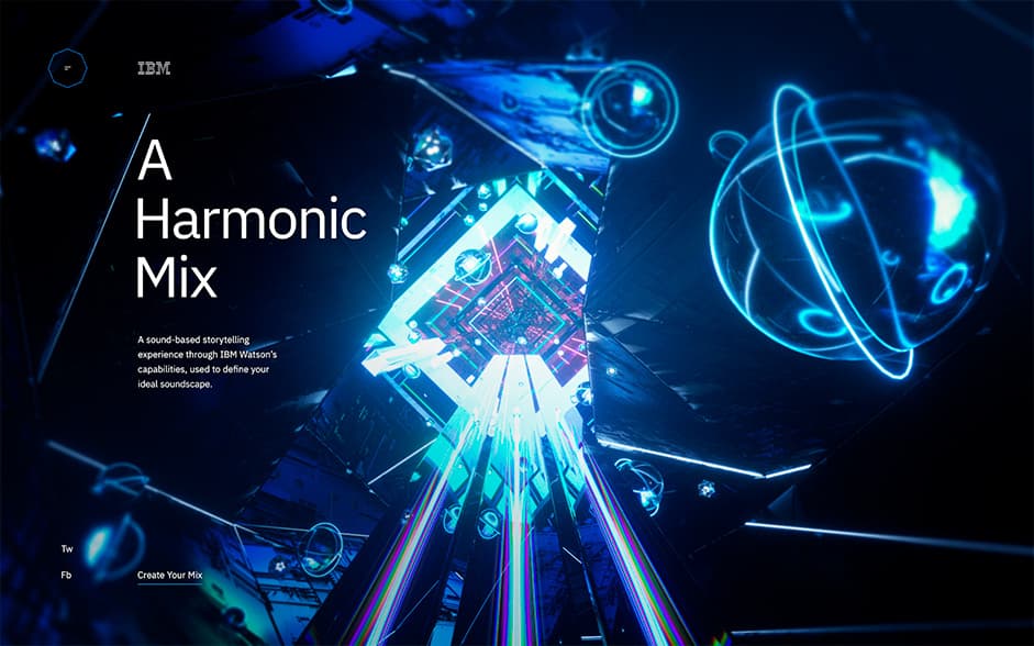
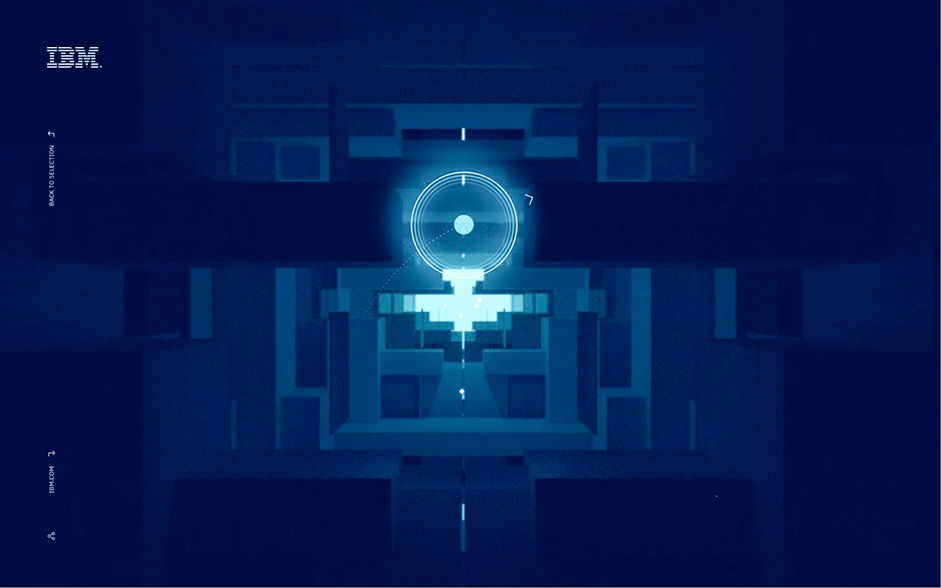
The Harmonic State is an interactive web experience that translates the breadth of IBM Watson's capabilities into a fun and engaging game, educating users on Watson's key business benefits. This IBM activation was initially concepted and introduced to us by GPJ. We teamed up with GPJ and Plan8 to create, design, and deliver this cinematic, audio-visual web-based experience.
Trailer video
The Brief: From Dissonance To Harmony
The original concept focused on a series of case studies that would artistically demonstrate how IBM Watson solves real world business problems. The user would start with dissonant and chaotic visuals that would be analyzed by IBM Watson, revealing insights for users to act on which would change the visuals into a more vibrant, structured and harmonious palette. This journey was complemented by sound, as a dissonant soundtrack gradually transitioned into harmony and order as users acted on the insights provided by Watson.
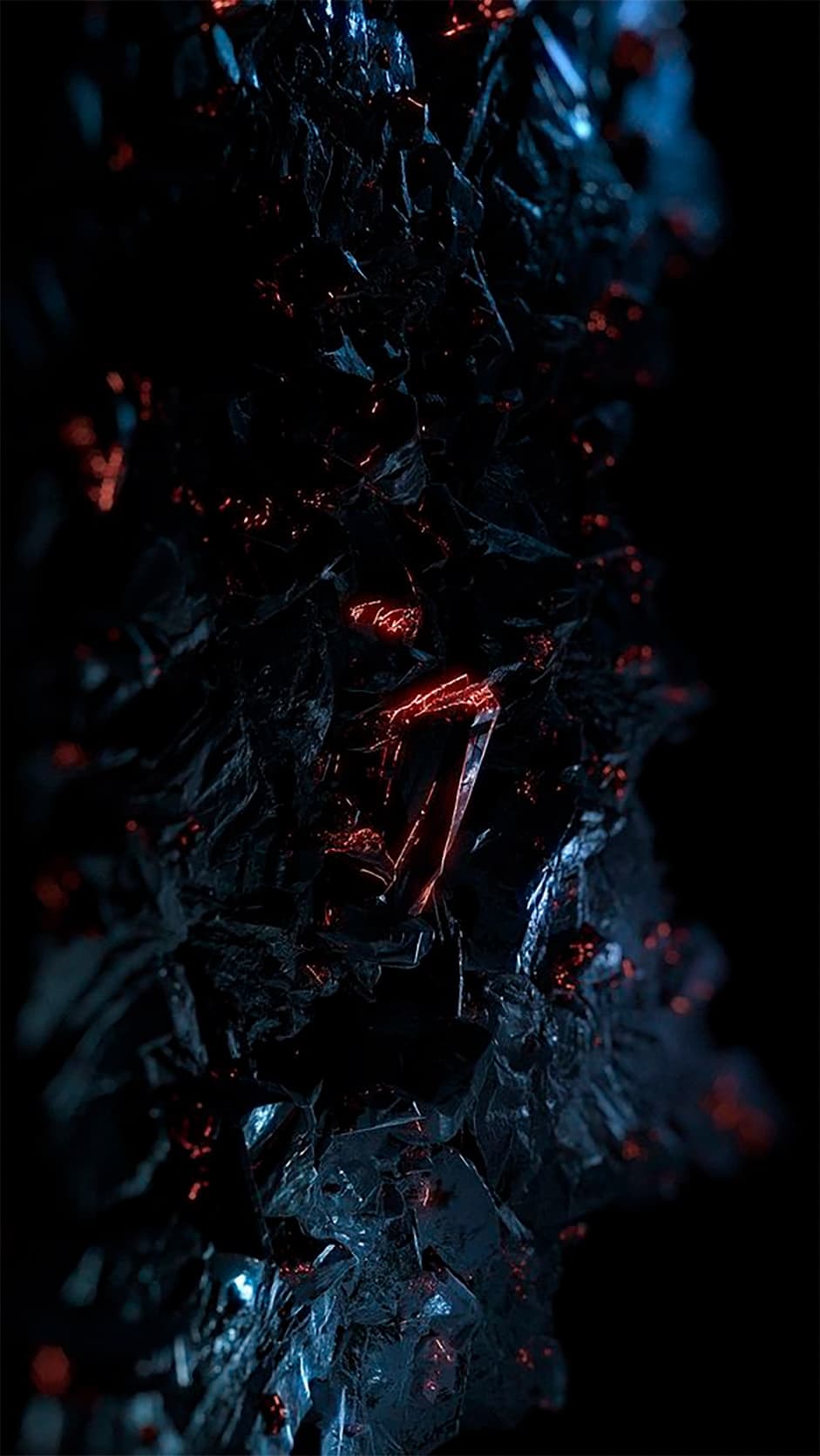

Initial visual inspiration for dissonance
Initial moodboards for the chaos / dissonance represented a business waiting to be optimized by IBM Watson. These visual soundscapes were asymmetric, disorganized, random, sporadic, dark and broken.

Watson analyzing animation
Once the experience commenced, Watson would analyze the environment and highlight visible insights for users to act on. From a business perspective, this process aimed to demonstrate how choosing the right AI partner can mean the difference between harmony and dissonance.


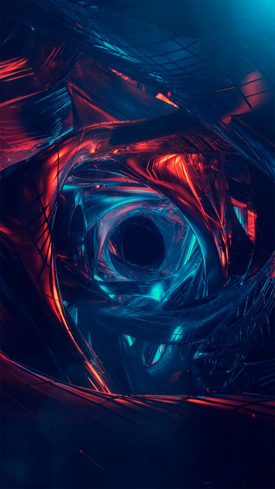
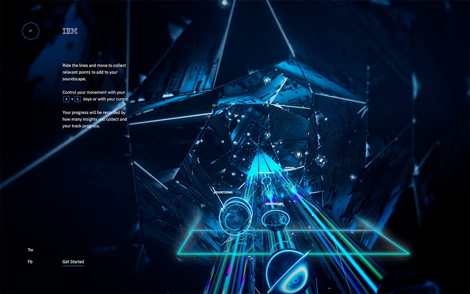
A generative 3D tunnel would move users towards harmony as they interacted
As users interact with the insights, a generative 3D tunnel would react dynamically to user gameplay. We suggested this approach to give each user a unique audiovisual experience, increasing replayability as the game would remain challenging on each new play through.
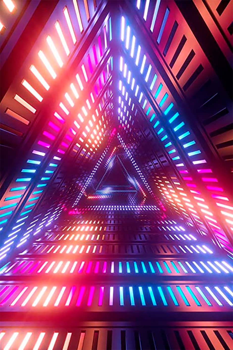
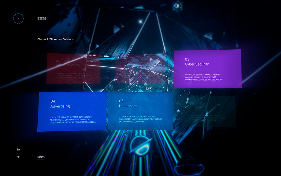
Initial Concepting and Flow
To visualize the concept, we developed a series of look dev screens to highlight the experience flow including onboarding, level selection, gameplay and a summary screen.
For the gameplay itself, we started with rhythm game mechanics involving timed orbs and lanes. While this wasn’t going to necessarily be the final game mechanic, it was a helpful starting point for the visual flow.
To further demonstrate the flow (and incorporate an experimental audio track provided to us by Plan8), we developed a motion comp. This combined the early visual direction, user flow (dissonance to Watson analysis to harmony) and audio elements.
A motion comp with music track was prototyped to demonstrate the concept
Visual Direction
As part of the transition from dissonance to harmony, we needed an overarching visual direction that could be applied in different ways across the three levels. This visual direction also needed to align with existing IBM Watson branding.
This proved to be a particularly interesting challenge as existing IBM Watson experiences and branding tended to employ flat, minimalist, 2D graphics -- so we needed to work out how to develop a new ‘north star’ for a rich, 3D, immersive experience, all while remaining 'on brand’.
To align across all teams, this was done through a series of moodboards that touched on how the Watson guidelines could be applied across different styles of visuals including particles, textures, geometric shapes and color palettes.


A series of moodboards were developed to communicate how IBM Watson branding could be maintained in a 3D immersive environment
In developing our style, we had to take into account guidelines for grid structure, typographic layout and hierarchy, user interface elements and motion. To manage this, we went for a simple and minimalistic approach that streamlined the experience for the user, fit IBM Watson requirements and allowed for flexibility through the different levels.
Design experiments conveyed simple and minimalistic UI
Developing the Levels
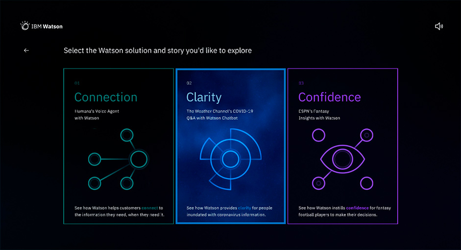
With visual direction and branding established, the next step was to develop three different level interpretations that would align with three real-life business applications of Watson.
These three case studies were:
- Improving wait times for Humana, a healthcare insurance company
- Assisting the Weather Channel with customer engagement
- Providing insights for ESPN’s Fantasy Football tournaments
Each case study was aligned with a theme that would become the name of the level and provide additional context into what the user was attempting to achieve through gameplay. Humana became ‘Connection’, Weather Channel became ‘Clarity’ and ESPN Fantasy Football became ‘Confidence’.
1: Connection
In ‘Connection’, users are introduced to Humana, a leading health insurance provider that aims to reduce costly pre-service calls and improve customer experience with Watson’s conversational AI.
Visually, we wanted to lean into the human form (given the case study was for a healthcare provider) and we used cables as a motif that could start messy and disorganized, before unravelling and working together to form organic shapes. These cables also paid homage to the call centre aspect of the story.


Cables would start in a disorganized manner and gradually resolve as the user progressed through gameplay
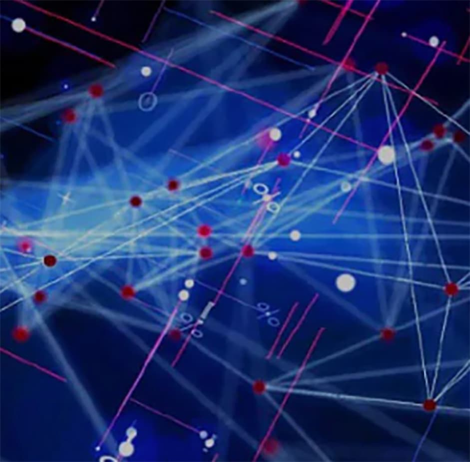
As this concept evolved in production, we immersed users in a network of fibre optic cables to travel through. Watson would then analyze the environment, highlighting the customer ‘calls’ and the correct source for where to direct the inquiry.


Build and design iterations demonstrated the evolving visual direction
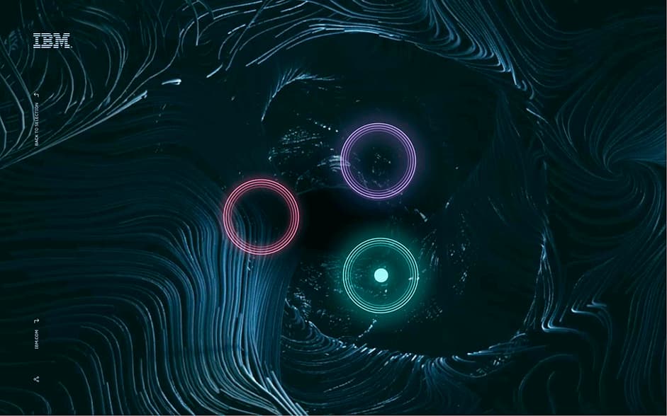
In the final result, users were presented three different rings to control. Acting with Watson, users direct these calls as they come in. With successful applications of this mechanic, the visuals and music grow more and more organized.
The final production build for Connection
2: Clarity
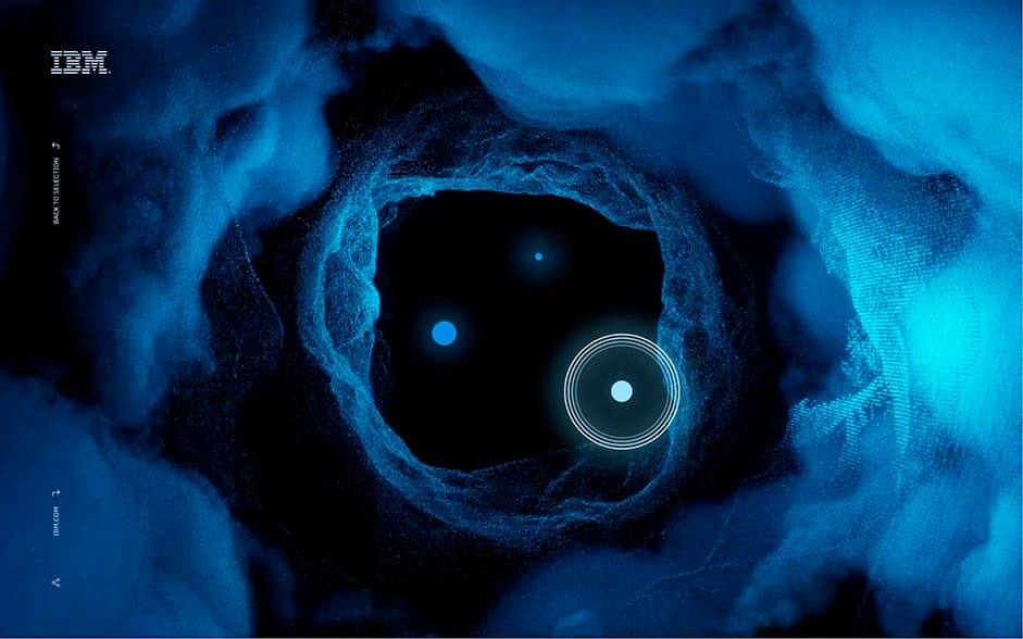
In ‘Clarity’ we demonstrate how the Weather Channel used Watson to help organize the mass of confusing information surrounding the COVID-19 pandemic. For gameplay, users would travel through the center of a thundercloud made of swirling data, with clouds obscuring the information users are looking for. Watson’s analysis and insights help combat this storm, providing clarity in an otherwise disrupted environment.
Users travel through a thunderstorm, searching for the Weather Channel’s insights provided by Watson
Aligning with overall IBM branding, the thunderstorm was a deep blue that evolves with changing cloud patterns throughout the level.


Evolving from the mechanics in level 1, insights in level 2 are captured by free form mousing/dragging
Development Deep Dive: Real Time Clouds
As part of the storm environment we were tasked with creating real time clouds. Rendering clouds in real time is a challenge that can be tackled in multiple different ways. Some applications use sprites to render the shapes, other solutions imply using modeled meshes modeled in 3d applications, and lately there’s a trend to use volumetric rendering of density fields using distance fields.
Using a volumetric approach, we had to be aware of a key limitation: the effect itself depends on the screen resolution (and this was particularly important given the project required to render the clouds in full screen). To address this, we rendered the clouds in a small render target and then upsampled this to fill the whole screen. The size of this render target was defined by the GPU of the user's device, meaning different resolutions would be provided based on the expected performance of each GPU.
The shader also takes into account that the clouds are allocated in the lower section of the screen. This allowed us to discard the upper section of the screen, reducing the amount of fragments to evaluate in the draw call. Scissor tests were used to avoid the use of discard in the shader.
To color the clouds, we applied a gradient ramp to the calculated density value. As there is no environment, we used additive blending with a background gradient to blend the clouds into the rest of the composition. This allowed the clouds to match the background as it got lighter and lighter during gameplay.

Clouds color is defined with a black and white density field with additive blending to the background
The integration with the orbs was done by rewriting the raymarcher into the orbs shader. Given the orbs are small enough in relation to the screen, re-running the raymarcher with full size resolution didn’t hurt performance. This way the orbs would display the sections of the clouds in front of them, while also displaying the parts of the orbs not hidden by the density field.

Integration between the orbs and the clouds uses a Hybrid rasterizer / raymarch approach
This approach works as a hybrid system -- where the rasterizer provides the 3D position where the ray marcher should stop advancing. This way, the density field would be lower than if it kept going until reaching the total marching steps. This approach required matching the cameras from the rasterizer and the raytracer, otherwise the orbs would display a different view of the clouds and the composition would look broken.
Finally for the lighting, we calculate the proximity of the orbs to the density fields (assuming they had normals point to the density field). This proximity provided a nice decay that allows us to brighten cloud sections that orbs are passing through, while also avoiding evaluating the normal for each fragment.

Light is calculated based on the distance from the orbs
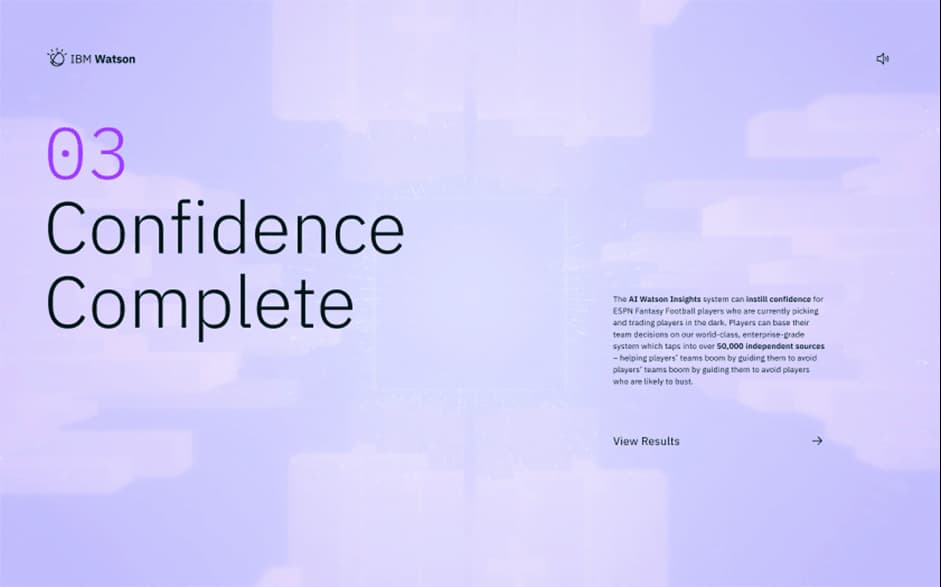
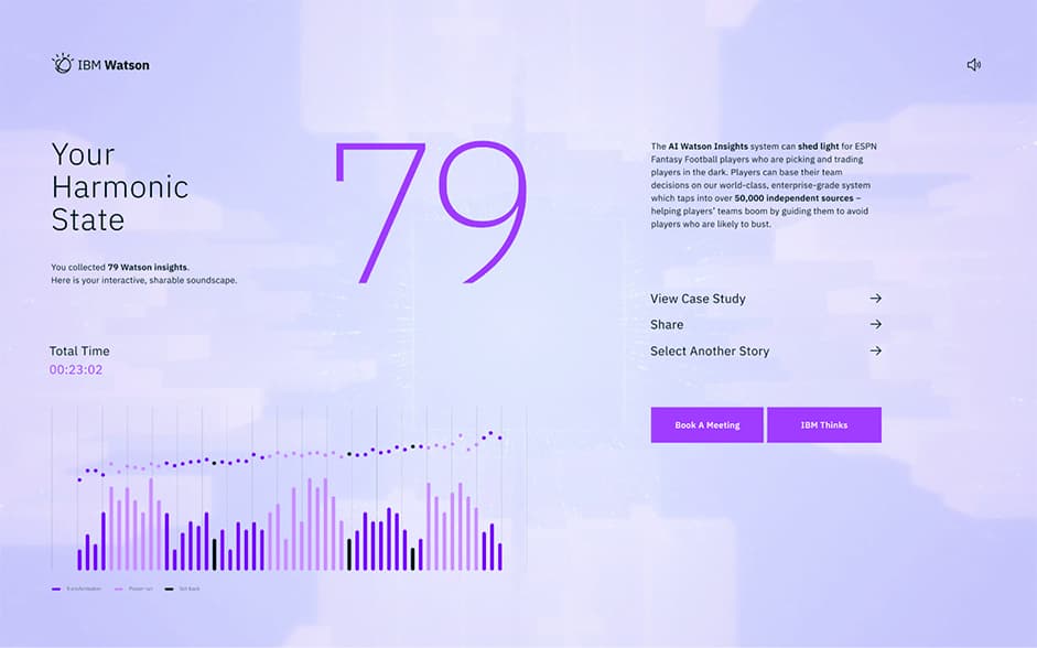
3: Confidence
For Fantasy Football players, there is an enormous amount of information telling players which picks to make throughout a season. In ‘Confidence’, we demonstrate how IBM Watson helps players sort through the mountains of content to eventually gain confidence in their decisions.

Calm, collected, soft gradient shapes represented content
As we experimented in dev, an early emphasis on colors took a back seat as we instead focused on creating interesting shapes and patterns that would be dynamic and challenging for users to play through.

Design and build iterations during production
For game mechanics, we wanted to add another layer of complexity given this would be the final level. As well as free-form moving around to capture insights, players could also use a slow-motion trigger that would slow down time and allow them to reach some otherwise challenging insights. Finally, matching the fantasy football theme, negative insights would also appear.

A slow-motion trigger gave users increased control over the game mechanic
Final Words
As we look back at The Harmonic State we are proud to have undertaken this complex build with an “artist-driven” approach. Throughout the project we empowered our designers and technical artists with tools to create complex effects with little to no developer input. We continue to experiment with this approach at Active Theory and look forward to sharing more exciting work soon.
Thanks to the talented teams at GPJ and Plan8 for collaborating on this build. The Harmonic State is available to experience at IBM Watson: The harmonic State
Company Info
Active Theory is a creative digital production studio with offices in Los Angeles and Amsterdam.
Thanks for getting involved with the votes and sharing it on social media - @HugolbBihan you have won the pro plan.