Massive congratulations to SILENCIO for winning Site of the Month April with SILENCIO - DIGITAL PRODUCTS, thanks for all the votes and tweets, check the end of the article to see if you've won the free year's Pro Plan
During the 5-year lifespan of the studio, we have naturally adapted our way of working to the digital needs of the market. However, the visual identity of our studio had not evolved in the same way and did not reflect our technical and creative capabilities.
Although it is always challenging to dedicate time to your own studio brand, we made the decision to create a website as a manifesto about our vision of the role of design in the contemporary context. Our goal was to reposition our brand and showcase our potential. We aimed to demonstrate the creative aspect that is constantly present in our work routine.
Concept & Storytelling
The starting point was to question whether we, as a studio, belonged to the category of digital products. Although our work can be tagged as such, we aimed to express certain disappointment and irony about it by drawing an analogy between the services we offer and everyday products. In this way, we created a reality that was halfway between the tangible and the intangible, allowing us to belong to the category in a disruptive and innovative manner.
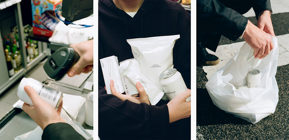
We proposed an immersive storytelling approach around the virtual purchasing process of these products, which unfolds as you navigate through the website. Sound plays a significant role, transporting you to a digital supermarket where each time you "purchase" a product, you hear the classic beep! of the barcode, and the receipt indicates which product you've bought.
We proposed an immersive storytelling approach around the virtual purchasing process of these products
The website concludes with a shopping cart containing all the digital products we offer, and the receipt serves as a pretext to include contact information and generate leads. We really believe that being too solemn and serious doesn't make a brand aspirational or exclusive anymore.
Design & Aesthetic
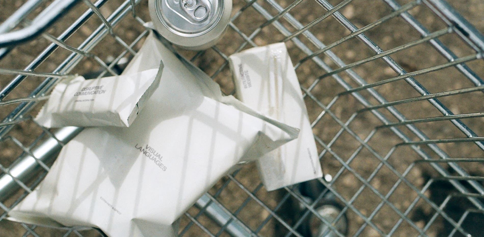
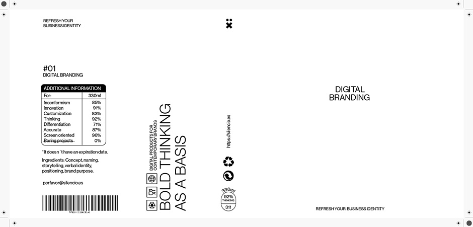
The concept itself defined the aesthetics. We generated a visual mood based on the overall appearance of any supermarket product: symbols, barcodes, and nutritional tables. We also adopted the language typically used in supermarket products.
We designed the packaging for different products in a clean, white aesthetic to allow the object itself to take center stage. All the products were created in 3D and rendered in webGL to achieve a smoother and more immersive experience.
Additionally, we created physical versions of the packaging to make an analog photography shooting that contrasted with the all-digital experience, and reinforced the more tangible everyday feeling.
Technical specs.
The 3D rendering was done using Three.js, with DRACO compressed models, that helped to reduce loading times. All the interactions and animations, both 2D and 3D, on the website were created using GSAP (GreenSock Animation Platform). The main typography used is Neue Haas Grotesk by Commercial Type.
The entire project was carried out internally within the studio, including the creative concept, copywriting, design, 3D works, interactions, and development.
SILENCIO ® VISUAL LANGUAGES
Based in Pamplona (Spain) SILENCIO is a design studio focused on digital visual languages for daring brands outside the norm. Crafting unique, innovative, and memorable digital experiences that strive to push the boundaries and leave lasting impact through design and interactivity.
Visit silencio.es !
Thank you for your vote and tweets @OlehMostipan, please DM us to collect your prize!