The responsive approach begins to make it's way, users appreciate the advantages, designers and developers around the world support it. If we're lucky enough to meet a client who wants to produce his or her site with this technology, we should be happy because we have the opportunity to work on a modern project. But we must also be concerned that when working on a good responsive project, work is harder and it's hard to convince a customer to pay more for a responsive site than for a normal site. We can push the client to pay more if they propose to develop a dedicated mobile site or application for iPad, but this isn't our case. We want our project to be "cross-device" and "avaiable in all sizes."
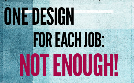
Responsive Design: A hard job ahead
If we think we can complete a responsive project working only with media-queries, grids and flexible images, we're only doing half the job, and definitely not a great job! For any web designer, thinking responsive means accepting a new challenge: to be creative not only to produce something that works well on desktop PCs, but also on tablets and smartphones; to create new designs for each device and not just to adapt the initial one, that's wouldn't be enough. Last generation tablets and smartphones have a special feature: the touch-screen, this leads us to focus on the optimization of our designs more than we did in the past when we only had to think of desktop versions of websites.
The Challenge
We need to think responsive starting from the concept, without fear of what awaits us, without limiting our creativity. Looking at various css-galleries, I've noticed a large percentage of very simple and minimalist sites. It may be a good choice, but I think that the motivation behind minimalistic style lies in the fear of facing the difficulties of a more complex design.
The challenge is to produce a quality product, with care and attention to detail and cross-device design. To accept this challenge we will have to take into account many variables, including:- · Screen size
- · Touch-screen
- · Content
Responsive Design videos
John Boxall - Client-Side Adaptation - BD Conf, Sept 2011 from Breaking Development on Vimeo.
Stephen Hay | Real-world Responsive Design | Fronteers 2010 from Fronteers on Vimeo.
Shelly Wilson: Creating Responsive Content from the Bottom Up from Together London on Vimeo.
Responsive Design Examples
Barack Obama's Website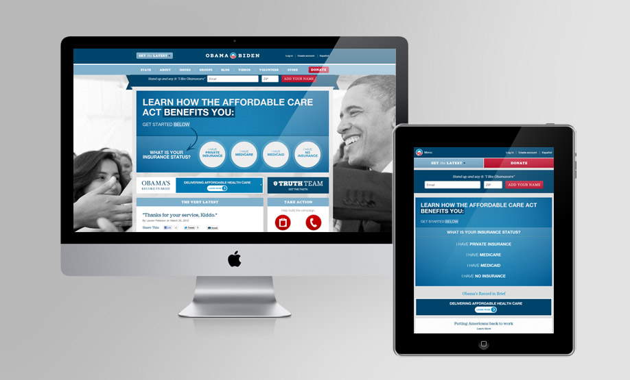 On the desktop version of Obama's site, the logo is placed in the central part of the header. Just below, there's the main navigation menu that occupies 100% of the page. The main headings (STATE, GROUPS, ABOUT etc.) are activated on "mouse-hover" featuring the voices of the second level. When the page is viewed on iPad, in the landscape layout, there are some really interesting changes concerning user experience. The logo is reduced to a single symbol and moved to the left. The main menu disappears from its original position and becomes a key attached to the logo. The two call-to-actions, "Get the latest" and "Donate", take a different location and become much more important.Clicking on the logo or text "menu" opens the menu in expanded format. This is very important to facilitate the UX on touch-screen devices. The menu setting is reminiscent of the native applications for iPad.
New Adventures
On the desktop version of Obama's site, the logo is placed in the central part of the header. Just below, there's the main navigation menu that occupies 100% of the page. The main headings (STATE, GROUPS, ABOUT etc.) are activated on "mouse-hover" featuring the voices of the second level. When the page is viewed on iPad, in the landscape layout, there are some really interesting changes concerning user experience. The logo is reduced to a single symbol and moved to the left. The main menu disappears from its original position and becomes a key attached to the logo. The two call-to-actions, "Get the latest" and "Donate", take a different location and become much more important.Clicking on the logo or text "menu" opens the menu in expanded format. This is very important to facilitate the UX on touch-screen devices. The menu setting is reminiscent of the native applications for iPad.
New Adventures
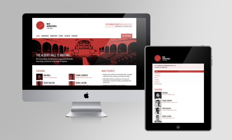 The page features an evocative image that accompanies the claim. The main menu is placed over the image. In the iPad portrait version, the page becomes more simple, the image is deleted and the space that houses the logo changes color to give more strength and dynamism to the template. The menu is arranged vertically and the elements of the section "Featuring" no longer have the float property, but are arranged in a more simple list.
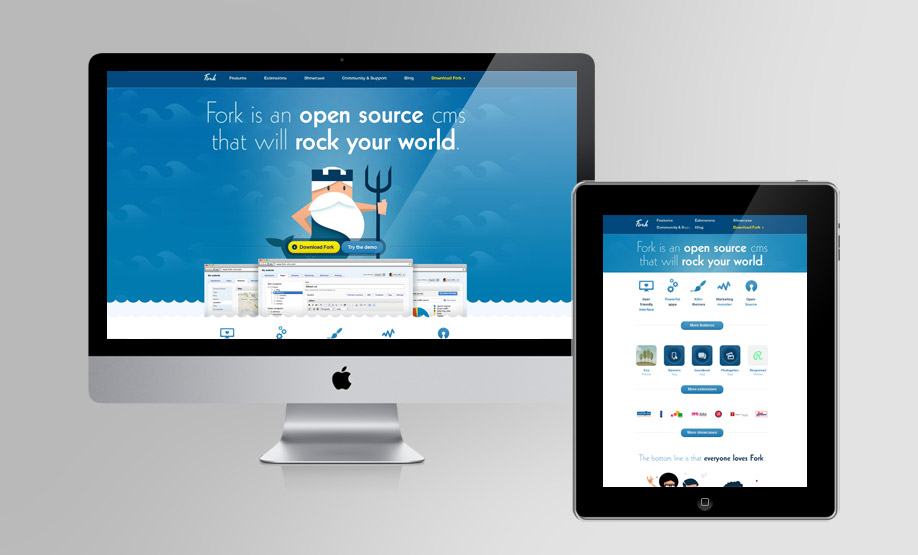
Fork
The page features an evocative image that accompanies the claim. The main menu is placed over the image. In the iPad portrait version, the page becomes more simple, the image is deleted and the space that houses the logo changes color to give more strength and dynamism to the template. The menu is arranged vertically and the elements of the section "Featuring" no longer have the float property, but are arranged in a more simple list.
Fork
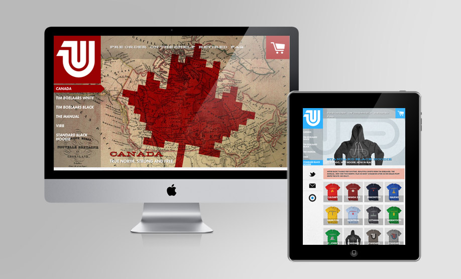
 The site features a generous creativity that accompanies the claim of product launch. When the page is displayed on iPad in portrait mode, media-queries come into action removing images that become unnecessary and may impair navigation.
If you continue to reduce the screen size, the page becomes even more simple by eliminating the icons.
United Pixelworkers
The site features a generous creativity that accompanies the claim of product launch. When the page is displayed on iPad in portrait mode, media-queries come into action removing images that become unnecessary and may impair navigation.
If you continue to reduce the screen size, the page becomes even more simple by eliminating the icons.
United Pixelworkers
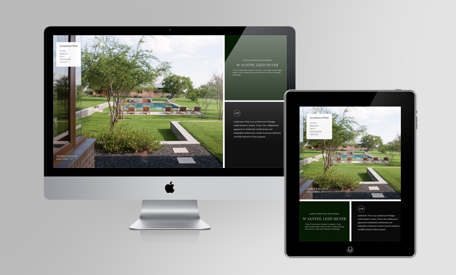
 This site presents the full-version desktop background image for the header part and below that is the content. The structure does not change in the iPad version, only in scaling percentage.
When we descend below 600 pixels, the page changes and eliminates the large background image. The logo becomes much larger and occupies 50% of the page. The logo is flanked symmetrically by 4 call-to-actions (Faq, Shopping, Twitter, Email).
Andersson Wise
This site presents the full-version desktop background image for the header part and below that is the content. The structure does not change in the iPad version, only in scaling percentage.
When we descend below 600 pixels, the page changes and eliminates the large background image. The logo becomes much larger and occupies 50% of the page. The logo is flanked symmetrically by 4 call-to-actions (Faq, Shopping, Twitter, Email).
Andersson Wise
 This project has several interesting ideas from the point of view of creative UX.
On the desktop and iPad versions, the setting is basically the same, they pay full attention to the optimal visibility of the main image. On the iPad, the two balck boxes are moved down to allow the maximum extension of the image.
If we decrease the size of the screen, the image keep its priority, thanks to the shift of the main menu to the top (right below the logo). The boxes are simplified, using a white background approach throughout the whole page.
This project has several interesting ideas from the point of view of creative UX.
On the desktop and iPad versions, the setting is basically the same, they pay full attention to the optimal visibility of the main image. On the iPad, the two balck boxes are moved down to allow the maximum extension of the image.
If we decrease the size of the screen, the image keep its priority, thanks to the shift of the main menu to the top (right below the logo). The boxes are simplified, using a white background approach throughout the whole page.
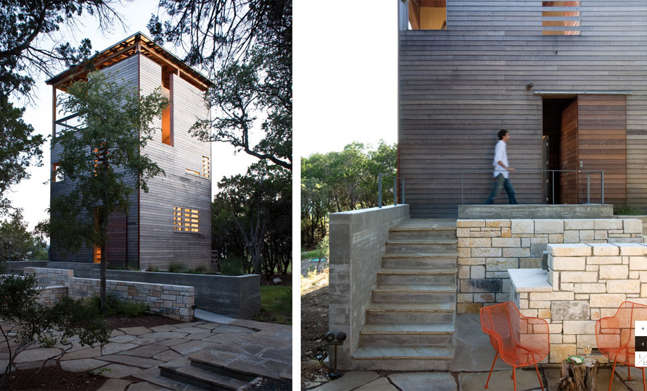 The "Projects" section is treated so that the ease of viewing images is optimal. If we go down to 600 pixels, the page structure is similar to that of the homepage and photos are presented in a slideshow with user-controlled keys.