Powerhouse Company by Build in Amsterdam has won Site of the Month April 2020, thank you to everyone who took the time to vote and tweet, the winner of the year’s Pro Plan in our Designers Directory is at the end of the article. Now Build in Amsterdam talk us through their process..
Powerhouse Company is an award-winning architecture and design firm with international studios in Rotterdam, Oslo, Munich and Beijing. We helped them to define their strategic brand positioning, followed by a complete rebranding and online platform.
We give meaning to space
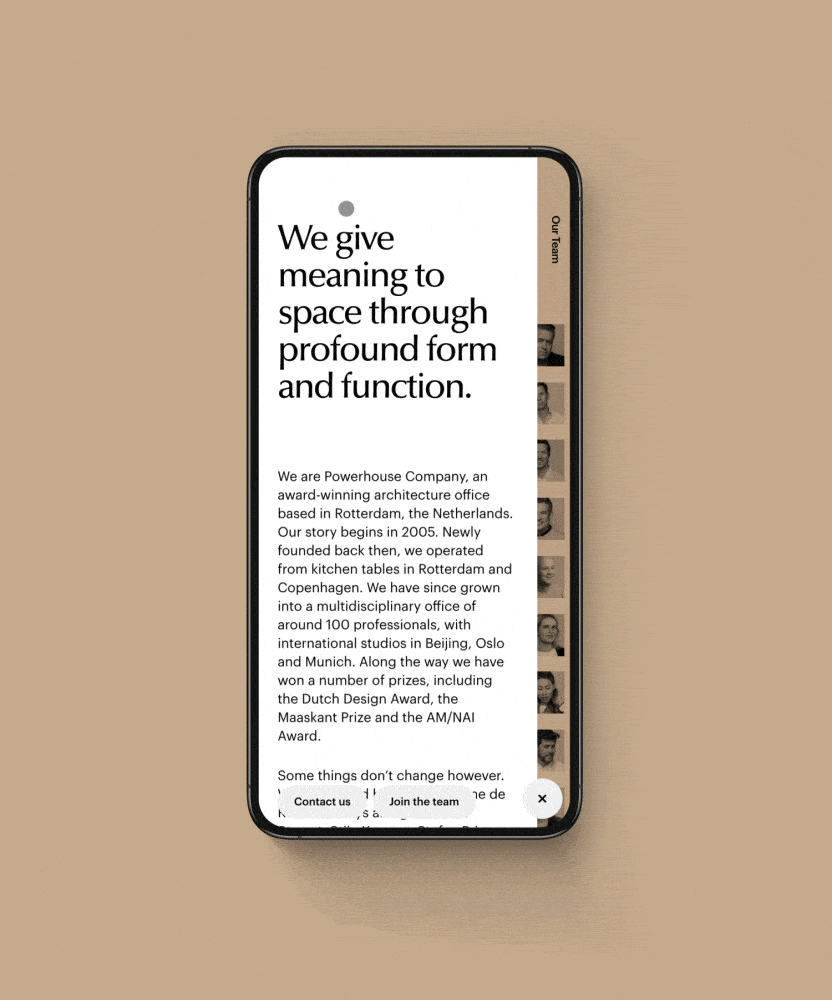
Through an extensive strategy phase, we developed Powerhouse’s strategic brand positioning. This included their brand claim “We give meaning to space”, which became leading for their brand identity and platform. In terms of identity, this meant generous use of open white space. The logo is a concoction of serif and sans-serif. This creates a modern feel with serene elements of a serif font. The Powerhouse identity colours are derived from earth tones, which the buildings are built upon. In contrast, we chose a daring Yves Klein blue to broaden the identity and make it more adventurous. These ingredients became the visual foundation of the Powerhouse online platform.
Meaningful navigation
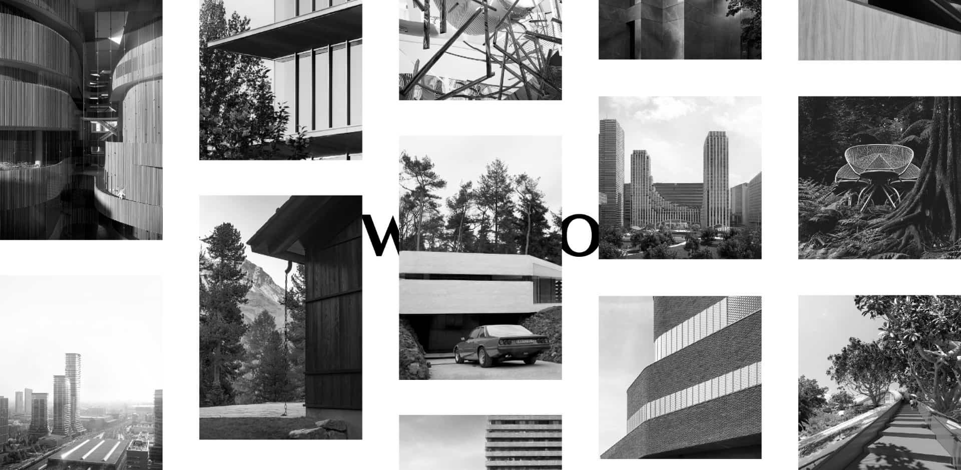
We gave meaning to the navigation menu by simply using their brand claim: “We give meaning to space”. Clicking on “we” opens the About page. Clicking on “space” zooms out the lightbox and leads to a smart filter for their portfolio, which varies from high-rises, private villas, public spaces, expositions, to yachts and furniture.
Their brand claim “We give meaning to space”, developed through an extensive strategy phase, became leading for their brand identity and platform.
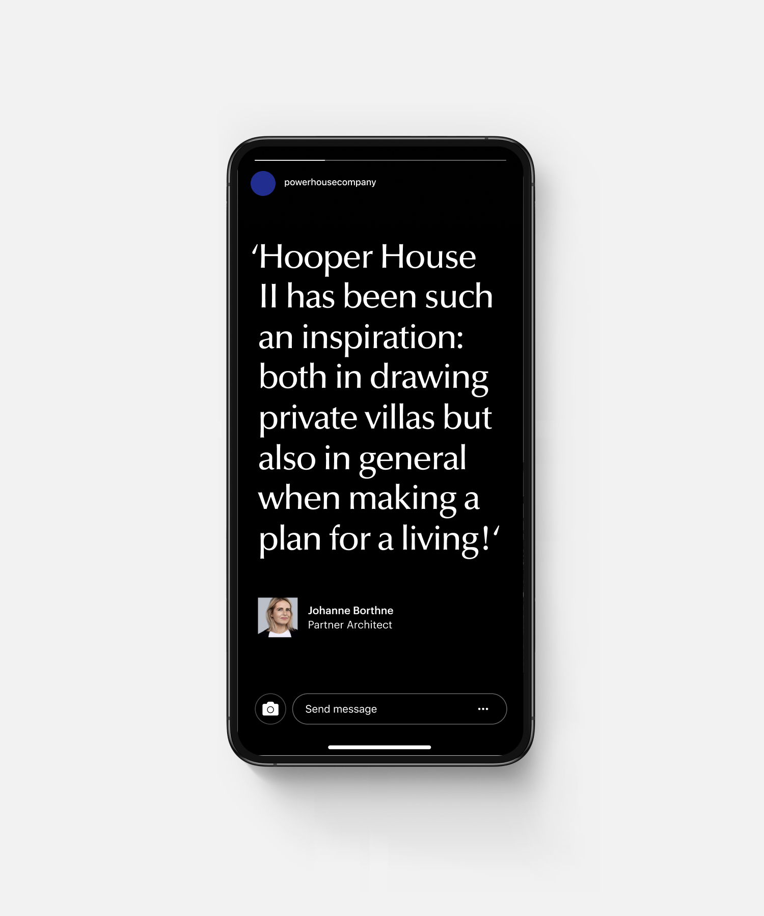
A community platform
The platform gives a voice to the collective intelligence of everyone involved at Powerhouse Company. All projects are constructed in a collaborative manner, written and tagged by everyone involved. Visitors can interact with the team of Powerhouse by commenting on every case. The team can reply to those comments.
Through guided exploration, we let people intuitively explore their work, the people behind it, and the materials used.
A spider web-like flow
Giving meaning to every aspect of each case by the collective intelligence of everyone involved creates an immersive experience and an endless spider web flow. Every page, story and team member is interlinked with each other.
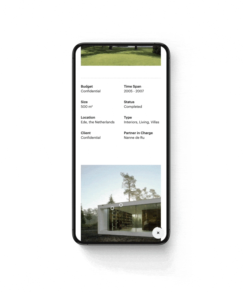
In the future, we will release a material database which is also interlinked. For example, if a certain material is being used in a specific project, you can explore the material on the Material page and see in which projects that particular material is being used. As a user, you can dive into the world of Powerhouse Company.
The materials per project are highlighted and projects are cross-linked if similar materials are being used.
Technologies
Our goal with this project was to create a seamless experience when browsing the website. For this, we needed a modern setup that could handle these requirements. We opted to use React to handle the rendering of the HTML server and client site. In order to make sure the user never sees the website loading, we preload the necessary data to animate to the next page. In the course of this animation we are able to load the rest of the data.
The biggest technical challenge of this project was the overview of all the cases. We used ThreeJS to create a 3D environment, where the visitors can explore the projects. The grid is calculated on the ratio of a visit, therefore we can show as many cases as possible during the intro animation.
A defined visual language
At Build in Amsterdam a case goes beyond the design of a website. We have developed a comprehensive guide for the visual content, allowing Powerhouse to cultivate a coherent and recognisable brand.

Build in Amsterdam
We are a branding and development agency specialised in digital flagship stores. We believe our industry is blinded by numbers, while buying decisions are based on emotion.We redefine conversion by building emotional clicks.
The winner of the year in our Design Directory is @awahabs16, please DM us to claim your prize!