It's been said that the “shoemaker’s children often go barefoot”. This saying reflects the reality of most of the designers, developers, studios or even agencies when it comes to portfolio update.
It is no easy mission to find time and energy in between commissioned work. I felt this urge to refresh my portfolio for quite a while. It came to a phase when I no longer wanted to update my previous portfolio with new projects.
Approach
As any other project for your clients, it should be approached on well thought-out strategic aiming, reflecting the essence of your personality, values and visual perceptions.
This time I decided I would slightly sideline my strategic thinking and let my intuition and feelings lead the process of creating my new portfolio. I wanted to simply have fun and not necessarily restrict myself with any boundaries. In what other project do you have complete freedom in creation? Although I didn’t want to go too far and create a digital art piece, I do address those clients who are ambitious and forward-thinking.
I address those clients who are ambitious and forward-thinking.
Flamboyance meets Simplicity
I intended to create a cross between visually rich, slightly cluttered and bold design and an intuitive, easily operated environment. Time is the most valuable commodity these days, to catch users’ attention in the vast digital landscape is one of the challenges I have been considering. To ease the users' experience I wanted to create an intuitive walkthrough process without the need of clicking and reloading content, so a one-pager seemed like a good way to present the studios’ profile and works.
I intended to create a cross between visually rich, slightly cluttered and bold design with an intuitive and easily operated environment.
Art Direction
It literally started with a blank canvas. No moodboards, no sitemaps, no wireframes. It is quite an advantage if you have been through the process of designing a portfolio before. You no longer really need to go through a process of preparation and once you have a core idea in mind you can start to convey it to the editor.
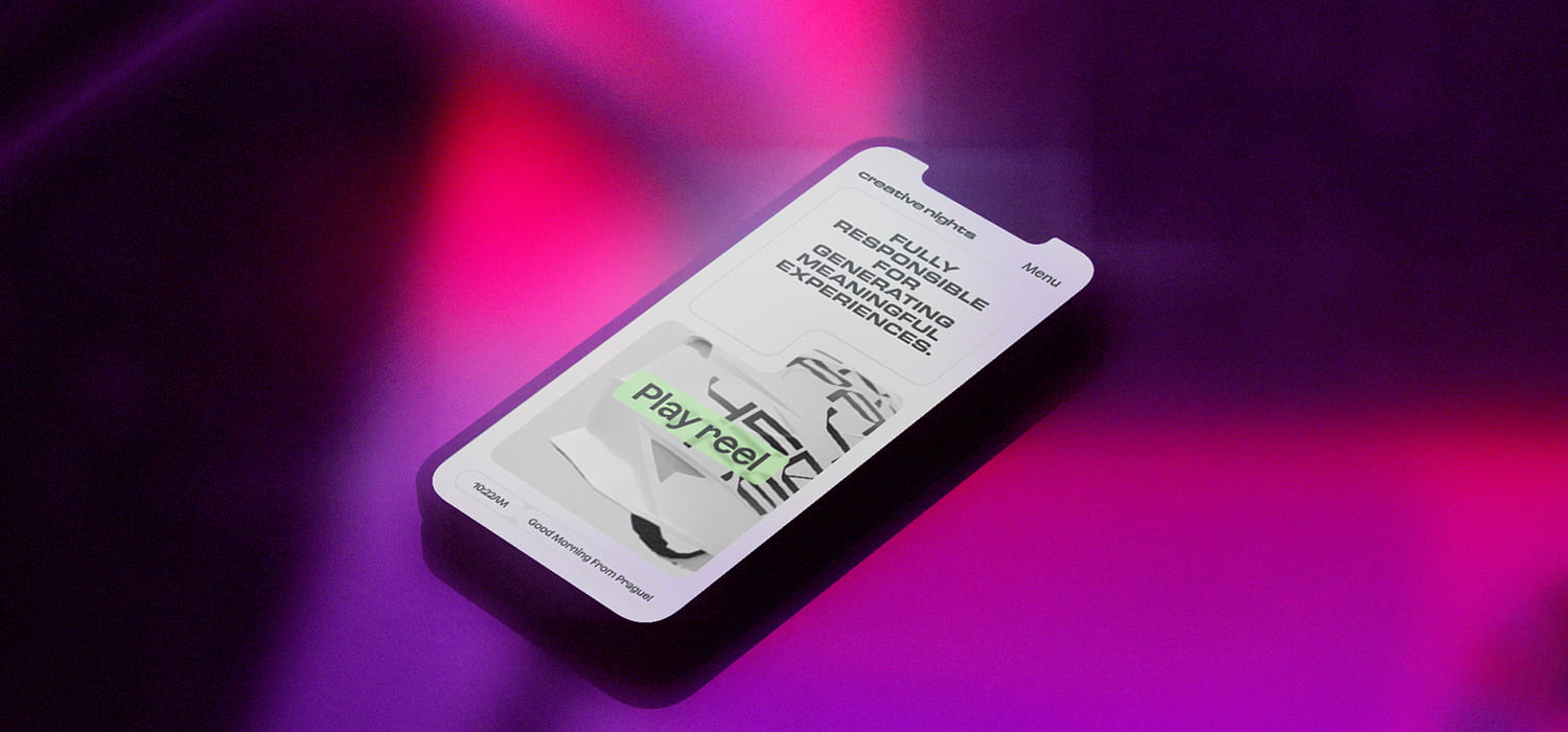
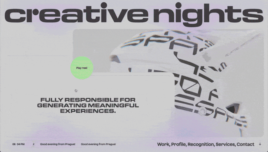
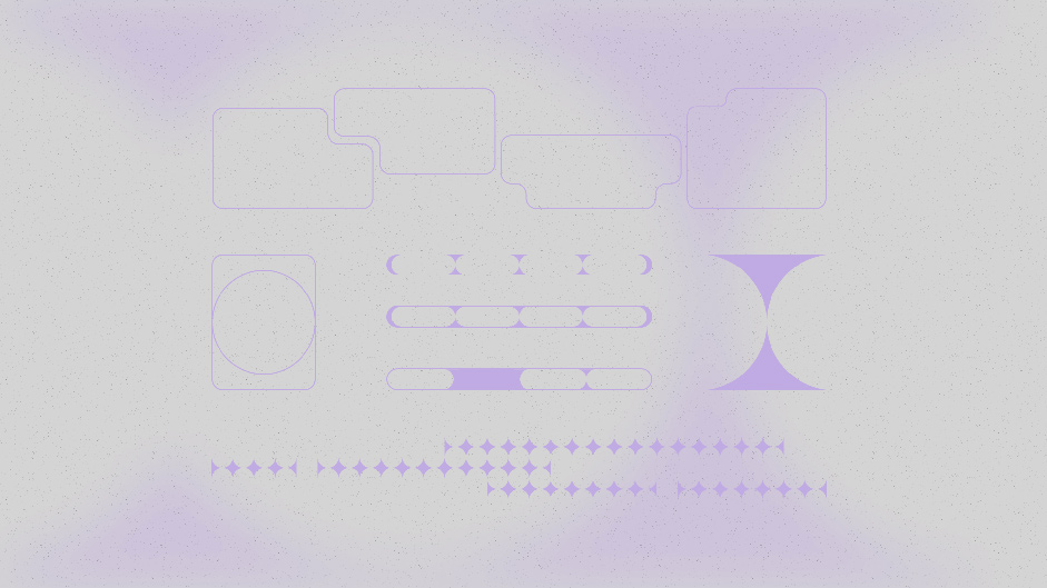
I started with the top - header section and applied an iterative process with tens of versions. Rather than having one - center oriented visual I aimed to build a few eye-catching elements which would instantly engage with the users in a short span of time. The “click” moment emerged when I defined these two elements which are nearly touching each other and coexist together in various ratios (desktop, tablet, mobile). They could be seen as a yin-yang symbol but are constantly reshaping and adapting to its format based on the user's interaction. The header section defined the visual language for the rest of the page.
They could be seen as a yin-yang symbol but are constantly reshaping and adapting to its format based on the user's interaction.
I wanted to avoid design cliches associated with the word “night” and chose rather discreet details in UI elements such as circle cutouts resembling the crescent. I slowly defined the UI elements and found the visual language. You can also sense these simple graphic elements in the blurred shapes which add the moody vibes.
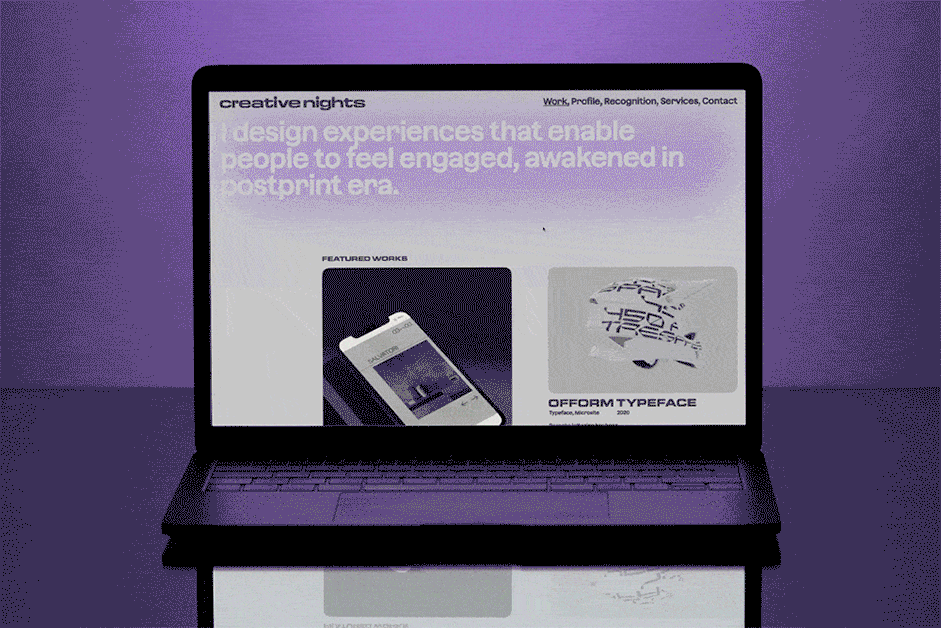
The rest of the page follows a very simple layout without being too quirky and over-animated. The major role is taken by bold typography, photo and video visuals in combination with expressive colour blurred backgrounds. Without being too wordy you can get a comprehensive picture of the studio work, achievements, and profile.
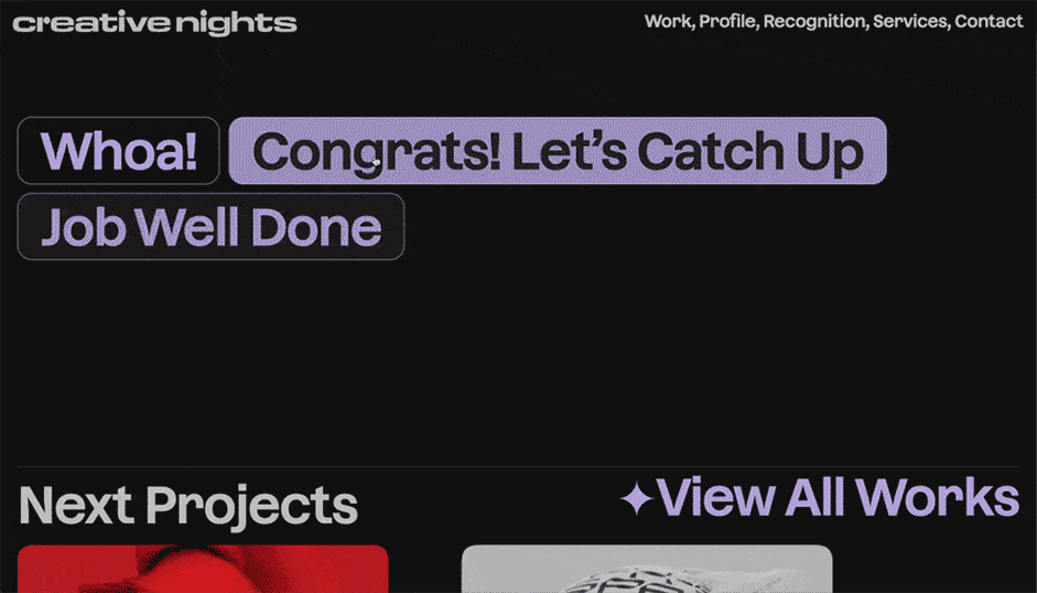
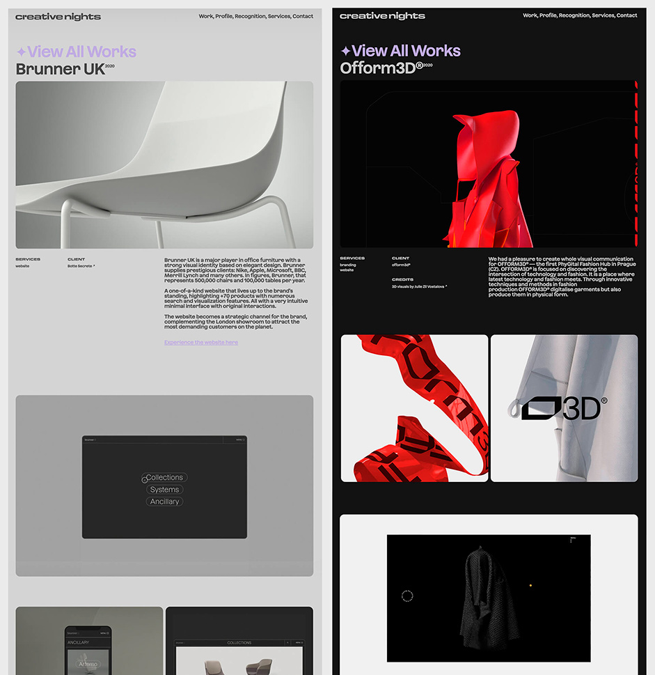
The times of huge case studies are over, so I built a simple modular system where I could present each project with ease and in a short time. Restrained to full width or two column thumbnails, with the possibility of changing heights is good enough to have freedom in presenting each project in various forms.
The times of huge case studies are over so I build a simple modular system where I can present each project with ease and in a short time.
Content Creation
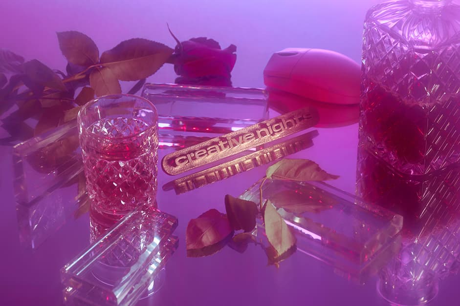
One of the activities I enjoyed most during the process was the content preparation for the website. I wanted to show the full arsenal of our services where Content Strategy and Production plays key roles. With the help of my talented friend - photographer Filip Beránek we create various sets for each section on the website. One of the most difficult tasks was to get the right items for each scene. On the contrary to high-end technologies which surround us we picked the products which are no longer used and represent the good-old times.
A piece of content we made for the portfolio - video for the contact section
I wanted to show the full arsenal of our services where Content Strategy and Production plays key roles.
Technologies
Tech stack
We decided to use our go-to tech stack, plus pixi.js for the header and preview animations: Vue 2/VueX/Vue-Router; Post CSS/SCSS/CSS Modules; lodash, webpack, eslint, ola.js, pixi.js.
Animations
We create most of the animations from scratch with SCSS and a little bit of javascript. For reveal animations, we use the IntersectionObserver. In more complex cases, we might use ola.js or tween.js. For transitions between pages and elements, we use the built-in Vue transition component.
Header animation
In each frame, we calculate a target position for each corner point based on the mouse position and slowly interpolate the current points' positions to the target ones.
For rendering, we used pixi.js.
- We chamfer the inner corners to get constant padding
- We draw the paths using Pixi.Graphics
- We blur the whole thing using @pixi/filter-kawase-blur
- We use a simple threshold filter to get a black and white mask with clean, crisp edges
- We use the same filter with a slightly lower threshold value to get a mask for the border
- These masks are later used to compose and render the final frame
Work preview animation
In each frame, we calculate a target angle to the mouse cursor from the center of the preview and slowly interpolate the current angle to the target one.
We have two rectangular masks, a white one as a base and a black one as a cutout.
The cutout position is based on the current angle and bound to the edges of the preview rectangle. The cutout scale is based on the distance to the center of the preview.
The rendering is very similar to how the header is rendered.
Content management
We store all the translations and projects' data inside the git repository itself as .js files. Thanks to this, Marek has full control over the contents of the website.
CI/CD
We used Gitlab as a code repository and a CI/CD platform. Every time a commit is pushed, the website is built and packed into a Docker container that is later deployed to the production server without any downtime. Marek receives a notification in Slack each time the build/deployment succeeds or fails.
We used docker-compose, nginx-proxy and nginx-proxy/acme-companion for automatic reverse proxy and generation of SSL certificates.
Testing
For testing, we used Browserstack and a handful of real devices. Most of our attention was on Safari, as some will say it's the new IE with all the bugs and missing features.
Company Info
Creative Nights is a small award-winning independent studio founded in 2014 by Marek Suchánek. We deliver resonant experiences and identities through bold visual languages and resonant ideas that enable people to feel engaged, awakened in the postprint era.
Recurect is a small creative studio focused on developing award-winning interactive experiences for the web.