How to merge product design and web design into one seamless experience? Updating and changing my portfolio for the first time in three years is no challenge. How do you reflect your growth and career change? During my time at Squarespace, I transitioned my skillset from a web designer into a product designer, and learned to merge the two, worked on an embedded team where our goal was to help define the future of the web and to design and build the digital world we want to live in.
The team was made up of talented product and web designers, including Tom Sears whose case study you can read about here. Our role was to help define the future of the web, and design and build the world we wanted to live in. This consisted of a deep understanding of the building blocks of website design, building up a library of trends in the past and present, and figuring out what would best serve our users and inspire them the way we felt inspired. We ended up with a deep catalogue of knowledge of past, present and future trends.
This gave me a good foundation of what a website could be, but how can you breakout of that mindset and produce something that stands apart?
Nurtured vs Manufactured Inspiration
How to ensure your work stands out.
Credit to Liz Wells here, because without her, none of this thinking would have taken place. She recently did a talk at an event in Milan about the thought process on nurtured vs manufactured design, this is something I often think about. Her talk distils inspiration into two camps, nurtured and manufactured. “Nurtured inspiration is rooted in continual reference gathering. Building up a catalogue of easy to find and produce work, while is easy, often leads to the expected design solution, and uninspired, and taking inspiration from sources that are easy to find, can lead to work that blends into the sea of sameness and doesn’t stand out.”
“Think microwave pasta. Sure, it’s technically food, but it’s not great.” - Liz
We wanted to build an experience that was inspired by connections and expression from outside the space we were actively working in.
How did this manifest throughout the site?
Working closely together with Jesper we wanted to pepper it with elements that would leave the view of the site with tasty morsels, design and interactions that would leave lasting playful impressions.
Navigation
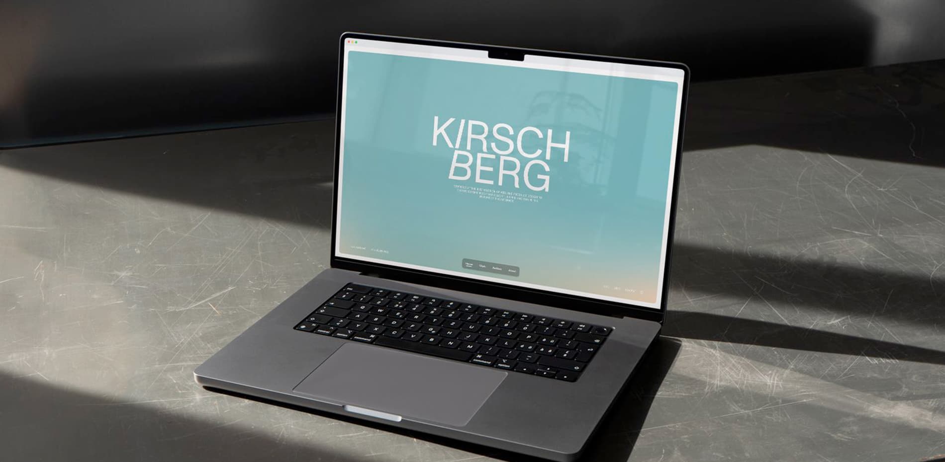
To highlight my thought process and experience, we wanted to build a website that felt like a product and had the experience of one. Taking inspiration from Apple’s Photo and mail app for the navigation and interaction of page loading respectively, we felt like we had designed and developed a concept that would work well together and translate from both mobile to desktop.
Landing page
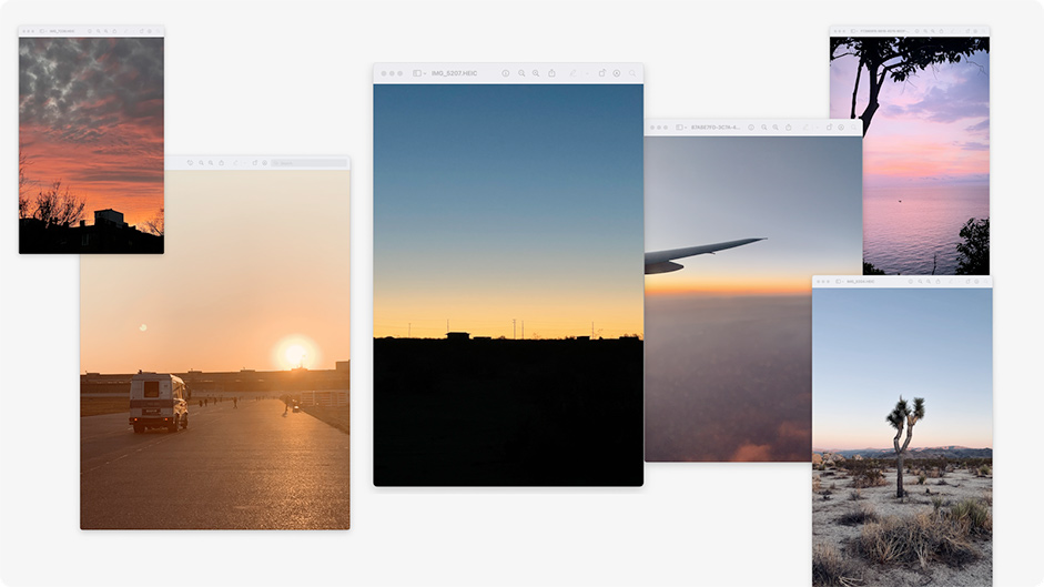
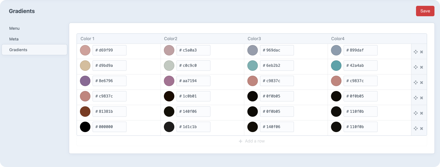
Having friends and family peppered around the world, our calls are filled with late nights, early mornings, golden hours and blue hours. Sunsets are a perpetual experience that happens every day, and we wanted to capture this in an experience where based upon the time of day, the user was created with a different colour. Jesper developed a system where we could input colours, times and values that would give users an almost background art effect of the landing page.
Project Page
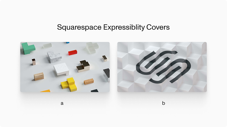
I love infinite scrolls, in my opinion they’re not used enough. I’ve used them in my previous portfolio, but we wanted to see how we could push it further. If we could give the user a feeling of really diving in to the work, and being fully immersed. We added a feature of a dynamic grid that would change with the projects added, along with A and B cover images of projects, so once a user has scrolled through the list once, the Recent Work title disappears, and they’re greeted with a second set of images of case study heroes.
Archive
Jesper has a talent for developing experiences that set the standard for unexpected web experiences, which he continued with our partnership. Projects that never saw the light of day, we wanted to create a space for them to really shine. These projects weren’t as in-depth as a full case study, so there was no need for the user to click into a detail page to get the full context. Using an omnidirectional grid, we created not only a playful interaction, but an environment that invites the user to continuously scroll and explore.
Distilling projects into their highlights
We all know nobody reads online, so let’s have some fun with it! An almost highlight reel for an evaluator pitch, distilling the projects into their highlights.
Animations and Interactions
We wanted to keep the animations snappy and quick. While we wanted to have flourishes of beautiful animation throughout the site, we did not want it to hold the user back and to feel that it was superfluous to the experience of the site, or upstage the work itself. We also wanted to give the user a feeling of control over the animations, especially within the case studies as the user dives into them as they scroll.
Tools
Development
Front-end frameworks/libs : GSAP, OGL
Backend tech: Craft CMS / PHP
Server architecture: Cloudways
Typography - Monument Grotesk by Dinamo
Design
Figma
After Effects
Credits
David Kirschberg - Creative Direction and Design
Jesper Landberg - Creative Development and Build