Did you know that it only takes 90 seconds for a user to make a judgement about a digital product? Interestingly for us as designers, most of this judgement is based on color.
Coming up I’ll give some tips on how to find colors that work together, how you can test them, and finally some handy tools.
Choosing a color palette for your app could be considered the most important part of an app’s visual design, strongly affecting the user’s perception of the quality of the product. But, choosing it doesn’t have to be overly complicated. When I'm designing a new interface, the principal considerations for the color palette are: the user demographics, where and how the product will be used, and any company branding guidelines.
I’m going to use an app I designed recently, Doctoroo, as an example to demonstrate the different steps I took and why. Doctoroo is a medical app for Android which enables users to book video calls and arrange appointments with doctors.
First Steps
Typically, I start by coming up with some adjectives that describe the product and the brand values I’d like it to portray. These never really play directly into the color choices, but serve as guidelines.
For Doctoroo, I came up with:
- Reliable
- Stable
- Professional
- Fresh
- Modern
To generate your own list, ask yourself: does the product need to be perceived as friendly? Robust? Professional? Cutting-edge? Futuristic? or perhaps more down-to-earth? If you’re stuck, think about who the product is being designed for and what you’d like them to think or say when they use the finished version.
My second step was to come up with a primary color - everything else would be based on this.
Contrary to what a lot of design resources say (and what I thought for a long time), most colors don’t evoke hyper-specific emotions. Instead, personal taste, life experiences, cultural considerations, and a host of other factors affect how an individual perceives a color. It’s nearly meaningless to say “red means passion”, or that any color translates to a specific emotion (not to mention this kind of statement has hardly any scientific evidence supporting it).
When choosing the primary color, it’s more important to consider how your audience will react to the color choice than the color itself. I chose blue for Doctoroo mostly because that’s what users expect from a medical app.
You shouldn’t use too many colors - stick to a small number that the average person can take in with one glance. I tend to use a very limited palette - one or two primary colours that work well together, perhaps one more color for accents, and then a range of subtler shades of grey.
Remember, the product will use a range of methods to convey information and hierarchy (size, layout/position, font, proximity, etc.), of which color is only one.
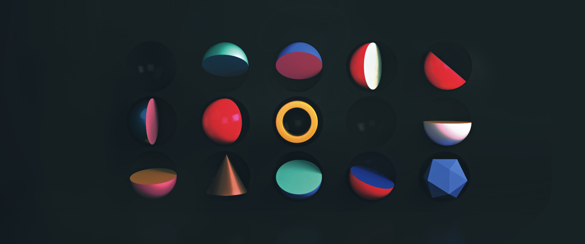
Color Saturation
The more saturated (intense) a color is, the more it attracts attention. I tend to use less saturated colors when I want users to focus on complicated or thought-intensive tasks, and stronger colors when they have one main function to complete.
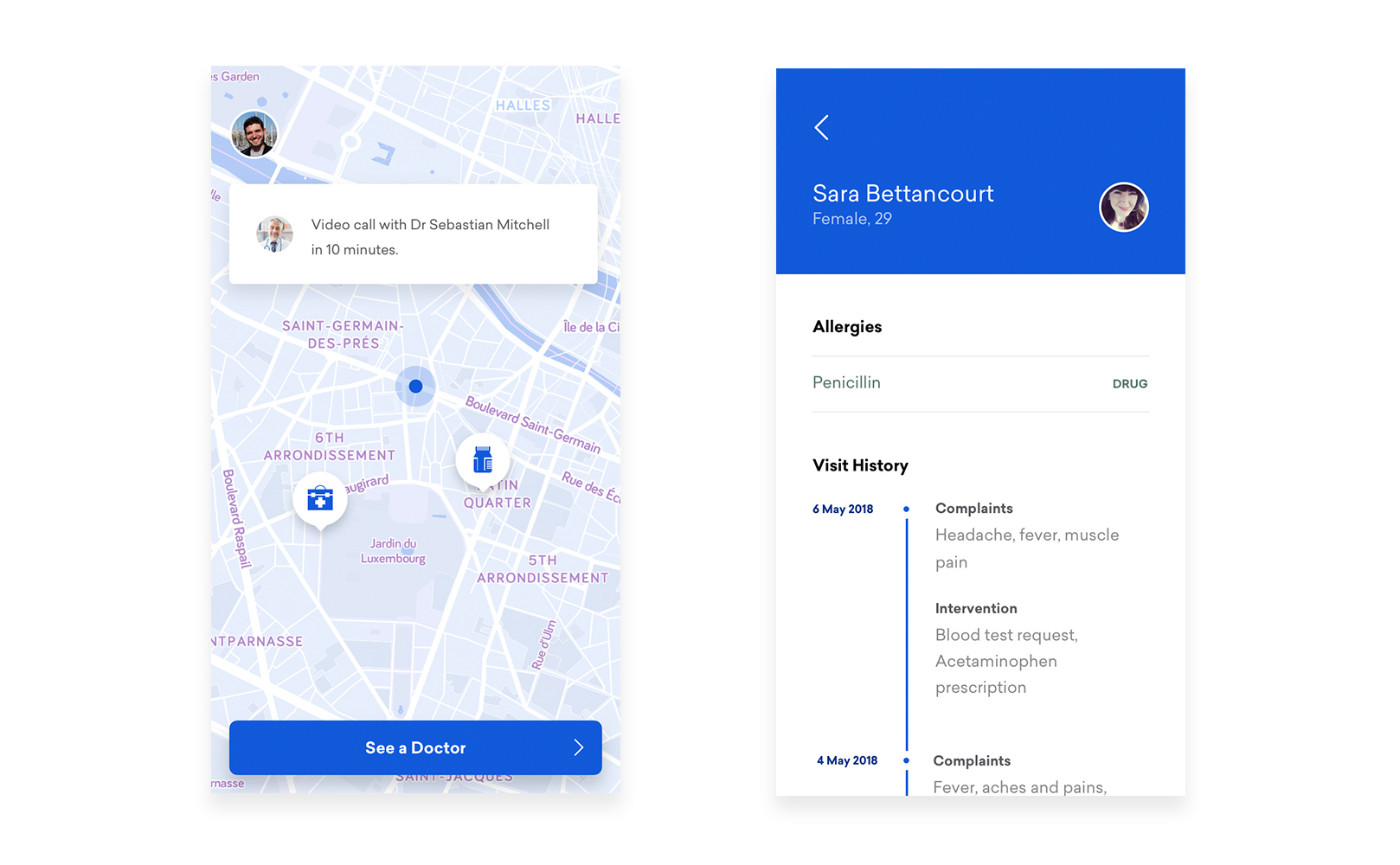
The screen on the left uses one saturated color because there’s only one function (booking an appointment), whereas the screen on the right is designed for doctors who need to be able to look through a patient’s allergies and visit history, which is why I used mostly desaturated colors.
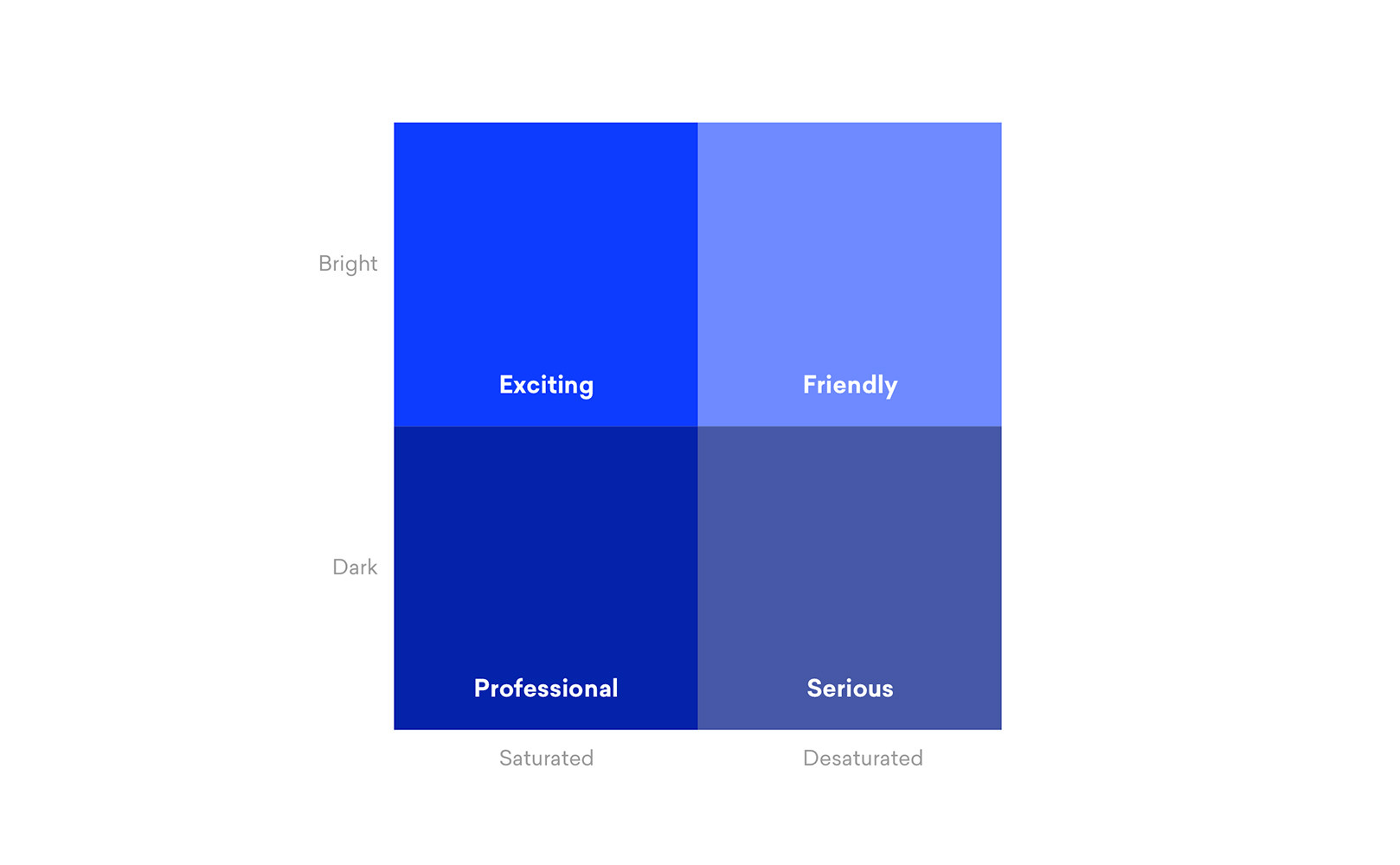
This diagram explains the general perception of colors depending on their saturation and brightness:
I never use two colors that are highly saturated together - this often just makes people’s eyes tired. Having said that, I always try to include a small amount of saturation in my greys - pure grayscale colors don’t exist in nature, and seem unnatural to users (although if that’s what you’re going for it’s not a problem).
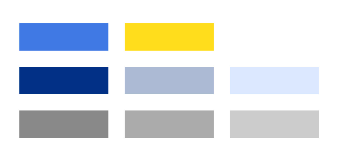
For Doctoroo, I chose a contrasting yellow that was bright and saturated to lend the app a more friendly feeling. The rest of the colors I chose were desaturated variations of the primary blue color, an easy way to generate matching colours and give the product strong tonal coherence.
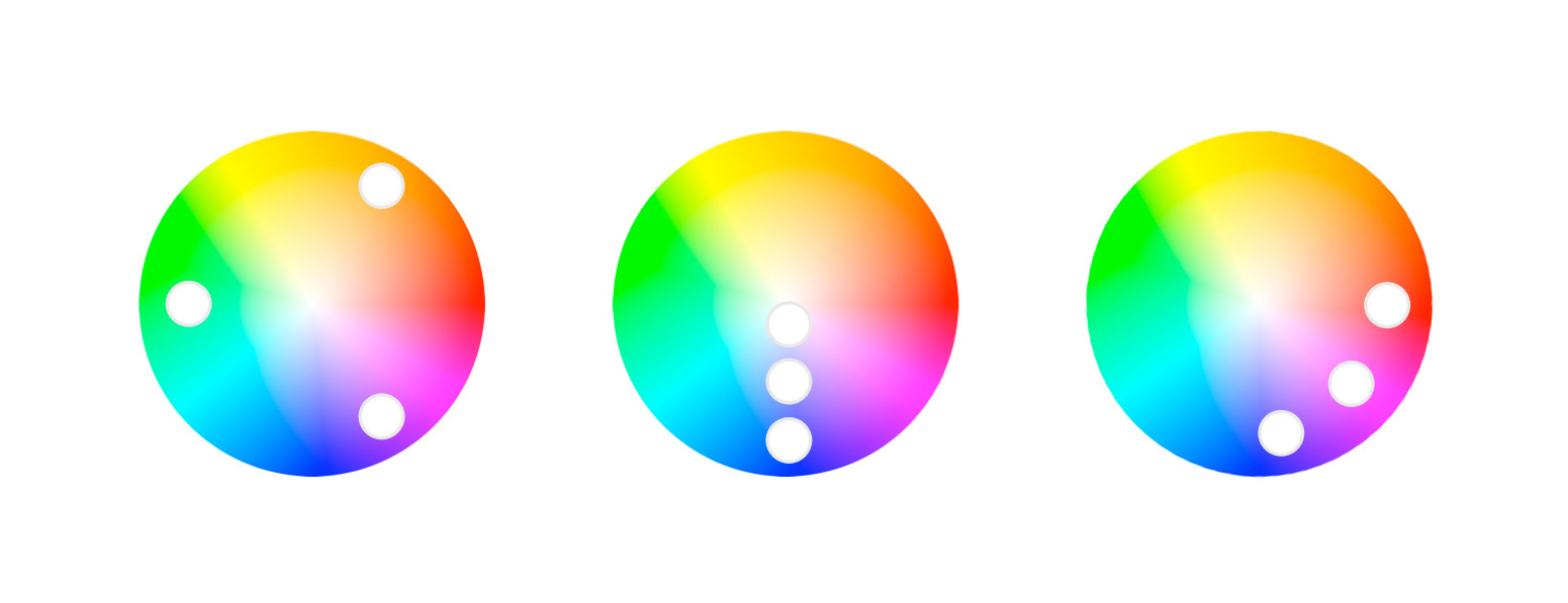
Creating a Palette
There are a number of traditional ways of finding colors that work together, but the ones that always work best for me are:
- Adjacent (pick a base color and choose colors next to it)
- Triad (draw an equilateral triangle over the color wheel)
- Shades (pick a base color and several versions with different saturations)
I usually find I need to adjust the color a bit because a mathematically perfect matching color often looks pretty bad.
Similar to musicians testing their music on different sound systems, try your designs on various devices and screens to see if the colours work on all of them, especially across different operating systems. You may find that the color that looks best on one device doesn’t look so great on a different monitor or a computer with different color calibration.
Tools
Unfortunately I still haven’t found the perfect great color palette selector. My favourite used to be the old Kuler selector within Photoshop. There’s a web version now, but it’s missing the ease-of-use of the old plugin. You may want to consider tools like Paletton, but I dislike the interface and don’t use it myself.
The material design guidelines are a great reference for applying color to interfaces, although a lot of it is common sense. You can usematerialpalette.com for a basic material-style palette for android apps.
Colourlovers.com is a site I’ve been using for about 12 years now. It has a massive selection of user-generated colors and palettes, some of which are actually quite good. Coolors also seems to generate good palettes but I’m not sure how their color selection algorithm works.
Dribbble colors is also good for getting inspiration - just pick a general color and find palettes that work.