Genesis is a new fast-food vegan restaurant in Shoreditch that serves up a completely plant-based menu with internationally inspired dishes. They aim to cater for vegans and meat-eaters alike by providing delicious food that's completely guilt-free. They approached us after seeing another site we produced, Two Chimps Coffee. They were impressed by the speed, mobile experience and animation on the site and felt that the icon-based illustration style would fit well with their "plant-based alchemy" idea.
How it Started
We were instantly excited by the Genesis project and felt that the concept resonated with our own beliefs regarding sustainability and environmentally conscious living. We conducted an initial Skype meeting with the Genesis team, to run through their ideas, before beginning to formulate a concept and put pen to paper.
Genesis had a range of assets, with artwork and visuals being produced by a number of other artists and designers. We chose to develop our own concept by creating vector illustrations that could translate digitally. Utilising the religious and mythical elements of the brand assets available, we produced a creative direction based on iconography and abstract visualisations.
We felt that designing the website in black and white would be more visually striking, creating a distinct style that would feel recognizable and unique. Our vision always involved a lot of animation work, so we refrained from bringing in lots of colours which we felt might distract from the overall experience.
Our vision always involved a lot of animation work, so we refrained from bringing in lots of colours which we felt might distract from the overall experience.
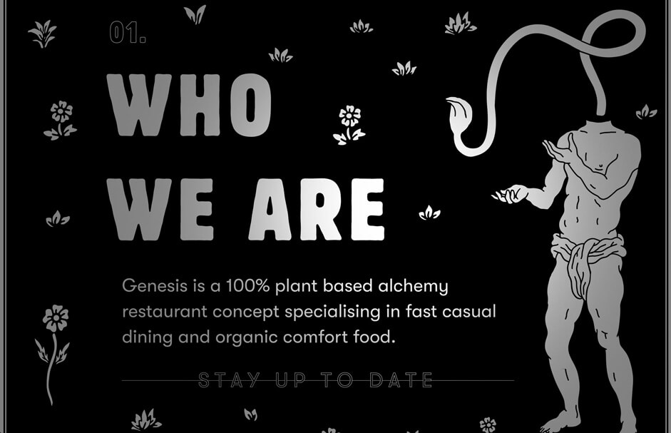
As this was a new restaurant concept that took a rebellious approach to dining, our aim was to translate this vision and create a bold design that mirrored the exciting and unconventional beliefs of the founders. For most potential customers, the website would be the first point of call, so we knew that we had to capture their attention and create a lasting first impression.
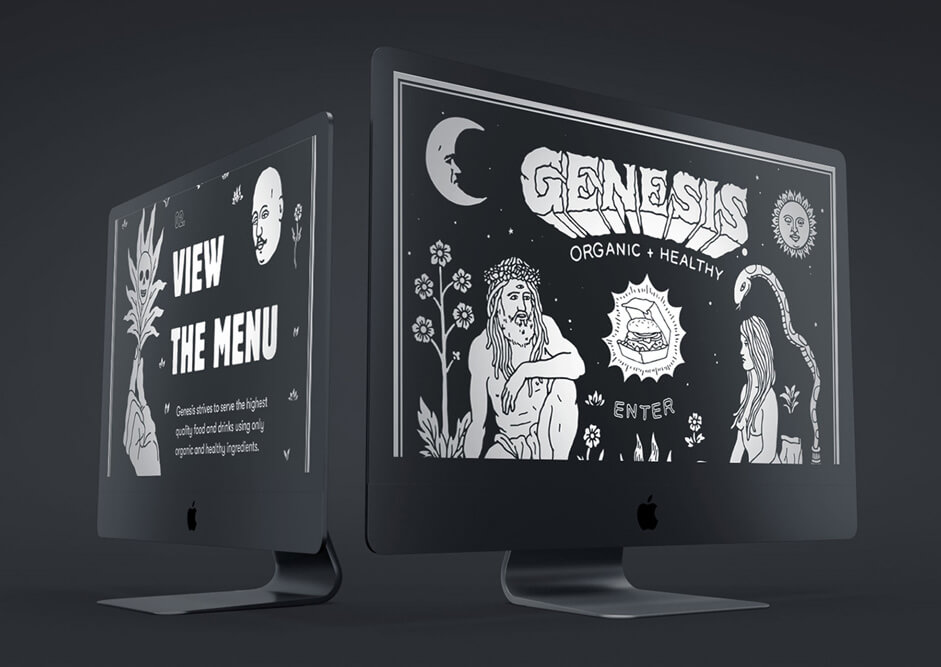
Thinking about the audience using the website, we identified five key sections and designed the experience around these. Each section is numbered and answers key questions in a prioritized order. The numbers were used in the final design to break the sections out and provide a subtle reference to chapters in a book, again alluding to the bible aspects we wanted to include.
Introduction
The opening animation was the first visualization we created and set the scene for the other sections, in both our process and the final design. We produced the initial storyboard for this animation following our initial meeting with Genesis. We’d come away from the meeting buzzing with ideas and had a clear direction in mind right away. After sketching out a storyboard for the main keyframes, we wrote up a description of how each element would animate. This would be eventually designed and animated in AfterEffects and the final animation has changed very little from those very first sketches.
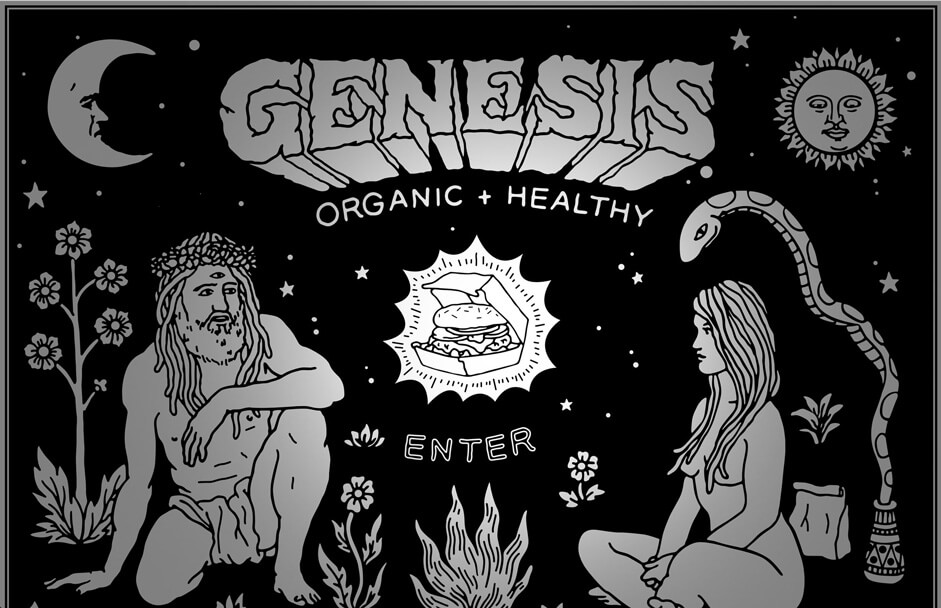
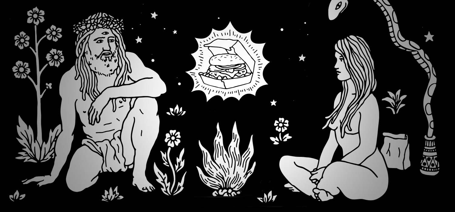
We wanted the first impression to set the scene for the rest of the site and stop potential customers in their tracks. The animation comes in sequentially and plays on the biblical connotations of "a light unto nations" taken from Genesis's brand document. Rather than communicating this through text, we used an elliptical reveal that "lights up" the page and triggers the rest of the illustration to come to life and begin animating.
First impressions are very important, we wanted to deliver a really unique experience and knew the opening animation was crucial to achieving our overall vision. Drawing on the biblical connotations of "a light unto nations", taken from Genesis’s brand document, we created a sequential animation that delivers a literal interpretation of this statement. We designed a scene that would “light up” and reveal iconic elements depicting the Garden of Eden. Here, the forbidden fruit is replaced with an easily recognizable symbol of fast food - a burger.
The burger is one of very few direct references to food, despite this being a restaurant website. This decision was very deliberate in our design process and a result of our brief to promote the "concept behind the restaurant" and to "create intrigue". Therefore, this led us to minimise obvious visual indications to food and instead focus on playfully introducing the Genesis ideology, creating a sense of mystery and discovery.
Another key element that was implemented to support this direction was the flashlight cursor that produces a lit up radial effect controlled by the user’s mouse. Again taking inspiration from the brand message, "a light unto nations", the flashlight cursor creates an interactive experience for visitors, lighting up areas they hover over. We had conceived this idea early on in the project but it took a lot of work to form the right balance between light and dark on the page.
Taking inspiration from the brand message, "a light unto nations", the flashlight cursor creates an interactive experience for visitors, lighting up areas they hover over.
About
The about section reveals the concept behind the restaurant with the key call to action of "stay up to date", inviting the user to register for the email newsletter. As the website went live before the restaurant opened, this gave Genesis the opportunity to start developing an early stage relationship with their audience.
Narrative theories play a huge role in our design process so our aim was to create a seamless experience from the opening animation through the entire site. To achieve this, we relied on scroll and hover-based events throughout the page that trigger micro animations. Each plant illustration has a scroll and hover animation, by growing in and shaking on mouse movement. The typography is also kinetic and adds to the continuous and seamless animation effect we aimed to achieve.
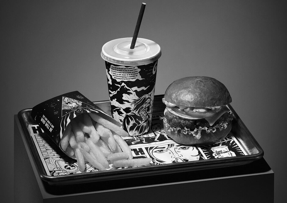
The Menu
On a more practical level, we understood that the restaurant menu would be an essential part of the website. Although introducing the brand was at the heart of our design process, we recognized that the ultimate goal was to generate bookings and enquiries. Our experience in this industry has shown up that a large number of visitors would be accessing the site from a mobile device, so it was crucial that elements such as the menu worked effectively on smaller screens.
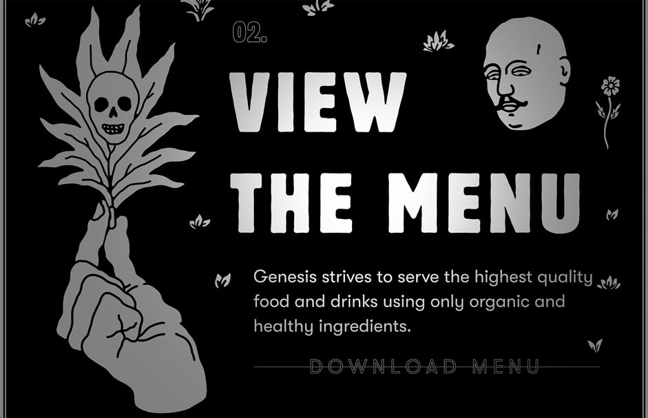
Using server-service device detection, we built the website to deliver both a desktop and mobile optimized version of the menu, depending on the user’s device. The A3 menu PDF designed for desktop collapses to a single column format for mobile visitors, so it’s easier for them to read.
Additionally, as we knew this would be a well-used area of the page, we also worked in a playful interactive element into this section. Specifically, the animated head that sits alongside the content has eyes that follow mouse movement.
Opening Times
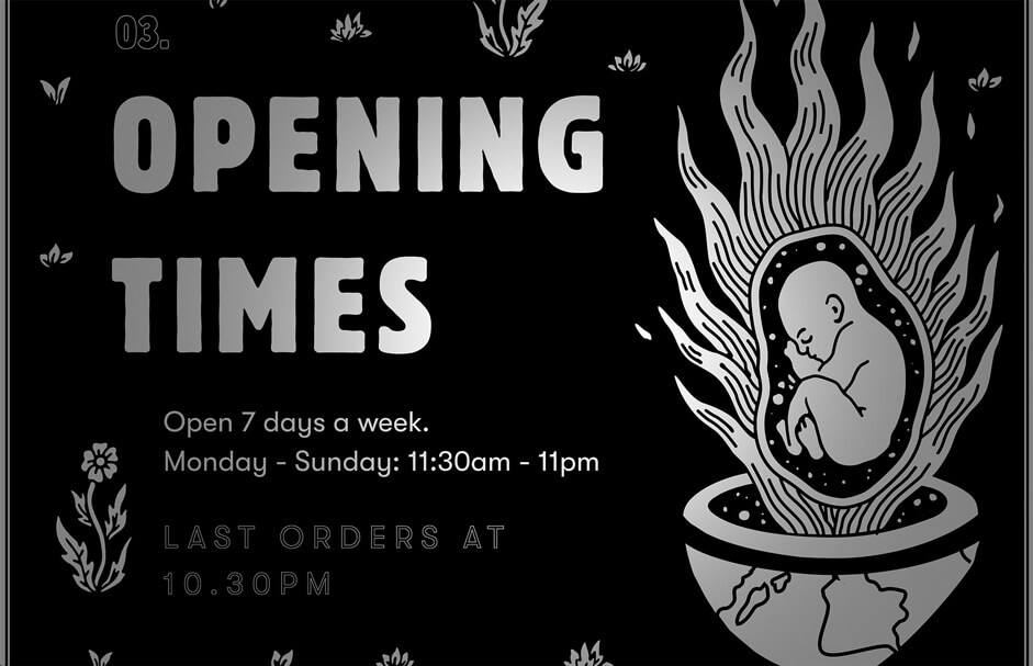
Another key piece of information for any potential customer are opening times. These details needed to be presented in a very simple and clear manner that would be easy for customers to understand and for Genesis to manage. Alongside the opening times is a call out for last orders and when the restaurant closes, which dynamically updates by querying the server.
Location & Contact
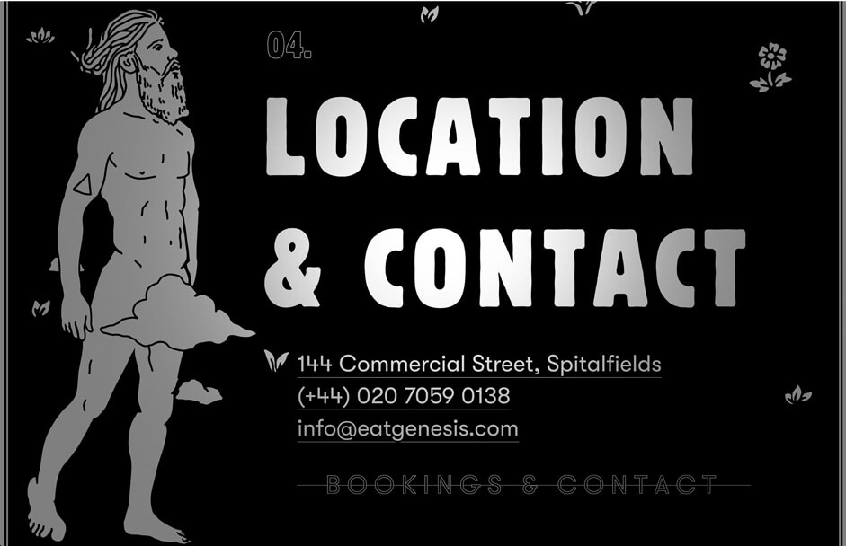
Naturally leading on from opening times is the essential contact information needed to make a booking. In this section, we have presented visitors with simple address information and a form to make a booking. As with the email sign up, forms have been presented in a modal to keep the page succinct. For this reason, we also chose not to include a map, although it was considered, and instead decided to link the address text to Google Maps.
Join the Team
One of the requirements was to consider recruitment and how this could be facilitated via the website. Attracting talented staff was highlighted as an important aspect by Genesis and we were tasked with incorporating this into the design. Using a third-party recruitment system selected by Genesis, we built a vacancies section at the end of the page.
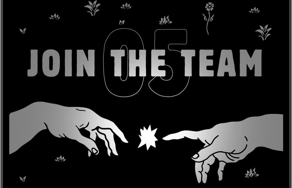
Aligned with the overall theme, the closing animation in this area was designed with obvious references to the Creation of Adam by Michelangelo. For this, we animated two illustrated hands that moved closer together on scroll, forming a spark on touch. These subtle references throughout the design form an overall aesthetic that continually refers back to the brand message.
Unfortunately, we weren’t able to directly integrate the website with this system, and using an iFrame caused some significant performance issues, so the decision was made to link to this off-site. To match the website aesthetic, we created a stylesheet for the templates to ensure continuity for all website users.
Challenges we faced
We enjoy challenging ourselves and design sites that will push the boundaries wherever possible. This approach means we sometimes encounter difficulties but also gain valuable knowledge that we take forward into our next project. One of the main obstacles we faced during the Genesis project was creating the SVG animations. This process involved converting the illustrations into a vector format before creating the animations, and then the technical considerations of including so many front-end effects on the page.
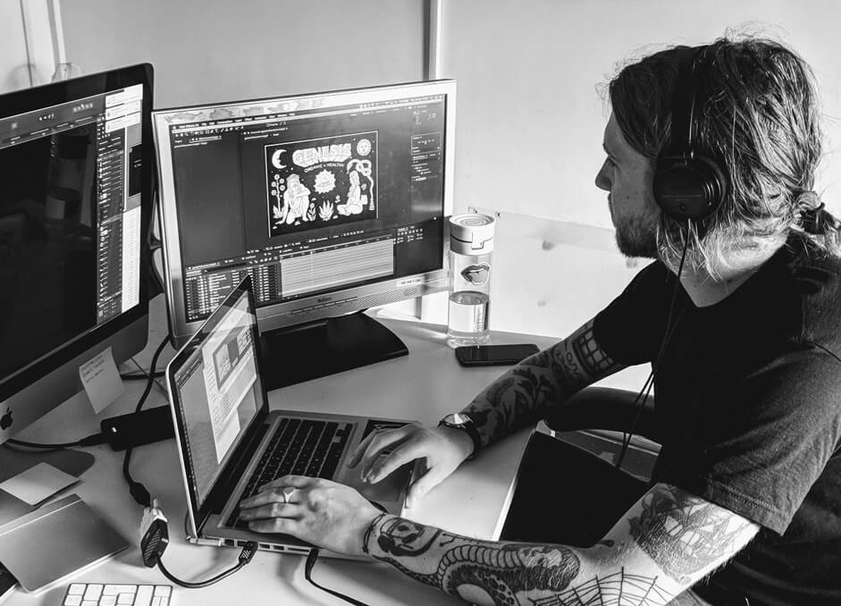
Our aim was to retain the hand-drawn style of the illustrations throughout each animation. After converting assets into a vector format, we manually rigged and animated each point individually, rather than using any shortcuts or AfterEffects plugins. While this process was very time-consuming, it gave us complete control over the animation and enabled us to achieve the desired outcome.
Performance was a consideration throughout the project but became an important factor in relation to the front-end effects. Animation is always very CPU intensive so we put in a lot of work to optimizing these effects as much as possible. The large number of animated SVGs also impacted memory and was very difficult to speed up. We were selective over how and which elements would animate and implemented a process of graceful degradation using responsive design and server-side detection (RESS) to ensure the site performed well on all devices.
The large number of animated SVGs also impacted memory and was very difficult to speed up. We were selective over how and which elements would animate and implemented a process of graceful degradation using responsive design and server-side detection (RESS) to ensure the site performed well on all devices.
Technology
WordPress is our CMS of choice as it offers clients an easy to use admin system. Additionally, because the platform is open source, it means that clients are never tied into a proprietary system if ever they wanted to work with someone else in the future. Nevertheless, we’ve developed our own special “flavour” of WordPress based on the Sage starter theme by Roots.
We relied on Airbnb’s JS plugin, Lottie, to export the animation. With the amount of animation on the site, Lottie ended up being a huge memory drain and was very difficult to speed up. We spoke directly to AirBnb (plugin developers) to find a solution and ended up dropping the version back to an earlier point in order to get the website performance up to an acceptable standard.
Our development workflow includes Gulp for automated build tasks, Composer for handling project dependencies, including the use of external WP plugins, and npm for package management. We follow DRY and BEM principles to ensure we create code that’s high-performance and easily maintainable.
There are several WordPress plugins that we utilise on projects to improve the back-end. Advanced Custom Fields (ACF) is our go-to plugin that allows us to customize and streamline the admin experience. All editable content areas are managed through ACF, in which we’ve added additional controls for character limits, and mobile/desktop menu uploads. We used Gravity Forms to power the form fields on the site and provide an integration with MailChimp.
Outcome:
As a team, we’re extremely pleased with the end result of the project. We’ve been especially proud of the response the site has received from customers and also our peers in the web design community. As a result, the site has won our first ever site of the day on Awwwards and gone on to receive many other awards and accreditations elsewhere too. We’re excited to see how the site will develop over the next few months.
However, most importantly to us has been the reaction from the guys at Genesis, who absolutely love the site. Genesis put their trust in us, giving us full creative license to fulfil their brief, and they’ve been delighted with what we delivered. We wish the Genesis team every success and hope the restaurant continues to push the boundaries and carries on creating amazing food!
Herdl is a UK based digital agency specialising in Web Design, SEO and PPC.