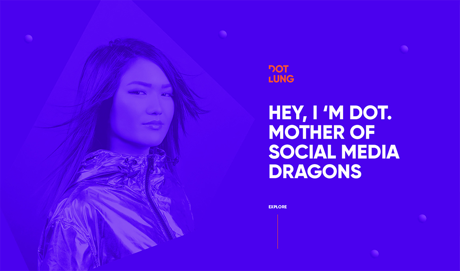
Dot Lung is a Global Social Media Community Manager and Consultant, from Los Angeles, based in Barcelona. Dot is an influencer, an enthusiast, an inspirer; she is a doer. When it comes to Social Media, she is one of the world’s leading consultants, having worked on accounts like OFFF - Let's Feed the Future, Digital Design Days, Sónar+D, Motionographer, Ladies, Wine, Design Barcelona and many more. This project is a collaboration of international creatives, carefully selected by her, reflecting Dot’s dynamic character and extrovertism.
Concept
The main concept of Dot’s Digital Branding and UI Design is a transformable dot, or more appropriately said, circle in any kind of form. A restless transformation of circles is constantly present - big or small, purple or orange, flat or 3D, hiding and revealing content - whether it is typography, photography or any other kind of graphic or UI design element. This creates a fluid and playful result applied throughout her digital identity, constantly creating forms and anti-forms by the appearance and disappearance of content.
We used the dot to create engagement and evoke interaction, making the user wanting to follow and play with it, achieving emotional bonding with Dot’s website, brand, and persona. From the “mouse over” triggered animations on the logo and concentric circles page transitions, to a large orange interactive circle and 3D scrolling parallax spheres, we follow the aesthetics and style of our custom made imagery.
Dot, is everywhere.
“We used the dot to create engagement and evoke interaction, making the user wanting to follow and play with it, achieving emotional bonding with Dot’s website, brand, and persona.“
Custom Made Imagery
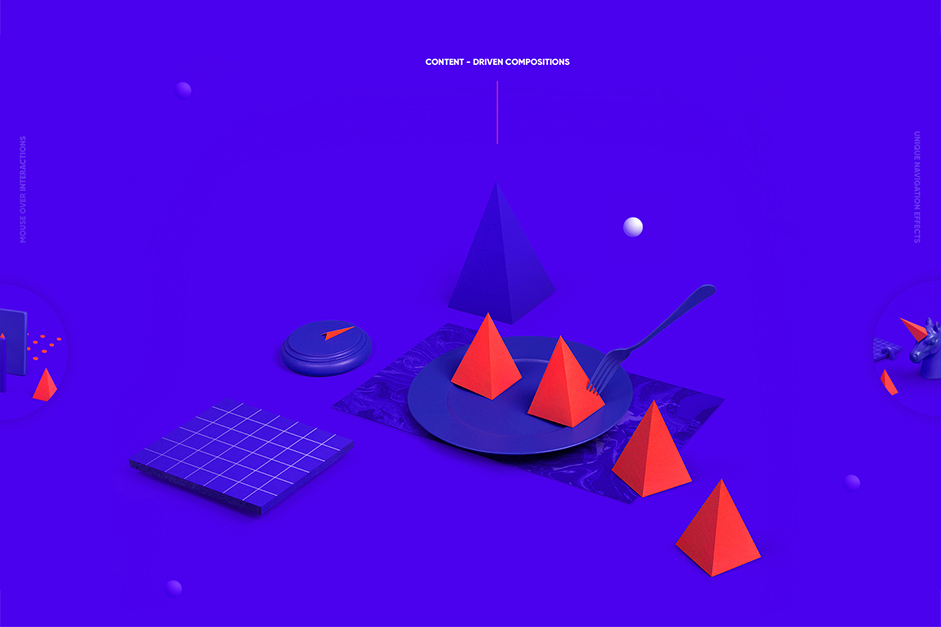
Dot stands for Dorothy and Lung stands for Dragon in Mandarin. Her name alone stood as huge inspiration for the concept, in regard to the imagery created for the website. We decided to go with monochromatic still life compositions, using our second brand color, orange, to highlight certain parts of the image. Dot’s services are 100% digital; this is why we wanted the images to approach the kind of perfection 3D gives you, but with real life compositions, so that we don’t lose emotion as we needed to create a ‘digital’, but at the same time friendly, profile.
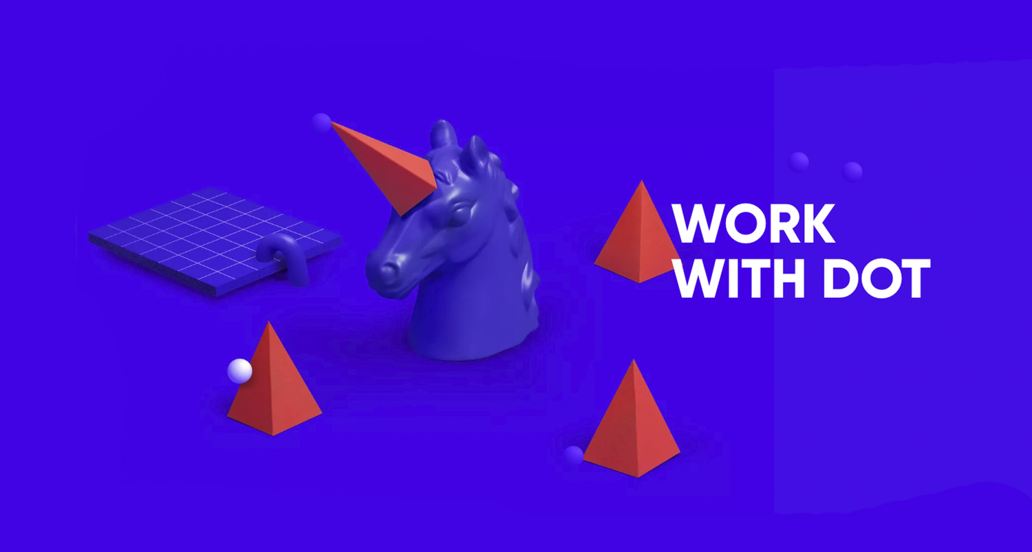
Dot is the “Mother of Social Media Dragons”. We made sure to highlight this on the homepage, where we see the very first, quite edgy image, of the dragon’s spine. Its spikes become part of all the following compositions: the spike becomes the horn of the unicorn; the edge of the pencil; the tail of the dragon on a plate. Each composition was created to represent Dot’s main activities and website sections, therefore we created a full screen slideshow in order to lead the user to navigate throughout the whole website easily, without even having to use the navigation menu.
The photoshoot took place in Barcelona, where we had the opportunity to work with Andoni Beristain (photographer) and Patricia Albizu (set stylist).
Video by Albert Dedeu, 360VR Barcelona
“Digital is literally my life. I live 24/7 on all platforms, whether it’s Facebook, Instagram or the latest and greatest app wanting to change the world.” - Dot Lung
Animations - Microinteractions
We used bold and punchy animations delivering freshness and a dynamic that represents 100% Dot’s personality.
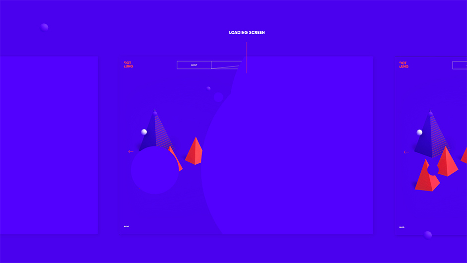
Following Dot’s personal branding concept, we worked with circular animations, starting from the site opening with 4 purple circles that shrink one after the other revealing the site underneath them. This transitions to a similar animation with two concentric circles when changing the page. Focusing on details, the center of those circles corresponds to the point the user clicks on.
Another point we realized was that we could use circles in the next/prev animation that is on all the hero areas. When the user hovers the arrow, the corresponding page’s thumbnail pops in and the page name appears next to it, one letter after the other. We think this added way more value than the effort needed to developed it.
Technologies:
Dot’s website is powered (for the most) by Wordpress, BarbaJS and TweenMax, along with many other cool technologies like CSS transitions, Ajax and SVGs.
We have more than 5 years of experience in WordPress development so it’s been very easy for us to set up an entire customized back-end that perfectly suits Dot’s needs.
We’ve also used ZURB’s Foundation as the front-end framework, which comes shipped with the FoundationPress starter theme.
Foundation allowed us to develop all the structure in almost no time thanks to its incredible grid system and responsive behavior based on SASS mixins (only the tip of the iceberg).
Adding Ajax navigation and custom page transitions was as easy as installing BarbaJS. BarbaJS is a plug&play library that adds Ajax navigation to every website to which it is included, and also has its own custom events that we used to make “magic” things such as the out animation with concentric circles.
We’ve used that library frequently in the past and we were already confident with it, knowing that it would do the trick.
All the animations and transitions are powered by CSS and/or TweenMax.
Simple animations, like buttons’ hover states or next/prev navigation present on all the hero areas are all managed only by CSS.
When animations start getting complicated, or more timeline-like, there’s no point in using pure CSS. In that case (like for the circular page transitions), we used TweenMax to do the job for us.
We consider TweenMax the de-facto library for web animation, it allowed us to setup complex and high-performant timelines in very few lines of code.
Some pages like WORK WITH DOT contain a custom accordion component that, when the user clicks on one of its links, hides the current accordion’s image animating a CSS clip path, loads the new accordion’s image using the Axios library and reveals it by animating back the same clip path. However, a unique future is that every time, it has a different value, in order to give the user a sense of “randomness”.
Content
Content plays a huge role in delivering an integrated product so it was incredibly important that we used the right tone of voice aligned with Dot’s personal branding to complete her identity. Tim Brown, originally from Canada, based also in Barcelona, worked his magic creating copy that satisfied completely the project’s needs.
Art Direction & Design: Sofia Papadopoulou / Greece
Code & Animations: Vool.Studio / Sydney
Photography: Andoni Beristain / Barcelona
Copywriting: Tim Brown / Barcelona
Company Info
Vool.Studio, The International Collective of Kick–Ass–Award–Winning Creatives!
We are Design Directors, Copywriters, Pirates & Developers.
Sofia Papadopoulou is a Multidisciplinary Awarded Freelance Designer & Art Director mainly focused on Digital Design & Branding. She is located in Thessaloniki, Greece, collaborating with agencies and clients worldwide.