It was the year 2021, in August. As the year was coming to an end, the team at basement were getting ready to fight Arishem, the Prime Celestial... lol, nah. We just got a call from a really cool gang. It was time again for us to design and ship some cool sh*t that performs. Alright, let’s take you for a ride, and buckle up, safety first, it's time to talk about Ranboo Fashion.
This was a friend of a friend kinda situation. Revolt (one of our trusted clients) contacted us to brief us about a massive merch drop. We’d be building for one of the most-streamed Twitchers our studio has ever handled.
For us, it wasn’t just about showing off fashion products. We needed to build a visual language that would reflect that of our client as well as his audience. Our client had credibility and our goal was to maintain it, so we put on our helmet, charged our pulsars, rallied the team, and got ready to deliver an amazing experience.
Now, this was "Ranboo", the most-streamed Twitcher and a famed YouTuber with millions of viewers and streamers across his platforms, so we had to supercharge our Performance subsystem to build a site that could handle as much traffic as possible. Ranboo showcased his site on his stream and had almost 70k+ streamers trying to buy his merch. Cool, right?
Building The Visual Language
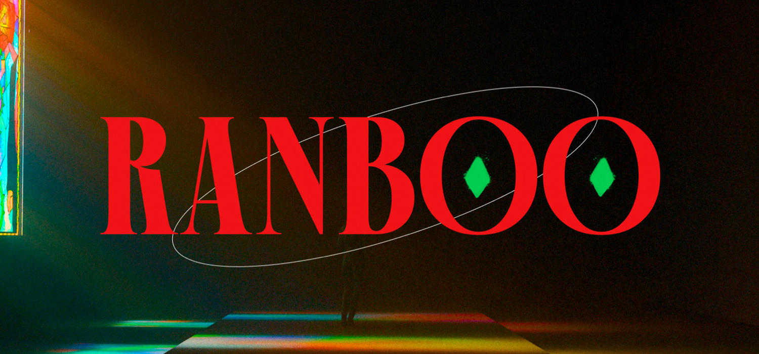
The first thing you notice when you come on the site is somewhat of a mix between an editorial vogue and a 80s trashy retro arcady and nostalgic feel.
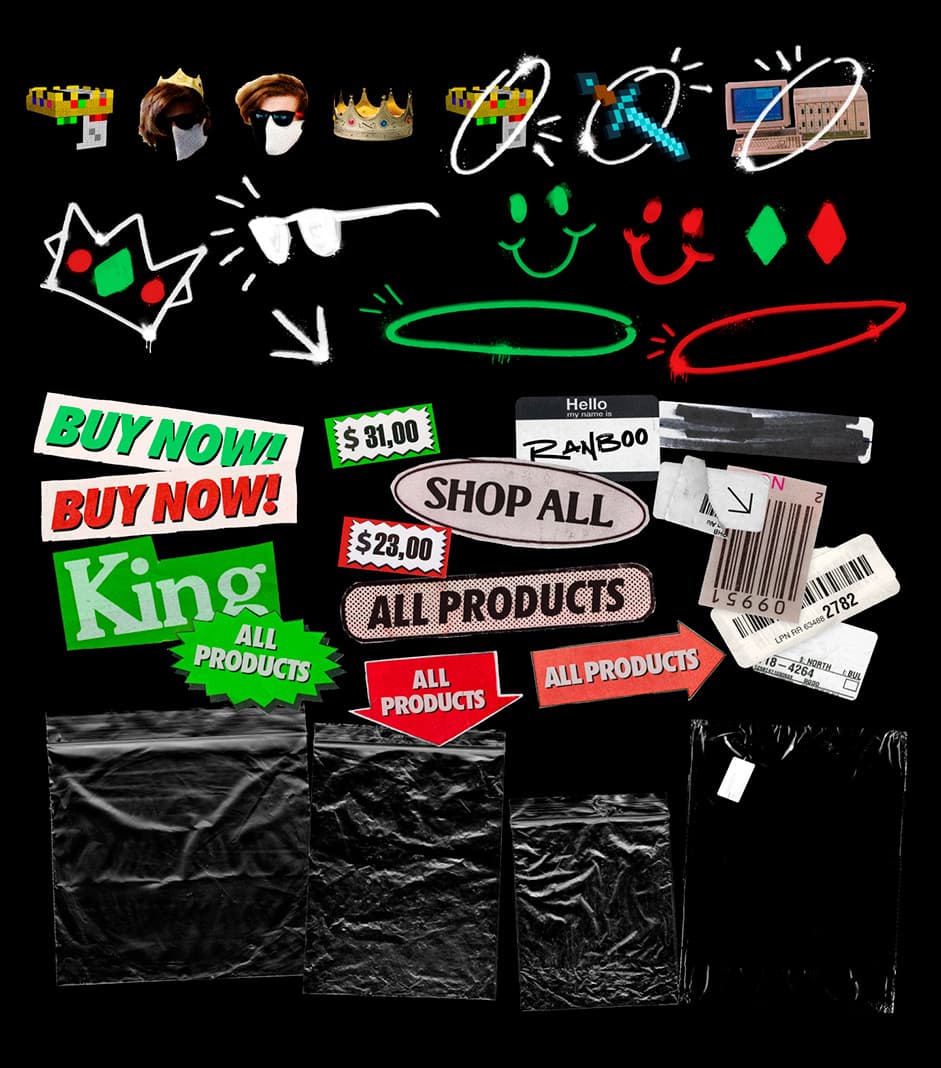
We aimed to capture not only his aesthetic in the site but also his personality, so we put him in our high-tech analysis chamber (shhh, it’s just our group of designers). Ranboo’s aesthetic was a palette of black, white, green, and red, and his personality was a touch of retro, sarcastic, quirky, mysterious, and also gothic.
Composition was key. Using Ranboo’s palette as a base, we started with a black and white approach and slowly integrated the rest of the palette to really capture the vision we were going for, experimenting with and integrating newer visual elements as we progressed.
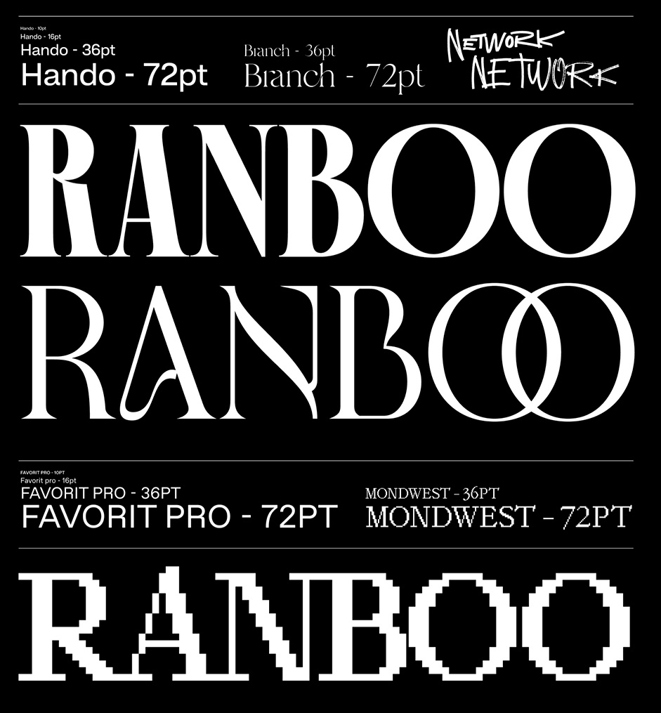
For typography, we really wanted to flex our muscles, having our visuals as a base we dove right into the coffee pot. We went for a mix of serif and sans-serif fonts that were grungy and retro, but were still very vogue. Our choices were Hando and Branch which tied together really well.
For the layout, we used a combination of fluid containers, fluid columns, grid columns, and some zig-zag patterns. We were aiming for extraordinary, because why do it any other way?
We Felt Good, Now To Make It Better
We did love the visual direction we were taking, but something was missing. To finally capture the entire Ranboo vibe, our first step was to add some vintage elements, graffiti to achieve a mix of retro, editorial, and grunge feel.
We designed the site to have a visually rich and engaging feel, interactivity and cool effects that brought about a feeling of depth and fluidity while retaining solidity, swiftness, and trust.
“You really can’t beat creative freedom, and this project gave us that in spades.” - Andres Briganti - Head of Design at basement
Development
At its core, the site was built using Next.js with other amazing superpowers baked in. We chose Next.js because it came with many features and tools right out of the box including routing, ready-to-use SEO, image optimization which equals faster load time, and many more features.
To speed up development we used our trusty boilerplate which has always been a great foundation for our projects with a lot of custom config that is very extensible across many different projects.
We wanted to bring the site exploration to a whole new level, so we asked ourselves, what would it feel like to be in Ranboo’s mind? So, we cooked up some portions in our lab, shrunk ourselves, and went into his mind, jk, maybe not.
“1.618”, Math?, Yes, The Golden Ratio, this was the groundwork for every easing and timing and layout on the site
"1.618”, Math?, Yes, The Golden Ratio, this was the groundwork for every easing and timing and layout on the site. We weaved it into every interaction and every smooth scroll.
The site was built to be responsive and have a perfect aspect ratio to provide the same experience across all major devices while maintaining quality.
Technologies & Tools
Figma: this is where we collaboratively designed all our high-tech prototypes.
Next.js: We are paid to use it, lol, just kidding. Well, we love React, and Next.js is simply the best framework to build with React. Also, we’re Next.js experts (we’ve used it A LOT). It’s our weapon of choice on any project.
GSAP: “Performance is paramount, especially on mobile devices”, so we chose nothing but the best to handle all animations and effects on the site. It allowed us to manage multiple keypoint transitions, with custom easings and duration for each of them.
Stitches, for CSS-in-JS: We love the flexibility Stitches has. It provides the full power of CSS while still being moldable. We enjoy the Framework Agnostic API a lot as this gives us the freedom to explore.
Locomotive Scroll: for smoother scrolling experiences.
Mux.com: for hosting our video assets. Videos are typically the larger assets you'd deliver to a visitor, so, if you are planning on building a high-traffic site. Then Mux.com is a great option.
Vercel: It’s our go-to deployment choice, zero-config deployment? This allows us to deploy fast, faster than the Flash could blink, yes, it’s that fast. Superfast edges, CDNs, high compression, what’s not to love?
— among others.
We’re all kinds of stubborn, so we went stupid and we decided to give this website a full basement systems upgrade with all the bells and whistles. We included animations, videos, and smooth parallax scrolling. Talk about a power pack, huh.
Overall Experience?
We really took this one to the moon, SpaceX style, focusing on rare layouts, creating impact, and breaking the typical grid. Having worked with Revolt before, we wanted to push the boundaries even more and create immersive visual experiences that were not only aesthetically pleasing, but also performant. Our clients were super responsive and amazing to work with, they also came through with their superpowers (being awesome clients).
For me, it was so much joy but also a tremendous challenge…, an unforgettable experience, monitoring and working alongside the amazing Revolt team…, We had a ton of people buying Ranboo’s stuff at the same time” — Jose Rago, Founder at basement
Company Info
basement.studio is a boutique studio with a committed team working on selected projects for startups and companies, bringing what they envision to life through: branding, visual design & development of the highest quality.
We’re a small team of like-minded individuals whose purpose is to create visually compelling and non-standard brands and websites, focusing not only on their looks but also on their performance.
As we like to say: we make cool sh*t that performs.