CSS 3D Transforms is a module that started life as a Draft specification in 2009. Using this specification, you can transform any visual DOM element to simulate three-dimensional space.
Today, Peter Westendorp shows us a very simple example which will help you understand the basics of 3D transformations using the typical, but instructive, 3D cube.
Here's how you make it:
A 'cube' <div>, with 6 nested <div>'s representing the six faces of the cube. Each face has an id so that we can target those individually.
The dimensions of the faces will be 200px by 200px, and to let each face start from the same point, we're setting 'position' to 'absolute':
.cube,
.cube div.face {
    width: 200px;
    height:200px;
}
.cube {
    margin:100px auto; /* moves the cube to the middle of the page */
}
.cube div.face {
    position: absolute;
}
To be able to see the 3D effect better we're going to give each face a different color:
.cube div#front {
   background-color: red;
}
  .cube div#back {
   background-color: green;
}
  .cube div#right {
    background-color: blue;
}
  .cube div#left {
    background-color: yellow;
}
  .cube div#top {
    background-color: orange;
}
  .cube div#bottom {
    background-color: fuchsia;
}
Now we have this in place, we can start applying the 3D transforms. Before we start moving the faces of the cube around in 3D space, we have to set the 'transform-style' property of the cube <div> to 'preserve-3d'. This makes sure we retain the 3D tranformations of the cube <div>'s children; in this case the six faces.
Please note that the transform, transform-style and animation properties currently only work with vendor-prefixes (-moz-, -webkit- etc.). But I left them out in this tutorial, for the sake of readability.
.cube {
    margin:100px auto; /* moves the cube to the middle of the page */
    transform-style: preserve-3d;
}
We also need to set the perspective (which is the distance of the object from the viewer) and we'll rotate the cube slightly so that we can see the top and right side as well.
.cube {
    margin:100px auto; /* moves the cube to the middle of the page */
    transform-style: preserve-3d;
    transform: perspective(700px) rotateX(-30deg) rotateY(-30deg);
}
Finally we can move each face into place. Let's start with rotating div#right by 90 degrees:
.cube div#right {
    background-color: blue;
    transform: rotateY(90deg);
}
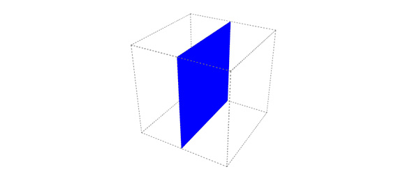
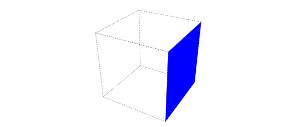
As you can see, this <div> is now rotated by 90 degrees, but is still in the middle of the 'cube'. When we add 'translateZ(100px)' to the 'transform' property, the div#right moves to the right:
.cube div#right {
    background-color: blue;
    transform: rotateY(90deg) translateZ(100px);
}
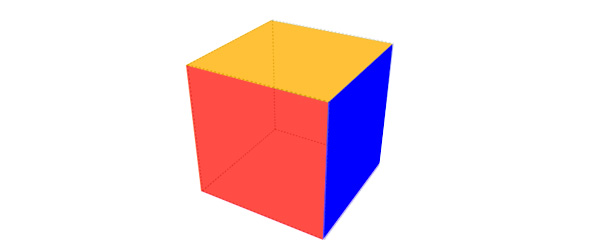
Now let's move all the other faces into place as well:
.cube div#front {
    background-color: red;
    transform: translateZ(100px);
}
.cube div#back {
    background-color: green;
    transform: translateZ(-100px);
}
.cube div#right {
    background-color: blue;
    transform: rotateY(90deg) translateZ(100px);
}
.cube div#left {
    background-color: yellow;
    transform: rotateY(-90deg) translateZ(100px);
}
.cube div#top {
    background-color: orange;
    transform: rotateX(90deg) translateZ(100px);
}
.cube div#bottom {
    background-color: fuchsia;
    transform: rotateX(-90deg) translateZ(100px);
}
As you can see, in almost every transform the same value is used in the 'translateZ' function, but still each face ends up in the correct place to form the cube.This is because the order of the transforms matters. By rotating a face first we're also rotating the 'internal' X-Y-Z axis of that face. Which means that if we translate on the Z axis after a rotation, we're pushing the element in the direction it is facing after the rotation is applied.
Animation:
Now let's give it a nice extra touch by adding an animation to the cube:
/* ANIMATION */
  @keyframes rotation {
    to {
      transform: perspective(700px) rotateX(-390deg) rotateY(-390deg);
    }
}
    .cube {
    margin:100px auto; /* moves the cube to the middle of the page */
    transform-style: preserve-3d;
    transform: perspective(700px) rotateX(-30deg) rotateY(-30deg);
    animation: rotation 10s infinite linear;
}
This brief tutorial certainly didn't cover everything there is to 3D transforms, but hopefully it did get you excited about this technique. If you want to experiment with the code, you can do so on CodePen: FINAL CODE