Telling Their History Through Design
Our long-standing partner, Zealous, an organization challenging injustice through media, storytelling, and arts along with with Jailhouse Lawyers Initiative at NYU School of Law, approached us to join their Jailhouse Lawyers campaign to raise awareness about the work of current and former jailhouse lawyers as human rights defenders and push for policy changes identified by these community justice advocates.
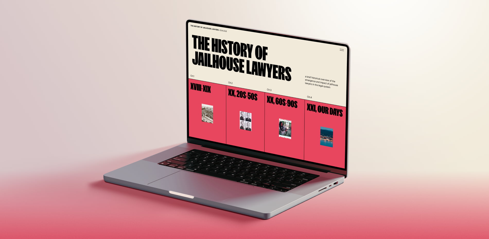
We were invited to create several parts of the campaign website. One of the key project aspects was an visual timeline tracing the history and growth of prison lawyers and showcasing their impact on the legal system.
Shaping the Look & Feel
We kicked off the project by diving into a detailed historical document filled with legal terminology, plus audio recordings, videos, and letters from the community. This research helped us grasp the context and capture the personal stories behind the legal movement.
While the client’s initial inspiration for the visuals came from an existing jailhouse lawyer project, our aim was to refine it, balancing visual harmony with the necessary sense of tension. We worked on color and typography choices and created design guidelines to stay consistent with the original style while elevating it.
“We utilized movie posters, vintage posters, book covers, and legal cases as references to bolster the concept of storytelling.”
Crafting Stories from Legal Texts
The main challenge was transforming dense, formal legal content into an engaging narrative that feels human. To solve this, we:
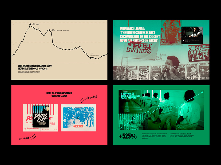
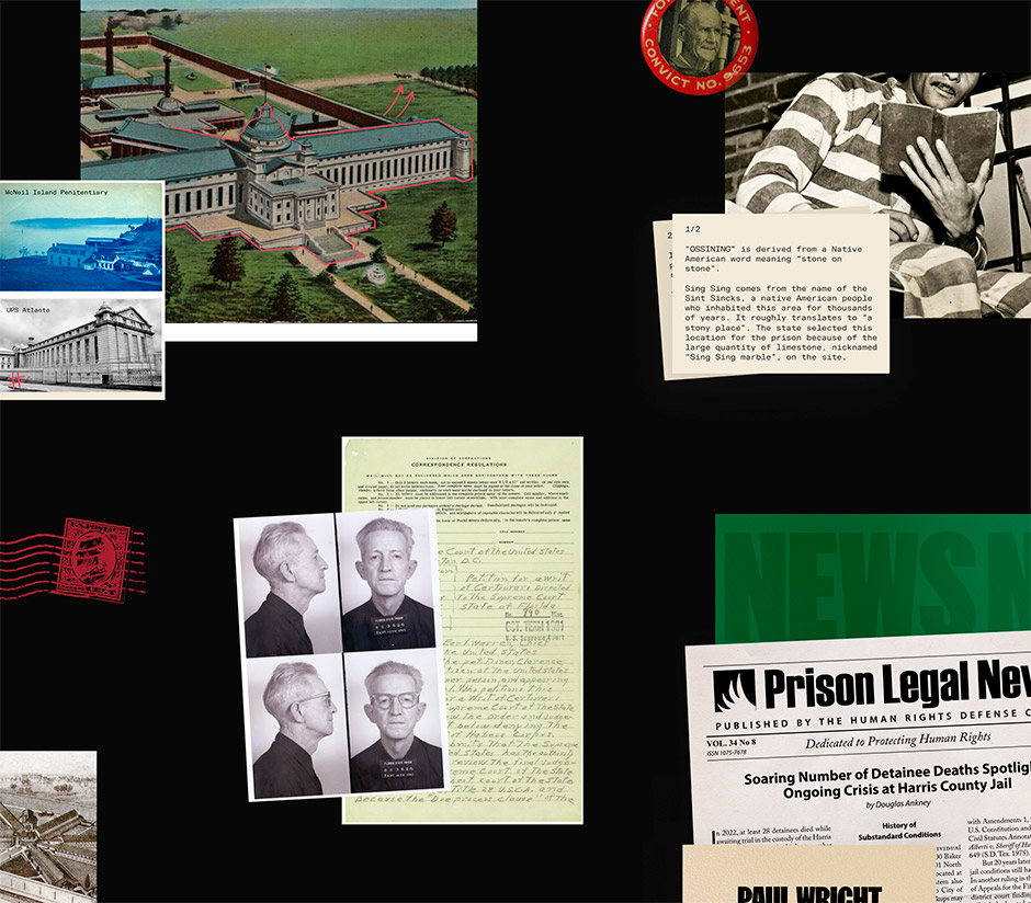
- Incorporated details from the lives of the mentioned individuals, to enhance its personal touch.
- Utilized visual anchors to provide readers with a glimpse of the overall story, encouraging them to delve deeper into the text presented each narrative as an individual instance by designing collages, streamlining text into documents, and aligning all content with a consistent style.
- Utilized personal photos and archived documents for authenticity. Our research for references primarily included movie and book covers, along with actual stories of prisoners.
By merging personal histories with a structured, consistent design, the website now brings forward the voices of jailhouse lawyers making their impact visible and compelling to a wider audience.
Behind the Build
Like other projects in our studio, this one was fully developed in Webflow. Since most of the site is based on horizontal scrolling, our first challenge was to decide what units to use for sizing elements on the page.
We ended up with this approach:
- Sections and elements that scroll vertically were sized using vw
- Sections and elements that scroll horizontally were sized using vh
This setup helped us keep consistent paddings and proportions in horizontally scrolling sections, making them look exactly like in the design — regardless of screen size.
Scroll Behavior
To create a smooth scrolling experience, we used Lenis, an open-source library by darkroom.engineering. It was simple to integrate — just a few lines of code — and gave us full control over scroll speed and smoothness.
Animations
Whenever possible, we used Webflow’s built-in animation tools, either on scroll or user interaction.
But when our ideas went beyond what Webflow could handle natively, we added custom scripts. For example:
- Animating headlines word by word as they appear in the viewport (existing solutions didn’t work well with horizontal scroll, so we built it from scratch)
- Switching image sequences on hover inside a Period block in the Hero section
- Changing stacking content cards one by one on click
The hand-drawn doodle elements you can see across the whole site were animated in After Effects and embedded as GIFs.
Performance & Optimization
During development, we considered whether to keep all content on a single page or split it into separate pages for each Period — especially since the site includes a lot of visual assets.
Multiple pages might have helped with loading speed, but introduced UX challenges:
- How to ensure a seamless transition between periods (one idea was to preload the next section automatically when the user reached the end of the current one)
- How to handle navigation between years consistently, whether they belong to the same period or not
Eventually, we decided to keep everything on a single page and focused on performance best practices such as using WebP images, lazy loading, minifying HTML, CSS, and JS, avoiding hidden or unnecessary elements, and other common techniques.
In the end, the page loads quickly and runs smoothly, which is critical for ensuring a smooth experience on both desktop and mobile.
The Team
Tubik helps both large and small businesses employ design to improve communication with their customers or users and increase sales of products and services.
We specialize in creating compelling brands, designing intuitive web and app interfaces, and elevating user experience through custom graphics and motion design.