Congratulations to Active Theory for winning Site of the Month October 2020 with Adidas CHILE20. Thanks to everyone who took the time to vote, find the winner of the Pro Plan in our Design Directory at the end of the article.
In a year of global cultural changes, launching an apparel range in a meaningful and engaging way was the challenge brought to us by adidas earlier this year.
For the Originals team looking after Foot Locker, it wasn’t going to be enough simply snapping some sleek product pictures. To really have an impact, it was important to develop a launch campaign that told both the unique story of the collection, and communicated the craft and quality of the clothes.
The Brief
Based on insights from adidas and Foot Locker, we wanted to position the product as something premium, versatile, and ubiquitously desirable.
To do this, we got up to speed with the collection and its story. We learnt the CHILE range was originally released in 1962 during the Chile Football World Cup. Since then it’s been re-released a few times with icons like Snoop Dogg using it to influence culture over time. This latest release, CHILE20, is a modern manufacture of the range, and includes eight different items.
The scope of the brief was particularly exciting too. While we were focused on a core digital activation idea (that would eventually take shape in a product microsite), our work on the CHILE20 launch campaign would also include:
- Making in store retail ads for over 500 Foot Locker stores in Europe
- Developing Social Media assets for Foot Locker and partner properties
- Creating a high quality pre-rendered 3D product film Supporting with mainstream PR
Early Concepting
In approaching the brief, we established a distinct strategic north star: tell a genuine and authentic product story. In a world of overstated advertising campaigns, we wanted to be straightforward in communicating what the CHILE20 collection is, and what it stands for.
Given this needed to be communicated across multiple European markets, we wanted to take a fairly visual approach to avoid getting lost in translation copy nuance.
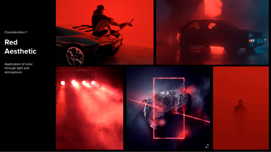
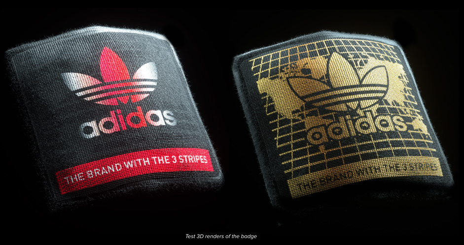
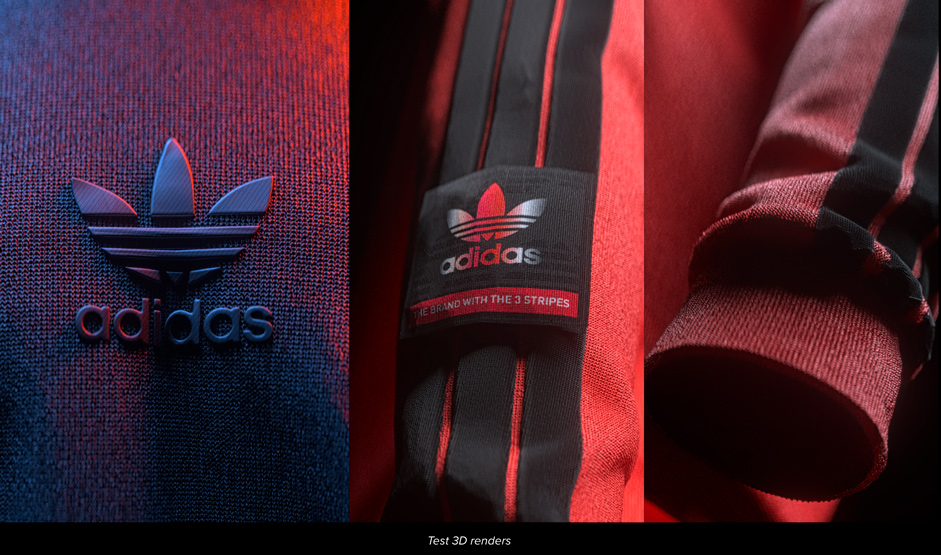
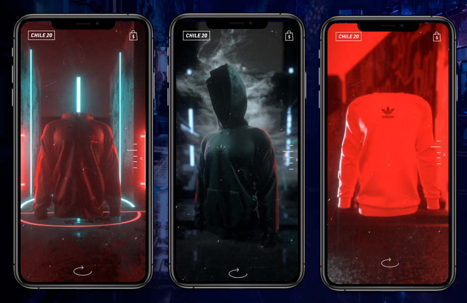
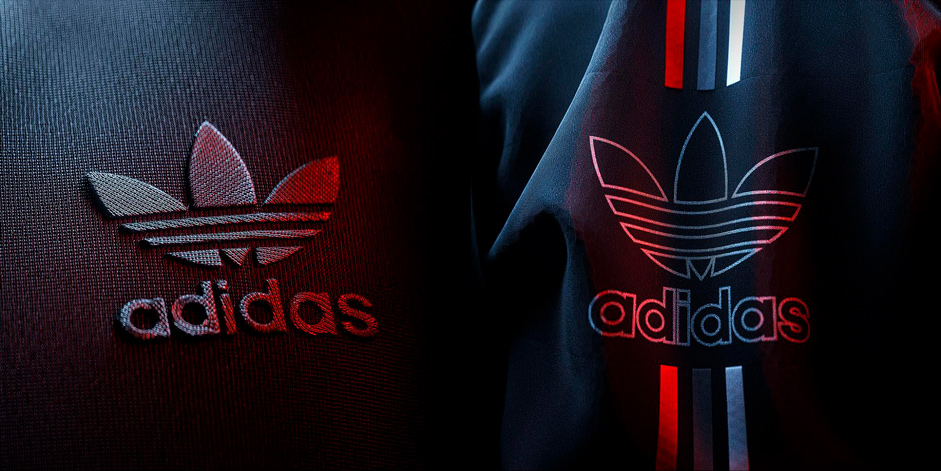
Using the product color palette as a base, we proposed some early art direction using a red aesthetic overall, with attention being paid to product details.
We also did some test 3D renders to demonstrate the visual fidelity we could achieve using digital production (as opposed to real life photoshoots).
Three Stripes. Three Worlds.
While we felt good about the visual direction, we still needed a story and structure to give the experience some cohesion.
Using the famous adidas ‘three stripes’ motif, we began to explore how we could create different ‘product worlds’ that could represent different thematic elements of the campaign.
Angle 1: Past, Present and Future
The first consideration for the three worlds story was around uncovering the legacy of the Chile product, seeing how it’s evolved into what it is today (from its history at the 1962 World Cup), and then thinking about where it could go in the future.
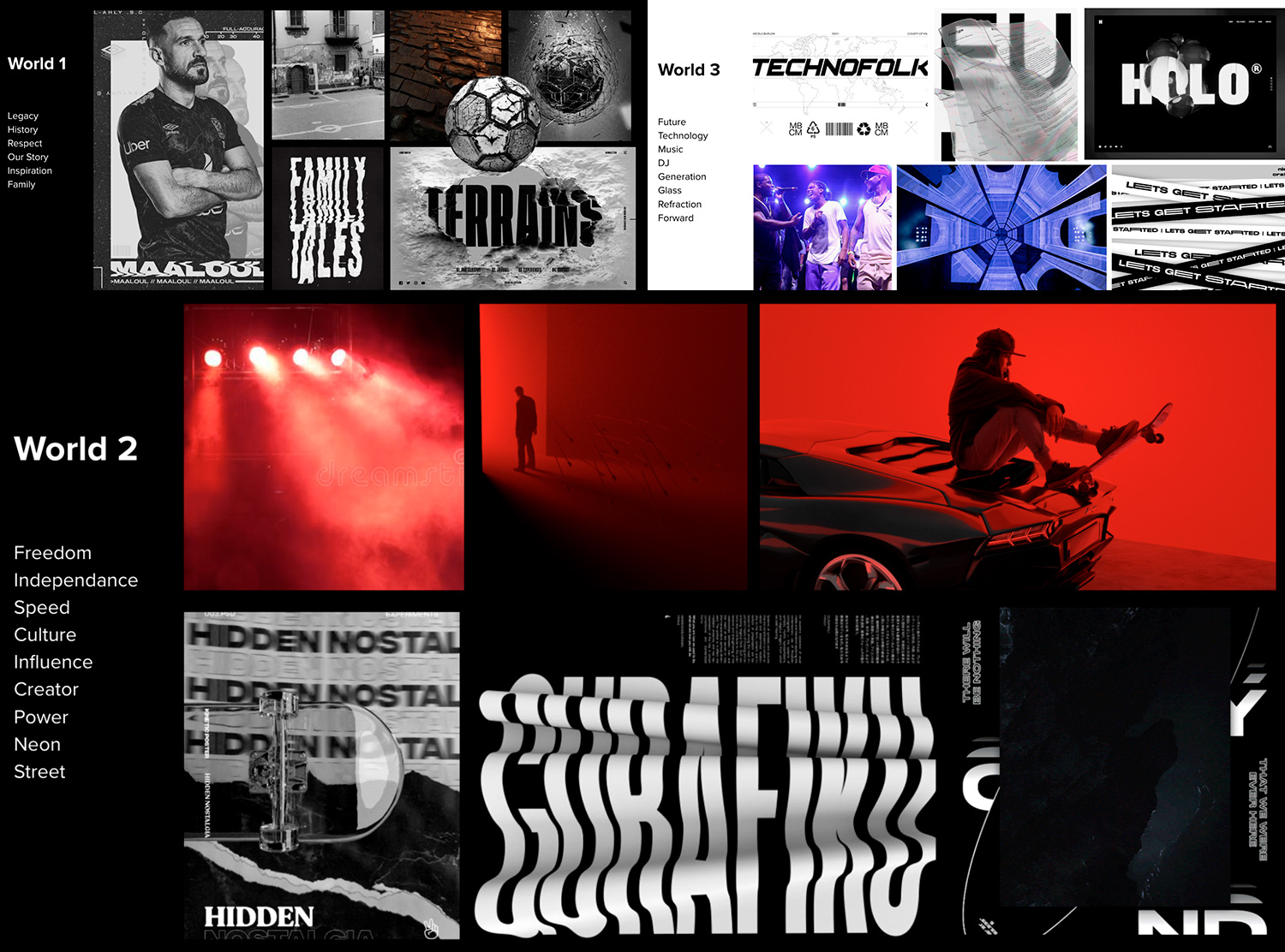
Angle 2: Hero Products
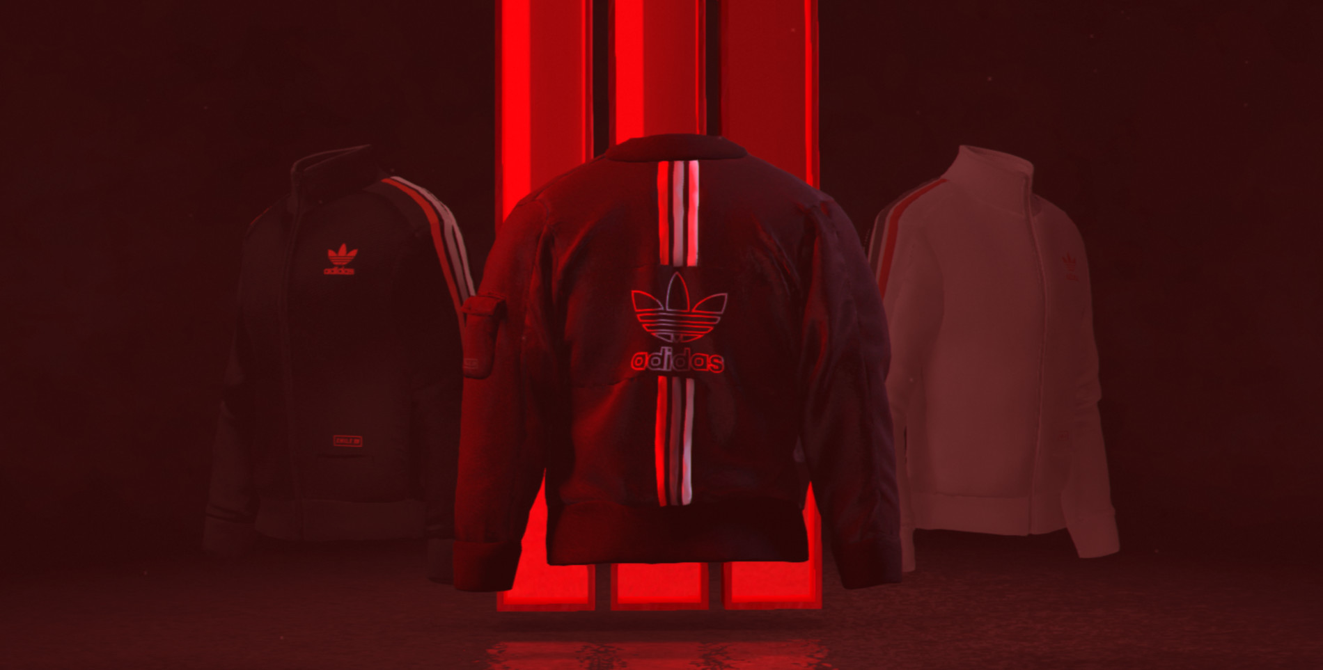
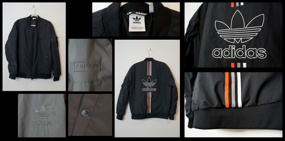
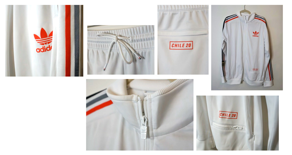
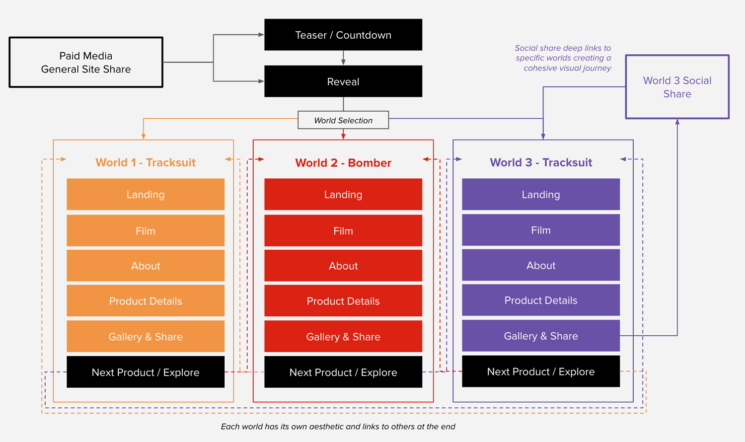
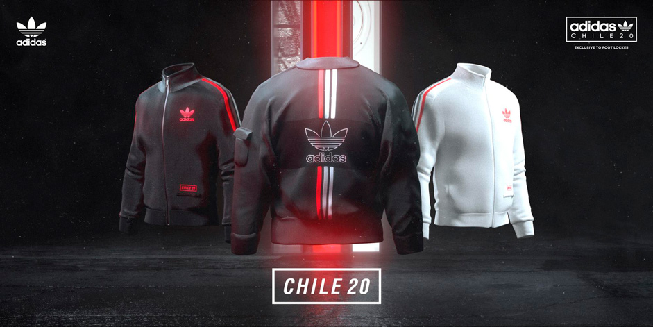
Another factor in the three worlds was showcasing a hero product in each world. The three products adidas selected (black tracksuit, bomber, white tracksuit), were three of the collection’s hero items and would influence the art direction and story of each world.
Angle 3: Topical Themes
Given the younger demographic and interest in street culture, we wanted to also work in some topic-based motifs that might resonate with some of the collection’s fans.
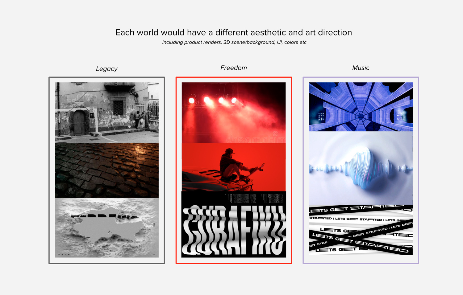
Ultimately, the experience would leverage all three angles, with each world highlighting a different product and theme, and telling the story of the collection from a slightly different angle.
A key interaction was also allowing users to fluidly transition between worlds at any time. Strategically this represented the flexibility of the apparel, and it was also a clean way of combining the art direction.

Planning the User Experience
In order to manage the scope of the experience, we decided to somewhat templatize the world. This also made it easier to seamlessly switch between worlds at any time, as you could simply jump to the corresponding templated section of the next world.
An Exciting Landing Experience
We wanted to give the landing page a strong identity as it would be the entry point to the entire web experience. As we were working with 3 products and 3 worlds - we aligned this with the iconic 3 adidas stripes, creating a colored stripe (matching the product) for each world. We iterated on this visual approach a few times, exploring different options.

Our final landing page experience was not only the entry point to the digital campaign, but served as a key visual that would also be extended to other campaign placements.

Crafting The Worlds
Each of the three worlds had a different visual identity, reflecting the legacy of the Chile product and how it’s evolved into what it is today.
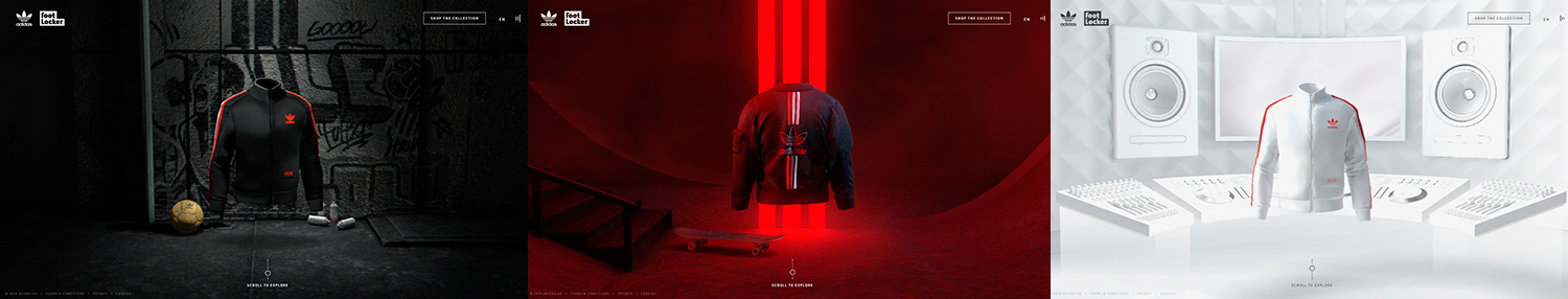
- World 1: Focused on the past. We created a black & white grungy environment with soccer graffiti on the street wall and the Chile 62 World Cup ball on the floor. We added grain on top of the entire section to make it feel a little more old-timey.
- World 2: Focused on the present. We wanted to allude to the pandemic without being too heavy handed. The skateboard motif was not only a nod to street culture of adidas Originals, but also served as a niche reference to skateboarding really taking off on the deserted streets of the COVID pandemic.
- World 3: Looking to the future. We didn’t want to go overboard with the concept of time - so instead we just went for a futuristic aesthetic. This was represented through a clean music studio with acoustic panels, modern speakers and floating mix table.
Creating The Products
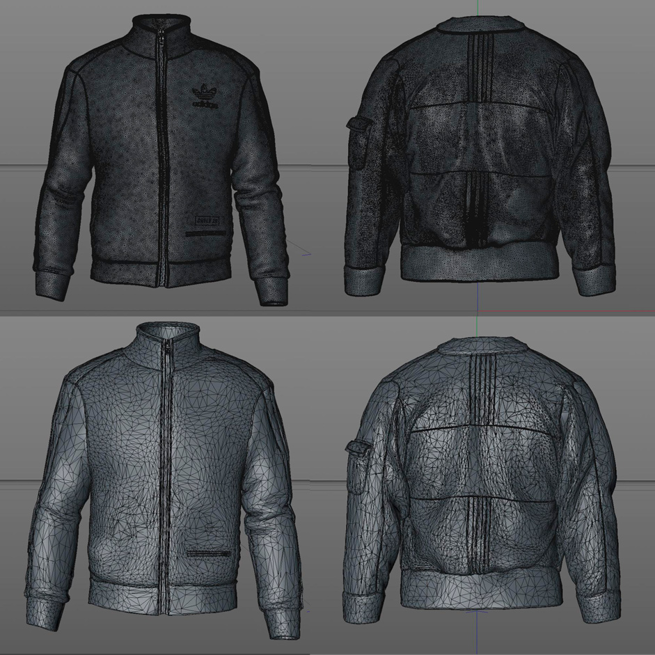
As the campaign called for many technical optimizations and closeup shots, each product needed to be meticulously digital crafted in house by our 3D team with close advisement from the adidas product team.

From statics: Although we had created high quality digital garments for product renderings and animated videos in the social media campaign, we also needed 3D models for the website.

To 3D models: Through some experimentation, we realized that the 3D models alone had the potential to show all the details on each product.

This, however, meant that we needed to be meticulous with the web version of each garment, as we needed to fit the details of each 500k+ polygon model and numerous 4k texture maps for each part of the garment into a much more optimized version with only a couple of 2k textures that could be loaded on a mobile device.
In the end, we created multiple different versions of each garment to test various techniques to optimize the high res mesh models. These included Marvelous Designer (with tools in Z-Brush), polygon reduction in Cinema 4D, and even meshing models through VDB volumes to guide the creation for the final optimized garment models used on the site.
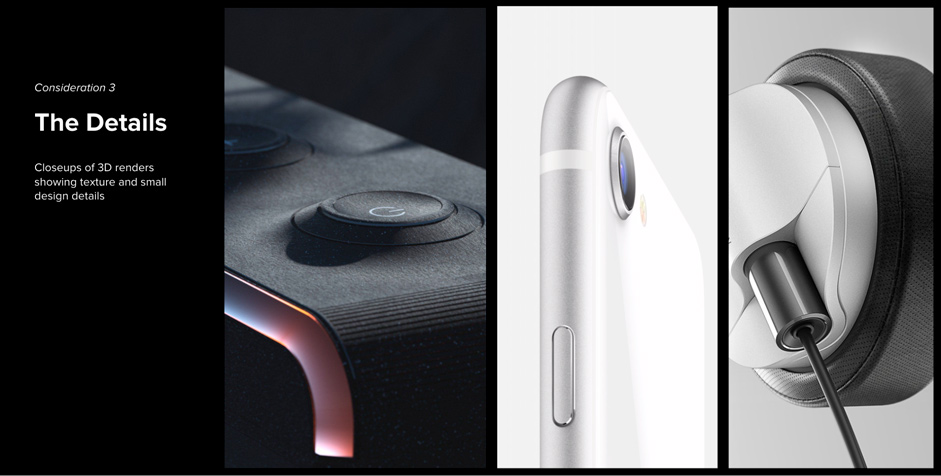
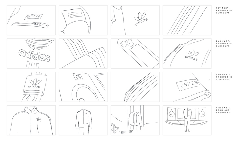
Product Close Ups
Key to the campaign strategy was getting users up close with the products (as it might be hard for them to see them in stores during the pandemic). Our initial approach was to use static renders alongside a faux-3D effect that would play with normals and cursor position.
To address this problem, we needed a new approach. By adding the garments into a 3D scene with a camera rotating we were able to zoom in on key areas while also providing users with context as to what they are looking at.
To help these close ups look realistic, we added some depth of field. At first we tried to blur the scene based on depth but we didn’t like the blur on the edges of objects produced by common real-time/performant depth of field techniques. Instead, we used a screen-space bokeh blur to highlight some areas and blur others. This approach gave us the feeling of a slight depth of field and allowed us to control better how the final image looked.

Managing Web Performance
The two main challenges we faced developing the website were performance related.
On one hand we had to render multiple 3D scenes at the same time when users scroll, drag between worlds or go from the home to any of the sections (and vice-versa). Some of these scenes also have reflections, which requires additional rendering.

The solution we came up with was to detect when the website is in one of these stressful and multiple-rendering states and alternate the rendering of the inner scenes in a ping-pong fashion: only one scene is rendered in a given frame and the other uses the previously generated render. Because these situations occur mostly when users are moving through the site the low frame rate rendering on these transitions becomes almost unnoticeable.
The second challenge we faced had to do with the weight of the assets. Because we went down the route of showing real-time 3D products instead of static images, we ended up having to come up with ways to optimize the loading of geometry and textures.
An easy and straightforward way to reduce the size of symmetrical geometries is to just export half of them and create two meshes, one rendering normally and the other with a negative scaling value on the X axis and backface rendering.

As for the textures we created a LOD system that first loads small size textures and then, depending on the user’s device capabilities, a high resolution texture that replaces the low quality one once loaded. This optimization was crucial to be able to show closeups of assets with multiple PBR textures.

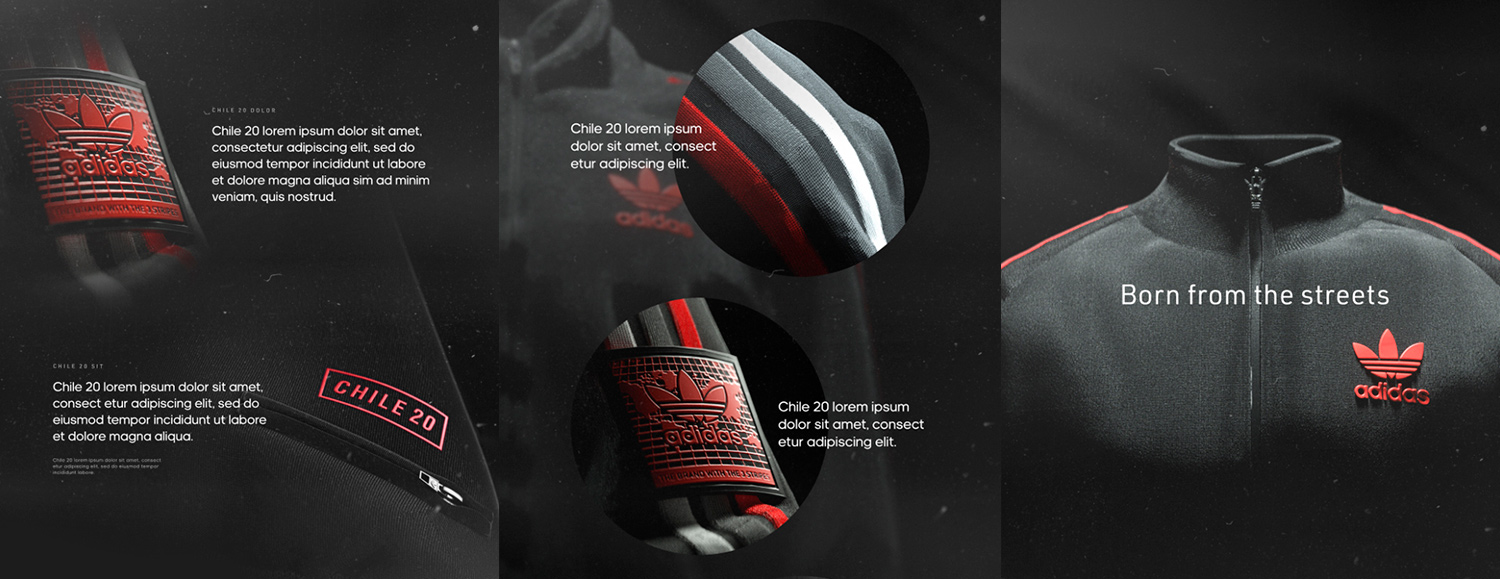
The Campaign Key Visual
The campaign key visual would headline the campaign across the website, paid media, PR and retail.
This went through many iterations as we explored the 3 stripes / 3 worlds motif across a range of different layouts and formations. We started with masks, which provided a slice of the product world stories - but eventually landed on a more balanced key screen that put the products front and center and used the stripes / worlds motif as a subtle backdrop.
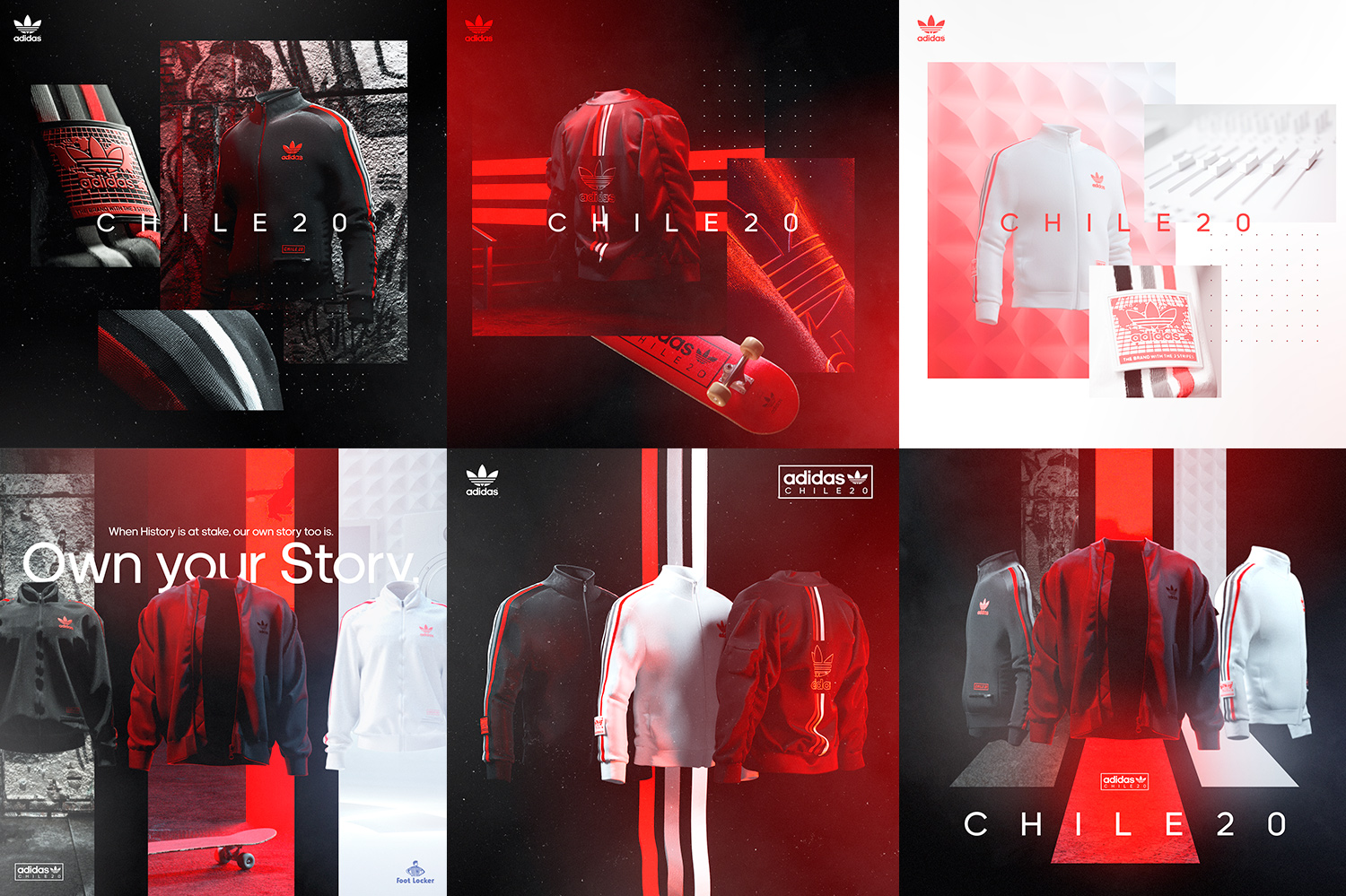
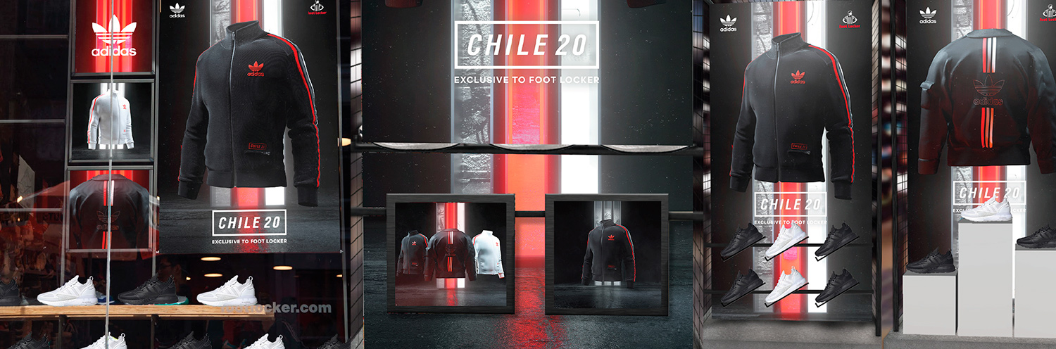
Extending it into Foot Locker Stores
For retail, we had to export the key visuals in many versions, with either the 3 products or each of them individually, in square/portrait/landscape formats. They were also called for in massive 16k layered comps. For time and performance reasons, we couldn’t let our computer run for days to render these visuals, so had to come up with a smart solution.
Using Topaz Gigapixel, a machine learning-powered tool, we were able to upscale visuals while preserving image quality. We then rendered out 4k layered comps in 300 dpi, 3500 samples (~35min straight in Octane), generated 16k images (~30min) using Topaz, then compiled layers and added post fx/logos in Photoshop. It saved us much needed hours or days of rendering!

Working with the support of Foot Locker and Intermarketing, the retail posters were then made available to Foot Locker stores throughout Europe.
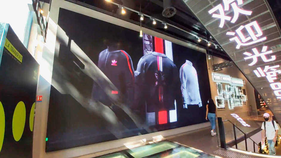
The Hero Film
The Hero Film.
The final deliverable of this project was a 15-seconds hero film for the collection, as well as three 6-seconds films for each product. This would be used on the website, as well as on other channels. We anticipated it early in our creating process by saving high poly models and 4k textures.
Very early, we agreed on a storyboard where we’d essentially use quick cuts of closeup shots of the products and their environment, then slowly zoom out on each of the 3 scenes. But once the key visual was defined, it became obvious to us to use it as the final shot of the film as it became the identity of the entire campaign, and to be consistent within all our deliverables.
We selected the most powerful parts of each product and played with camera easing to link them all in the video. We ended up not using the environments shots as it felt quite disconnected from the rest. In post production, we played with the colors and used applied a grain texture on top of the film to give it a more originals look.
We exported a total of 16 film versions for retail, social media, ads and media partners.
Conclusion
The CHILE20 campaign went live in September 2020 across website, social media and in store retail. It also had PR support from Hypebeast and Outpump. Despite launching in the middle of the pandemic with an all-new digital approach to production, the collection was met with a warm reception both online and in-store.
We thoroughly enjoyed the production process of working as the creative lead agency on the project. Thanks to all partners and sponsors on the project and we hope to team up again soon.
Company Info
Active Theory is a creative digital production studio with offices in Los Angeles and Amsterdam. Learn more on their site here.
Thanks for getting involved in the voting process and tweeting about it, @patrik_media you have won the Pro Plan, DM us on Twitter to get your prize! :)