We Blend, are a creative agency and a full time receptor of emerging trends. Our new website represents the last step of the challenge we undertook to refresh our brand identity which has led us to a brand new visual identity. Our aim was to highlight the specificity of our aesthetic approach and taste when dealing with communication.
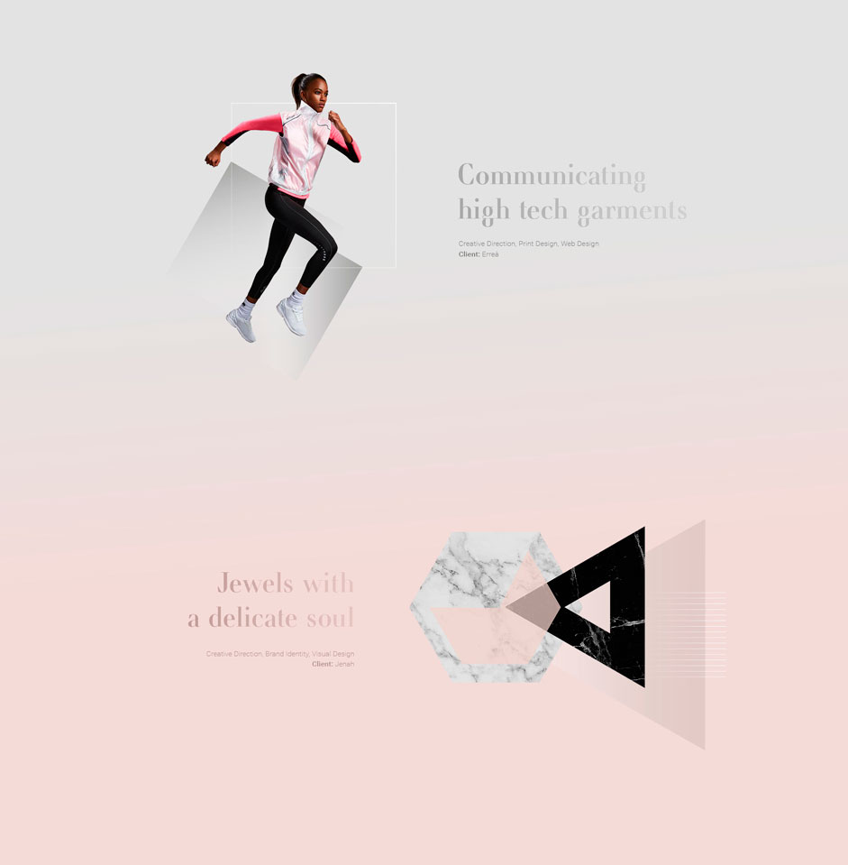
Work preview images
The concept: making the perfect Blend
Blend is not just our name, Blend is our philosophy. Our vision is to create a natural and fluid connection between brands and their public, but first of all between us and those brands who are asking for collaboration.
"Blend is not just our name, Blend is our philosophy"
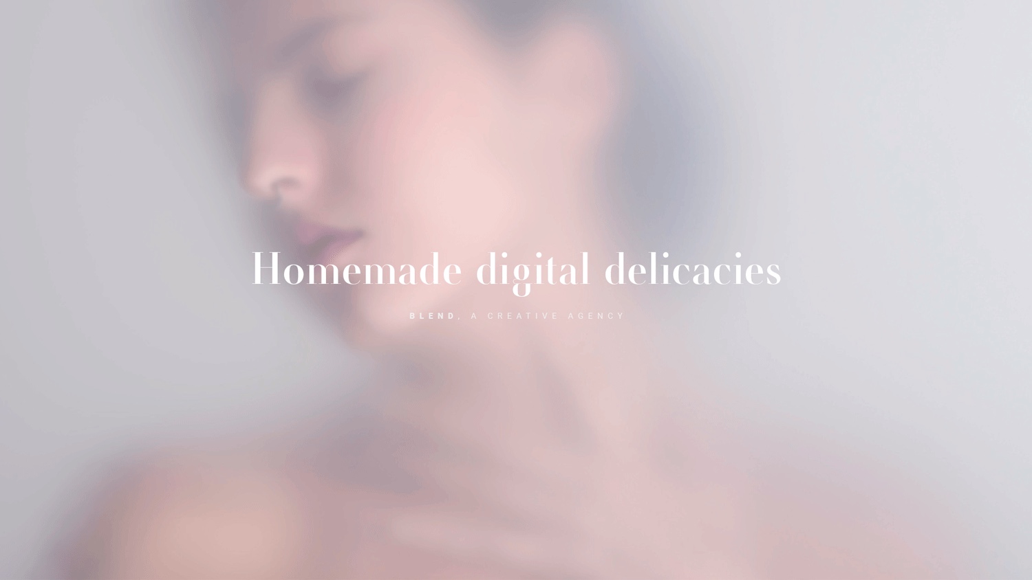
In the process of conceiving our website we put extra effort into letting its visual identity embody the attitude of making single elements part of an inspiring and seamless whole. By choosing a blurred photo as the main visual in landing page and with the addition of animations to every project displayed, we offer an unconventional experience to intrigue visitors of the website.
The design: form follows concept
Once we defined the main design concept ("making the Blend") we tried to shape its visual look and feel by using several aesthetic expedients. On the landing page we decided to use a delicate and poetical photo which, through its shades and blurring with the background, should convey the idea of blending and the feeling of the elegant and clean personality of our agency.
Every project is presented in a fluid continuum where, while scrolling, gradients shift from one pale tone to another with delicacy, gracefulness and balance.
The animations intermingle pictures with illustrations on the about page and in every work preview image in the homepage while the selection of colour palette of the typography matches the shades of the background.
The typography chosen convey a clean and elegant personality
An unconventional point of view about us
Since Blend is a place where ideas grow, we wanted to provide a new point of view on our creative process. Therefore we choose an aerial view for the pictures in the about page with the aim of changing the perspective completely, allowing users an unconventional peek at our work.
Experiencing the website
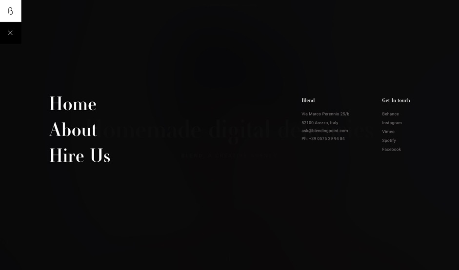
We translated the concept behind our refreshed identity providing the website with the option of double navigation, therefore the user can choose an emotional or a more informative way to explore what we created. By scrolling down the homepage, projects preview images are displayed on top of delicate monochromatic backgrounds delicately shifting from one soft colour to another making the transition smooth and seamless.
Each work is presented with clean and elegant animations which combine pictures and illustrations. By clicking on them the user enters the page dedicated to the single project by perceiving no actual load or abrupt transition from the homepage.
An element of surprise can be found on the "About" page where classy animated geometrical shapes appear unexpectedly from behind the team photos. The same outlined shapes are used in a sequence of animations to narrate "our creative path" in order to reinforce the storytelling with a visual presence.
We decided to give our website a custom cursor, which feels like a filtered blending lens when passing over pictures. The cursor has a functional effect which translates in a zooming-in effect that offers the user an immediate comprehension of clickable areas.
Technologies
In order to get the effect of the surfacing of a female figure from a foggy background in the landing page, two different perfectly overlapped photos have been used: one is completely blurred while the other one is set at its highest focusing.
The simplest solution would have required a single photo to zoom in and blur simultaneously through CSS transformations. However, since these transformations do work in real time on a big size image, such a solution would have required a huge waste of resources with a certain decrease of performance.
Instead, our solution is based on a minimal increasing of the two photos (scaling from a ratio of 0.96 to 1.0) and on the opacity of the blurred photo. This way, we obtained an high quality visual effect without compromising the performance, while making the presence of two different images completely imperceptible.
The animation of the single graphics have been realized with After Effects and then exported through the bodymoving plug-in into a JSON format. This technique creates several advantages such as a better control over the animations, while making it possible to provide one single JSON file containing all the information needed for the proper functioning of the animation (which is perfectly controllable through javascript and the body moving.js framework). This technique also enhances compatibility through devices and the lightness of exported files.
For the animations, such as the parallax and the appearance of texts and images, javascript presets have been created. Animations belonging to the same group share a common code, but have different settings. The duration of the scroll and the speed and the direction of the movements are obtained in a dynamic way through the html attributes "data-xyz". This technique allows to creare reusable presets while making it possibile to adapt each element to the various layout needs.
- Frontend Frameworks and Libraries: JQuery, GSAP, bodymoving, ScrollMagic
- Backend Technologies: None
- Server Architecture: Apache, PHP
- Tools: Adobe Photoshop CC 2018, Adobe Illustrator CC 2018, Adobe After Effects CC 2018, Adobe Dreamweaver CC 2018
Company info
Blend is an Italy based creative agency, a fluid connection of experimental thinkers whose commitment is to provide high quality contents though an unconventional, poetic and seamless aesthetic.