The latest Viens-là’s website is the fourth version since the creation of the studio back in 2011. Our website has always had the same key points: a friendly and colourful art direction, a seamless navigation system, and meticulous attention to detail.
But the most important thing for us in a portfolio, is to differentiate ourselves from the competition. The client should be able connect with us saying “This is right up my alley”. Our previous website hadn’t been updated in four years. It portrayed a vision that no longer fit our current ambitions. The studio has matured and has to establish a more serious take on things. It was sometimes perceived as fresh and amusing; qualities that can describe our team but no longer our current approach.
Conception
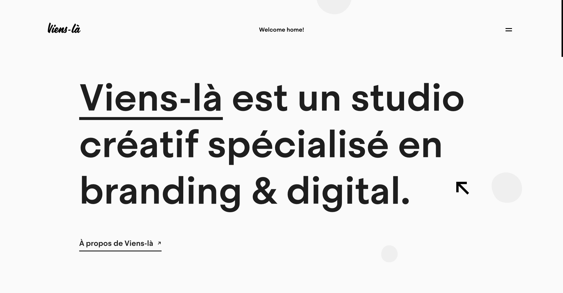
The project started during the summer of 2019. Initially motivated with the ambition to grow Viens-là’s brand image. We all agreed that we should take our time and release a website that resolved the incoherence with the studio’s current reputation : how do we mature the studio’s image while still maintaining the friendly and fun side of things ? How do we push the boundaries of digital creativity yet be understood by the general public ?
The foundation for our reflexion was to start off with something much simpler and professional while staying fun and being able to keep the studio’s traditions. We had the idea of working with circles and rounded shapes and use this as the governing principle for the navigation within the site, and more globally, the new identity for Viens-là.
Alleviate and simplify the website
Most importantly, the content needed reorganizing : we wanted to bring more importance to the content that is essential. In other words : our projects, our know-how and the presentation of the studio. In today’s age users don’t have a huge amount of time to dedicate to going through all the pages of a website. We had to get straight to the point and make the most important things stand out.
Creation
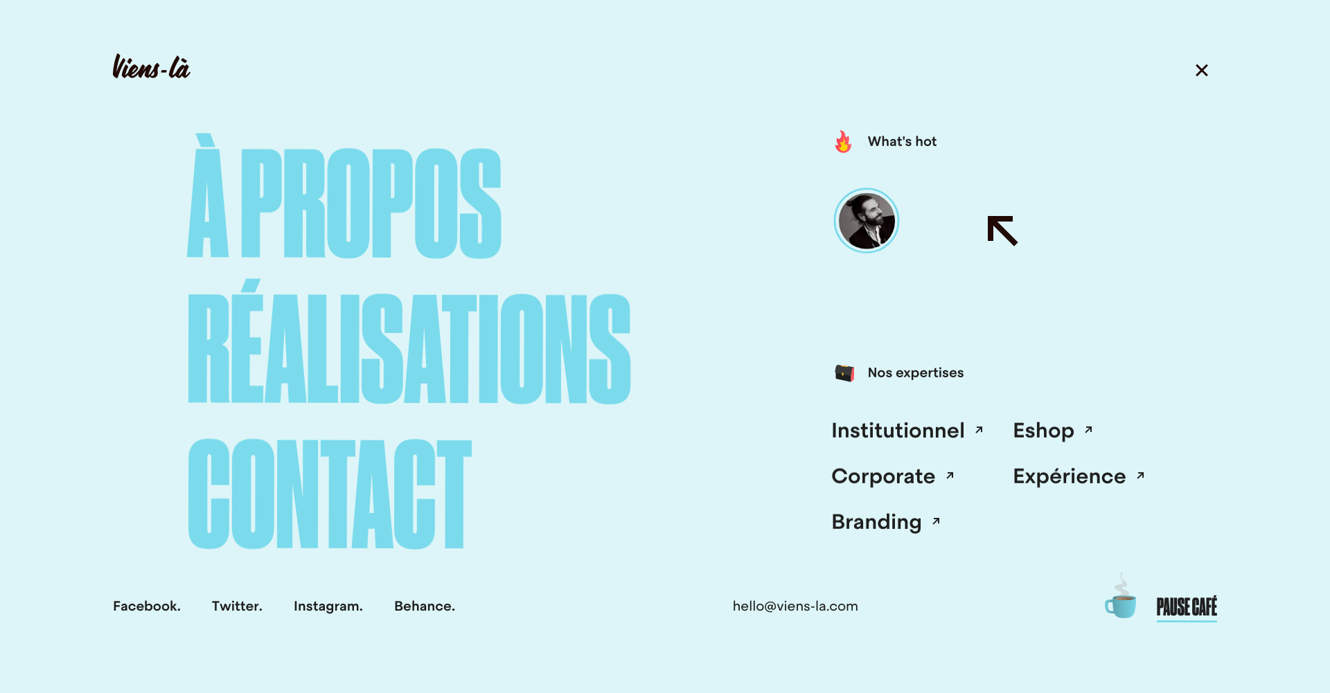
The art direction had to represent the studio and be forthright while remaining creative and easily understandable for everyone. We decided to move on from the blue-green-yellow gradient that has long been emblematic to Viens-là for a more “serious”colour palette. We wanted freedom in the terms of colours we used throughout the website, especially for project pages, where the colours could easily be adapted to the art direction of the project.
The typographic choices help the art direction in the quest to be subdued and modern
As well as simplifying the sites navigation, the typographic choices help the art direction in the quest to be subdued and modern. The use of a condensed font helps make an impact and contradicts the smoothness of the shapes and animations. The objective being to show our know-how on how to create a perfect balance (as all things should be), and the experience we have developed over the years.
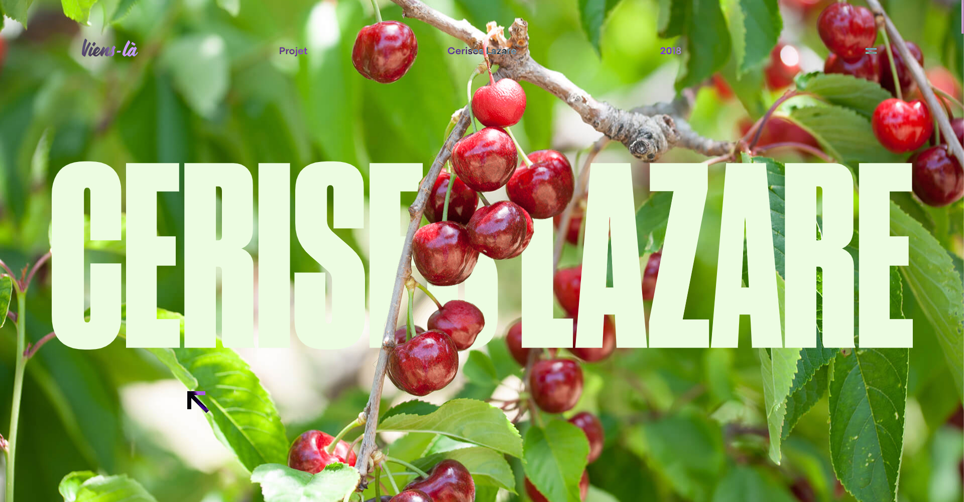
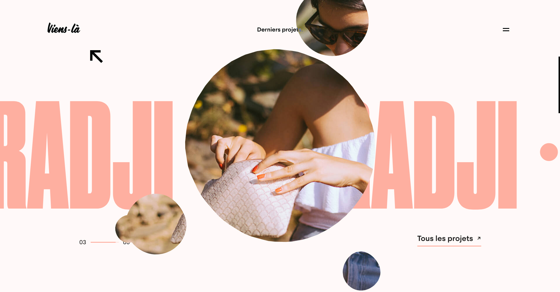
The page covers received particular love and care. Each project image has been cut into two layers to interpose the title between them creating a unique effect. We also recall the use of circles which is used as a mask to contain these layers. Different colours are allocated depending on the project. This allows us to create a cohesion throughout the site, but also allows each project to be individually distinct from one another.
Throughout the site, interactions and animations enrich the experience and the art direction. The circles however remain the heart of the animations : being with the depth that they create, or how they are used for the navigation. They may follow the cursor, be used to reveal images or show a point of interaction when hovering over elements.
To achieve this, the website is running a Three.js canvas within each page that allows us to pass certain HTML elements in front or behind it to our liking. This means we can cleverly have the circles regroup behind a button to allow the text to remain visible but overlay other elements such as a slideshow to show that there is a possible interaction at a certain point on the page.
Each circle is in fact a 3d mesh, a basic sphere that is deformed with a noise function and then continually rotated, giving it a gooey appearance. This allows each circle to pass in front and behind other elements in the WebGL 3d space as can be seen on the project slider on the home page. The main difficulty was getting the WebGL 3d elements to line up correctly with the HTML elements, no matter the screen size or resolution.
Goodies and Easter Eggs
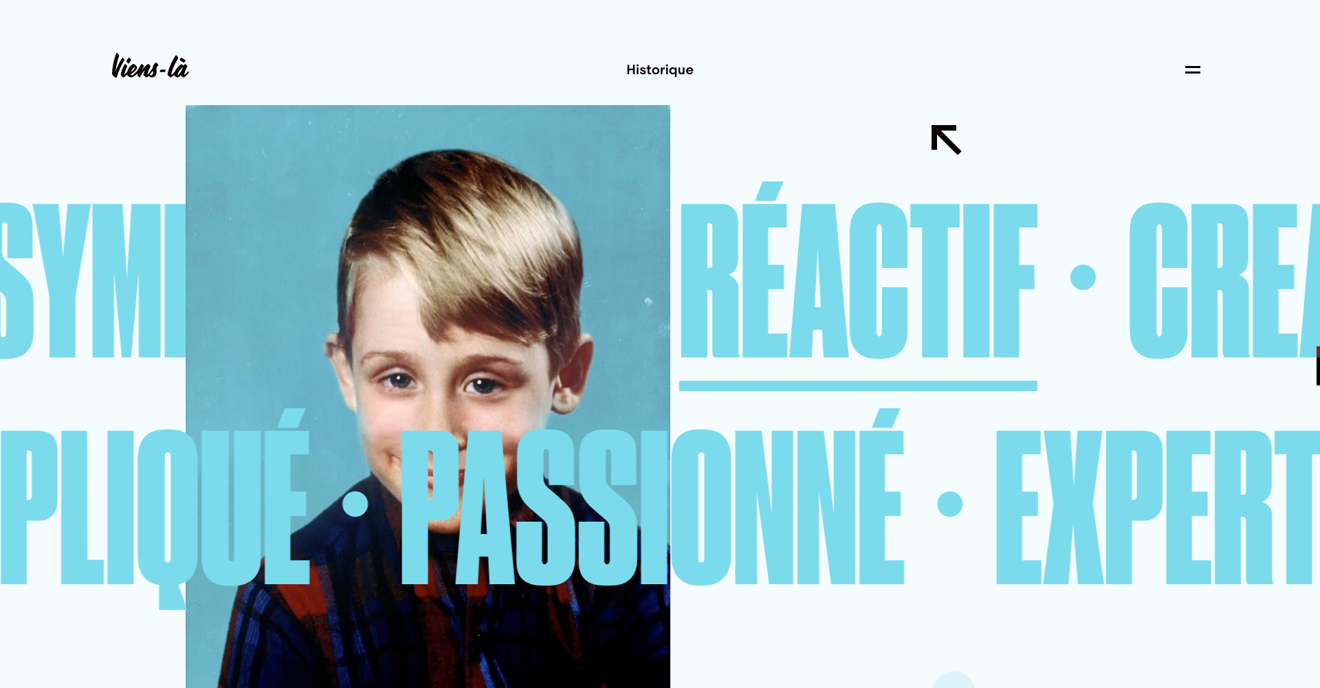
Every Viens-là website has a set of goodies and easter eggs! They are very dear to us. During the first phases of reflexion, the idea of having 6 words to determine the studio was something we wanted to implement. This lead to representing each one of these words with a character from pop culture, and bringing them to life! The ‘90s are part of Viens-là’s DNA, we had no choice but to have a bit of fun morphing famous celebrities from that era.
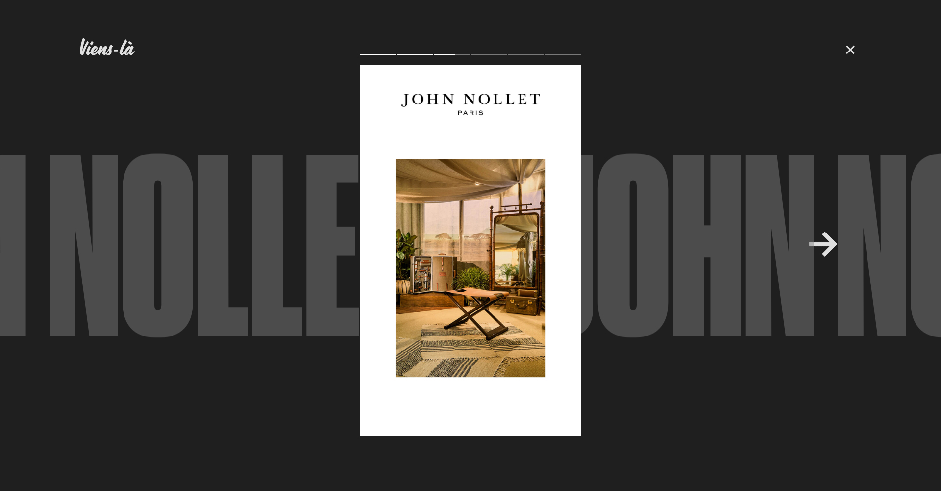
• Stories “à la” Instagram: the ideal format to showcase a project. Afterall… if Instagram stole it from Snapchat, why not us?
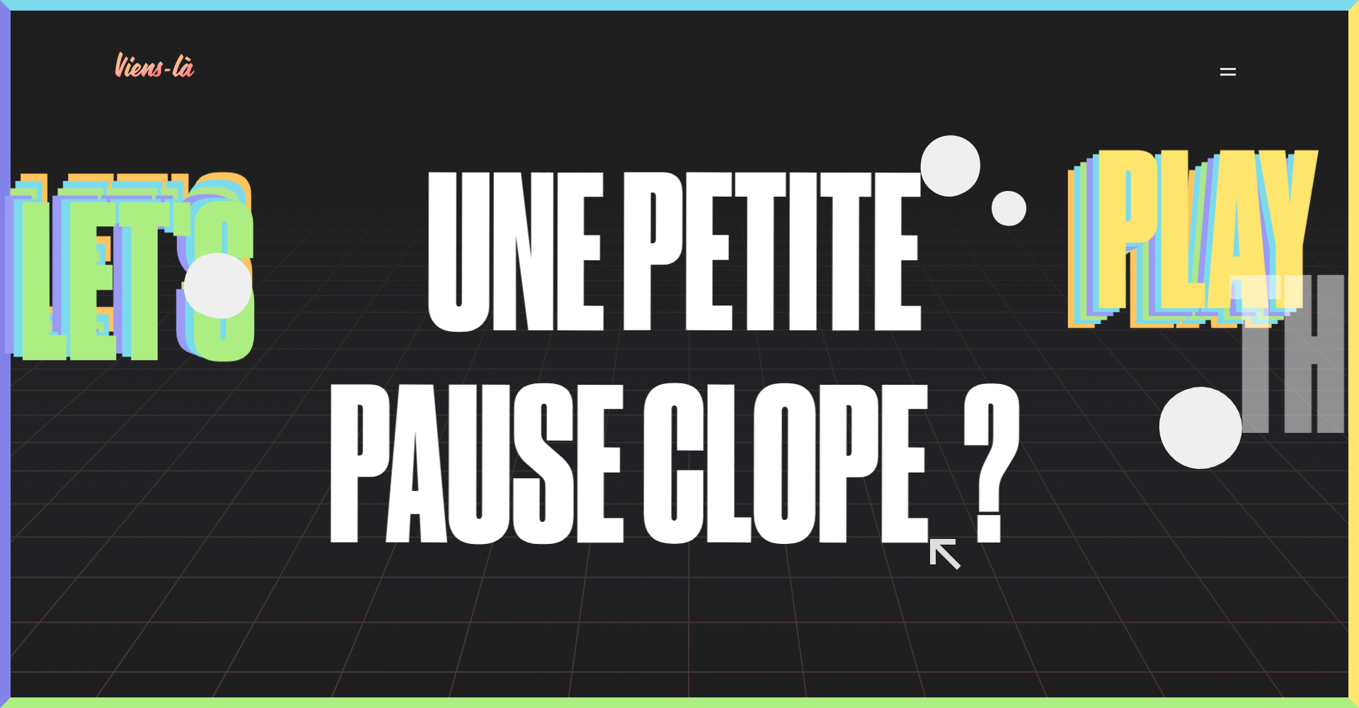
• “La pause café” : the unique compilation of game made by Viens-là.
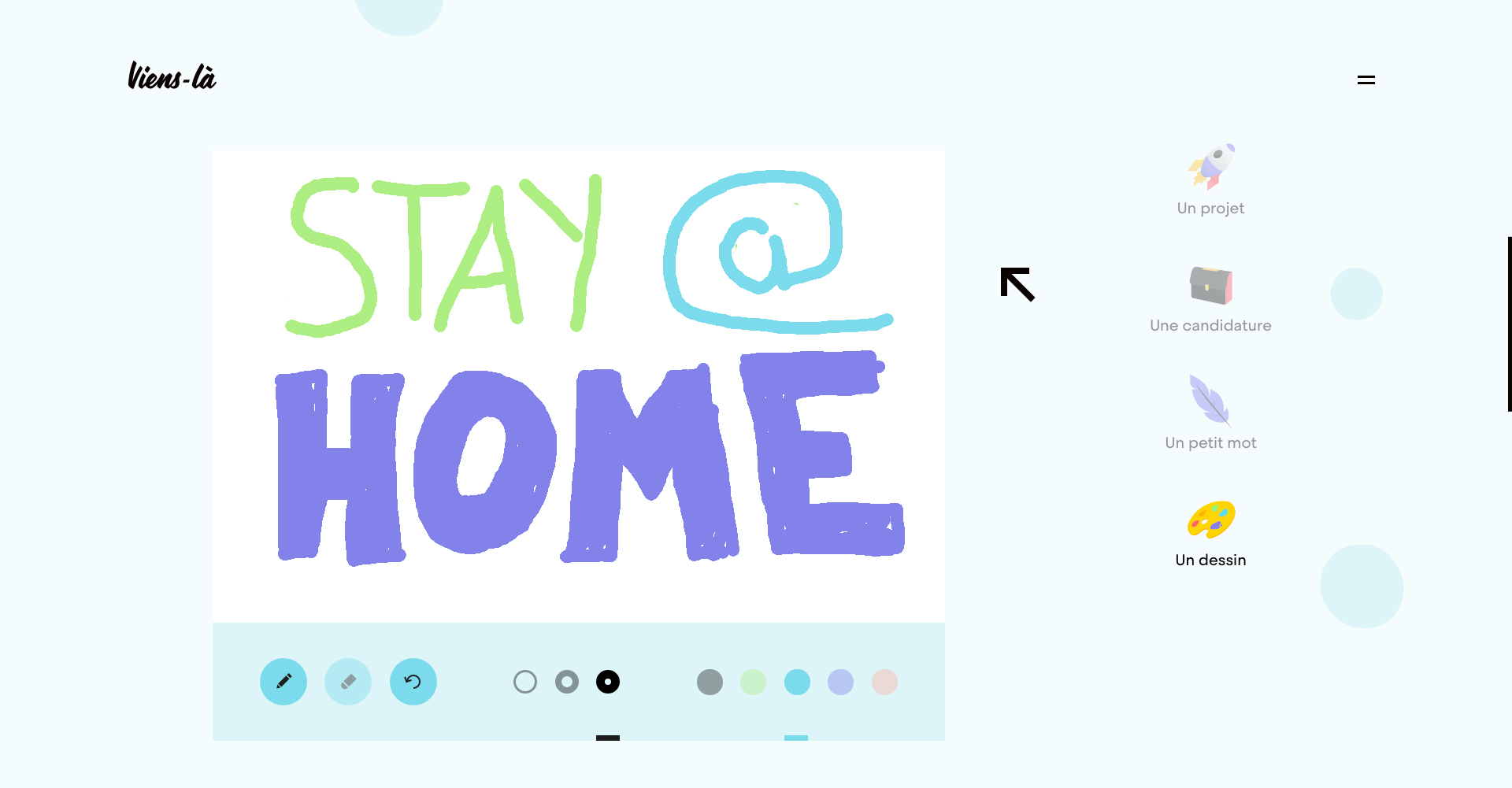
• The contact page : we wanted it to be simple, straightforward and most certainly fun to get in contact with us. We wanted to go above and beyond the average contact form, so we made it so that you can send us drawings, drop us a line, or send us love letters!
Technologies
The backend of the website runs on Wordpress, it’s as simple as that, just as do all our productions. Front-end wise, we’re running Three.js for the custom WebGL animations, Anime.js to animate HTML elements and Barba.js to allow us to create custom page transitions. Everything else is homemade with a few in-house secrets.
Viens-la
A creative studio based in Paris, founded by Nicolas Roume and Frédeeric Paquet in 2011, Viens-là thrives on creating high-grade websites and has over the years gained recognition within the community, from the art direction to the animations, the user experience and the meticulous back-office. We englobe the entire production line to guarantee the final product. Our strengths? The flexibility of our art directors, our network of freelancers that have all worked at Viens-là at some point in time, and our ability to have fun while we work!
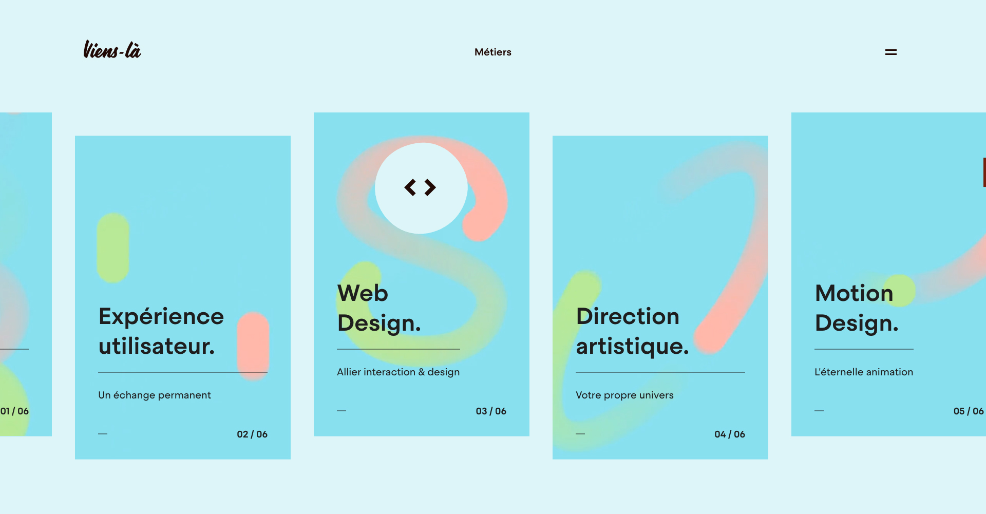
We take pride in human relationships, be it with our clients, our teams or our contractors. With time, Viens-là has become a big family that we are all proud to be a part of. Put simply, Viens-là in 6 words : creativity, reactivity, passionate, determined, expert and fun.
