Introduction
Before we start diving into the project itself, let me explain the two main reasons for the creation of our brand:
1. The Freelancer's Curse:
'Sorry, we feel more comfortable working with a big agency over a solo freelancer'. Those were the words I heard over and over again in the last couple of years presenting myself as a solo entrepreneur. From a customer's point of view pretty reasonable I guess.
Therefore, I had this gloomy prediction that I might hear this argument again pretty soon when one of the Fortune Top 10 companies invited me to a pitch in April 2017. So I worked even harder on my pitch deck and managed to get to the final round along with a big agency. I guess you can imagine how it turned out.
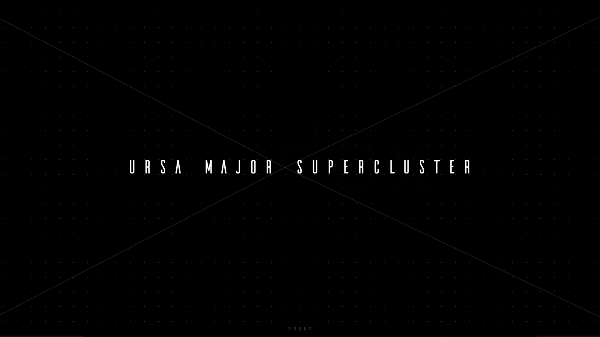
After losing the pitch due to the 'freelancer's curse' I sat down with my long-term development partners and we decided to create a brand that would represent myself and a team of talented people to collaborate with if we have to handle more complex jobs. This union is now called URSA MAJOR SUPERCLUSTER.
2.The development attempt:
Certainly, nearly every web designer has had the pleasure of sitting in a room with their developer, staring at the same screen over and over again, fiddling with and tweaking a site until they actually start hating their very own project. This procedure inevitably leads to a moment where you tell yourself: I wish I could develop all of it myself. The idea of a 100% solo created website stuck in my head ever since the start of my digital career. Therefore, my long-term goal has always been to create a high-end website (front-end) completely on my own.
So I took the chance when developing URSA MAJOR SUPERCLUSTER. Although the brand stands for a team collaboration to service big projects, I decided to make this my solo created website-project debut.
The approach
“It had to be nuts”. Nothing like a typical kind of agency website. URSA MAJOR SUPERCLUSTER had to stand out from all other agencies or studios. The style of the site had to fit the brand name. Futuristic with a touch of retro in order to avoid a too clean and overly styled look.
We live in a fast-paced world and people tend to scan content in a very shallow way. In order to catch the user's attention my intention was to create a playful and unique entrance experience to the site. It had to be kind of strange and experimental but without being weird or awkward.
Sounds irritating, strange and complex? Perfect.
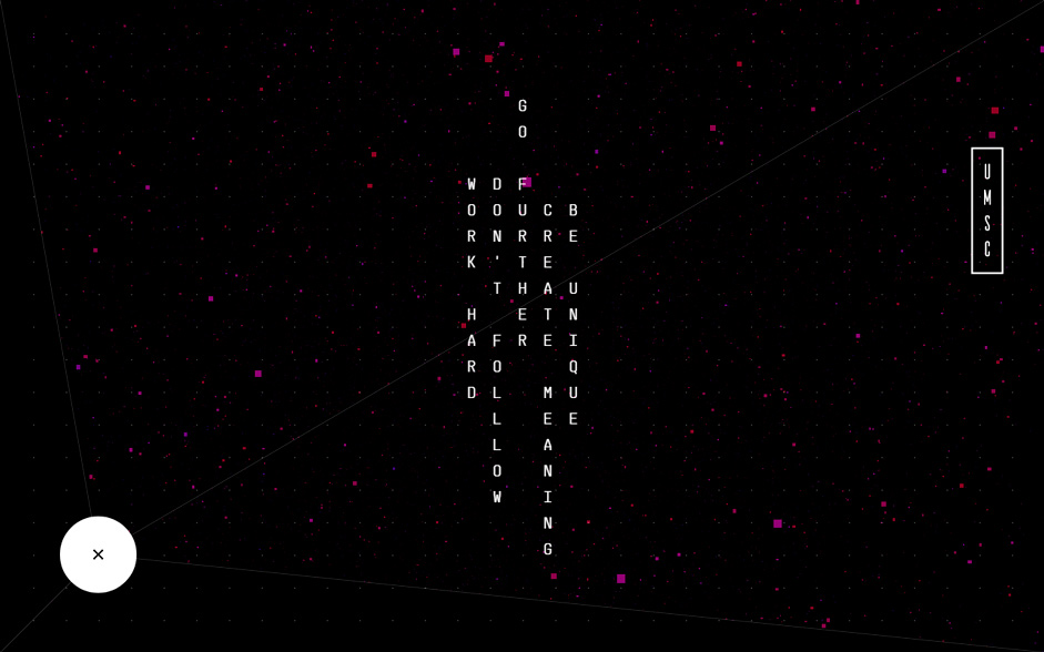
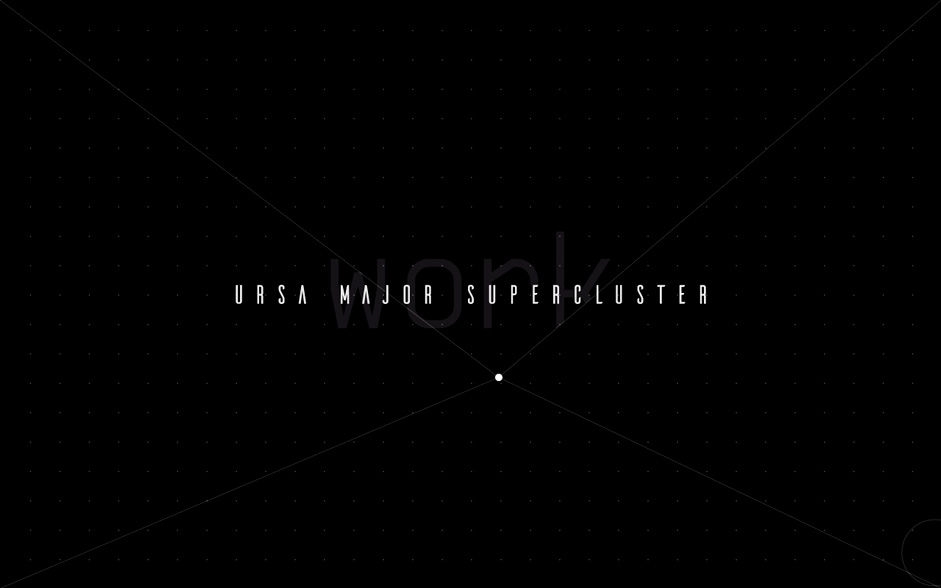
I started searching for a completely new approach to building a site structure. After I playing with various ideas, I got stuck with the geometrical concept of 4 lines stretching from the corners of the viewport to the current mouse position. This creates 4 triangles, 2 of which reveal their content when moving the cursor to the opposite side. Sounds irritating, strange and complex? Perfect.

Side note:
I’m not sure if anyone noticed that the text on the codex page appears like a silhouette of a person as I arranged the letters in a special way.
The challenges
Oh boy, where shall I even start? The whole project has been a huge challenge but let's split it up into three main tasks:
1. Javascript
Three months ago I didn't know how to write a single line of JavaScript code. I had some basic knowledge of HTML and CSS but the only thing I knew about JS was the statement I heard over and over again from developers: 'That's not possible in CSS I have to do it in JS'.
Therefore, I knew it was something more complex and harder to learn. I started to build up very basic knowledge via Codecademy’s JavaScript course, however after I finished it I was kind of discouraged. It felt like trying new walking boots when climbing Mount Everest without any climbing experience whatsoever.
It kind of felt like the levels in ‘Inception’ when I had to google the answers to my questions to find a solution to a problem of which I couldn't even understand the given answers on stackoverflow.
Nevertheless, I just started using Paper.js and its awesome documentation and began to build one element after another. It kind of felt like the many levels from the film ‘Inception’ when I had to google the answers to my questions to find a solution to a problem of which I couldn't even understand the given answers on stackoverflow. So I eventually completed hard-fought and finished the product, working 8-16 hours every single day, seven days a week.
2. The UX issue
To be honest, the UX really has been a tightrope walk. On one hand my aim was to surprise the user with something unique and new, on the other hand it shouldn’t be redundant or clunky to use. I aimed for the user experience to be a rush from being confused to entertained to finally impressed and all that within seconds. In order to achieve this, the navigation response had to be proper to every action, leading to the right direction while exploring the homepage. Once understood, the navigation should be as entertaining as it is fast and efficient.
Part of my marketing was to gain further public attention for the site through applying for potential awards through various platforms such as Awwwards, Cssda or Fwa. Usually UX ratings for experimental websites are judged harshly (especially experimental navigation). So I had to take those considerations into account and did not go all in for “craziness”. But luckily the site performed very well (otherwise I wouldn’t be writing here).
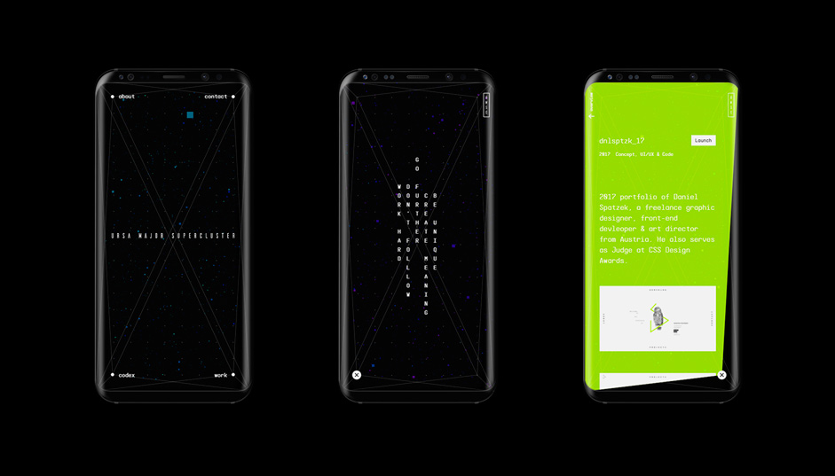
Responsive Troubles
Due to its strange nature it was difficult to translate this site to small mobile devices. Although I decided to stick to the desktop version on tablets, I had to recreate the main part entirely in order to achieve an easy-to-use experience on smartphones.
Technologies
The website uses HMTL5, CSS3, JavaScript and LESS. The main part, the navigation and homepage, has been created with Paper.js. Paper.js is an open source vector graphics scripting framework that runs on top of the HTML5 Canvas. Big thanks to Jürg Lehni & Jonathan Puckey for developing - It’s absolutely awesome and simple to use! Other frameworks I used are three.js (3D pixels), GSAP (animations) and jQuery.
Tools: Atom, Adobe XD (tested on this project), Adobe Audition, After Effects, Photoshop, Illustrator

Company Info
Daniel Spatzek is an award-winning freelance web-designer, art director and creative frontend developer from Austria. His work ranges from digital design, branding, illustration and traditional graphic design to photo art direction and conceptual collages.
Since summer 2017 he has been running URSA MAJOR SUPERCLUSTER, a digital design studio specialized in unique and eye-pleasing digital solutions.