INTRODUCTION
The Gigi project comes from the desire to think beyond and overcome the widespread conformism of the Fashion Industry, designing something new but yet immortal. The concept comes from the intrinsic collection’s identity, creating the foolproof bond between design and designers. Let’s get right into it.
DON’T LOOK BACK
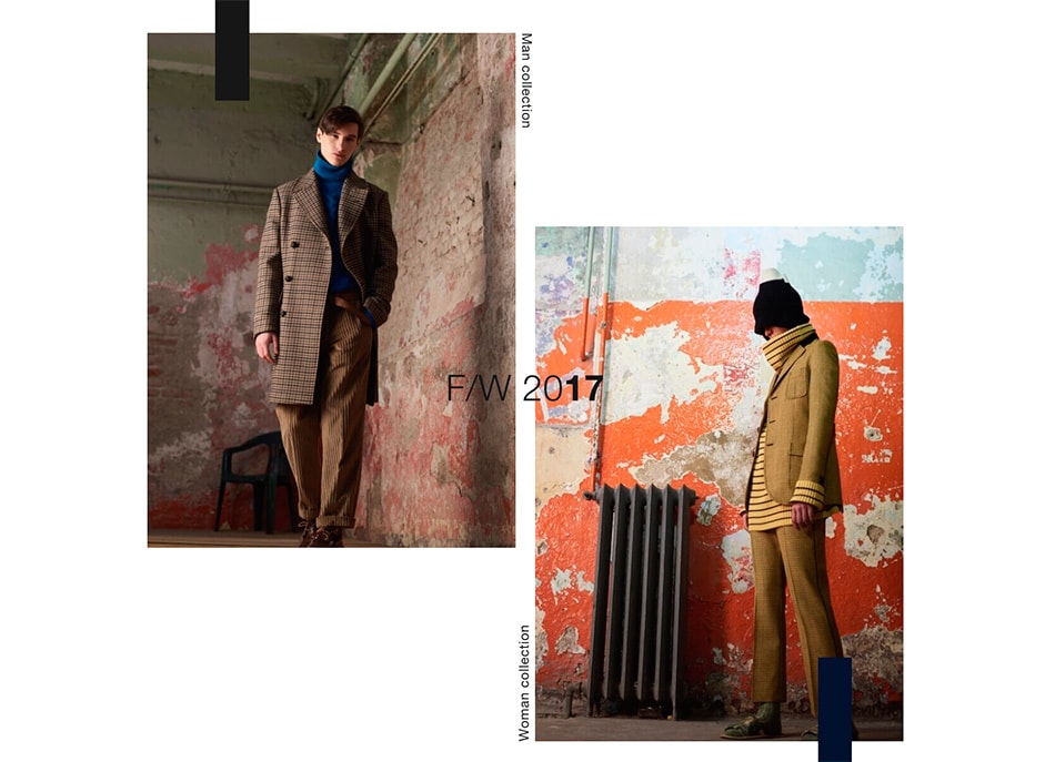
The Gigi is an international brand born and raised from the brotherly collaboration of Pierluigi "Gigi" and Mario Boglioli, who initially have taken root with a men-only apparel project. Today the collection is implemented with a womanly glimpse, thanks to the special involvement of Ana Gimeno Brugada: a Spanish-born designer who boasts plenty of experience with brands including Dries Van Noten.
With “The Gigi”, we talk about progression - and even its motto is the proof: don’t look back, a significant mantra that pushes towards improvement and being ready for the change.
THE APPROACH
We ended up at the dawn of the Brand new SS 2018 Women’s collection, a moment when we had the opportunity to start a direct creative comparison between art Directors. It’s not only about digitally communicating: the project is even knottier compared to the release of the platform itself. It includes a meticulous restyling on the base of the fundamental brand values, to give extra appeal and a greater panache.
We did not touch the logo, but we intervened with our personal view of design, typography and styling, collaborating together for a fresh rebirth of the brand. Starting from their corporate perception, we rebuilt the entire communication conveying an out-of-the-box approach - as we are used to - from the brand review to the digital marketing (social media guidelines and strategy).


DESIGN
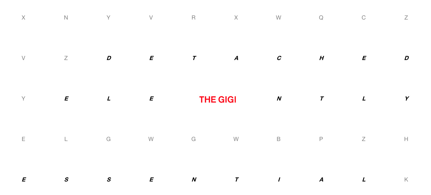
For the design, we kept a playful tone of voice all around using elements like the crosswords in hp or the cross pattern.
The final result is a cutting-edge product made with distinctive creative thinking, a product that talks to a cross target, reaching every person stylistically united.
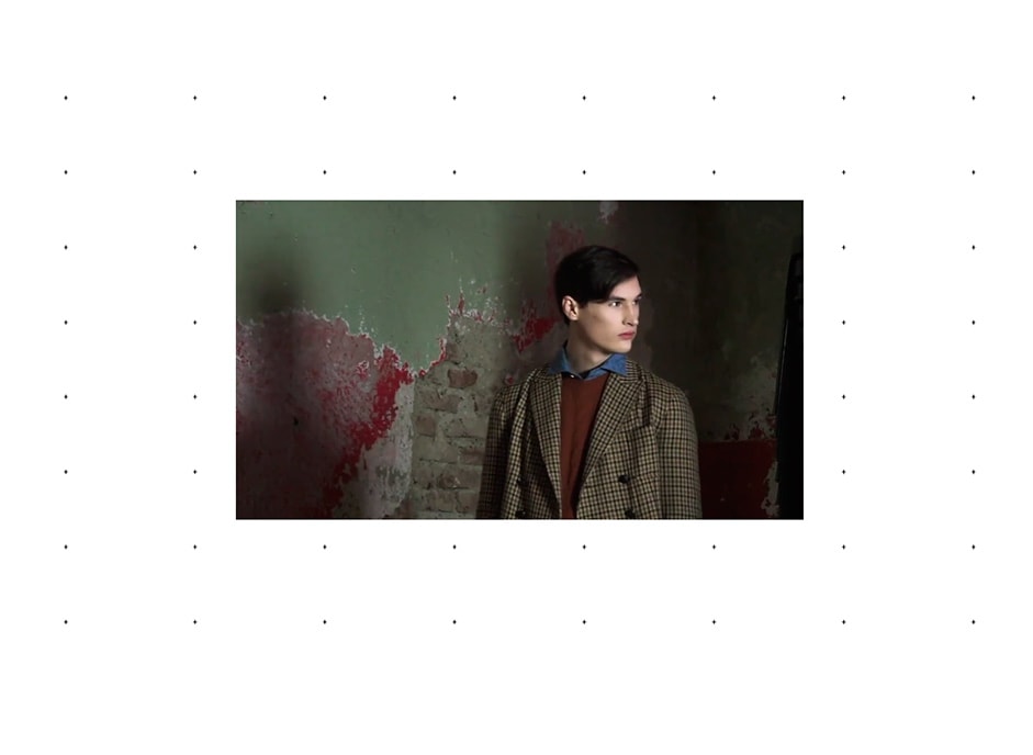
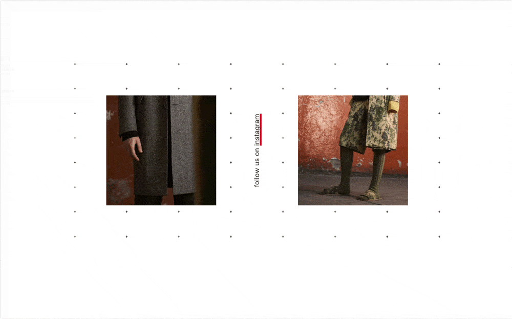
The nature of the collection is translated into digital and you can find it in each particular element designed for the brand personality. The typography interposes itself as a leading component of the pages, alternating pictures and graphic marks. Right at the base of the layout, clean lines exalt both the brand’s personalities - respectively for the men’s and women’s collections. The use of white space serves to glorify all the pictures.
TECHNICAL ASPECTS
The website is written using Vue.js and configured with webpack and vue-loader like some of the digital projects made by Adoratorio.
The CSS, scoped, is pre-processed by Sass and stuffed by a long series of custom mixins, functions, utilities and a custom base configuration.
Animations using GSAP and different libraries have been used for the project: some of them written by us, like the smooth scrollbar. All the different Canvases are self-written with native Canvas API for a best support and better performance.
The Gigi has requested no back office, therefore to push data to the front-end we used Firebase as CMS and rest API. Deployment is made on Heroku using express.js as a web server.
ADORATORIO STUDIO
Adoratorio Studio is a multidisciplinary digital agency based in Italy: we are cool kids with a natural instinct for beauty edgy-ness; we touch the digital world with hand crafted, significant amazingness. Our idea of beauty is pretty clear: there’s no amazing in meaningless stuff; that’s why we always try to pair stylish appearance to powerful messages, embracing various fields all around the digital world playing freely around tech and skills without putting bonds to creativity and imagination.