The Message to Ukraine site is a dedication of love for our home country. We created this project to celebrate the 30th anniversary of independence in August 2021. It is a special one for us: here we try to show the uniqueness and beauty of our country, talk about the people and cities, and remember your favorite national dishes.
The author's poem is the basis of the site in the form of our favorite storytelling. An interesting feature is a custom font that we made for this project. These days "The Message to Ukraine" is acquiring a new meaning for all Ukrainians and all who love and stand with our country.
The Main Idea
In 2021 Ukraine celebrated its 30th anniversary of independence. The idea of a site creation was born in our team. We wanted to create something special that could find a response in the heart of everyone who visited the site. We didn’t want to give any political mood to the project, we wanted to tell the world about Ukrainian people and our traditions, about our cities and favorite food, about creativity and language. And we succeeded with it! The whole website is one story with cool animations. It has horizontal and vertical scrolling. Users can find an interesting menu layout and an About page hidden in the menu.
The whole website is one story with cool animations.
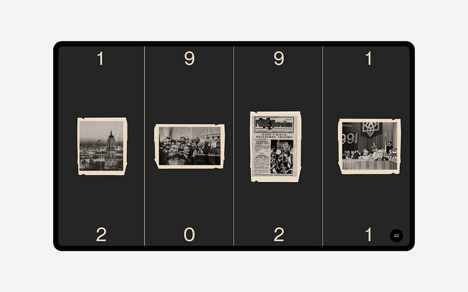
In order not to deviate from the styles of the site, we decided that the menu would also be divided into 4 lanes as a preloader. First, we show the years 1991 – 2021 (now 2022). This is the period when Ukraine became independent. And these 4 strips are also like sheets from a book that touch and overlap each other.
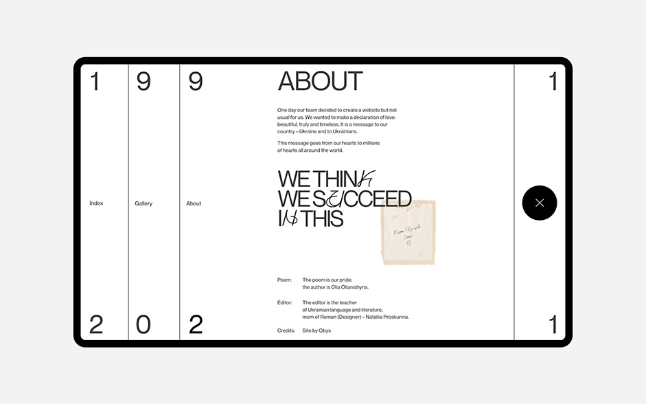
In the menu each strip contains its own information branch, and when you hover over them, elements appear that correspond to these pages. But we decided it didn't make sense to have a separate page for About, since we didn't want to show a lot of information there. Therefore, when hovering over the About branch, the user immediately sees the information.
We wanted to create something special that could find a response in the heart of everyone who visited the site.
The Content: from Images to Poem
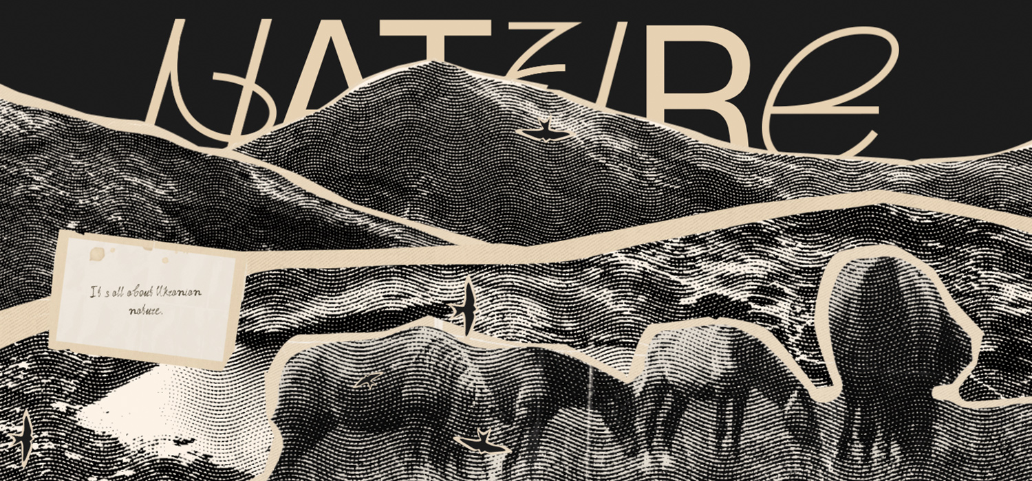
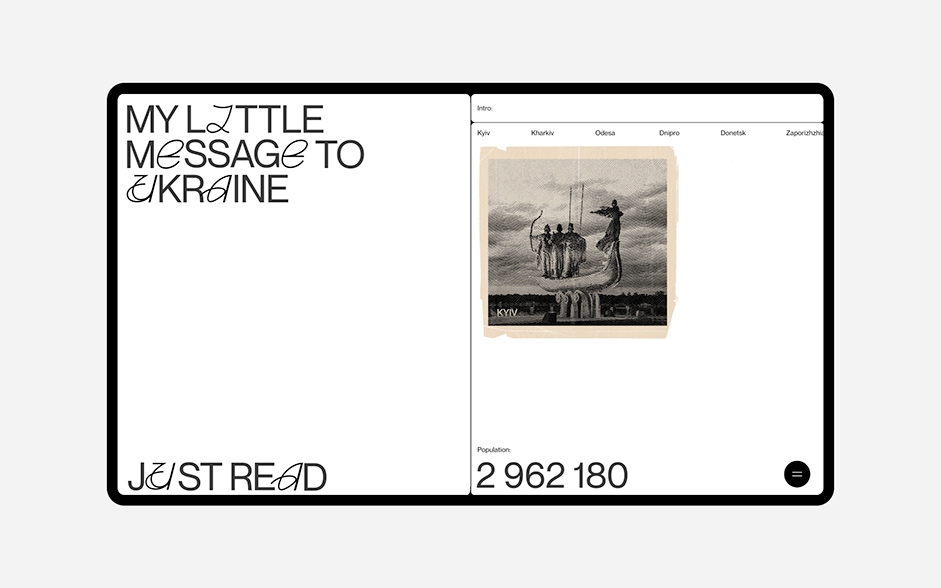
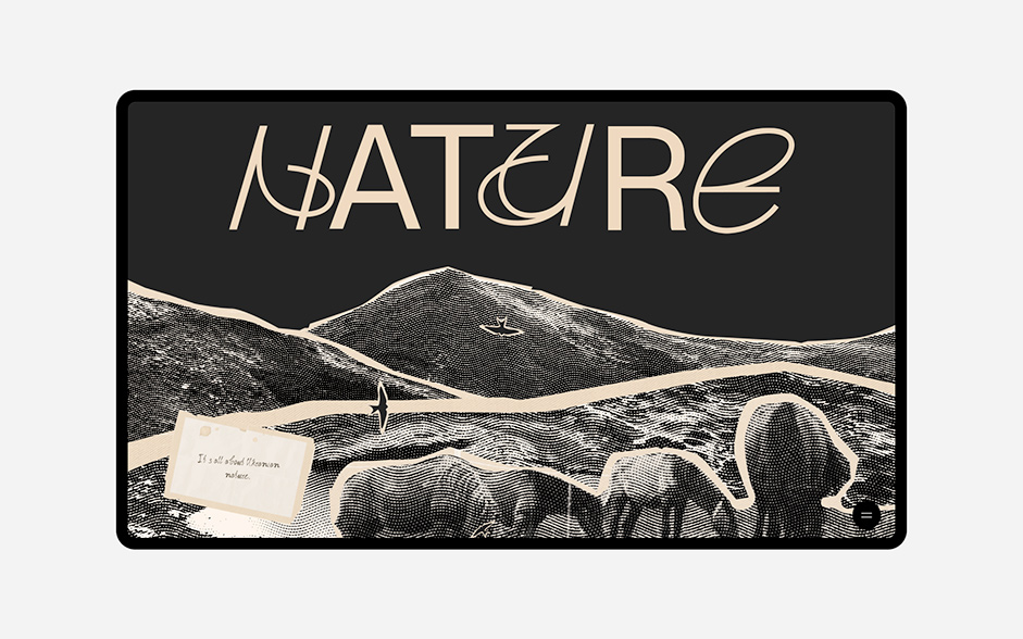
When we started coming up with ideas for the future site, we were faced with the issue of content selection. We wanted to use copyright-free photos, but at the same time everything should be in the same style, not look too simple and reflect the whole mood and soul of the project. The site has a lot of historical photographs and paintings. Therefore, at one of the brainstorms we decided that we could try to make all the pictures in the form of clippings from newspapers, books, etc. First we made the shape, then we picked up the styles so that it looks like old sheets of paper. And in the end, to give it an even more interesting effect, we decided to process all the photos in a halftone style. All these effects made all the content, all the graphics and photos on the site just like we originally envisioned. We tried to make all the content in Ukrainian style and mood.
Since there are a lot of clippings on the site that interact with each other, touch and overlap, we decided that the information can also be divided into blocks, as if they were different sheets and they would run into each other, touch etc.
The poem is written by our team member and corrected by our designer’s mum (she is a teacher of Ukrainian literature). It became a kind of basis for the site, determining the main vectors of this digital love letter. We tried to fit as many interesting details as we could onto a small site and dive into everyone’s soul.
The Font Combination
Two fonts are in order to make the site unique, we didn't want to write all the phrases in one font to make the accents. We created our own font completely. We created it specifically for this project in order to give it a more Ukrainian identity and to enhance the impression of the content on the site. We are inspired by the works of Georgy Narbut, Vasily Krichevsky, Vasily Ermilov when developing the style. Paired with sans serif, this font adds a unique stylistic touch. This year we are planning to release the entire font with a beautiful name “Krasa”.
Technologies
We have already said more than once that Readymag is a tool in which a designer can implement his ideas without developers. In addition, we had a very short timeline (we only had one month from the idea to launch) to come up with and implement all our ideas, and Readymag was perfect for this. We love scroll-based animation because it allows us to surprise the users and create unexpected features for them. And, of course, the scroll-based option is easy-to-used on Readymag. But at the same time, we need to come up with new features every time.
P.S:
The birds on this site are a symbol of freedom and independence of Ukraine. More than a month has already passed since Russia invaded our country. For more than a month, Ukraine and Ukrainians have been fighting for our rights and our freedom. If you want to help Ukrainian children and people, please follow the links of the funds – Voices of Children and Help Ukraine Center. Or any other you trust.
#StandWithUkraine
Company Info
Obys is an Ukraine-based design agency that creates unique graphic and web experiences all around the world.