Why another studio page? Good question! After the launch of URSA MAJOR SUPERCLUSTER v2 last March, Spatzek Studio was actually the second studio page within the space of a year. Now you may be wondering why I went through this struggle twice in such a short space of time.
The reason is simple: The URSA MAJOR SUPERCLUSTER 2019 (UMSC) the site was the biggest fail in the history of web design. Go check it out, otherwise you have no idea what I'm talking about. Oh and while you are there slap on the heart icon on awwwards ♥
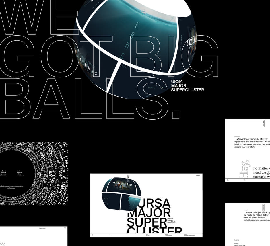
Contrary to our expectations, the UMSC site bombed completely
Contrary to our expectations, the UMSC site bombed completely. It did not perform well on mainstream awards websites, and we did not get many inquiries (though it worked well on more niche and art-oriented award sites like SiteInspire). Due to its very experimental and artistic approach the site did not really resonate with the audience, so after some time it was pretty clear that we took it too far. But enough about my ‘fails’ (yes, there are quotation marks because I’m awesome). Let’s talk success! That brings us to the new Spatzek Studio site.
Learning from my mistakes, I completely changed my approach. But before we get into that, let me tell you more about the new studio:
- Spatzek Studio is pretty much the same as URSA MAJOR SUPERCLUSTER, but with a little twist:
- It’s not just a freelance collaboration brand like UMSC has been. It’s an officially registered advertising agency. I know nobody here cares about that crap, but I had to mention it.
The name ‘Ursa Major Supercluster’ was pretty funky, but hardly anybody was able to memorize it.
Why the name change though? The name ‘Ursa Major Supercluster’ was pretty funky, but hardly anybody was able to memorize it. Therefore, it was not at all appealing to the Austrian audience. I opted for the non-creative but sexy name ‘Spatzek Studio’ to make it easier for the local audience. Plus, I am the Brad Pitt of web design in Austria (according to recent statistics more than 10 people know my name - numbers are rising).
The approach
Contrary to its predecessor, the new site should not be overly fancy or rely too much on creative effects. Pretty much the opposite was the goal: A good-looking website with a simple structure, easy to use and understand, yet appealing and unique. Sounds boring? Yes. Did it end up being boring? Nope.
I did not try to create aesthetics and effects to make the content interesting. Instead, I started creating actually interesting content.
Since the goal was the opposite, my creative process had to be turned over as well: I did not try to create aesthetics and effects make the content interesting. Instead, I started creating actually interesting content. Mind-blowing, isn’t it? When it comes to About Pages in particular, most studio sites lack creativity. While researching, I felt that pretty much all of them said the same old crap and had the same content in one way or another.
I realized that the About Page had the most potential to make the studio stand out from the competition. When writing the text for this page, many ideas arose from the content that were later translated into a concept that tricks people into liking the studio.
How to trick people into doing something they do not like
Before we talk in depth about the world-famous About Page, I have to say a few words about the other parts. Since this site was still a studio portfolio, the actual work had to be the hero, so I made sure that visitors get a huge dose of my work slapped in their faces at the very first impression. There is no better way to achieve that than to show a reel that captures the attention of the viewer and gives them an impression of what we are capable of. But enough of that, I’m sure you can figure out the thoughts behind those sections on your own.
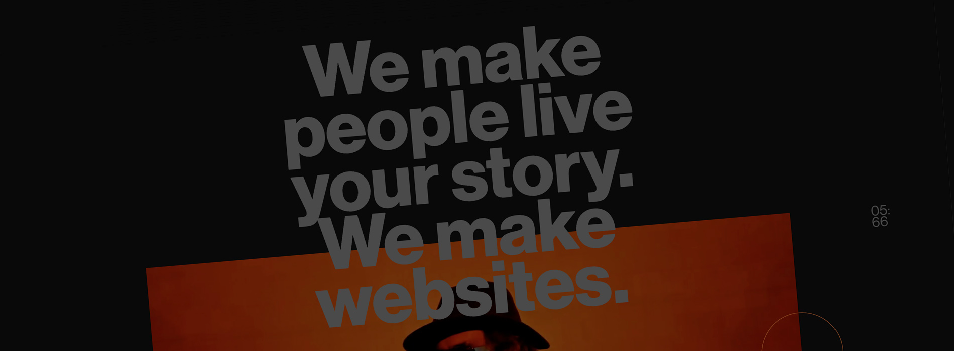
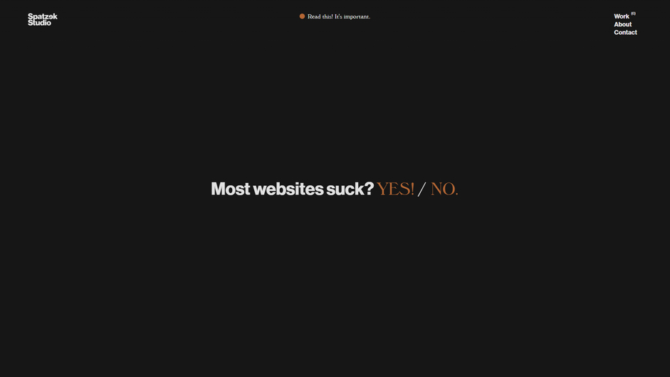
Ok, let’s talk about the About Page. As stated above, I wanted to focus on the message. There was a huge amount of content that had to be communicated. The only problem: Tricking people into reading a lot of text tends to be harder than you think.
Be honest: Would you read a text of ~1700 characters if it is presented like this:
Probably not (unless you are a real weirdo who enjoys staring at white walls). But how did I manage to make people read the exact same amount of text on my studio page? Here comes the trickery:
- Start off with a very empty page. Just a single sentence that captures interest and makes people curious.
- Don’t show how much people have to read at all.
- Make them interact with the site (in this case by asking questions with clickable answers). If a person puts effort into something (like answering), they are less likely to quit right after.
- Repeat the Q&A process at least once more, to trick them into expecting even more questions.
- Be funny and/or controversial to keep people interested.
- Add funny gifs (everybody likes gifs) from time, to time to hook them.
- Repeat above points until you said everything you wanted to say :)
- Make a call to action in the end to keep momentum.
But does it work? Oh my god, yes! According to Google Analytics the average session duration is 400% of the average of all my other websites (from 40k users last month until today).
Do you think I am a genius now? Yes/No. Correct!
Technology
Technology-wise there is nothing really interesting to say since the site does not use any fancy stuff like WebGL or complex effects. The only thing worth mentioning, is that I ditched ScrollMagic because it felt outdated. Instead, I decided to write my very own scroll animation script called SpatzekScroll.js 🤦♂️. (Thanks to @Jesper_Landberg for motivating me to finally do it ♥)
The website is using Nuxt.js at its core. Nevertheless, since we do not need a CMS, the HTML is pre-rendered to make the site even faster (according to performance mastermind @mario_sommer). The animations are powered by GSAP. Smooth-scrolling is done via ‘smoothscroll-for-websites‘ plugin by Blaze (Balázs Galambosi)
Company Info
Spatzek Studio is a Digital Design Studio that creates highly functional, unique & award-winning digital products in the most uncomplicated way possible.
The studio is managed by owner Daniel Spatzek, an award-winning webdesigner, art-director, creative frontend developer from Austria.