Create us a modern, sharp website, one that expresses our DNA like no other - was the initial request from simplxr. We believe that behind every cool website there's a strong brand, where the internal and external branding blend seamlessly together. One of the challenges here was to achieve an experience that connects with potential customers as well as potential and current employees.
First challenge: creating the brand
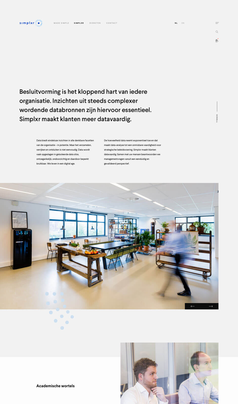
Our first task was to shake-up the brand, Data science is craftsmanship: there is no off-the-shelf method that can be implemented at the touch of a button. It is and remains science and explaining it to the public in clear, understandable terms, can be quite a challenge. Unlike others, Simplxr excels in this area. Whether it is algorithms, finance or analytics.
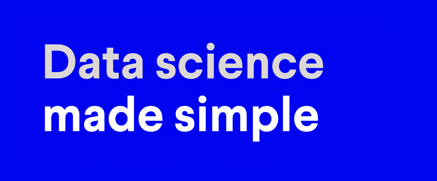
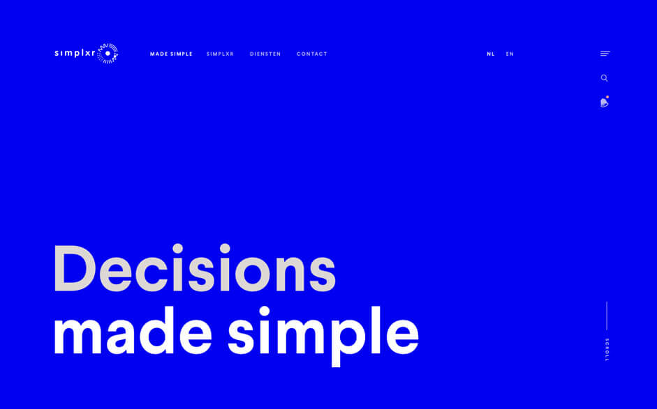
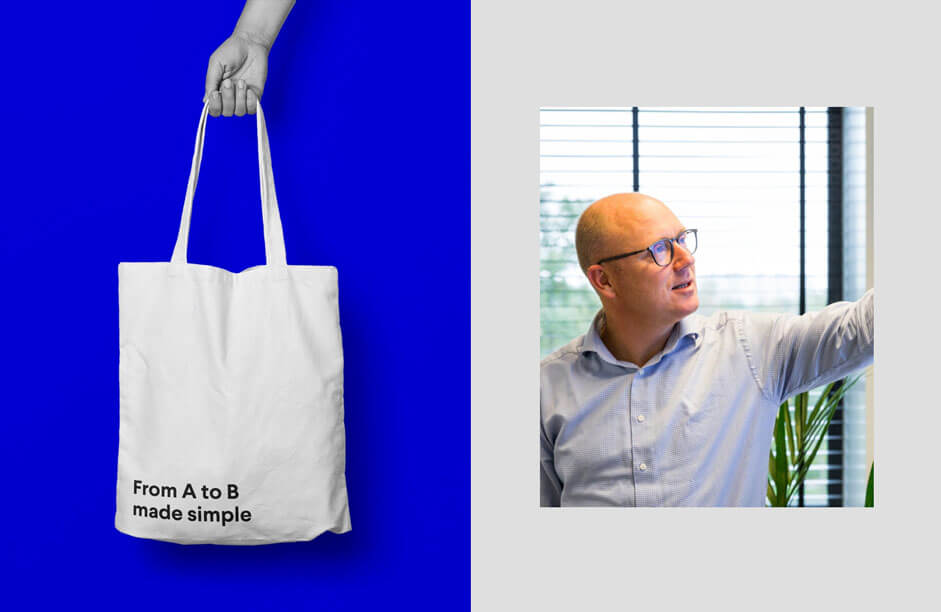
In several creative sessions, we were able to pinpoint the Simplxr DNA more and more clearly. Ultimately, we translated that together into the slogan: "Made Simple". We applied that to the entire development of the brand. Both in their printed communications and online presence.
We trusted the photography to Mees van den Ekart, a photographer we like to work with on projects like this. The photography played an important part in the final design and the story it tells.
Second challenge: doing it right
One site, multiple target groups. As with every other project, we constantly kept in the back of our minds that even though Simplxr is our client, we are of course working for the end users. To serve the relevant end users as perfectly as possible, we had a strategic session in which we concentrated on personas and the customer journey.
What we look for is clarity. The "Made Simple" slogan must immediately come to the forefront without being side-tracked by items that do not matter. The text in the header is replaced to add extra weight to the slogan. The bright blue color lends support by putting the emphasis on the text, while still playing on emotion.
Typography
We chose the Larsseit font family from Type Dynamic. We were looking for a readable Sans, flavoured with a pinch of grotesque, from Thin to Extra Bold, Larsseit never lets us down.
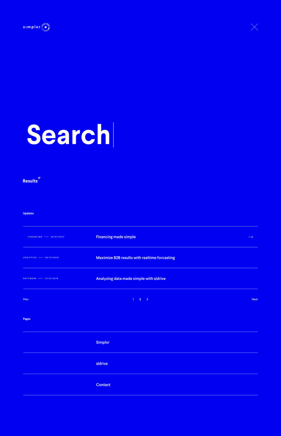
Search
A powerful search function was important in this project. Here too, we wanted to do it differently and avoid generic search features that are currently flooding the web. Through animation and a clear design, we created a search function that shows it can be done differently.
Through animation and a clear design, we created a search function that shows it can be done differently
When you enter a search term, the search function navigates you in the direction of the results. We then categorised these results to give the whole structure. As you can see, the "Made Simple" slogan also had a significant influence here.
Vacancies
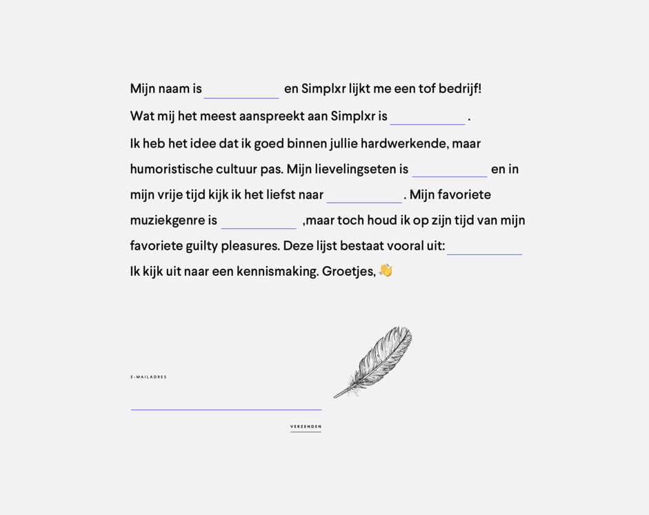
To separate the wheat from the chaff, when it comes to potential employees, Simplxr mainly wants to know if you are a good fit. Of course, they want to know how tech-savvy you are, but a cultural fit is even more important. The vacancy form therefore does not ask about your CV or work experience, but more about your taste in music, hobbies and guilty pleasures.
The other pages
The type of blue we use, must be used in moderation. It may not become garish. This is why we kept the other pages to a minimum and mainly played with various shades of grey. Apply a touch of parallax to give some depth to the whole.
Technical challenges
Keep it simple but make it complex. We do not use particularly special techniques, we do our best to keep the quality of our code high. For this site we use Ajax a lot to dynamically load and use search results, messages and forms.
BarbaJS
We use BarbaJS to make transitions between pages. It also reduces the HTTP-request of your assets and offers the possibility of prefetching pages. The final transition at Simplxr is just a simple fade between the various pages. Because, hey, "Made Simple".
Smooth scroll
The site uses a "smooth scroll". This gives a polished feel to the scrolling experience. We make the animations and transitions ourselves and activate them on the basis of your scroll position. No JS-library, only animations by means of CSS.
There are a number of downsides to this solution. For example, think of internal target locations (#link) that no longer work, or the browser's back button that no longer brings you back to your previous scroll location. We store the position of internal links and scroll manually to them as soon as you call them up. Re-creating the back button is trickier; we store the location of your last scroll position on the previous page. When you go back, we also scroll manually to this position. It's extra work but gives the user more control.
We store the location of your last scroll position on the previous page. When you go back, we also scroll manually to this position. It's extra work but gives the user more control.
Post updates
One small, quirky feature is the bell in the header. This displays a red dot when there are new blog posts that you have not yet read. We use a cookie to save the read messages and for every new visit, can read whether there are new messages.
Sage
We use Sage as the basis for WordPress. This is a boilerplate with a modern workflow. It ensures you can apply MVC in WordPress and can use Blade as templating engine. Are you a WordPress developer? Be sure to check this out!
Front-end Frameworks and Libraries
- BarbaJS
- Smooth Scrollbar
- Stuurmen-CSS
- Sass
- Webpack
- Ajax
Back-end Technologies
- Wordpress
- Sage
- MaxCDN
Company info
Stuurmen strips companies down and exposes the DNA right down to the hair follicles. We turn burning ambition into brand strategy and arm you with digital awesomeness. Kill off the average – mediocrity is way too boring.