Neematic was founded by three enthusiasts with an ambitious goal to build a brand new vehicle production company in their home country of Lithuania. Each of the founders has a unique competence. Linas, who is an architect by training, has been at electric motoring for the past 7 years. When he met Domas, a race engineer for Audi Sport TT cup and Porsche Carrera Cup Great Britain, they quickly hit it off.
Ideas about perfect distribution of weight and motor positioning started to come up, as did the first concepts of the bike. They were joined by Justinas, a biz dev trained at the National University of Singapore. He was in charge of business development at Invest Lithuania, a governmental agency for attracting foreign investment, and took an additional challenge of growing Neematic upon himself.
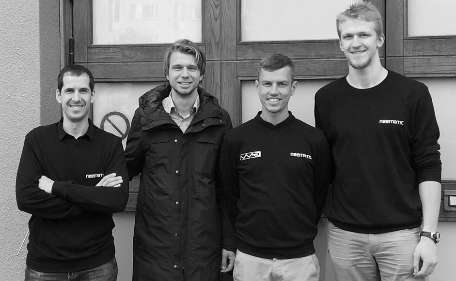 Neematic team (left to right). Co-founders: Linas, Justinas, Domas; biz dev associate: Lukas
Startup meets designer
The guys at Neematic are ready with the product prototype and eager to start the promotion. They are on the lookout for a digital design partner who’d handle the branding, the website and other aspects of their digital presence. Luckily for Siarhei, he gets a Site of the Day award for Rollpark, and generates some buzz in Lithuania because of that. Justinas reaches out.
Strategy. How to promote a €9,000 bike
Siarhei and Justinas meet at a cafe on one of the central streets of Vilnius and chat about the vision behind Neematic. They quickly establish a handful of points that would define the design strategy and guide the decision making.
- Because of the initial low volume production, the price for the bike may end up pretty steep. Which brings Neematic into premium segment. Which, in turn, significantly raises the bar for the quality of company’s presentation.
- Company branding has to be revisited. New visual identity should be designed from scratch.
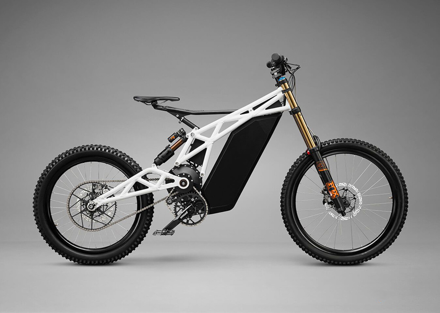
- Imagery is very important for creating a feeling of excitement and exhilaration. We have to double down on videos and photography; commission a professional rendering or a studio photo of the bike.
- Because the product is new to market without a significant track-record, our best hope for establishing a customer base is early adopters. Which in our case means MTB enthusiasts, who care about:
- Technical specifications. Range, top speed, weight distribution, etc.
- Components. Big name components can build credibility for the whole set up.
- Engineering. Ideas behind the setup.
- Real-life footage. Seeing the bike in action.
- Besides MTB enthusiasts we would also want to appeal to future investors. Introducing the team, their credentials, and the timeline of product development could be a first step in establishing trust.
- There are two key objectives we want to meet with the site:
- Creating an email database of interested riders through offering free test-drives.
- Collecting monetary pre-orders.
With the strategic guiding points on his hands, Siarhei kicks the projects off. First stop is the branding.
Visual identity. As exciting as the bike itself
Famous designers often say that a logo is just an empty vessel, and it’s up to the company to feel it with meaning by providing amazing user experience, products and services. Siarhei set out to make this vessel tailored specifically for the needs of the company, and capture the essence of the existing brand in a new logo.
- Make it feel as exciting as riding the bike itself.
- Make it feel professional to appeal to MTB community.
- Make it feel premium to meet the inevitably high price tag of the product.
- Make it feel connected to the product, by sharing the same visual design features and semantics.
After a couple of iterations, Siarhei comes up with a new logo that does just that. It features rigid custom typography, that mimics the robust nature of the bike. The wordmark is coupled a unique symbol, which merges three different meanings into a single mark.
- Bolt. Speed and electricity.
- N letter. Neematic brand name.
- Triangle. A base-form for Neematic frame design.
![]() Neematic logo
Neematic logo
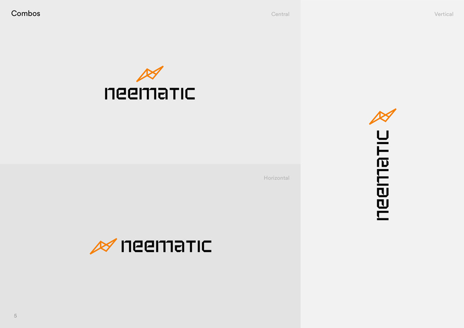 Logo layout combos
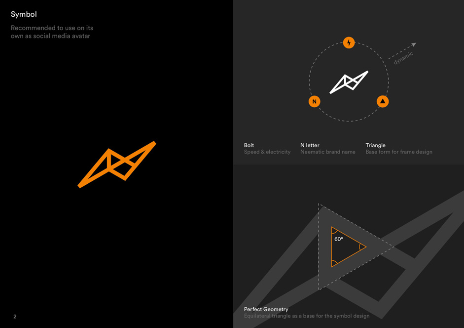 The idea behind Neematic symbol
Both Neematic and Siarhei are extremely satisfied with the result. While Siarhei continues the work on the website, Neematic team swiftly applies new branding to all of their offline materials: the trade show booth, business cards, pitch decks, and company swag.
Imagery. Studio photography
To make the website feel premium professional-grade imagery is a must. Siarhei interviews a couple of 3D modellers and render professionals to get the estimations for the work, but eventually decides to move away from 3D visualisation to studio photography and work with Edgaras, a professional photographer, with a studio in the renowned artistic district of Užupis.
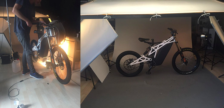 Behind the scenes of Neematic photoshoot. Edgaras Marozas studio
Wireframing. Time to nail the pitch
In parallel with the branding and the photoshoot, Siarhei is working on the wireframes for the new site. It’s imperative to establish the general structure of the page before moving into the visual polish. Wireframing stage allows to focus on the message the site is trying to get across and align the priorities. In essence, a website like that is a sort of an interactive pitch deck, and you have to approach it the same way. Think of the audience that’s going to be on the other side of the screen, think about their priorities and try to cater to them the best way you can.
 Neematic wireframe
The wireframe is ready. It looks ugly as sin, but that’s precisely the point. While your mind is not preoccupied with aesthetics you can focus on structure and content, and be sure that your business objectives are met. Every section you see here serves a purpose. It either describes a specific detail of the product, creates an emotional connection through visual, builds trust through transparency, or calls to action.
Visual. Connecting the dots
When putting mock-ups together Siarhei is thinking of the bike as a centerpiece for the whole site. Everything else is secondary. The design tries not to interfere with an outstanding shape of the vehicle, all it does is supporting and emphasizing what already is an amazingly beautiful product. The uncompromising black background is used to elevate this premium and professional feel. Punchy headlines, and on point descriptive texts are put together with the precision that mimics the build quality of the bike itself. All the elements are there to serve a purpose. To inform and to communicate. Communicate both the feeling and the value.
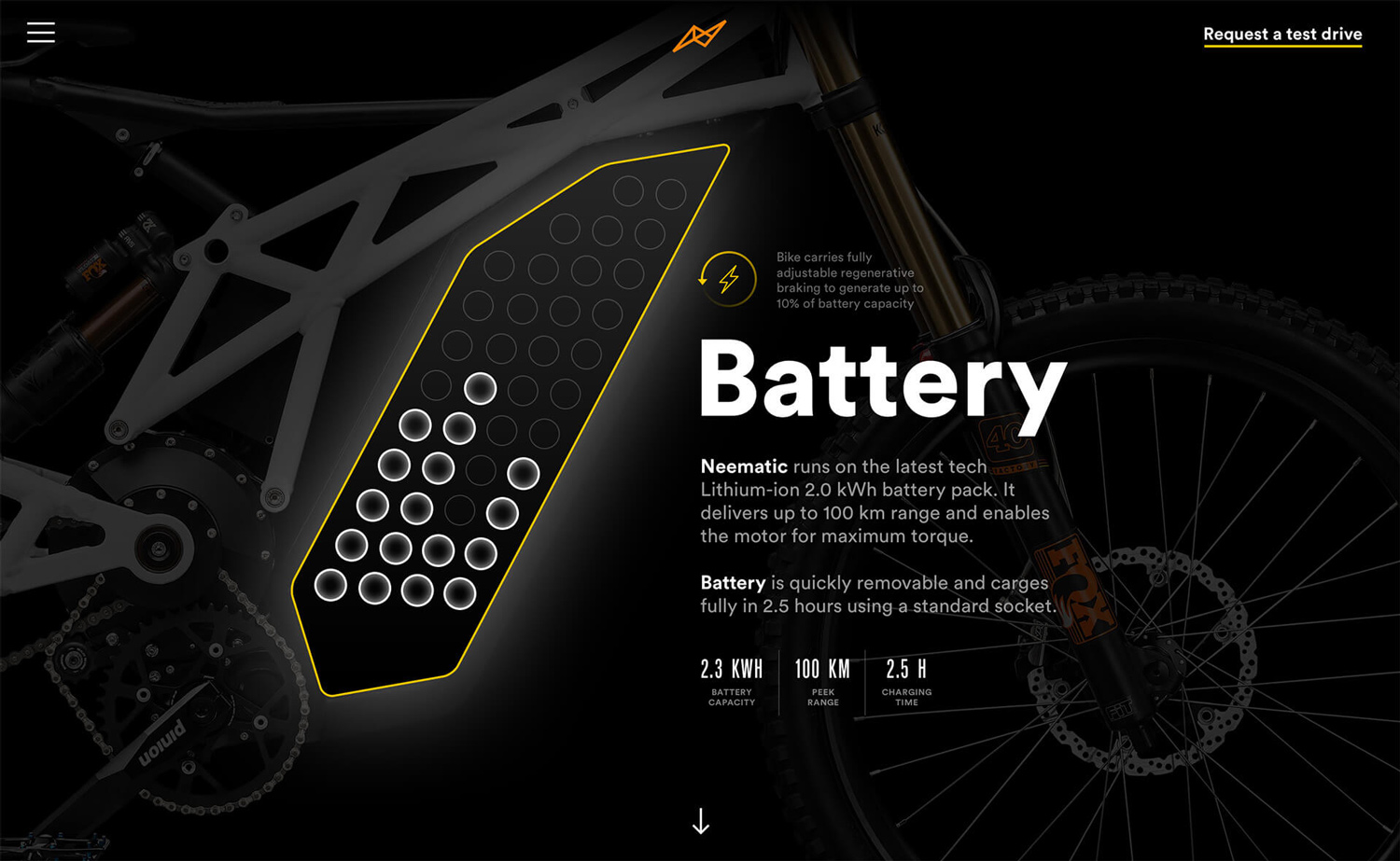 Explaining the battery, its power, charging time and peak range. All the specs that are important for the potential buyers
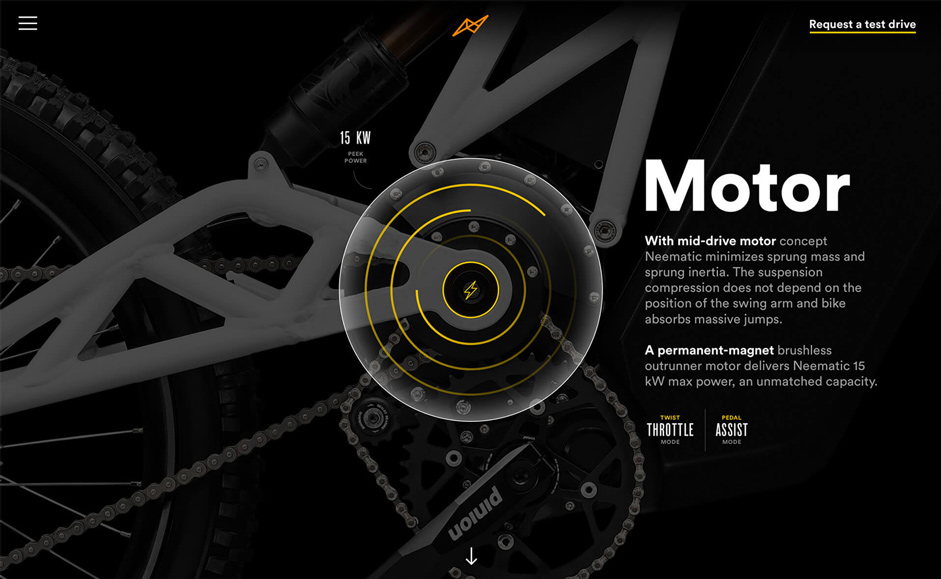 Explaining the electric motor and the specific MTB-centric features, like twist throttle and pedal assist modes
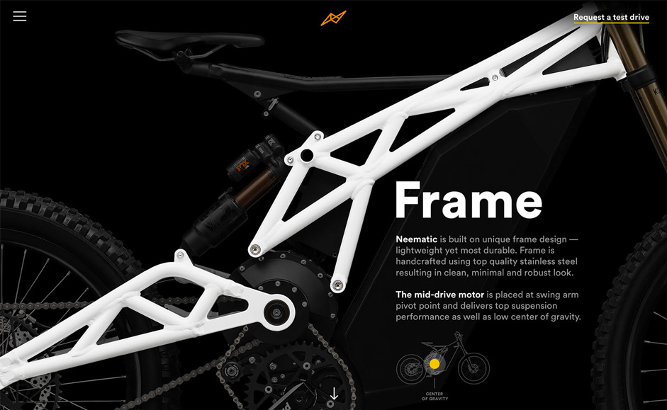 Focusing on the beautiful frame design that also delivers perfect weight distribution
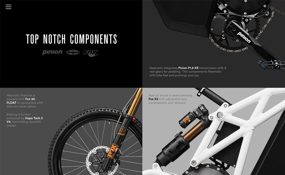 As Neematic bike uses big name components, it’s an important piece of information for building credibility among MTB community
Development
Sites like this don’t need a lot of back-end effort. Neematic.com doesn’t even use a CMS. It’s plain HTML and CSS, which usually are considered an easy job to do. But not in this case. To make the actual site as impactful as the mock-ups, several requirements have to be met:
- Pixel-perfect translation of PSDs to HTML. Even the slightest deviation will damage the premium, solid built feel that is imperative to the project.
- Buttery smooth custom-made transitions of the slides that describe the components. The idea is that the frame of the bike will move around with the scroll and zoom into the component in question.
- The rest of the animations should be buttery smooth too.
- Quick loading time.
- Responsive behavior.
Siarhei looks no further than Daumantas, a developer he’s been working with for a while now. He is the guy behind the aforementioned Rollpark and his attentiveness to design detail and animation skills are second to none. Not surprisingly, Dau nails the job of implementing Siarhei’s design. The resulting website is clearly Awwwards-worthy.
Results
It’s been a long and exciting journey for all the parties involved. But it was well worth it. Siarhei and Dau got a second Site of the Day award and are immensely proud about that. Neematic, in turn, has managed to collect the required number of pre-orders within a week after the website launch and cleared itself a path for the next round of investment. With the new website, Neematic now looks more mature and professional, which helps with attracting all sorts of partners: from brand ambassadors to advisers and sponsors.
Company Info
Siarhei is an independent designer based in Vilnius, one of Europe’s finest capitals. He works remotely with clients from all over world, including places like San Francisco, Los Angeles, New York, London and Melbourne. Over the course of his career, he’s helped many businesses and entrepreneurs bring their products to the whole new level of quality and refinement.
Follow Siarhei’s design activities on Facebook at http://fb.com/siarhei.design