CPG brands all over the internet use Repeat to turn one-time buyers into repeat customers. The Repeat team knows CPG inside and out and has built a reputation for their content that reveals insights and challenges that only true CPG leaders, tastemakers, and strategists could uncover.
With this in mind, we worked with their team on strategy, identity, and digital to create a brand experience that doesn’t just make the business case for Repeat’s products, but also serves as a hype beacon for the CPG community.
Brand Identity
Approach
When it comes to projects, we don’t expect every opportunity to be interesting by default, rather we expect ourselves to make them interesting. This requires that we’re intentional about pulling the best ideas out of the minds of our clients, then collaborative in layering on our own ideas to push the boundaries of what’s possible. So when Repeat brought us a strong brief and high hopes for being seen as a colorful voice in the CPG space, we needed to avoid any perception of them being another salesy SaaS brand and instead present them as a brand loved by client companies — and perhaps be one that they perceive as “one of their own.” An interesting challenge, you might say.
Look and Feel
At its core, the Repeat sensibility is friendly, bright, and optimistic — like how each of us might describe our favorite CPG products. We imaged Repeat as a brand that makes products people love, added a tech layer, and gave it a smart and spontaneous persona, with moments of playful interaction and nods to things that only CPG insiders would understand. The result is a joyful and light experience, and a friendly reminder that if you take care of your customers, they might just return the favor.
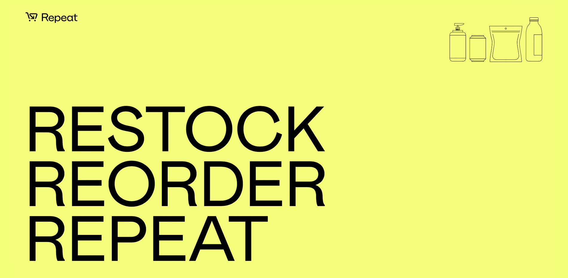
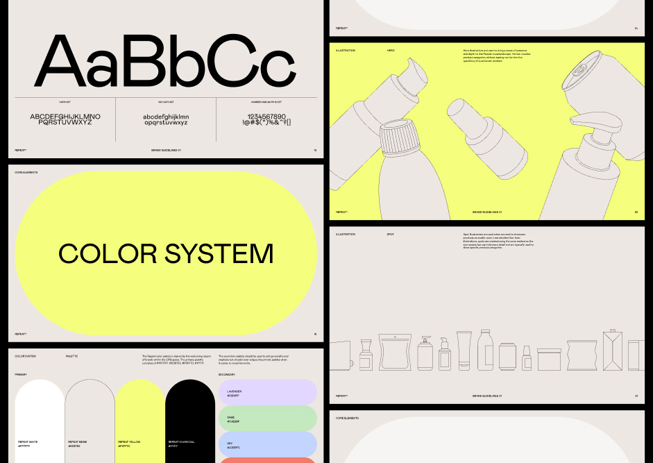
Logo
Repeat makes the shopping cart experience so easy that shoppers come back again and again. We redesigned the logomark to be a looping shopping cart and conveniently set it next to the Repeat name (and purpose). It quite literally suggests “shopping cart on repeat.” The curves of the mark echo the geometry within the customized logotype, creating a sense of continuity and harmony. We think the mark is simple, clear, and informative, a perfect match for the brand.
Color
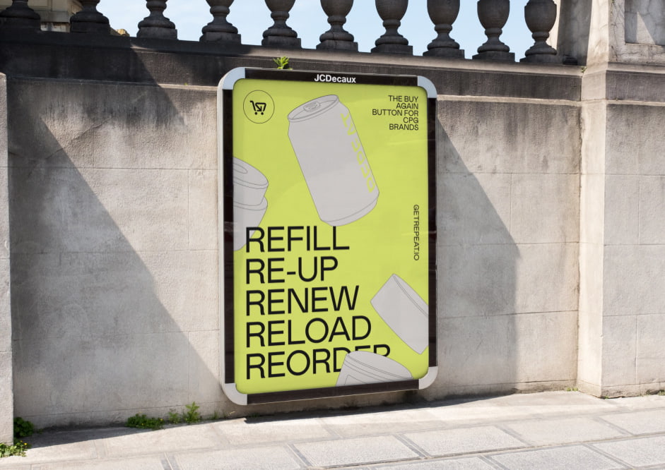
The Repeat color palette is inspired by the welcoming nature of brands within the CPG space. It has expansive potential but is generally used with restraint, giving it a capacity for both utility and expression. At Studio Freight, our belief is that color should be used simply and effectively, which means giving every color a job to do. Bright chartreuse is set against a warm beige to clearly direct the user’s eye to important calls to action while the supporting hues of the secondary palette fill in the gaps to complete the experience. We were also careful to ensure that the brand could work in dark mode, adding variety and partitioning different experiences when needed.
Bright chartreuse is set against a warm beige to clearly direct the user’s eye to important calls to action
Illustration
Similar to our approach to color, we always want to make sure that our illustrations are systematic and thoughtful. This way, they can scale across channels and platforms in a way that is flexible and unique. First, we set out to create a suite of hero illustrations that convey a sense of dimension and depth through perspective but lack shading, resulting in a more flat and graphic look. From there, we built out a set of secondary illustrations and icons that could be used on their own or in combination with the hero graphics. Finally, product abstractions were created as a means to represent the benefits of Repeat’s technology in a way that extends to the website experience.
Website Design
Approach
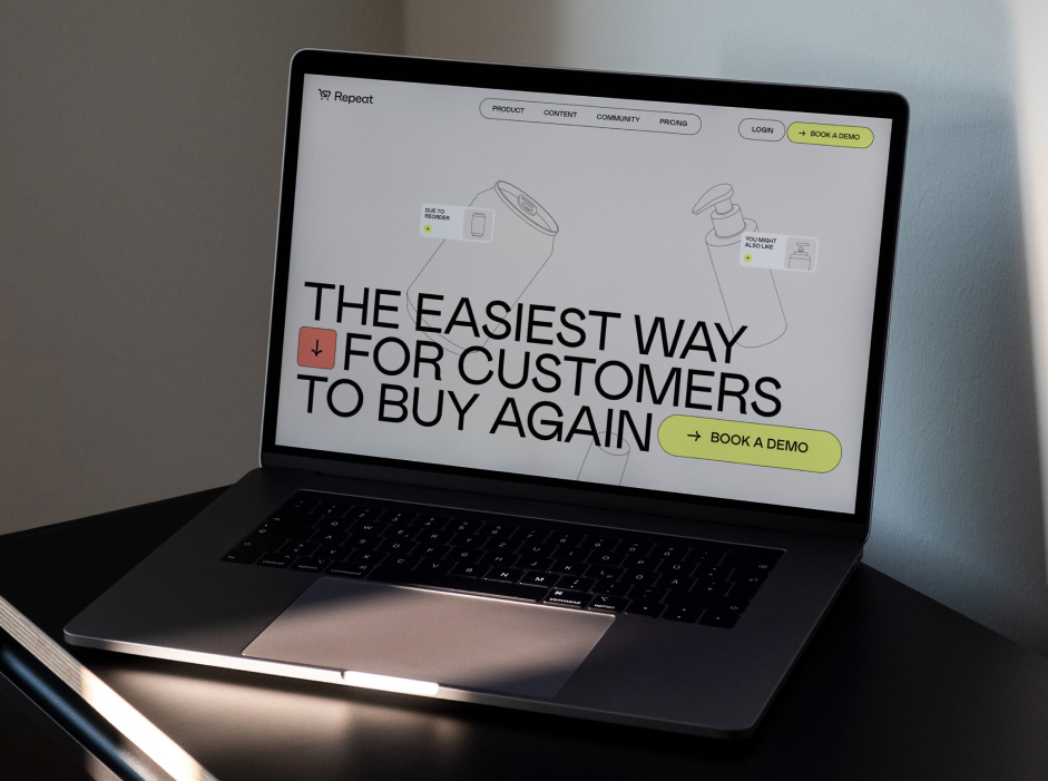
Most B2B sites are dime a dozen with the same uninspired and bland conventions used over and over “for the sake of conversion.” But there’s a way to be functional and remarkable. Once the site structure and UX flow were established, we put the unrepeatable Repeat identity to work on the web — adding visual layers, creating UI extensions, and imagining a bevy of surprising moments for users to discover. As always, we worked side by side with our developers to design a smooth and performant experience that combines GSAP animations, Lottie files, and 3D renders.
Layout
We wanted each page to have its own distinctive visual approach so there’s always something new to engage with. However, it was equally as important for us to thread a needle of consistency throughout the system by establishing a logic for type styles, dynamic hero components, and color treatment throughout the site.
We designed a variety of scales and case styles to achieve a loud yet approachable sensibilityTo keep things simple, we used only one weight of Mabry Pro for the typographic system. Leaning into Mabry’s balance of modern form and personality, we designed a variety of scales and case styles to achieve a loud yet approachable sensibility for the copy design.
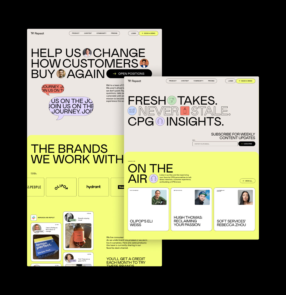
The hero components consist of all-caps typography combined with circles and/or rounded squares (which can be adjusted in the CMS). For added flexibility, the color, style, position, and fill of the shapes can be changed as well — enabling an endless variety of unique compositions.
Sections
To create even more rhythm and clarity we gave each section its own color. To prevent the scroll from being repetitive, we used 4 primary colors (white, yellow, beige and black) and we enhanced the experience by varying the depth and types of transitions between each section, using a parallax effect that makes it clear for users when they’re entering a new section (we toyed with this idea further by incorporating a wipe page transitions to give the user a seamless transition from page to page as they explore the website).
2D and 3D
CPG is the main theme of the website, so we wanted to emphasize common CPG product types through illustration. We were looking for a balance of simple yet interesting, so instead of using 2D svgs, we created 3D renders that still feel like an illustration. When you first land on the site, the product illustrations look deceivingly simple, but as soon as you move your cursor or scroll to the next section, you can see them shift on their axes. We were looking to create a non-distracting “oh damn, that’s cool” moment.
Highlight: CPG House
Early on in the process, Repeat let us know that they wanted to make their customer community feel like a party you couldn’t miss. After some exploration, we decided to build their community access point with its own unique page. To do this, we opted for a horizontal scroll, flipped the switch to dark mode, and raved our way into a wild combination of floating 3D packaging, party pics, and layers of parallax scrolling that lead up to the biggest CTA you’ve ever seen.
Development
Making 3D Feel Like 2D
With the intent of enhancing the visual depth of our floating elements, we used full 3D models and implemented a toon shading technique. However, the toon shader wasn’t quite giving us the result we were after. In order to achieve optimal edge detection, we did a lot of research and found that incorporating the Sobel operator, in conjunction with input from our 3D artists for model adjustments, gave us the most effective solution — and proved to be successful in achieving the desired visual effect of making 3D feel like 2D. Note: Keep an eye on Studio Freight Darkroom and Drei, an open source component is on the way!
Technologies
Frontend Frameworks: Next.js
Backend Technologies: Contentful, Hubspot
Server Architecture: Vercel
Tools: Lenis, r3f, Postprocessing, GraphQL, GSAP
Company Info
Studio Freight is an independent creative studio built on principle. We bring together the best thinkers and makers to build new worlds. Stop by our internet headquarters at studiofreight.com.