Regular ‘workouts’ can sharpen your instinct for design
Founded more than three years ago, DesignWorkout is an online program that revolves around creative thinking. It aims to help users develop essential skills for rapid design by showcasing peculiar challenges. These novel tasks form the basis of the project.
‘Daily ‘workouts’ cultivate the ability to see multiple solutions and pick the most effective, act boldly and make independent decisions. Each task is unique, and should take only 30 minutes or less to complete. Just enough to help to put the day on the right track’ says Dmitry Barbanel, the author of the program.
.jpg)
The DesignWorkout system puts no limits on medium—feel free to use anything from paper and pencils to tomatoes and mozzarella. Still, one of our intentions is to encourage visitors to try out Readymag—a browser-based tool that helps create and publish web projects in WYSIWYG-style without the help of developers. Tanya Egoshina, the designer responsible for the look of the project, explains how her visual concept evolves.
Moving things around
The inspiration came from a list of exercises we received from the DesignWorkout team. When I looked at everything, I noticed that many were obviously inspired by the feel of paper and cardboard. You can move paper pieces of different colors to create a collage, glue or pin some of them to the background, and so on.
.jpg)
I also wanted to show users straight away that they can interact with the project, not just browse through.
That’s why I made the main page rearrangeable—you can drag and drop pictures and shapes wherever you want. Technically, this was accomplished with a piece of custom JS code (though Readymag is basically a no-code tool, it still allows you to twitch page sources directly if necessary) that makes non-text widgets movable. Text widgets had to stay in place like anchors, otherwise users might inadvertently destroy the structure of the page. That means they wouldn’t be able to return to the workable state without using the ‘refresh’ button.
I devised the main page using this technique and liked the result: it had a vibe of freedom. So I decided to continue with the idea, using it on task pages as well, but reinterpreting it somehow each time. The first few pages were easy, but inventing new ways to use draggable shapes eventually became harder—that was my own creative ‘workout’ of sorts.
.jpg)
Fonts, colors, and animations
Readymag offers a rich palette of design tools, including a vast font library, animations, embed capacity, and more. One of my tasks was to show how to harness this richness, as limits are necessary for any decent design. That’s why I adhered to a certain minimalistic style throughout the whole project.
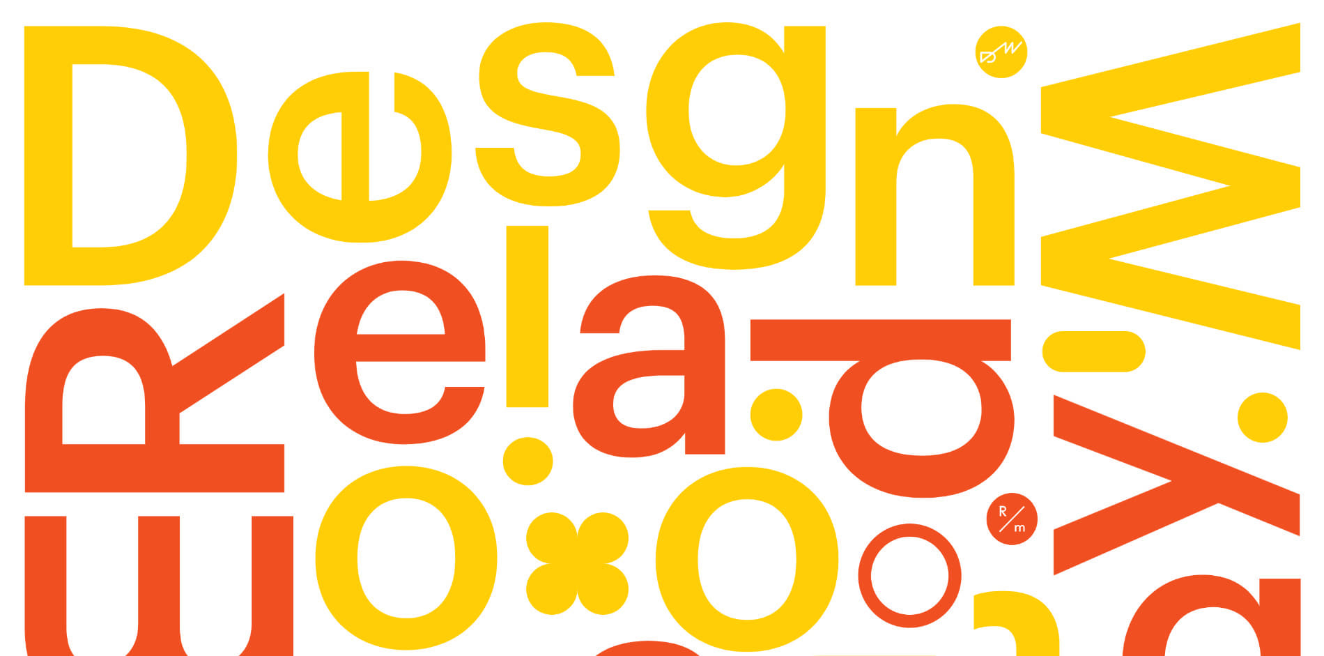
The primary font is Graphik—it’s more or less the main font we use for Readymag projects, giving them a strong Swiss School feeling. I also used Druk as a secondary typeface. Colors (yellow, red, black, white) came from the DesignWorkout brand guidelines, though they also fit neatly into Readymag’s laconic color palette.
.jpg)
This overarching minimalism allows you to be more creative with smaller elements.
For example, some of the tasks encourage users to try animations. In particular, workout number three prompts you to depict both your activities and emotional state during a day of self-isolation with a graph. This task in infographics design is significantly more complex than it may seem. You can use lines pointing upwards or downwards to represent the intensity of your feelings, but still need to find other means to represent your emotional state. Animations can come handy here: perhaps hovering over a graph piece moves it up or down, showing whether the task was literally “uplifting” or “down to earth”.
In other tasks, you may benefit most from our image and icon libraries. In task number five, you’re encouraged to depict a fantasy creature. You can accomplish this with an image of a real animal from the Unsplash library, which can then be “enhanced” with icons—adding dragon paws to an elephant’s body or making a lion breathe 8-bit fire.
.jpg)
As a final piece of advice, after you finish Design Workout, I suggest redoing the tasks you liked most using as many different artistic means as possible. It still feels fun the second and the third time, particularly when you try a new approach each time.
If you liked this project, you can support it by voting. Stay home and keep safe!