Sep 12, 2019
Once Upon a Time in Hollywood by Watson D/G Wins Site of the Month August: A Case Study
The Once Upon A Time in… Hollywood Magazine site serves as an expansion of the film’s world, giving the user the feeling of flipping through a 1969 magazine as they explore exclusive articles and content. Through animated transitions and fluid navigation, we made the site feel both retro and modern at the same time.
➭ Approach
Quentin Tarantino has a deep admiration for nostalgia and culture. For his latest film, Once Upon a Time in.. Hollywood, he brought one of his most personal narratives to the screen, recreating a year that changed Los Angeles and pop culture forever: 1969. The film discusses fame, friendship, changing perspectives, politics, masculinity, and the looming terror of the infamous Manson family murders. All of these elements make the film special, and all of them in some way or another needed to be honored by the marketing campaign.
Knowing that Tarantino has built up a hugely dedicated fanbase over his career, we had to approach this in a way that sold the film on its star power and merits, fit into the filmmakers expanded in-world universe, and felt authentic to the 1969 time period.
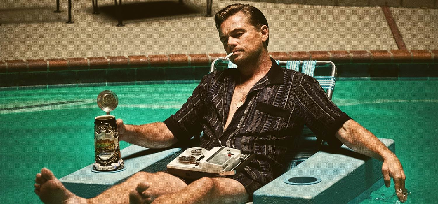
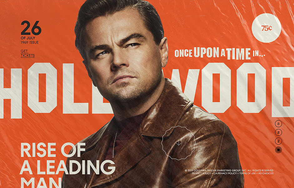
Since the star of the film, Rick Dalton played by Leonardo DiCaprio, is a Hollywood celebrity obsessed with his own self image, we decided to make the site in the style of a late 60s gossip magazine. This gave us the opportunity to showcase imagery and content in an authentic way, as well as include in-world advertisements and Easter Eggs that connect the film to Tarantino’s extended universe.
➭ Writing and Planning
This format also allowed us to give fans early access to the storylines of some of these characters through in-world interviews written in the style of the time. We researched classic interviews from magazines like Playboy, Rolling Stone, and Life to make sure we were approaching them in a believable way. We also worked directly with Sony and Tarantino’s team to make sure our copywriting was accurate to the screenplay, giving additional information that feels exclusive without spoiling or contradicting anything that happens.
"This is me. This is the year that formed me. I was six years old then. This is my world. And this is my love letter to L. A.” -Quentin Tarantino
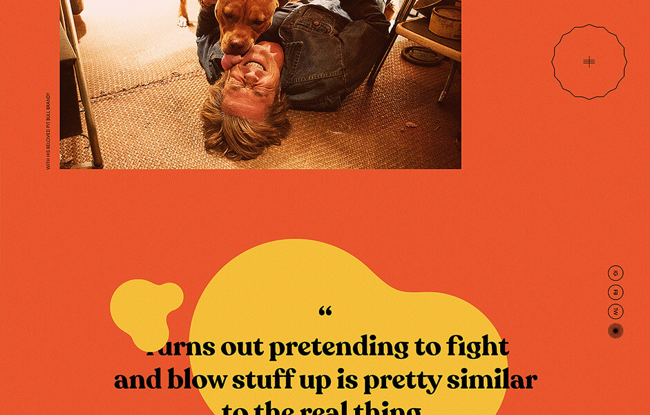
We also included articles that fit in directly to the time period, including stories on Manson victim Jay Sebring’s hair salon, and music reviews from tracks on the film’s soundtrack. A “Hollywood Classifieds” section was also added to include more short-form advertisements and articles, as well as offering an opportunity for us to add and remove promotional content as needed.
➭ Design
Once we had locked down which articles would be included in the magazine, our design team worked hard on creating a style that evoked a real 1969 magazine without feeling too dusty or old-fashioned.
Subtle animation accompanies each pages as the user scrolls from one section to another, helping the site experience flow seamlessly without taking the user out of the in-world 1969 aesthetic. The front cover features a dynamic plastic cover that animates as the user runs their cursor over it, giving the feel of a real magazine pulled from the news stand.
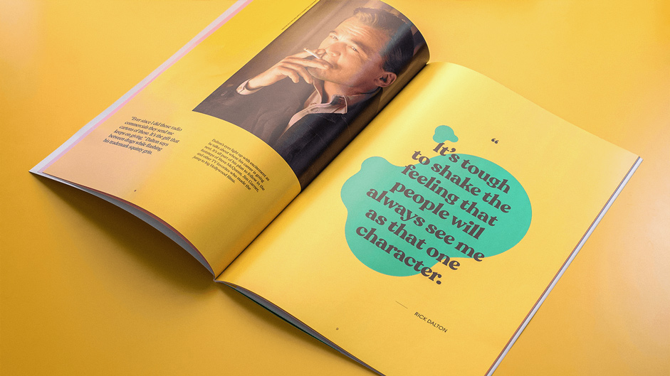
The oversized layout encourages scrolling and exploring the pages as you read the articles, evoking the feeling of scanning your eyes across a magazine page. The entire magazine could be read by seamlessly scrolling from one page to the next, or fans can click on one of the articles using the animated table of contents. We chose a bold color-coded style for each article as a visual indicator that the user had moved on to the next page of the magazine.
➭ Promotion
Once the magazine site was live, custom videos and Instagram story promotions were created to drive audiences on social to the experience. On Instagram Stories, we created a mini-version of the magazine featuring swipe-up prompts to each individual article, allowing fans to browse the site from within the in-app browser on the platform. Social videos paid tribute to the popular style of subtitled social media news articles, teasing some of the content in the site and prompting fans to visit the URL for more.
We have found that this method of digital promotion helps to combine digital and social seamlessly. Uniting the style of the site with the style of the social campaign makes the swipe-up prompt feel like a natural extension of the social media experience, using the in-app browser as a way to keep people in the app without any need of intrusive link-outs or URLs.
Additionally, as a companion to the film, we concurrently created a physical print run of the magazine to be handed out at the star-studded premiere and at 35mm screenings of the film across the country. Thousands of them were handed out, and Tarantino fans and film junkies were thrilled to receive such a unique companion piece to commemorate their experience. We were told that Quentin Tarantino said that our magazine is required reading, and many fans took to social media, sharing pics of their magazine as proof that they made it out to the theater on opening weekend. This took the activation full circle, proving that a physical handout can still make it to social media as long as there is an element of “bragging rights.” It also drove people who didn’t have access to the physical print to check out the online version to avoid FOMO.
➭ Outcome
In the end, the site was a fantastic addition to the pop culture phenomenon that went on to become one of Quentin Tarantino’s most successful movies of all time, and one of the year’s most talked about films. The site adds an extra layer of story for fans, and gives newcomers a little sneak peek of what’s to come in the film. Overall, it was exciting to step into Tarantino’s world for a while and relive the summer of 1969.
➭ Technologies
The front end is a single-page app built with Vue CLI, using HTML5, SCSS, Webpack and JavaScript ES6.
We used npm (node package manager) and yarn for package management, Webpack for module bundling. We also used Vue.js framework for front-end javascript. Animations were created with the GreenSock Animation Platform (GSAP).
There was no need for back-end technology since it’s purely a promotional site with limited need for updates; instead, we used a prerender method that loads all app routes and saves the results to static HTML files. We used viewport units to create fluid page layouts. Using viewport units ensures that the design is always as intended, which was definitely helpful to retain the magazine design layout on a broad range of different browsers and devices.
To complete the experience we added some WebGL effects to the website using custom shaders rendered with Three.js. Moving the cursor on the cover will affect the light direction causing a realistic plastic light reflection. Throughout the website we added subtle metaball effects and liquid page transitions.
➭ Company Info
Watson Design Group is an award-winning creative boutique specializing in digital storytelling, online development, and social media. We are imaginative, innovative, and driven by our passion for interactive design and community engagement. Projects we've brought to life include campaigns for A Ghost Story, Once Upon a Time in Hollywood, and the Isle of Dogs. We've had the pleasure of working with clients from FX, A24, Netflix, Disney, Riot Games, Lionsgate etc. and are constantly looking forward to creating new, exciting digital marketing and social initiatives. We are not afraid to challenge ourselves and push the envelope of what's possible, setting our goals high and keeping our eye on the digital horizon.