Olga Prudka is the site for a Ukrainian fine art photographer from Miami and New York.
The Logotype and Main Idea
Our main objective, from the logo to the live website, was to showcase the photographer's work and accentuate its beauty.
In this project, as in many of our projects, we used a non-classical logo design workflow. This was not the starting point of our project. We always start the design part of work with a mood board. In this case, a mood board created for the client's website helped with the work on the logo. It felt like it was some kind of fashion magazine. This helped determine the style and look of the future logo. We've got a unique authoring geometric font logo. It was important for us to maintain simplicity and convey the mood in the details of the font, in its shapes and proportions. We hope we succeeded.
The logo seamlessly integrates into the website and also serves as a recognizable symbol for the photographer on social media.
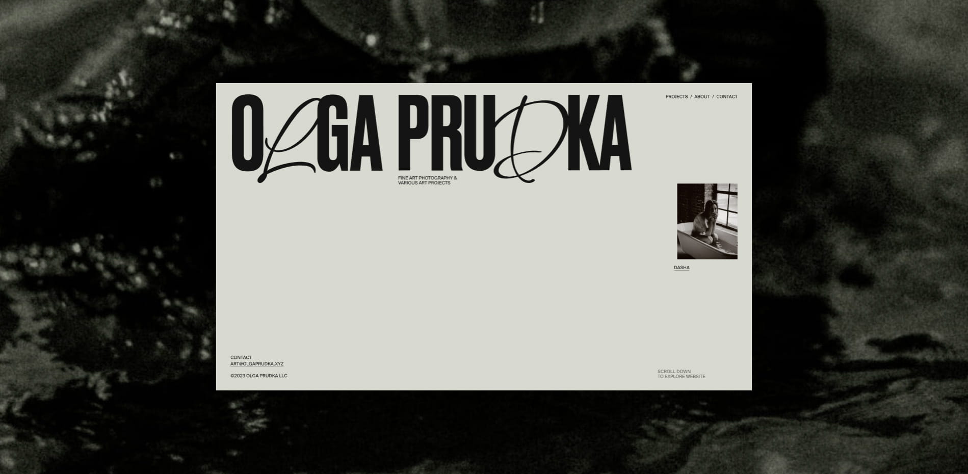
We had an interesting pair of headline fonts on our home screen. Bold condensed font pairs well with cursive letters. This has become one of the main features of the site. And the client was afraid that people would think that the title on the main screen is the primary logo. Therefore, the idea came up to make an animation of the morphing of a large accent heading into a small logotype.
“The logo seamlessly integrates into the website and also serves as a recognizable symbol for the photographer on social media.”
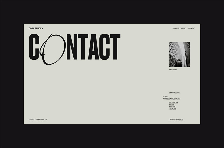
The Creation: Website Design
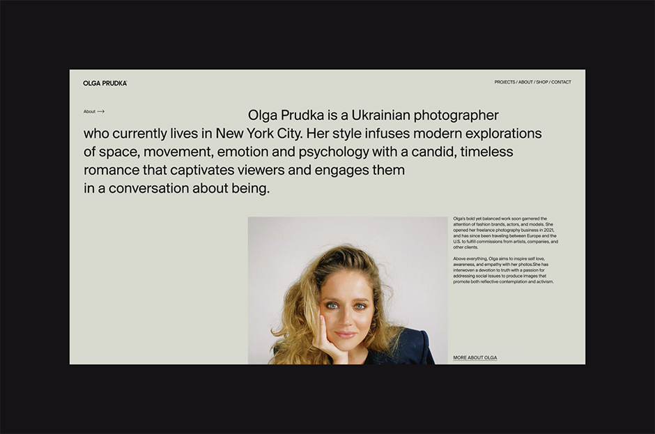
We set ourselves the task of making a minimalistic website with its own interesting features, but work will be in the foreground. We also tried to use a minimum of font sizes and work with space and grids. So that photos would be the main element of this design, and fonts, compositions, and animation would only emphasize the artistic direction of Olga's photos. To capture her exact sense of femininity in fine art photography.
Thus, the main feature of the first screen was born – a headline of 2 combined fonts, which, when scrolled, morphs into Olga's strict and geometric logo. As if symbolizing that behind its simple forms there is a whole range of emotions that Olga experiences and conveys through the photo art.
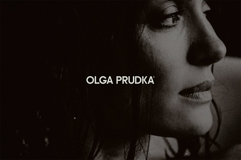
“Photos meet the user on the preloader so that he immediately understands that this is a photographer's site.”
The Role of the Content
Before creating a website for Olga, we looked at dozens of websites of other photographers in similar and different niches.
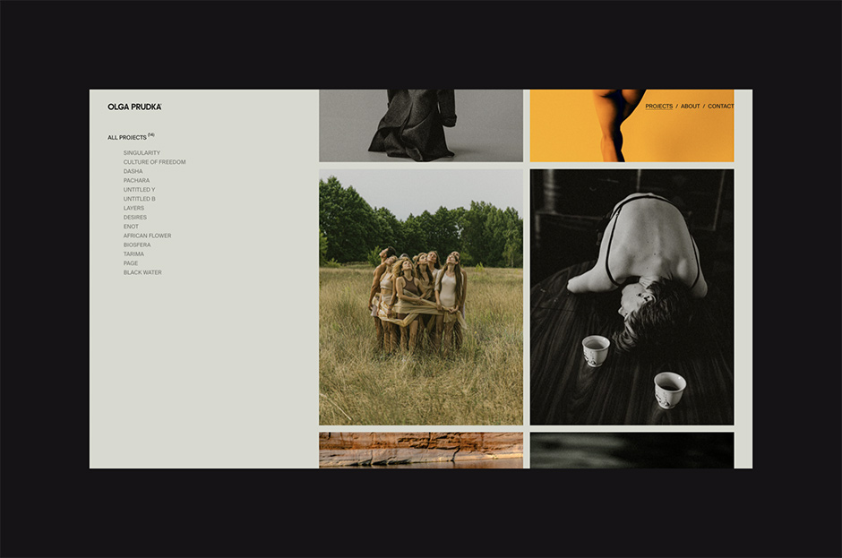
The main conclusion we came to is that we want to focus on the photographs themselves. Emphasize, highlight them, make them big. And in no case distort their proportions and do not counter them with complex hover effects (a disease that many photographers' sites suffer from).
Photos are the main element on the site. Since this is a portfolio site, we put maximum emphasis on them. Photos meet the user on the preloader so that he immediately understands that this is a photographer's site. We use large full screen photos as breaks before the footer. We made minimalistic portfolio pages and the projects themselves, where work is in the foreground and nothing more.
Animations
There wasn't much animation planned for the site. The main task was to make a preloader, smooth appearance of headings and transitions between pages. We wanted to convey smoothness, lightness. Light hovers on projects, parallax photos when scrolling a case, etc. All of these animations are minimal, but add up to a nice result for the user's eye.
It was very important for us to achieve a feeling of ease in the animation of the site. As like to breathe. We have already wanted to implement some tricks for a long time, for example, we have already tried to implement this type of preloader before in a test form.
From a technical standpoint, it was new for us to work with Lottie to create a JSON animation for a logo morph. This was necessary because the animation itself was created in After Effects and we needed to correctly transfer it to the site. As an alternative, we considered the PNG sequence, but this option did not work.
The Site Development
The site was developed quickly as everyone liked the project and so did the developers. We accurately formed all our development requests and our developers accurately translated them into reality. We have made a convenient admin panel so that the client can fill his site without problems. Initially, we planned to launch a store inside the site. It was created and designed, but in the end the client decided to shelve that part of the project and go live without it.
Technologies
Front-end: GSAP - animation library everyone knows about, this is the core of any kind of interactivity across the website. Lottie was used to create a morphing effect of the logo on the Homepage. The animation was prepared by Motion designed to make sure we have custom and smooth morphing of letters.
Barba.js is the core of page transitions effect. With the usage of GSAP - we can create any kind of transition between pages without page reload (AJAX page transitions). Animation system is to make sure that it is easy to attach some kind of animation to the element, we created our own data-driven animation system. Just add specific data attributes to the element, and the element will be animated on scroll. Show/hide/move/rotate - anything. Easy to adjust if client wants "animation here, but not there". As always, GSAP is the core of those animations.
Locomotive scroll is popular custom scroll Library, which is great in all aspects. With their callback system - our animation system works even better 😉easy to adapt to any needs.
And a LOT of handwritten ES6+ javascript code from scratch. When you write everything – you control everything. To make the website performant is the most important part.
Backend: Nothing special, WordPress + Woocommerce. Keep it simple.
Company Info
Obys is a creative design and development agency based in Ukraine, specializing in creating unique graphic and web experiences globally.
More about us is here.