MOHEIM is a brand that creates new standards, its products share a minimalist, simple design that remains timeless. MOHEIM has been providing the world with various items for living spaces, from tableware to furniture, striking an elegant balance between a quiet appearance that fits into the lives of its owners and a presence unique to MOHEIM's products.

What we did to bring out MOHEIM's design concept on the website
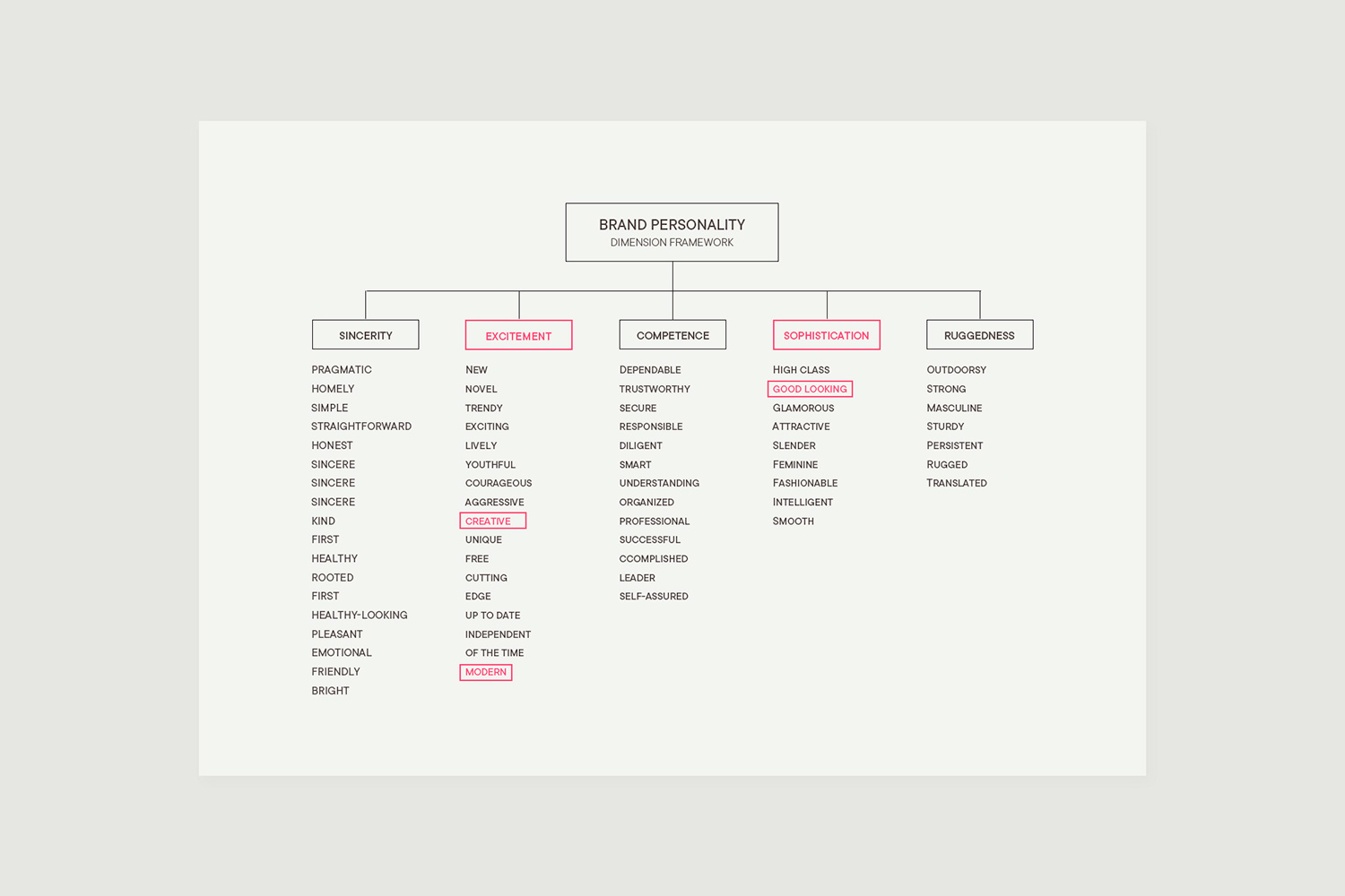
Our initial approach was to work with the client's production team to verbalize the brand identity. We began verbalizing the customers' brand image by applying Jennifer Aaker's dimensional framework. We then presented the client with image boards and benchmark sites based on the keywords generated from this process, and discussed the future direction of the design.
About the Design
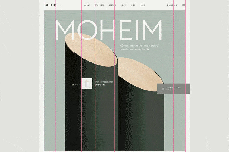
To express the client's concept of simplicity with presence in their designs, we needed to introduce eye-catching elements that would draw the viewer's attention to the site and create a lasting impression. Through trial and error, we devised the strategy of adopting a website layout with an intriguing yet well-organized design, unlike any other competing site.
We needed to introduce eye-catching elements that would draw the viewer's attention
About the grids used
We repeatedly adjusted the design's grid positions to give a well-organized impression, while offsetting the website's elements to the left and right.
We used a total of 7 grids. To find the optimum balance, we repeatedly tested where to place the four lines, other than the center grid and the grids displaying the left and right content widths.
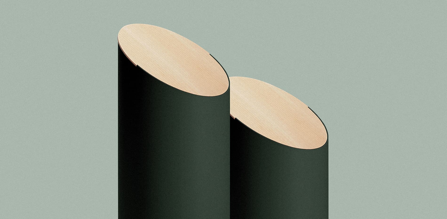
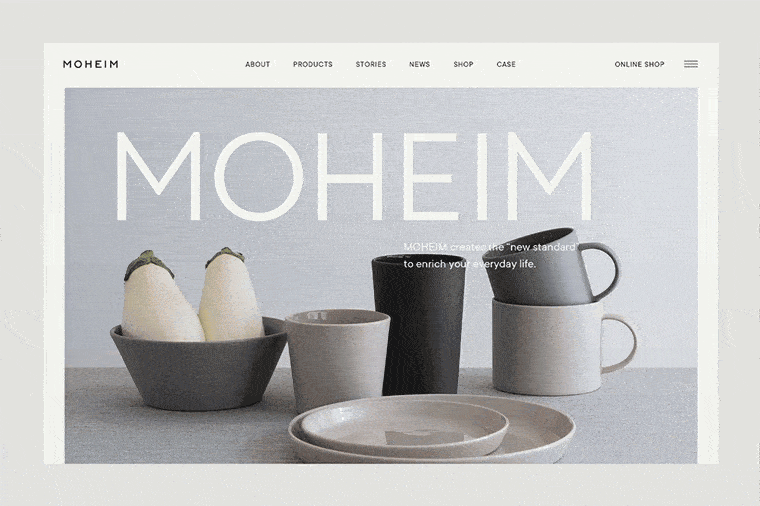
About the photos used
Because of the limited budget for this project, the visuals had to come from the client's existing stock, and we spent a great deal of time retouching them.
About the animations
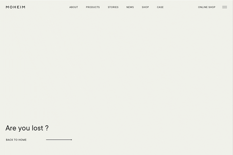
We placed interactive elements and animations that would surprise and delight users in places they would not notice at first glance, such as mouseovers on banners and 404s.
In our past projects, our developers often took the initiative in creating those staging elements. However, this time, the designers created the video and path animations as a new approach for our team. Our developers used animation libraries such as GSAP and Lottie to output these animations to the browser, creating a unique presentation.
As users casually browse through the site, they will encounter slightly unconventional effects they have never seen before. Thanks to the impact of those presentations, we adopted a simple presentation that followed the site's general tone and feel for the other aspects.
We did not use special techniques to manage the performance of the animations but spent a lot of time adjusting the easing/seconds, etc. (This was very enjoyable for us, and we considered it essential to maximize the site's quality.)
Tools used
Animation: GSAP, Lottie Web, Three.js
Page transition: Page.js
Service Worker: Workbox
Company Info
baqemono is a creative studio based in Tokyo, Japan.
Click here to learn more about our work.