Mogney is a QR payment service based in California. It allows sales points to accept payments without credit cards or smartphones. Our task was to showcase the advantages of the service to the clients and tell them why they should choose it over the familiar payment methods.
The objective was to introduce the new product to users, which means the design has to hold the attention and direct it by highlighting the key points, providing available information and impressing at the same time. We’ve taken care of more than just showing something complex in a simple way, but also of indulging the user. And, as we know, finding pleasure in the website equals finding pleasure in the brand.
How the idea came to us
The main thing that scares people off from trying a new technology is the necessity to study complex instructions and the anticipation of the problems that may come because of misusing it. Especially it is the case with everything related to money. That is why we presented the service terms in the most illustrative way and with a simple, but engaging interaction.
The curtain idea was a game-changer — it didn’t just solve the task but became an interactive game for the users. So we’ve adapted it for all the devices and it became the main UX element everywhere — designer Elena Kudaeva.
We’ve gathered all the information on one page and broke it down into a clear structure. By studying the service we saw that the questions and fears of both businesses and customers are similar, the difference was in the solutions offered by the service. This is how we came up with the curtain idea — to switch the content with one gesture meanwhile keeping the structure in place.
The design that solves business tasks
A good logo shows the essence of the product. For the Mogney logotype, we came up with a fictional currency sign: it speaks to the user saying they can pay either in dollars or by using Mogney, which is equally easy.
The company is promoting the service for the two categories of users at once: there are two apps in App Store and two in Google Play, and it confuses people. To set clear visual references, we’ve chosen vibrant corporate colors — blue and orange. They are used on the site’s pages, in the apps and in other means of communication with users.

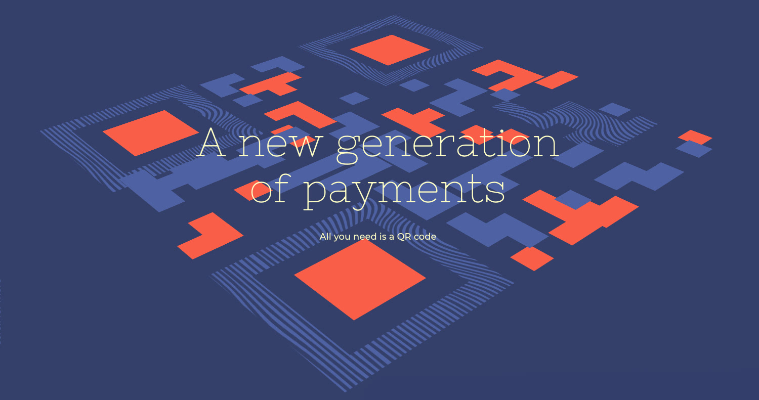
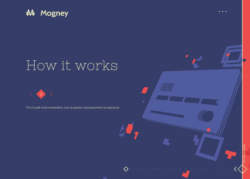
For the main symbol of the site we chose QR code itself. When scrolling, it transforms into new illustrations: we’ve showcased how complex technologies generate a unique code in a smartphone, replace plastic cards and become a simple solution for everyday shopping.
Complex interactions load instantly
The main task we were facing at the development stage was optimization. Design solutions do not make much sense if the website doesn’t load when you need it to. This issue is important for any project, and here we did really well: the website loads on any device immediately. It is due, in no small part to the principles of Creative Frontend Development: all the objects, solutions and animations were created specifically for this project from scratch.
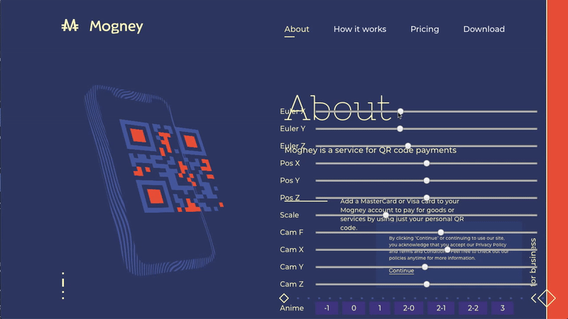
To work on complex objects we developed configurators. The website has six 3D models that have multiple settings of the camera, angles, rotation, placement on the screen and scale. After that, the image is combined with the draft using Pixel Perfect: this allows us to see the overall page composition and get the best position of the object on any screen, which eventually speeds up the whole process of frontend development. — Anton Ustinov, Creative Frontend Developer.
In general, the website is bright, voluminous, and has cool interactions. It might seem like it has many complex elements that are supposed to overload the site, but on the development side, it all looks different. For example, the QR code consists only of two types of squares, blue and orange that are duplicated according to coordinates. They make a group that moves on the 3D scene. This means we don’t need to load the whole picture, but just to draw two squares through Canvas. As the picture is fragmented, it weighs less and there are fewer textures in video memory — just two.
Due to the dichromatism of the site, it might occur to you that there are two images of each object for the site that load when the site loads, but it’s not quite like that. There is a highly optimized SVG code in JS, and the color is being added already at the site. Due to the fact that there are fewer server requests, we’ve managed to fasten loading by half, and the website works wonders even on outdated computers and is extremely fast on smartphones.
Mobile Site of the Week

The Mobile version of the site is as important as the main one. That is why we’ve adapted all of the functions and animations and transferred the smallest details for the full user experience. On the desktop version, the QR code on the first screen slightly tilts depending on the cursor position, and on mobile its movements are tied to the movements of the device itself: the website gets the data from gyroscope and its code mimics the tilts.
We think that a cool project should not just address the needs of a business, but push the industry forward, and set new standards: Mogney won Site of the Day, Developer Award and Mobile of the Week on Awwwards.

About the agency
Red Collar is an agency from New York that implements bold ideas using the most modern technologies. We create impressive projects that help brands to enter people’s hearts and minds. It has been proven by over a hundred professional awards and by clients that come back for more.
Subscribe to get our news on Facebook, LinkedIn, Twitter or Behance.