The story of this portfolio goes way back. Just after finishing my studies in 2019, I started my freelance career. And at the same time: My portfolio. Four years have passed since then, and while the design has completely changed halfway through, and I managed to discourage one developer and then motivate two others, the core concept has remained the same: Designing a portfolio that reflects the versatility of my work.
From the beginning of my studies until today, I've kept this desire to explore various technologies, learn new forms of expression, and be a generalist designer rather than an expert specialized in one field. This exploration involves using different means of expression such as interface design, motion design, 3D design, illustration, UX, storytelling, and more. It also extends to the wide range of clients I've worked with in recent years, from craftsmanship with ism to haute couture with Dior, event management with Pernod-Ricard, cultural institutions like the Château de Versailles with Google, technology with Mojo, storytelling with Nomadic Tribe, gaming with France Patate, and the nonprofit sector with Béa, among others.
This portfolio is built around this principle of multiplicity and versatility.
Reload concept
Right from the loader, we introduce the visitor to the concept of "reloading" symbolized by the associated button. This button appears in different places on the website to refresh the text, reveal another aspect of the project, or present different content. As it is the key interaction of this portfolio, we invested a lot of effort, both in motion design and development, to push the concept of this button to the maximum.
A brief explanation of how Ivan developed it.>/p>
The bouncing button with the rotating arrow can be broken down into smaller parts. First, we created the basic morphing from the "normal" SVG shape to the "rounded" shape. Then we added a "scale-up" animation and a background color change for the hover state. When clicking on the button, it returns to its previous state and continues to scale down, creating a "bouncy" effect. The arrows have their own rotation animation and naturally scale with the button container. When the button is hovered over, we make the arrows slightly scale up to accentuate the growing effect.
On the About page, the concept of refreshing is further developed. Each line can be refreshed using the "refresh" button to discover a new aspect of my skills, the clients I've worked with, the agencies I've had the chance to collaborate with, and the awards that have recognized these projects.
On each project page, we find the reload button again. It introduces the most important keywords related to the project, as if answering the question, "If you had to summarize this project in three words, what would they be?"
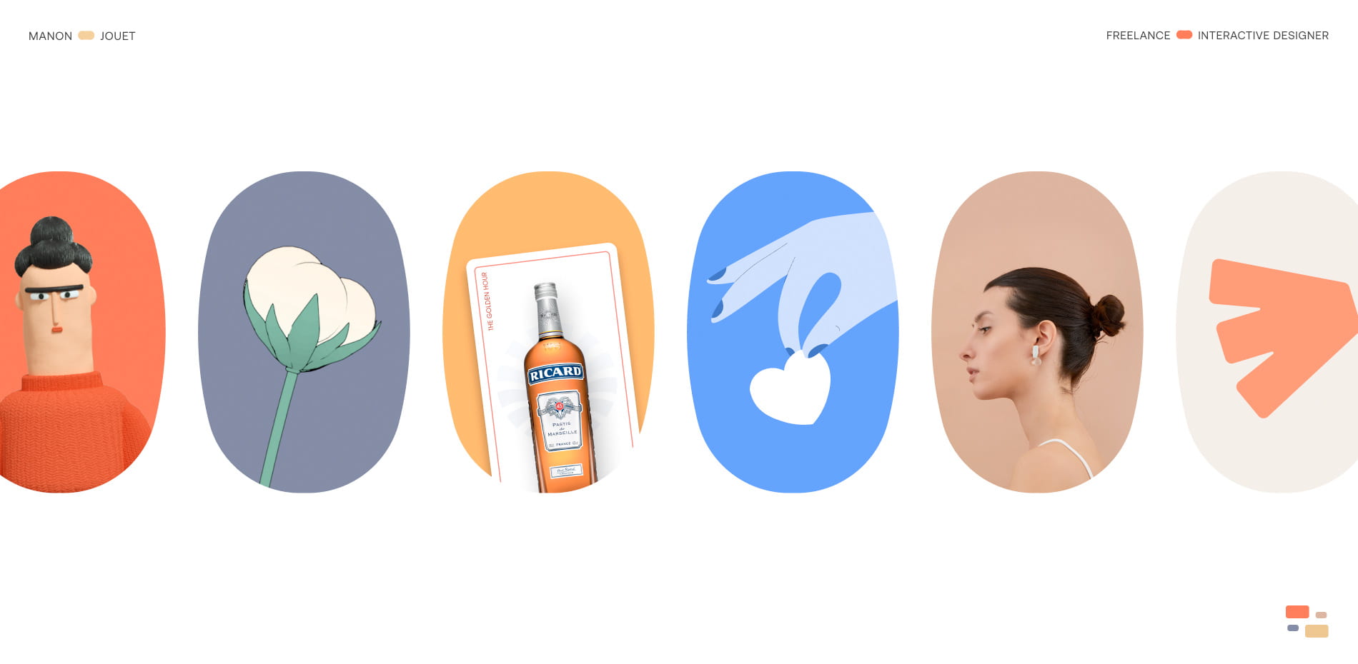
On the homepage, each project is encapsulated in a small colored window. The visual universes of the different projects are completely distinct, and visitors can be guided towards the one that attracts them the most. Whether it's discovering the playful character of the hybrid game France Patate or exploring the more serious topic of Japanese craftsmanship with ism.
“The core concept hasn't changed: Designing a portfolio that reflects the versatility in my work”
Playfulness
After versatility, the second major concept of this portfolio is playfulness. I noticed at the end of my studies that 90% of the projects I had worked on were either games or included gaming mechanics. In short, it had to be fun in one way or another.
Colors
I've selected a specific color for each project, choosing the hue that best represents its spirit. I asked myself the question, "Which color would best capture the essence of this project?"
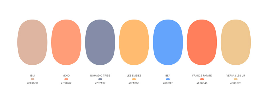
For example, for the Versailles VR project, I chose a golden color, referencing the gilding and sumptuous trinkets found in the Palace of Versailles. This hue evokes opulence and a luxurious aesthetic that characterizes the project.
For the ism project, I chose an earthy color that reflects the clay used in ceramics. This color highlights the connection to craftsmanship and natural materials.
For Les Embiez project, I opted for an orange-yellow color, evoking both the sun and the famous Ricard aperitif. This vibrant and warm color reflects the sunny, friendly, and festive aspect of this event-oriented project.
Thus, each project in my portfolio is associated with a color that visually captures its essence and distinctive atmosphere. This approach contributes to creating a coherent and immersive visual experience.
The use of colors plays a significant role in creating this joyful aspect, but we also wanted to incorporate it into the animations and micro-interactions. The animations are built around the "bounce" easing, with rounded, responsive, and organic shapes, and lively text. Ivan and Thomas have a great sensitivity to motion design, and despite what they might say (wink), there was almost no rework on the animations and transitions. They managed to create enjoyable interactions that make visitors want to come back for more.
The previous button:
This is a very old trick to show an infinite translation. There are 3 arrows, but the last one is out of the view and hidden by the `overflow:hidden` of the container. When hovered, we animate each arrow to translate to the left by 100% of their size, revealing the last arrow and hiding the first one. When the animation is done, arrows will take their original position tricking the eye to think they are infinitely looping to the left. We also added an animation to stretch the container to give a more “alive” feeling while animating.
Technologies
To create the carousel, we utilized DOM Elements listeners for scrolling, dragging functionality and hovers. This approach ensures consistent behavior across different devices and web browsers, without relying on the mouse-wheel event for scrolling or ray casting in WebGL for mouse events. We implemented the carousel's logic using JavaScript and requestAnimationFrame, enabling communication between the DOM and WebGL.We explored various techniques, such as SVG, Canvas 2D DOM, and WebGL, for building the carousel. After thorough experimentation, we found that WebGL was the most suitable choice for achieving a seamless animation. We used OGL as it is a small and effective WebGL framework, as we mostly needed a simple camera and plane meshes. By employing an orthographic camera, we could work within a 2D space, allowing us to use pixels instead of relative positioning and maintaining a 1:1 alignment with the design.
Working with videos can come with performance cost with WebGL, but using the recent implementation for “requestVideoFrameCallback” enable us to play smoothly the videos.
While evaluating different approaches, including SVG, creating the shape in GLSL, or combining mask images, we ended up utilizing Signed Distance Field (SDF) textures, providing the best fidelity to the design with simplicity. To generate SDF images, we utilized a helpful node tool developed by Matt Deslaurier. This tool allowed us to create two gradient images, and then smoothly blend together using a smooth step antialiasing function in the fragment shader. The use of SDF textures enables us to animate shapes without encountering aliasing issues or compromising performance.
Design
Figma
After Effects
Typography - Aeonik by CoType Foundry
Credits
Manon Jouet: Creative Direction and Motion design
Ivan Daum: Front-end & animations
Thomas Van Glabeke: WebGL carousel