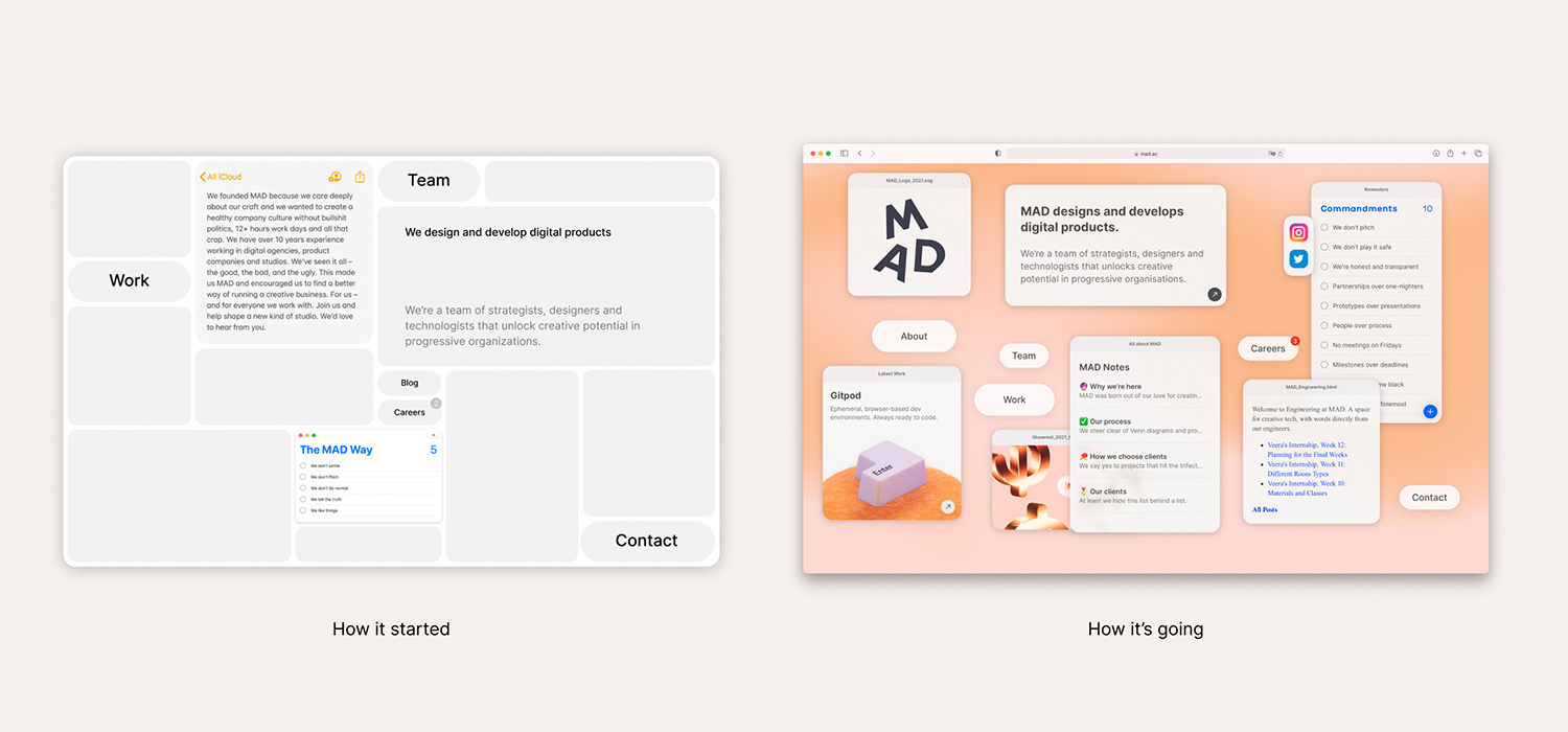
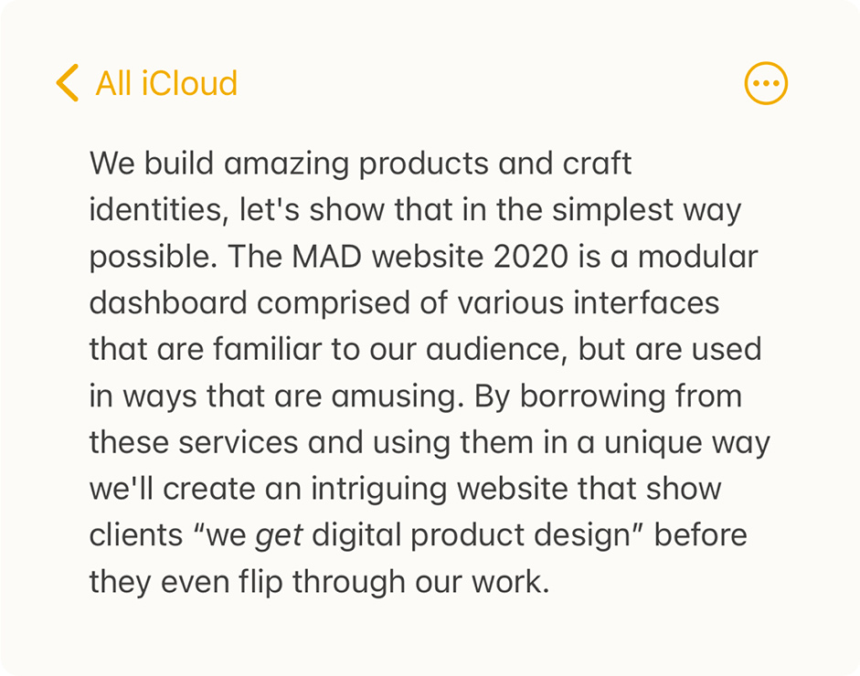
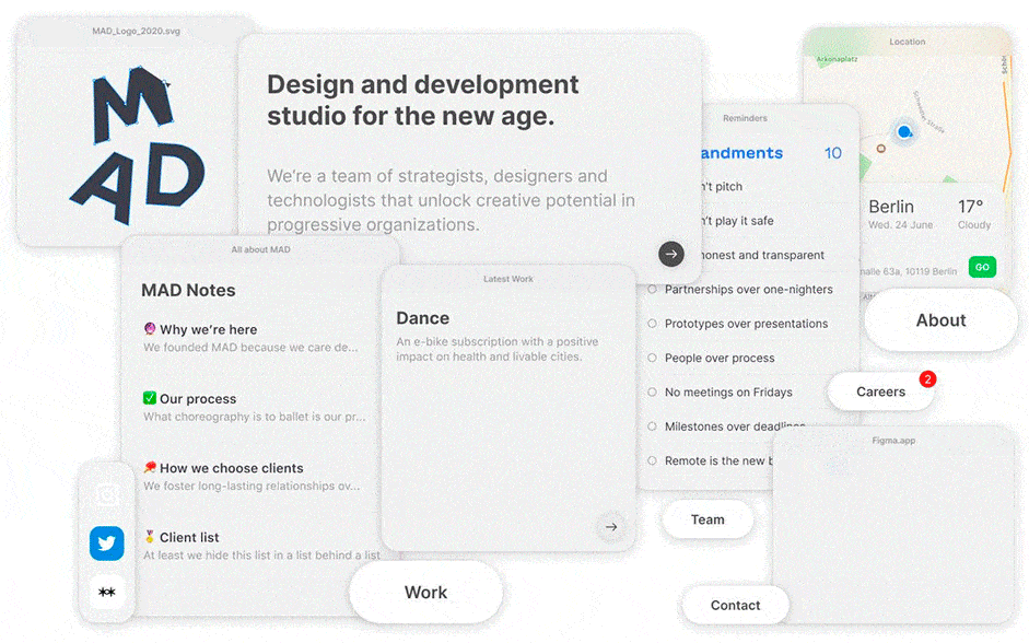
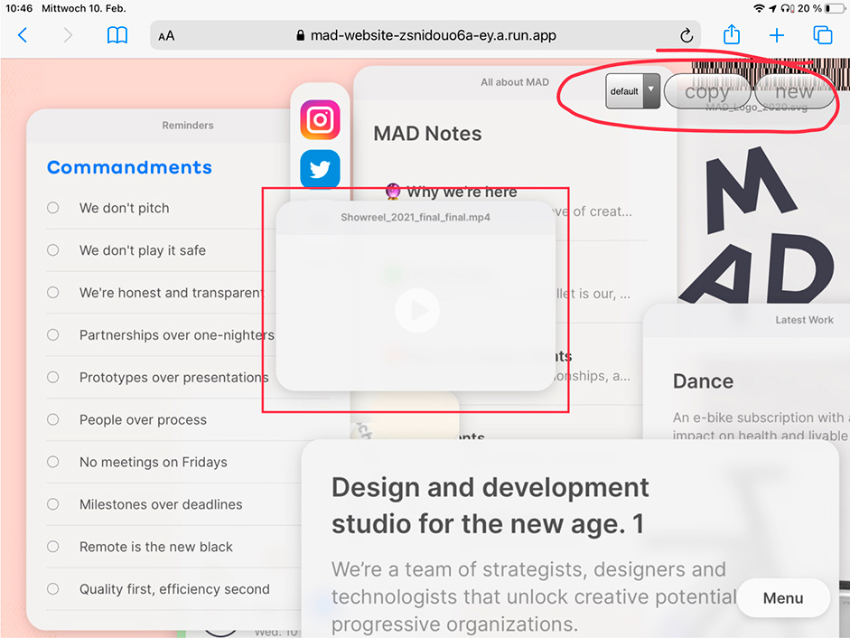
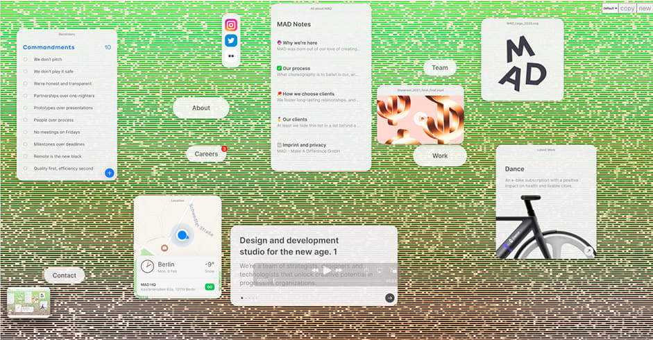
In early 2020 we set out to redesign our website. After a couple of ideation jam sessions, the seed of a concept was pitched in the form of a hasty mockup (see above).
What it lacked in polish, it made up for in ambition–to show what MAD was capable of without a visitor having to navigate to our ‘work’ section. In this case study, we’ll reveal our process as well as the challenges our small team of 6 faced over the year-long (side) project.
Ideas and parameters
Once we’d decided on the idea, we set about writing a vision for our website, something we could look back at and measure our work against every few weeks. Ideas can be easy to come by given favourable conditions, but too often ideas remain ideas, or fail to meet the purpose for which they were conceived. Ideas need to be measured, validated and constantly prodded. Those that survive, whether by evolution or careful pruning, will form the most solid base and fare better into the future.
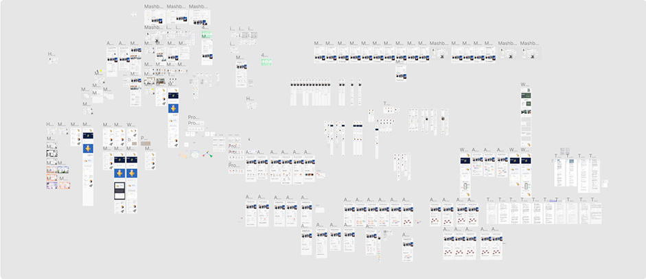
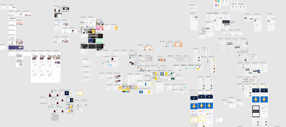
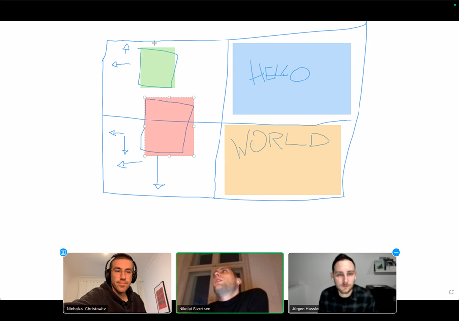
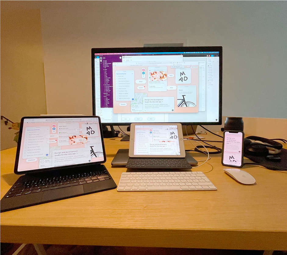
This gave us enough of a direction to get started with experimentation. The challenges of creating a pseudo OS-desktop-as-a-website showed up in many different forms, from how to maintain hierarchy on a cluttered desktop, to how to treat detail pages. We wanted this website to showcase how closely our design and engineering teams work with each other, so we involved the whole team from day one, utilizing constant feedback loops and jam sessions in Figma. Below you can see a few of our ‘playground’ Figma docs which illustrate how we iterated and iterated until we felt we had met the vision outlined above.
The challenges of creating a pseudo OS-desktop-as-a-website showed up in many different forms.
Refining a design–data vs. intuition
We firmly believe that intuition and experience should drive decisions. This means we use data gleaned from UX interviews only to back up our intuition. Too often designers are data-driven, hoping verbose and number-heavy notion docs will save the day, instead of conceptualizing and iterating their way to a solution. In practice this means we explore widely and loosely before iterating on those explorations until they feel right.
As you’ll see in the GIF above, we made several stylistic attempts at our dashboard design style. Even though we’d landed on our chosen style really early on in the process, we took a few days to try alternative designs just to confirm we’d made the right decision initially. Having the time to experiment this much really contributed to the overall quality of the final product.
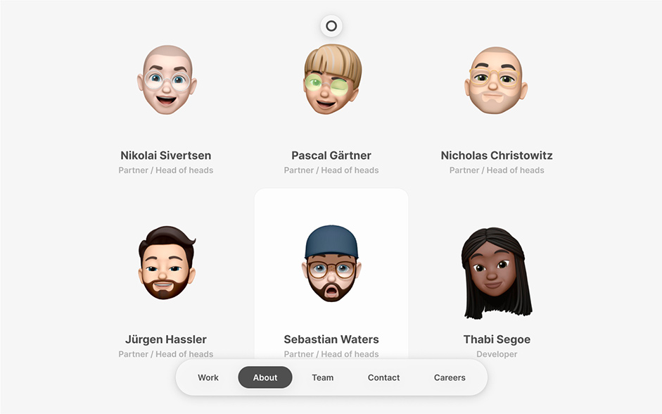
We’re massive proponents of practical solutions. As part of the initial concept, we decided we’d use Apple Memojis instead of team photos. They’re fun, easy to create, and way more efficient than calling a photographer in for every new team member. It’s not a novel idea, nor a wild one, but in the context of a website like ours it seemed like the most logical solution.
Responsive challenge
Creating what is essentially a series of windows within a browser window posed an interesting challenge. We needed to ensure the 0.1% of people who drag their browser windows into different aspect ratios to stress-test a website’s responsiveness would be pleased with the way the windows moved and arranged themselves. We also needed to ensure that we maintained a certain hierarchy on the z-index so buttons would always find themselves on top. First, we split up the modules by priority then our engineering team built a few different tools to allow the design team to move modules around on a test instance of the website, and save the coordinates of said modules (for use in the final version), thus allowing us to ensure that the first look at our website would always be a visually pleasing composition at multiple breakpoints before the user started playing around.
Creating what is essentially a series of windows within a browser window posed an interesting challenge
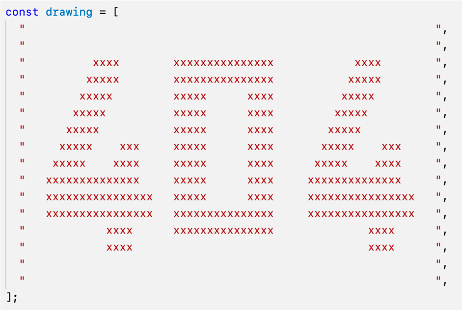
The value of prototyping and happy mistakes
Our 404 page is our visual reminder of why we ensure that design and engineering work side-by-side from day one.
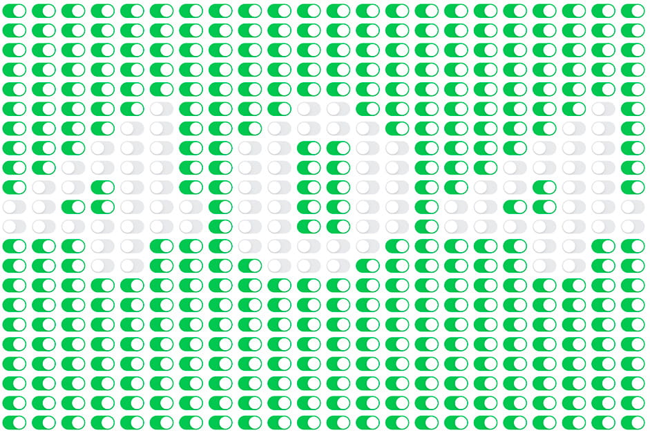
The idea was pitched half as a joke and half as a challenge to our engineers. The result is something neither design nor engineering imagined at the outset. What was meant to be a funny 404 page made up of interactive radio switches became an interactive drawing tool... mostly by mistake and miscommunication. Lately we have found we’ve been able to harness these lucky outcomes more and more for our clients.
Result
Half-pixel borders and browser compatibility
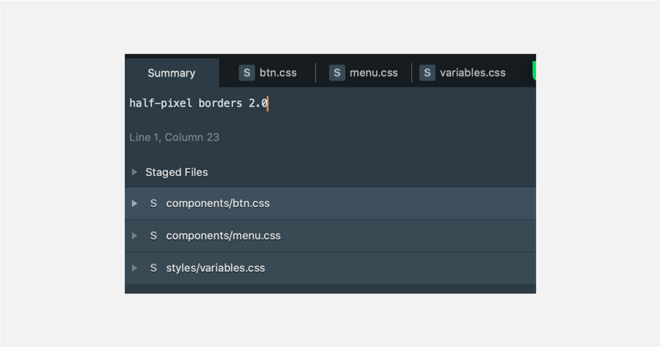
Our design made extensive use of half-pixel borders, but unfortunately, only Firefox and Safari support fractional pixel widths on borders. We therefore chose to fake these using box-shadow. This worked well across browsers, and some CSS custom properties made it easy to use different variants across the site and easily refine them together over calls.
The home stretch
Everyone’s favourite, QA. It’s hard to put into words how vital a solid QA process was to the success of this website. We took a full month to refine and polish and nudge and break and fix every element until the website matched the level of quality we expect from ourselves. Multiple devices, Linear, Tuple, and Tailscale made this daunting process more manageable.
One thing we realized fairly late in the process was that the window dragging interaction required a different set of tweaks to feel good on a tablet than those we had already implemented for mobile and desktop. On desktop, windows can be dragged the usual way. Using the same technique on mobile would mean that windows move when you’re simply trying to scroll. We, therefore, added a long-press mechanism with a timeout to initiate dragging on mobile.
However, this same mechanism felt sluggish and unresponsive on a tablet, where we almost had the screen real-estate of small desktops but the interaction model of mobile. To solve this, we sat together on a call for hours, sharing localhost in real-time with each other using Tailscale, and reloading the site on all devices after each change to see how it felt. In the end, this allowed us to find solutions that felt good across devices.
Technologies
Frontend:
Typescript, Preact, preact-custom-element, custom WebGL fragment shader
Backend:
Node.js, Sharp for image processing
Tooling:
esbuild for super fast builds, rsync and systemd for deployments
Collaboration tools:
Tuple for remote pair programming, and Tailscale for remote live prototyping
The main challenges we came across were performance-related. Modules were slow to drag around when they had a background blur, and dragging them around impacted the smoothness of our background shader’s animation.
We optimized these aspects to create a smoother experience:
- Make client-side rendering more granular by only hydrating specific parts of the page via custom elements. This improved time to interactive considerably. Examples are standard things such as a
or , but also elements such as (for the background shader) or (for the notes applet on the home page). - Disabling the CSS backdrop-filter effect in Chrome because it was noticeably slowing down dragging performance compared to Safari (Firefox doesn’t yet support backdrop-filter out of the box).
- Pausing the background shader when dragging modules on the landing page to give the browser an easier time computing the background blur.
- And then a host of standard optimizations, such as using the Sharp library to dynamically resize and compress images based on the screen size or making judicious use of preload headers.
Company Info
MAD–Design and development for every screen.