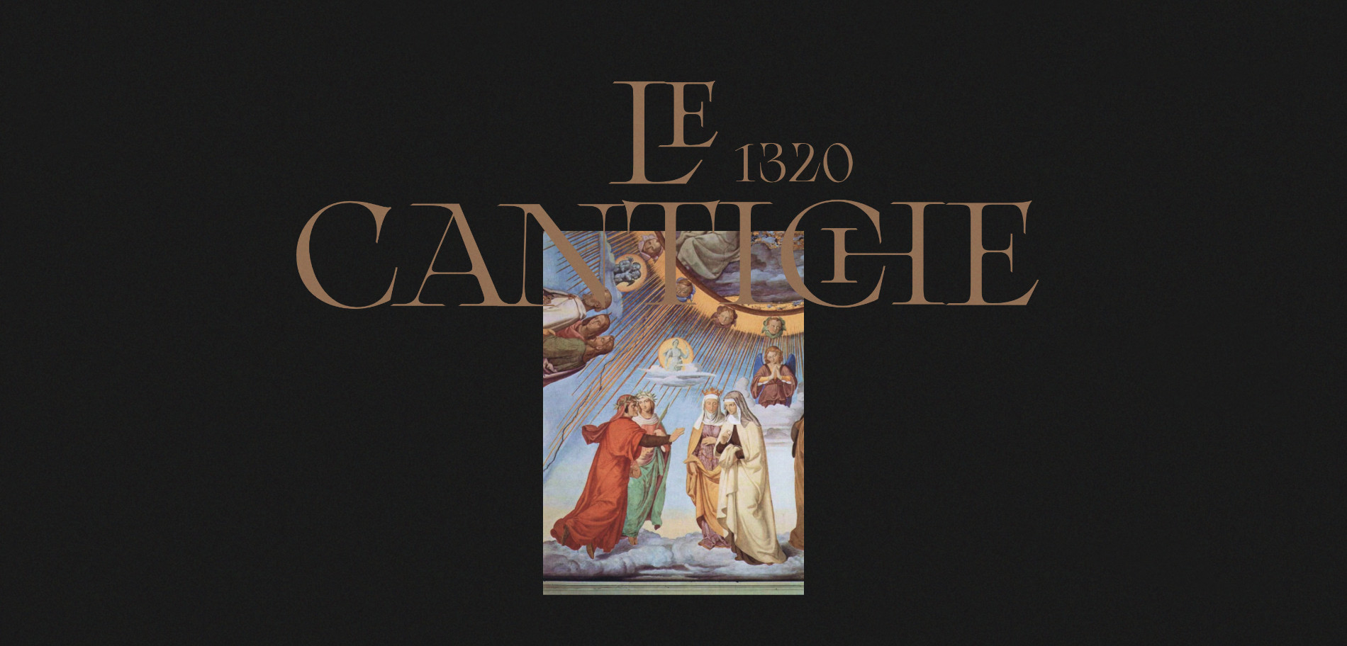
Le Cantiche 1320 is a personal project to celebrate the 700-year anniversary of the iconic Divine Comedy. The Italian narrative poem written by Dante Alighieri in 1320.
The Divine Comedy is one of the most important and well known works written by Dante Alighieri, it is studied all over the world, and considered the greatest masterpiece of literature of all time.
I’ve always been fascinated by Dante's masterpiece and I’ve enjoyed studying it a lot at school. Because this work is written in the vernacular language, (the ancient Italian language), definitely studying it can be very difficult. This project has been created and curated by Creative Director Emanuele Milella in collaboration with Front-End Developer Clément Roche.
.jpg)
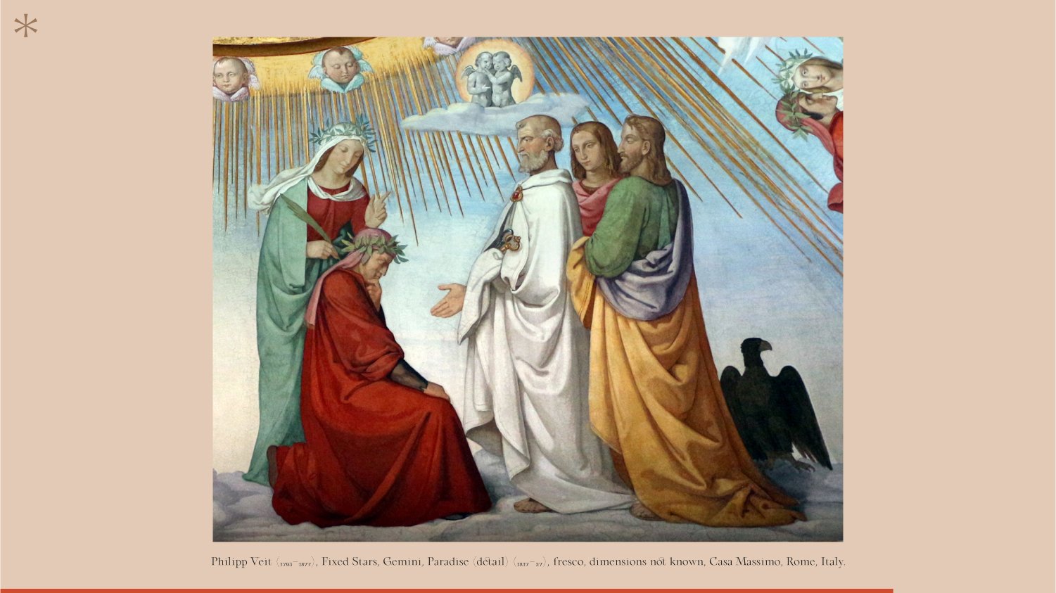
A huge part of the design process was spent on research. Even though I studied the poem for several years at school, I wasn’t able to remember everything, so it was crucial for us to dust off the books and open them again. Collecting all the important information, gathering all the right content that needed to be displayed and sourcing all the related images gave us the ground foundation to build the initial design concept.
.jpg)
In parallel to the research, we created a copy/paste storyboard with all details of the project to better visualise all the elements involved, and to start to create a design structure. With this in mind we started different design explorations for the page layouts and structure. The storyboard was so important and made the design work much easier. The whole design was built in separate/independent blocks, allowing them to be moved across the whole design if needed.

I usually have the tendency to use storyboards for my design. It helps me visualise better all the elements and future components of the whole experience
Layout and Content
The main idea of this project was to reproduce a digital booklet where users could browse easily without losing the look and feel of a book. I thought that having a combination of large images and big and bold typography in a storytelling layout would help people to get more engaged. We decided to have the design as a double page spread like an open book, so choose to have a horizontal scrolling experience.
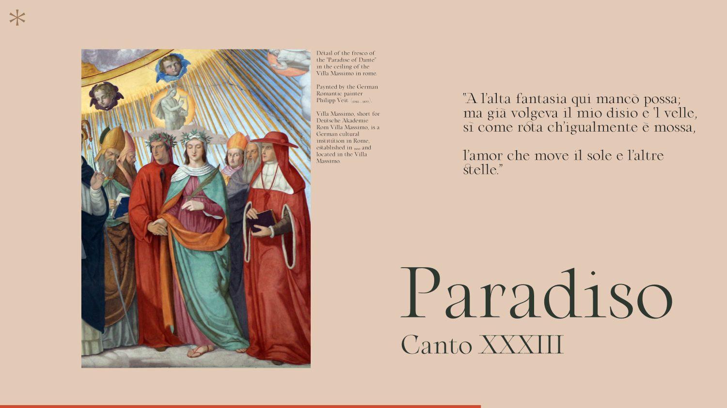
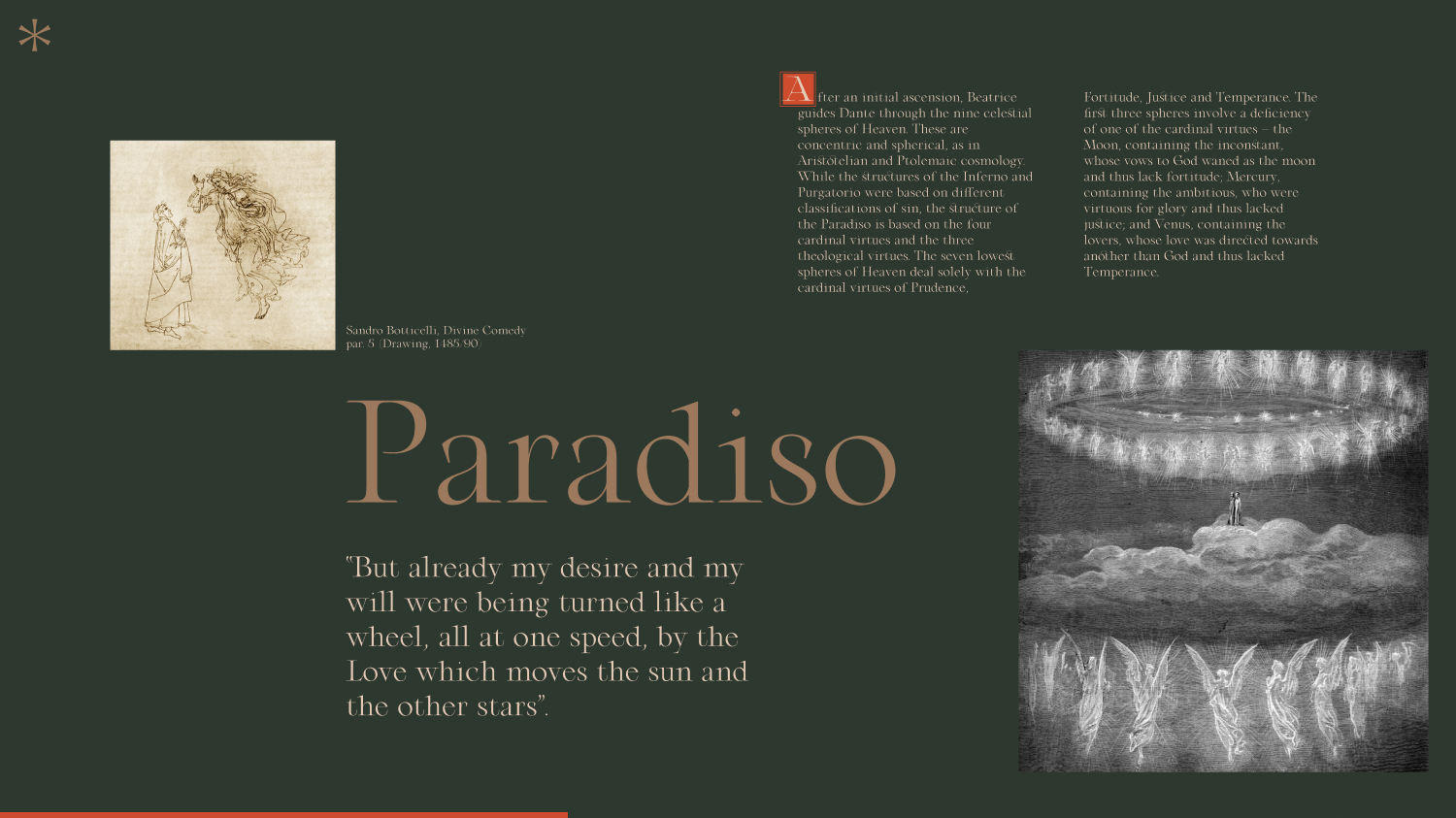
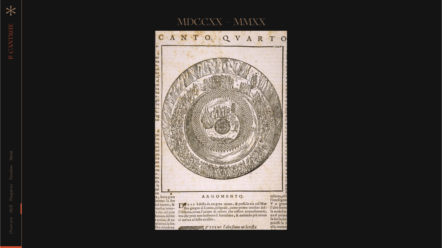
The layout is divided into four main sections where we focus on each book of the poem. The Hell, the Purgatory and the Paradise. An introduction page was created to introduce the project and the overall details of the three books. A particular effort has been made on the design in order to highlight all the illustrations and images. To follow this path we tried to give full height to most images.
Art Direction
I really enjoyed art directing this project! I somehow managed to add exactly everything I wanted and envisioned in my mind in the right place. It was a lot of work but also a lot of fun.
.jpg)
Particular attention was given to the typography in use. In all my projects I make a lot of room for typography, as for me it’s 90% of the design and can drastically define the look and feel of the whole experience.
We wanted to highlight somehow the old century style. So we decided to use a meticulous and generous serif family typeface based on XVIIIth Century French aesthetics, in order to create this atmosphere. A lot of time and research has been spent finding the right style. In the end we decided to use the font “Arthemys Display'' designed by Morgane Vantorre, a French type designer. It was great working with her, the collaboration and her availability was fantastic!
In all my projects I make a lot of room for typography. For me it’s 90% of the design
Arthemys Display is inspired by old engraved letters from cartographies, and represents a bringing together of shapes from the past with a contemporary twist. The graphic particularities of Arthemys (especially its ligatures and alternates) enable any text to have both a delicate and majestic value.
In order to create this atmosphere, we decided to use a meticulous and generous serif family typeface based on XVIIIth Century French aesthetics
Technologies
The main idea was to adapt the book reading feeling to a web experience, so we created several nice effects from it. First, we decided to use viewport height as the main unit in the CSS in order to keep the same layout whatever your viewport dimensions. Then, we played around horizontal smooth scroll parallax on images to add some volume to the reading. Next, to lead the user reading, we created a text block fade using CSS ‘mask-image’ property and ‘linear-gradient’ function. Finally, using WebGL and Fractal Brownian Noise we did a dissolve effect to imitate paper burning-feeling.
Also, for performance reasons all images are rendered with WebGL.
Frontend:
Libraries:
Hosting:
Author’s Info
Emanuele Milella is an Italian Creative Director and Interactive Designer. With a focus in web interfaces and interactive design, Manu defines the visual design of a project - from initial exploration to final deliverables. Since 2015, he has been working with many companies (from digital agencies to startups) helping them to create interactive product experiences.
Clément Roche is a freelance developer based in Paris. Student at Gobelins and front-developer at Neuvième Page.