Introduction
J-Vers is a programmatic job advertising agency with years of experience in the field. They develop recruitment ad strategies that deliver immediate, predictable results — optimizing time, cost, and effort in the hiring process.
When they approached us at Obys, their request was clear: to create something vibrant, tech-savvy, and engaging. A site that not only looks exciting but also communicates the company’s essence at every step.
As always, we started with a mood board — carefully collecting visual references to shape the style and energy of the future site. Together with the client, we explored ideas and aligned on the best ways to bring them to life, ensuring the final direction matched their vision.
The project included three main pages: a Homepage, a Case Study page, and a Career page. Each one had to feel dynamic, interconnected, and stylistically in tune — creating a cohesive user journey that leaves a lasting impression.
Bringing the J-Vers Identity to Life
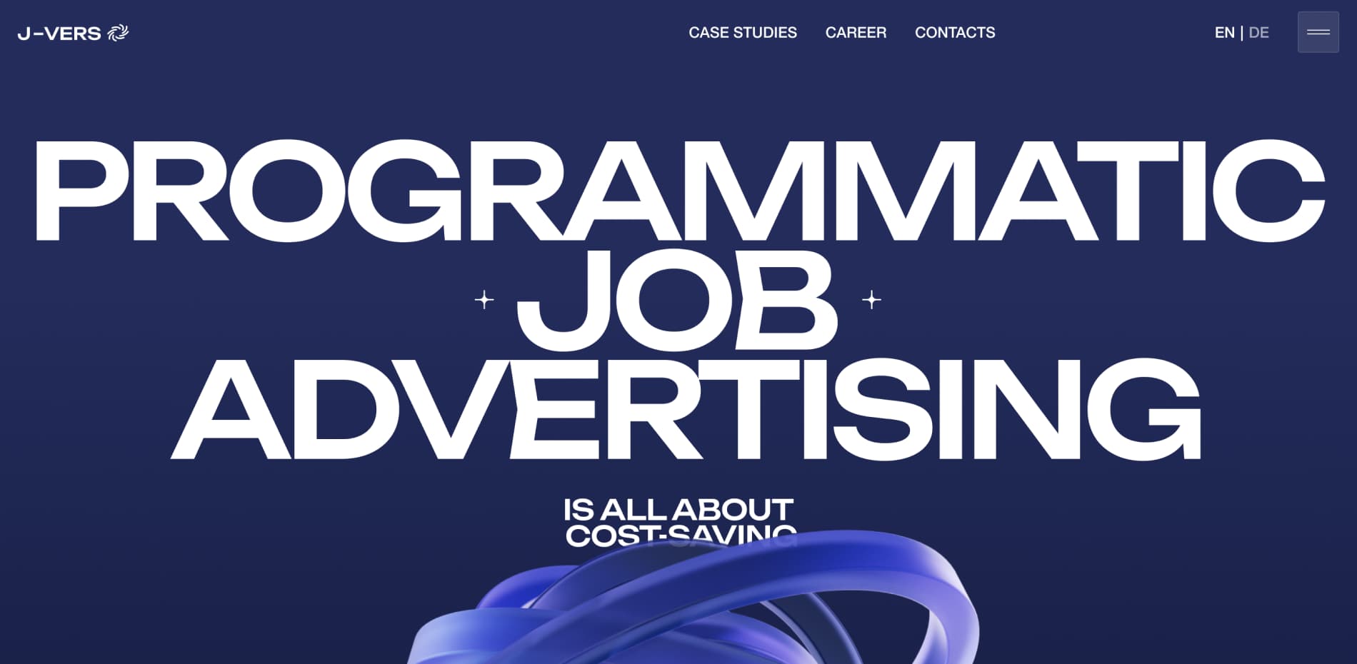
J-Vers already had a distinctive brand identity — bright colors, custom typography, and abstract forms that expressed their unique spirit. Our task was to seamlessly implement all of that into a modern, clean website design that still felt bold and expressive.
We built a sleek, visually balanced interface using black and white as the foundation, while bright brand colors were applied strategically as accents. This approach kept the overall look elegant and focused while still delivering strong visual character.
To elevate the interface further, we added some of our own Obys-style touches — oversized typography, subtle lines, expressive illustrations, and a clean typeface for the main content. These elements helped add rhythm and personality throughout the experience.
One of the biggest strengths of the brand identity was its colorful gradients and abstract shapes, including oval spheres and spirals. We brought those into the site as 3D objects and background graphics, helping to maintain a strong visual link between the brand and the digital experience.
“Whether you’re missing content or dealing with tricky typography, there’s always a way forward. Keep experimenting, stay flexible, and trust your process. ”
Creating Visual Content from Scratch
One of the early challenges we faced was the absence of content. J-Vers didn’t have any ready-to-use visuals — no photos, no 3D assets, no videos. But instead of seeing this as a limitation, we turned it into a creative opportunity.
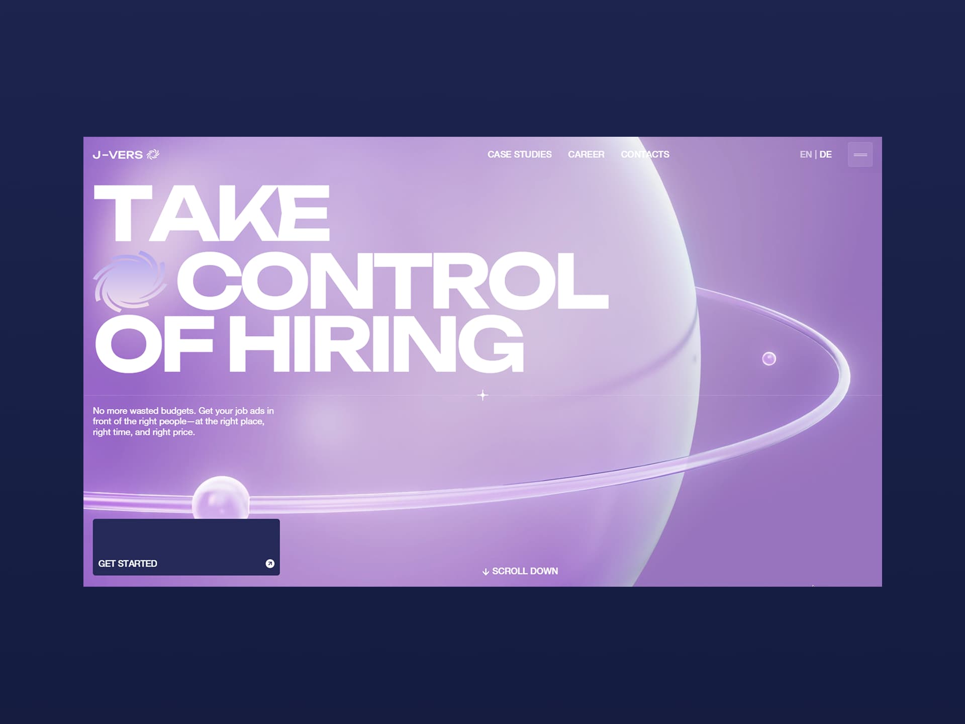
We generated images of people using AI in Midjourney based on mood boards and real-world photo references that matched the company’s key industries. All 3D illustrations were custom-made by our design team in the J-Vers brand style. These visuals weren’t just decorations — they became core storytelling tools. For example, in the hero section, we created a cinematic transition from the preloader to a 3D animation that shows a planet orbited by smaller spheres. This symbolic scene captures the brand’s concept: people and professions revolving around the J-Vers universe.
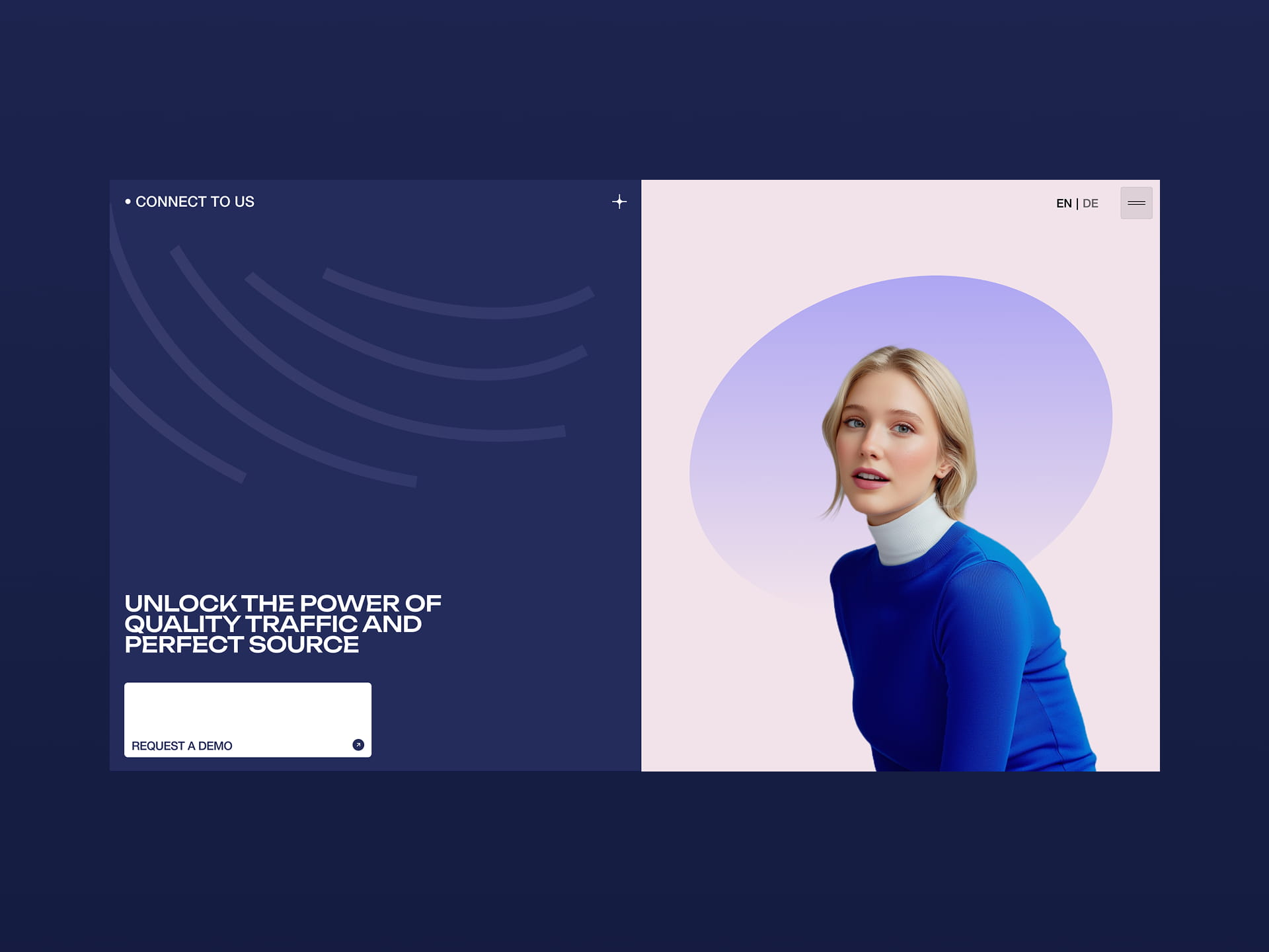
We also introduced unique 3D characters — human figures in minimal, white spaces, surrounded by interface elements, icons, and data layers. They evoke a sense of futuristic, human-centered technology — something smart, streamlined, and full of potential.
Every visual element on the site — from the illustrations to the AI-generated humans — was designed to feel aligned with the brand’s tone and help guide the visitor through the story.
Turning Limitations into Creative Solutions
One of the early challenges we faced was the absence of content. J-Vers didn’t have any ready-to-use visuals — no photos, no 3D assets, no videos. But instead of seeing this as a limitation, we turned it into a creative opportunity.
We generated images of people using AI in Midjourney based on mood boards and real-world photo references that matched the company’s key industries. All 3D illustrations were custom-made by our design team in the J-Vers brand style. These visuals weren’t just decorations — they became core storytelling tools. For example, in the hero section, we created a cinematic transition from the preloader to a 3D animation that shows a planet orbited by smaller spheres. This symbolic scene captures the brand’s concept: people and professions revolving around the J-Vers universe.
We also introduced unique 3D characters — human figures in minimal, white spaces, surrounded by interface elements, icons, and data layers. They evoke a sense of futuristic, human-centered technology — something smart, streamlined, and full of potential.
Every visual element on the site — from the illustrations to the AI-generated humans — was designed to feel aligned with the brand’s tone and help guide the visitor through the story.
Core Features and Design Highlights
From the very beginning, our goal was to create an immersive, emotional experience. We didn’t just want to design a website — we wanted to design a journey that feels alive. Every animation, every transition, every interactive detail was crafted to reflect the essence of J-Vers and its people-centric, tech-forward philosophy.
Transitions play a major role here. The first thing users encounter is a cinematic opening — a smooth entry into a 3D scene where silhouettes of people orbit around a central planet. This symbolic world introduces the idea of professions revolving around the J-Vers universe.
Throughout the site, we used animated 3D shapes that respond to scrolling, adding depth and tactility to the experience. Fixed elements keep the interface feeling grounded, while dynamic content keeps it engaging.
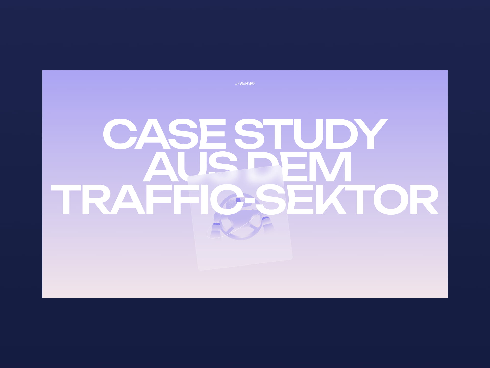
On the Case Studies page, we introduced an orbit-style transition to smoothly dive into each project. Each case is represented by a floating “glass” card paired with a custom illustration — an interactive design that invites users to explore.
And then there’s the cursor. A playful element that leaves a pink paint-like trail as you move. Pause for a moment, and it comes to life on its own — subtly reminding users that this site is responsive, alive, and ready to surprise.
All of these design elements work together to deliver something memorable. It’s not just about aesthetics — it’s about creating a digital space that feels tactile, emotional, and real.
Technologies
The project’s frontend was built using Next.js, chosen for its hybrid static and server rendering capabilities, which allowed us to optimize both performance and SEO.
Key libraries included:
- React Three Fiber (R3F): A React renderer for Three.js that made working with complex 3D scenes more declarative and maintainable. It greatly simplified the integration of WebGL elements into the app.
- Three.js: Used for custom shaders, lighting, and advanced 3D object handling. We combined it with R3F for physics and camera control.
- GSAP: Our go-to animation library. We used GSAP for scroll-triggered animations and entrance transitions, giving the website a polished, dynamic feel.
- Tailwind CSS: It has become our default utility-first framework of choice for every project.
Backend Technologies
For content management, we used Strapi CMS. It provided a headless CMS with a clean admin UI and customizable content types, making content management straightforward for the client. Strapi’s REST and GraphQL APIs allowed us to structure content flexibly and fetch only what we needed, improving performance. We also configured roles and permissions to secure the admin area and control API access.
Server Architecture
The app was deployed using Render.com and Vercel, which handled both the frontend (Next.js app) and backend (Strapi) as separate services: The frontend was deployed as a static site using the SSG (Static Site Generation) strategy.
The backend (Strapi) ran as a web service, with a dedicated database and persistent disk for storage.
Environment variables and deployment pipelines were managed directly through Render’s dashboard for fast iteration and easier maintenance.
Company Info
Obys is a creative design and development agency originally from Kharkiv, working worldwide. We specialize in creating unique graphic and web experiences that combine strong visual storytelling, thoughtful interaction, and emotional impact.
More about us is here and here.
X: @obys_agency
IG: @obys_agency