IMPRONTA: Architecture, Product, and Digital in a Single Gesture
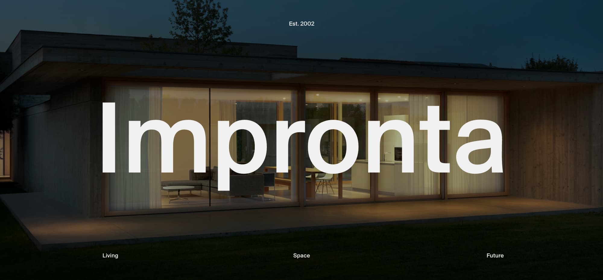
A lightweight interface for dense content. Impronta’s website turns a complex technical world into a digital experience that is orderly, fluid, and measured — where every visual detail serves clarity.
“The elegance of an interface lies in its transparency — when it’s there, but not seen”
Making the Whole Feel Simple Without Oversimplifying the Content
The project began with a clear challenge: making highly technical content intuitive — opening systems, finishes, options, materials. We created a clear visual hierarchy, a lightweight interface, and a modular navigation logic that guides users without overwhelming them.
From the menu to product pages, every element was designed to deliver depth without heaviness. The experience is quiet, clean, measured. The site doesn’t impose an aesthetic — it lets it emerge.
Modular Structure, Coherent Voice
We started with structure: a fully modular, configurable system that allows the Impronta team to build and update content independently, while maintaining consistency and precision. This approach enabled us to manage a large amount of information and shape it into an essential digital narrative. Every section, every component has a clear purpose. Nothing is ornamental, nothing is random. Even the animations — subtle, purposeful, never intrusive — follow this logic: not made to impress, but to guide. The result is a website that doesn’t show off — it shows method.
Technologies and development
We chose Nuxt.js, a Vue.js-based framework, for its performance and reliability. Content is managed with Strapi, an ophttps://nuxt.comen-source headless CMS connected via GraphQL APIs — a setup that ensures flexibility and consistency in how information is delivered. The website is structured around reusable modular blocks, designed to be freely combined while maintaining visual coherence. For animations, we used GSAP, specifically the Flip and SplitText plugins, to achieve smooth transitions and refined micro-interactions.
Company Info
ET Studio is an independent creative studio driven by beauty and meaning. It designs custom digital experiences — websites, visual identities, branding strategies, and content — for brands of all kinds, from established companies to emerging projects. Each work is a carefully designed narrative system, where aesthetics and meaning stay in balance. Design, copywriting, and education are the tools it uses to build experiences that inspire, clarify, and improve everyday life. It works with care and precision, between intuition and method.
What was the biggest challenge about making this website?
Handling a large volume of technical content without making the experience feel heavy. Every element had to be informative but also lightweight, modular, and easy to explore. It was a constant balancing act.
Share a tip about making this website.
Start from structure. A solid modular system can simplify complexity and give your content the space it needs.
What did you learn when making this website?
That you can combine depth with clarity. And that working on multiple brand touchpoints — like the website and catalogue — at the same time strengthens consistency.