Illuminating Radioactivity is an educational website designed by Tubik Studio and shows how thoughtful and daring design can change the approach to modern education.
Radiation holds not only tragic but also curious and inspiring stories and the clients aimed at experimenting with the interweaving and creative retelling of these complex narratives, pushing the standard perception of the phenomenon and broadening the outlook of what people know about radiation. They hoped the project would revitalize the collective understanding, and embolden people to be responsible custodians of our radioactive world.
As for the client side, Illuminating Radioactivity is generously supported by the Stevens Institute of Technology and developed in partnership with the Bombshelltoe Arts and Policy Collective and the Stimson Center. In addition to the website, a part of the project is the book Atomic Sublime by Lovely Umayam and Tammy Nguyen.
Design
The main creative direction the Tubik team got on Illuminating Radioactivity was changing the perspective of a common vision of the radioactivity phenomenon, in particular presenting a great deal of information from experts and scientists in a clear, digestible, and engaging way for the wide and diverse audience. The content visual performance had to move the understanding of radioactivity from something negative to a broader outlook including the positive side as well.
One of the iterations of web design was corresponding to educational needs: airy and elegant, simple and intuitive, somehow looking like a beautiful textbook. That was the moment the client was sure that they wanted something absolutely uncommon and even revolutionary. They wanted design breaking standards as well the project itself aimed at breaking standard thinking about radioactivity. So, the Tubik team developed a totally new concept of visual style and interactions.
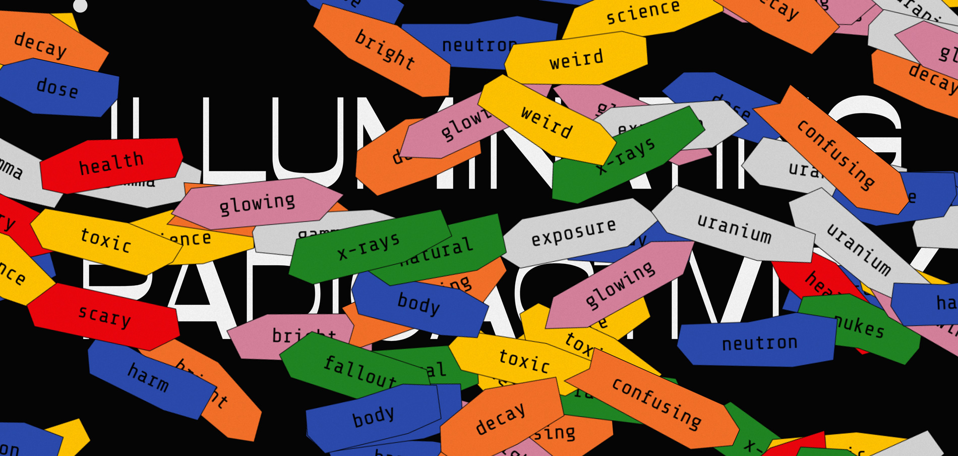
A super interactive page that opens the field full of bright tags
Interactive Home Page
One of the clients’ wishes was to make the home page interactive. There are many stereotypical associations about radiation, most of them are negative. The clients’ shared the idea to add the interactive form on the home page and invite visitors to input the associations they have about radioactivity. Yet, designers quickly convinced them that offering a newcomer, not knowing much about the website to make some effort was not the best idea. Instead, they created a super interactive page that opens the field full of bright tags featuring popular characteristics of radioactivity. Moving the mouse cursor, visitors erase the tags, much like the website is going to erase the common stereotypes about the theme of radioactivity.
Typography
The main font used for the title elements is also symbolic. It is called Opposite, and it was chosen for its attractive, irregular, and original geometry of characters. So, even the font supported the goal to set the opposite direction to the global understanding of radioactivity.
The main type of visual content for the website is trendy and catchy collages with a vibe of brutalism and livened with smooth animation.
Images and Animation
To step aside from the traditional presentation of archive photos and graphics, the massive work was done on images. The main type of visual content for the website is trendy and catchy collages with a vibe of brutalism and livened with smooth animation. Keeping the balance of text blocks and images integrated into the narration, the designers reached the presentation of such serious content in a way that wouldn’t let the users feel bored. Each section of the website also has a theme collage and color solution. Which, together with the long-scroll structure, creates the amazing experience of engaging storytelling.
Details
There are also other design details adding their two cents to cool interaction and worth mentioning:
- An interactive cursor with dynamic visual effects supports the theme
- The effect of visual noise is added to all the website pages to amplify the atmosphere
- Some of the website parts also feature the sound imitating the Geiger counter
- The pages devoted to the findings of particular scientists break the long bulks of information into several bright cards changing one another in the process of the scroll and making the text consumption easier
Technically, the main platform to realize the project was Readymag: when the main concept of the visual performance was agreed, the designers moved right to Readymag and built all the user experience with it from the very start. This way, they could instantly check how the interactions and animation work together with the text content and different backgrounds. No doubt, that was a super informative experience for all sides. The design team had to dive deep into the theme and work in tight collaboration with experts to make the website not only attractive and unique but also readable and trustworthy.
Company Info
Tubik has been on the market since 2013 starting from outsourcing UI and UX design and growing the diversity of services year by year. Now, Tubik is a full-stack digital agency with all the specialists required for the efficient creative process from scratch.