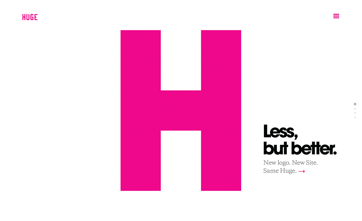
Huge has always stood for simplicity in design: “Less, but better.”
So to kick off 2014, we continued to apply this principle to the evolution of our own brand, introducing a refined design system along with a new logo and a reengineered site.
Over the course of the last 15 years, we have grown so much and worked hard to apply the same approach we take to our client work, to our own brand as well. We wanted to celebrate that growth with a nod to where we are heading. This latest iteration introduces a refined mark and a replatformed site. We elevated the branding to be more sophisticated and built a website that shows off our culture and all of the work that we have been doing across offices.
-
The logo and design elements.
There isn’t a single design project at Huge that does not start with a grid. A major component to design is alignment, so a grid is always a great place to begin. To break rules you need to know them. Having a grid as a base layer of design allows us to spend time trying to find new and interesting ways to break the rules.
Our logo has the same foundation. The new mark incorporates taller letters and uniform type to ensure it always feels big, reflecting our name even when it’s small. We’ve simplified our color palette to four colors: magenta, grey, black and white. To make things easier to read, we’ve completed the new design system with the introduction of a secondary serif font to our body text. Called Galaxie Copernicus, it was made by Village and supports our own customized version of ITC’s Avant Garde.
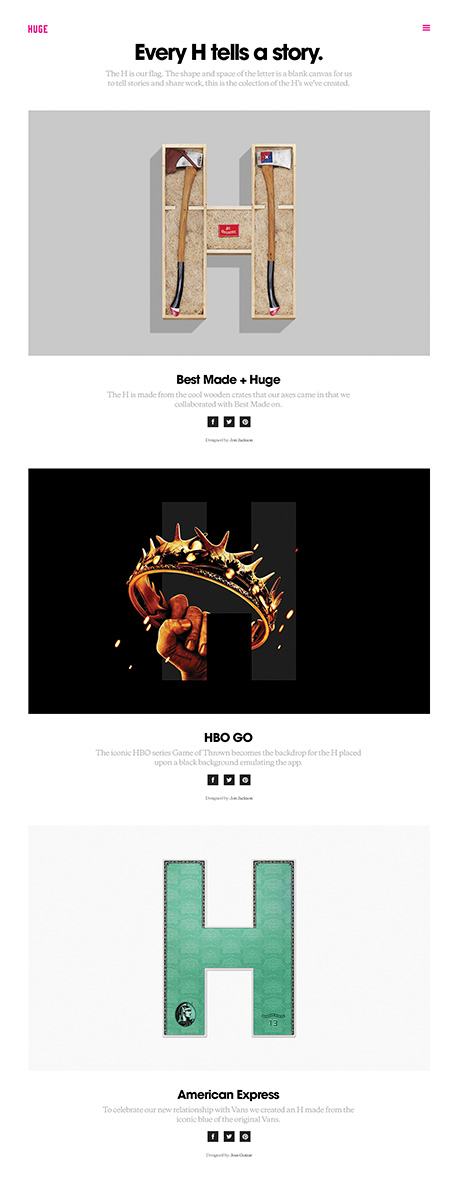
The H.
At Huge we really try to understand our audience and the appropriate design for them. When it came time for our own redesign, we saw that the majority of people coming to agency sites were in two groups: those who want to work with us, and those who want us to do work for them. We set out to create an experience that showed off the work that we do with style and simplicity for both groups. What we came up with is the iconic "H." The shape and space of the letter is a blank canvas for everyone at Huge to share work they’ve done while reinforcing our overall brand identity. This is our symbol, recognizable across the web as a tribute to things we’ve made that we love.
The simplicity of the H was a design that came to light through multiple iterations. The H at first started out so large that it was only apparent on scroll, very graphic but subtle. We tried countless versions of the larger scale option, but we could never get it feeling right. So we started to play with scale, and used animation to bring the different H's to life. It seems like the most simple and obvious part of the site, but it was by far the most finessed and thought out element with over 15 prototyped versions of that page.
-
"We set out to create something that really represented Huge as an agency; functional, simple, and smartly designed."
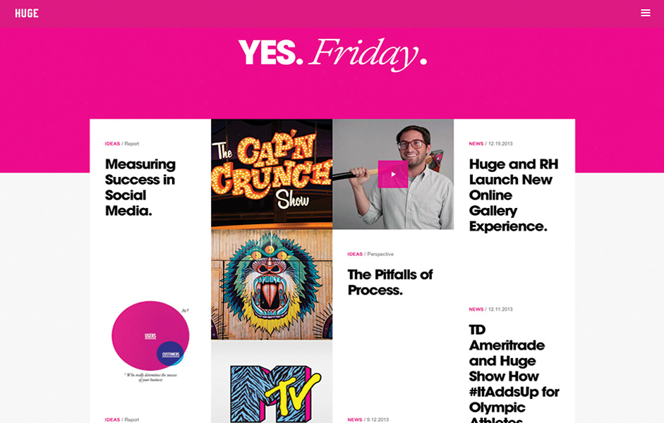
The site.
The simple grid that inspired our new logo is also the framework for the latest version of Hugeinc.com . The new site is designed across four breakpoints for four screen sizes, so no matter what device you’re on, you can see what the amazing people at Huge have poured their blood, sweat, and tears into.
The goal was always to simplify the site design. It is very easy to over design for the web, adding too many links and cross promotions, and header images that do not add to the experience. We wanted to create a site that allowed the content to be the main focus, whether it was an article or idea, or showcasing the work that we do. Anything blocking that goal was removed from the page. While the site has nice form, we led with a lot of function. This made room for an easily populated site with content and still maintained its design. It also gave the design more timelessness in a medium that is all about reaching the latest version.
We’ll continue to evolve Hugeinc.com and make it even better. Because we’re not done. Design is never finished.
Technology.
The initial prototype was built using NodeJS with Mustache and SASS, which allowed us to rapidly scaffold the templates. Once we were happy with the templates, we moved over to Sitecore 7 as the CMS platform. We tried out various things on this project, including NodeJS, GruntJS, Hogan and Bower, but the front-end work makes use of HTML5, jQuery, Compass/SASS.
Final Technologies.
HTML5, SASS/Compass, jQuery.

Huge is a digital agency that provides business strategy, design, marketing and technology services to some of the world's largest businesses and best-known brands. The company is known for successfully harmonizing user needs and business goals to create industry‐changing digital experiences for its clients. Huge has offices based in the United States, Europe and Latin America, and is part of the Interpublic Group of Companies. For more information, please visit: Hugeinc.com