Brand guidelines can often feel rigid and complex
When we first met with Dropbox, they expressed that their design standards site had become dated and underutilized.
When referenced internally, they felt overly technical. Designers would visit the site for specific information rather than for inspiration, and its potential felt constrained.
We wanted to reimagine what the guidelines could be—not a ceiling to design within, rather a floor that anyone could build from.
“Knowing that with some of the refocusing that the company’s had to do, we want to make sure that the fun is always present."
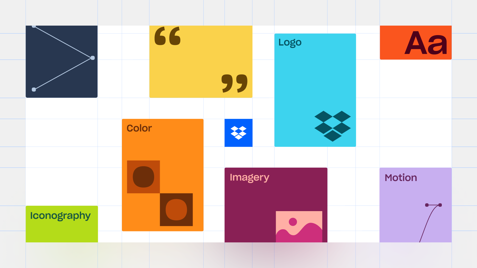
Resurfacing (Craftful) Fun
As Dropbox grew, so did its brand. COLLINS' bold 2017 rebrand broke away from convention, introducing a uniquely expressive identity to the world. But as the company expanded its product suite, the system naturally evolved, becoming more structured and scalable to support evolving business needs.
In that shift, some of the original spark—the playful, experimental energy that made the brand feel so distinct—became a little less visible.
When we revisited the guidelines, we found the spirit was still present, subtly woven within the system. Our job was to bring it back to the surface in a way that felt reflective of where Dropbox is today.
“It’s not necessarily about ‘here are the necessary integers and digits you should use’."
Feeling Our Way Forward
In the beginning, no one knew exactly what this was going to become. The existing guidelines provided us a rich foundation to play with, so we weren't starting from scratch, but we also wanted to move away from being prescriptive. Instead, we set out to capture and convey a feeling: how the brand could be experienced, not just explained.
Early concepts cast a wide net, catching all sorts of planes, pinwheels, nonlinear stories, and oversized type moments. Some ideas landed, and some didn’t. However, each round of exploration taught us that the brand came not in strict rules, but the spaces between them, in moments of looseness and discovery.
“The explorations were fantastic, but I think it made us realize that we needed to get back to our web roots and think about this in more of an editorial sense."
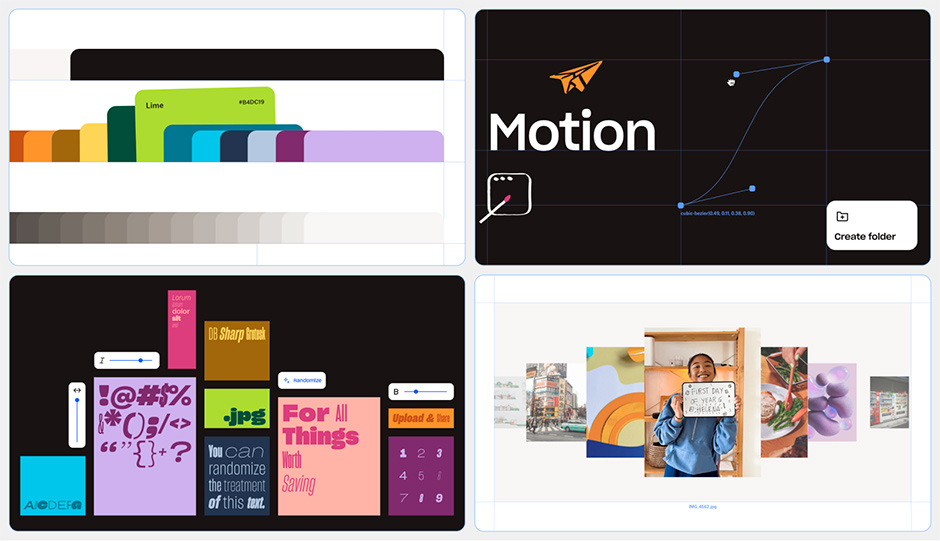
Navigation (and Recalibration)
As our initial explorations grew more ambitious, the site began to feel like a long-form video. The interactions and animations were visually rich, but their complexity often distracted from the content. Usability was getting lost in the spectacle.
A breakthrough was unlocked with two key additions: a narrative intro and a grounded navigation system. The intro set the tone, welcoming visitors into the story, and the navigation gave them structure, anchored in a familiar brand element that helped guide the journey along.
This sparked a key realization: not every section needed to be its own “moment.” The site didn’t have to perform on every scroll. It needed rhythm, peaks and pauses to let the brand room to breathe, and visitors space to move through.
Ideas about planes and layered surfaces initially showed up in literal ways: angled layouts, scroll transitions, and pinwheel menus. But over time, these big conceptual gestures softened into quieter principles that would subtly shape how visitors moved through the site, directing attention without demanding it.
As we scaled the theatrics back, the site began to unfold more naturally. It starts to build itself through the guidelines as visitors scroll, coming across as less of an overwhelming collection of components, and more of something alive to explore.
“You can kind of see how a lot of our ideas came full circle. Which just goes to show why you never throw stuff away. There was so much stuff that we ended up going back to because we were just making so many things every week."
Iterations Upon Iterations
There were plenty of points when this project could’ve gone in a completely different direction. The process wasn’t linear, but each round moved us forward.
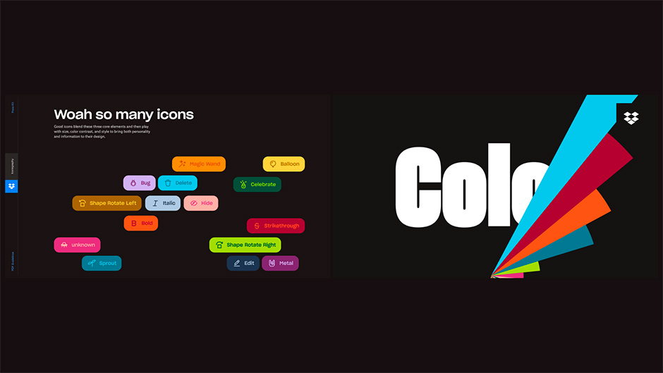
You can still see echoes of early experiments throughout the site. A scrapped folder-tab idea reappears in a color palette interaction. Pieces of a “site as a plane” concept live on in the navigation.
Nothing was ever truly lost, and what we ended up with wasn’t one polished idea — it was a composite of everything we explored, shaped into something that finally felt right.
“We were going to need to work really closely with the Dropbox team to develop the content — not only getting all of it from them, but also making sure that there was a dialogue, design wise, between what we were saying and how we were saying it in the context of the site designs."
To Our Heart’s Content
One of the biggest challenges we faced was scale.
This wasn’t a one-off page. It was a full brand experience, spanning across dozens of pages and hundreds of moving parts. Every asset, word, and interaction had to work in harmony with the broader system.
To keep track, we built a color-coded content key in Figma to track the status of every asset and line of copy. As the design evolved, the content evolved with it. That system helped us stay on top of constant change and reinforced a simple truth: the story only works when every part moves together.
“The ability for us to move with code in lockstep with how design works, I think, was absolutely crucial to this. I feel like half the design happened in code."
Careful Chereography
With all its moving parts, we needed a front-end that could keep up with Dropbox’s evolving brand system.
Design and development ran in parallel from the start, following a cascading workflow. Content and layout came first to ensure accessibility and performance, while motion and interactivity were layered in once the structure was solid.
This phased approach let us balance technical precision with creative flexibility, enabling a range of rich, tech-driven components like:
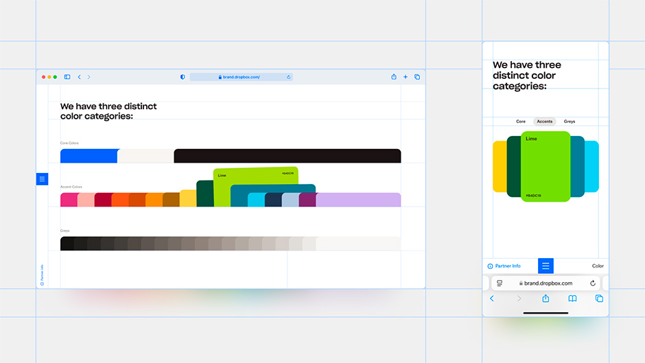
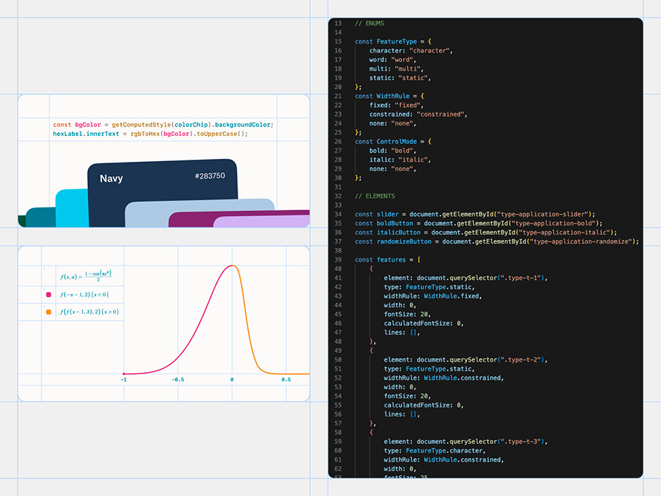
- Color chips: Non-linear easing and a custom grid system to prevent hover collisions while staying responsive.
- Type widget: Variable font manipulation using binary search and categorised layout boxes, with fine-tuned sliders and synced character pair styling.
- Menu tab stretching: Squash-and-stretch motion principle simulated using quartic regression on keyframe scatter plots.
- Partner info button: A subtle color transition between light and dark backgrounds, timed to match human eye dilation.
This level of interactivity came with real engineering complexity. We pushed Webflow to its custom code character limits, embedding JavaScript across the site to handle animations and interactions throughout. We also developed a modular layout system to enable Dropbox to manage and update content long-term.
QA involved over 200 tracked issues, covering everything from animation timing bugs to layout breakpoints. To scale elegantly across devices, every interactive detail was rehearsed with care, tuned manually for responsiveness and performance.
In the end, the dance wasn’t just visual. Every layer, behind the scenes and in production, moved in sync to bring the Dropbox brand to life.
“We had all of our screens kind of designed out in Figma, but we ended up taking it a little bit further than that. And part of that was just the team's trust in us to take it further and experiment where we needed."
Trusting the Process
One of the defining factors of this project was how we were able to work, and who we were able to work with. Dropbox’s intentionally small and design-led team kept feedback loops tight and decision-making fast. Most importantly, their trust gave us the freedom to treat the site as a creative playground, not just a set of specs.
The Bézier editor that animates a paper airplane’s flight path. The resizable imagery tiles with bounding boxes. The drawing tool on the Framework page. Most of the site’s most memorable features weren’t part of the brief, and some weren't even conceived until the development phase. They emerged organically as we were able to play with the possibilities of the brand, driven by a simple desire to surprise and delight.
Since launch, we’ve heard how internal teams at Dropbox have been able to use the site as a new benchmark for their craft. We’ve read about people rethinking their own brand systems to be more interactive and expressive. And we’ve seen designers return to the site to try to recreate something they experienced (and maybe catch something new they missed the first time).
The goal was always to create something approachable, something more than a static guide.
We wanted the site to feel like a story that’s easy to follow and even easier to keep writing. A clear invitation for people to explore, revisit, and engage with the brand in their own way, not just to follow the rules. And more than anything, we hoped it would inspire people to continue imagining what else it might become.
“Obviously it's great to get that external validation. But at the end of the day, internally, it means a lot. And I think it's just going to be a really powerful piece of evidence for us to just always push for high quality moving forward."
Daybreak Studio
Daybreak Studio creates brand, web, and software experiences by integrating technology to enhance human craft.
We work closely with ambitious companies to realize their vision for the future. Through everything we do, we aim to build works of design that are beautiful, intuitive, and functional.
Design that feels right. Tech that works well.