Having recently entered the world of freelancing, I realized that I would probably need a portfolio site. While that’s a natural thing for a Creative Developer or an Art Director, as someone working predominantly in project management there weren’t many reference points... so I approached it with no restrictions or preconceived ideas.
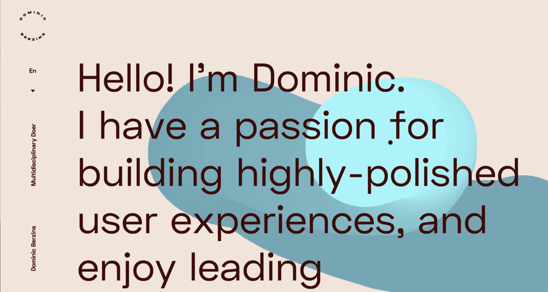
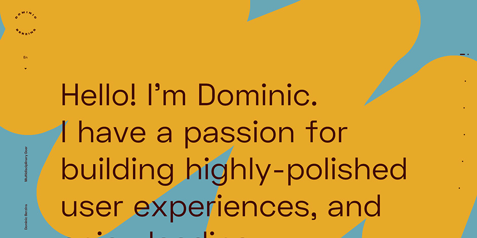
I wanted to have a single page site that would read as a kind of a story and wouldn’t require the user to have to navigate menu systems or sub-pages
I knew I wanted to have a single page site that would read as a kind of a story and wouldn’t require the user to have to navigate menu systems or sub-pages (as let’s face it, people in advertising often don’t have the time or attention span to delve into your site!). The result met these requirements, and despite the optional interactions along the way, it is possible to get from start to finish in one smooth scroll.
It also needed to be a bit unique and fun to play with, to hopefully stand out in a sea of portfolio sites.
Canvas Drawing
After wireframing the site and running it past some UX friends for feedback and tweaks, we kicked around some ideas for a theme. The art direction and creative concept were devised completely by Kacper. From the original concept for the drawing mechanic, we iterated and tweaked until we had something that was fun and as fluid as possible.
There were constant playtests and value updates for the drawing line widths, the sparkles effect, how the screen-fill animated, the percentage of canvas that needed to be drawn on in order to trigger the color change, etc.
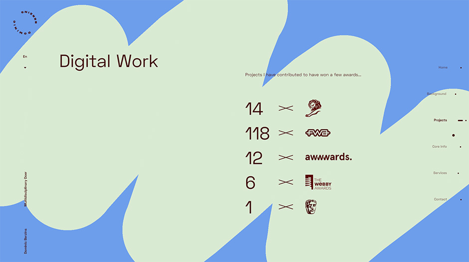
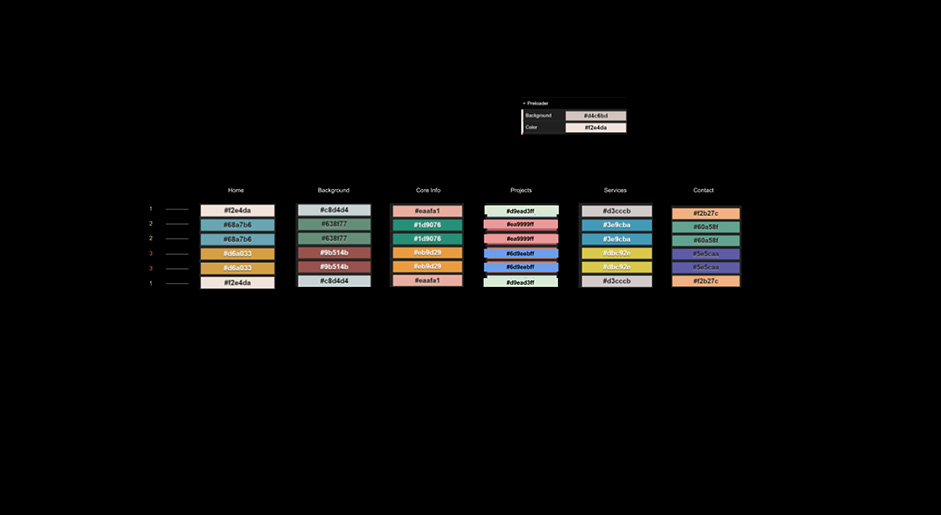
Colors
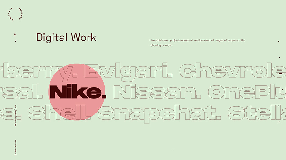
Each section of the site has three different colors that combine with each other. The users are able to see more than eighteen colors while navigating the whole experience, which makes the entire experience more colorful and playful.
The Lists
Lists of things are boring. Long lists of things are even more boring. Unfortunately given the type of work I do, and the things I needed to convey, it wasn’t possible to avoid lists. As a result, we knew they had to be integrated in an unobtrusive way that could be interacted with to allow the user to investigate further.
The lists (used for core skills, and for brands) can be highlighted, scrolled or dragged.
We settled on a method that had some natural motion and allowed the user to interact in one of several ways - so that the user wasn’t expected to guess how. The lists (used for core skills, and for brands) can be highlighted, scrolled or dragged.
Interaction with scrolling lists
Localization
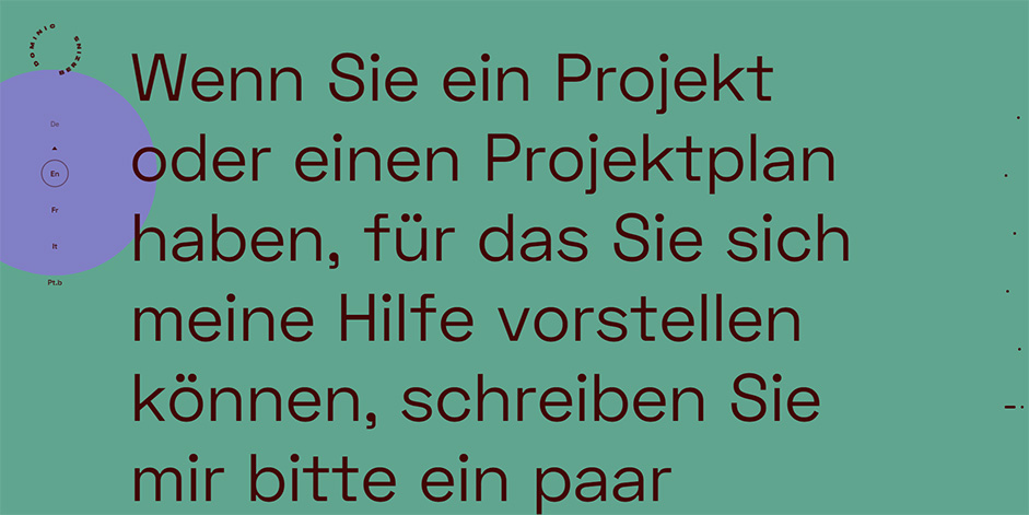
Given the global world we work in, it seemed like an obvious decision to localize. The site content is driven by a headless CMS, and the site was built in a way that allows the addition of new languages on-the-fly, without any new deployments needed.
With the help of friends familiar with the advertising industry, we managed to translate the content into multiple languages authentically. (initially French, German, Italian and Brazilian Portuguese - a few others are planned) From the first month’s analytics data, the choice was validated - large percentages of users were from those countries with localized content and they had chosen their local language from the menu.
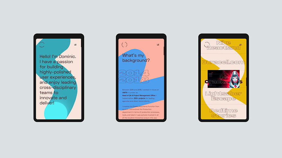
Mobile
Whilst the concept was designed to be as consistent as possible across desktop, tablet and mobile - there were a few mobile-specific tweaks that had to be made. We went for a traditional style burger menu for quick navigation and had to do the following two specific changes:
- The canvas drawing needed a slightly different approach given that it’s not possible to independently scroll the site and move a cursor. This resulted in a lot of playtesting to find something as natural as possible and is still fun.
- The Case Studies section also needed to function differently; so while we went for a 3D animated preview image triggered on mouse-over with a ‘hold to launch’ method on desktop, on mobile we opted for static image ‘shown on scroll’ and ‘tap once to launch’ method.
The Struggles
The main challenge of the project was the Browser Compatibility and Performance of the website. Since we wanted to implement a lot of animations and interactions without compromising the user experience or the navigation of experience, it’s essential to test on multiple browsers. We performed structured QA tests across quite a range! Here is our device matrix of browsers:
- Desktop: Google Chrome, Microsoft Edge, Opera, Maxthon and Safari.
- Tablet: Google Chrome and Safari.
- Mobile: Google Chrome, Safari and Social App browsers including Facebook, Twitter, and LinkedIn.
(Note: on Mobile and Tablet, our site was tested across a broad range of iOS and Android devices using an array of firmware and models)
We used UA Parser to detect the user’s specs and deliver feedback screens in cases of not matching our support matrix.

Unfortunately, the once-mighty Firefox has become problematic when wanting to do fancy things and still maintain performance. As a result, we had to disable the sparkle effect on the cursor in order to maintain the smoothness of the site. Interestingly, browsers such as Opera and even IE11 could handle the effects without dropping frame rate!
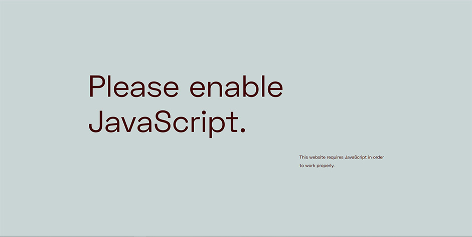
We also provided important feedback screens for users when they’d disabled essential functionality in their browser settings, such as disabling JavaScript. (without this, these users would be presented with a blank screen on loading the site!)
Technologies
All decisions on framework and tech were made by the wonderful Tech Lead Luis.
We used only JavaScript for the entire development of the site. Everything was written from scratch using Classes, Event Emitters and Promises, all of these available with ECMAScript 2015+.
Animations
We consider GreenSock as the most powerful library to work with for animations, so we used it to create almost all animations on the site. And to work with the three-dimensional graphics, we choose Three.js due it’s popularity, performance and simplicity.
Content
The content of the website is managed with Prismic, an API-based CMS. We fetch the content using their JavaScript library and also using some utility functions written from scratch to render the content with Template Strings allied with DOM manipulations.
Build
We used Webpack for all the build tasks, some interesting loaders we used in this project are: Babel Loader, PostCSS Loader and GLSLify Loader, basically, all the loaders required to work with specific technologies like CSS Modules and GLSL inside JavaScript.
Company Info
MMXIX Collective is a creative development studio specializing in crafting high-end web experiences. Their website can be found here.