To be honest, I’m not even sure if you can call this website a portfolio. The main purpose of a portfolio is to showcase work which ideally lands you more clients. But that was never my intention when creating dnlsptzkIV. Instead, I aimed for something different: a work of art.
"I aimed for something different: a work of art"
E. H. Gombrich‘s famous book ‘The Story of Art’ begins with the words: “There is no such thing as art. There are only artists”. In my opinion this implies that art is always personal, a manifestation of thoughts, feelings and ideologies through the skill of the person who created it.
So the plan was to create something that is truly mine, something unique that reflects my personality and is greater than the sum of its parts. Not your typical designer portfolio, which usually emerges from the process of taking inspiration from others and combining and changing stylistics until it no longer looks like a copy (which actually resembles the process of an AI — a topic I don’t want to go into here).
"To achieve this, the website as a whole had to be a personal statement"
To achieve this, the website as a whole had to be a personal statement. I used the medium ‘portfolio’ as a vehicle for this statement. A meta-concept that runs through all sections.
This meta-concept stems from something that’s been bugging me for a long time: people are always looking for rules and guides, completely forgetting that while those rules are still useful, they’re not the only truth. Broken design laws don‘t necessarily have to lead to bad results—if done skilfully, they can lead to a new, more creative, and unique outcome.
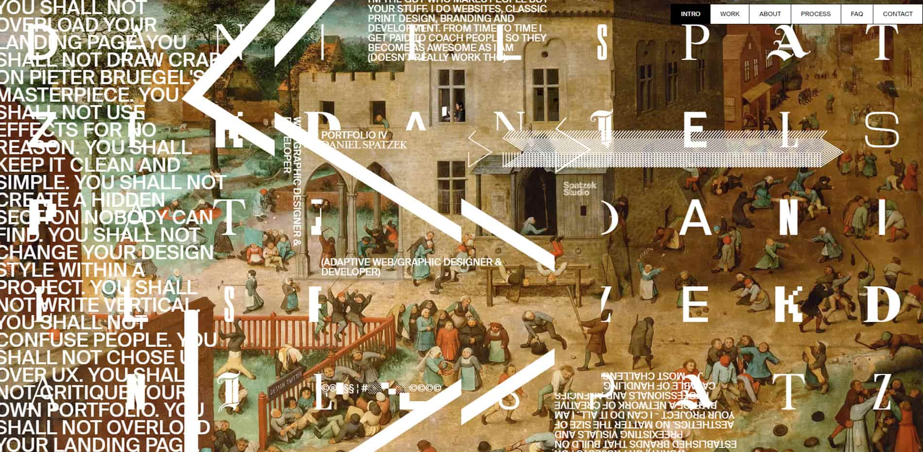
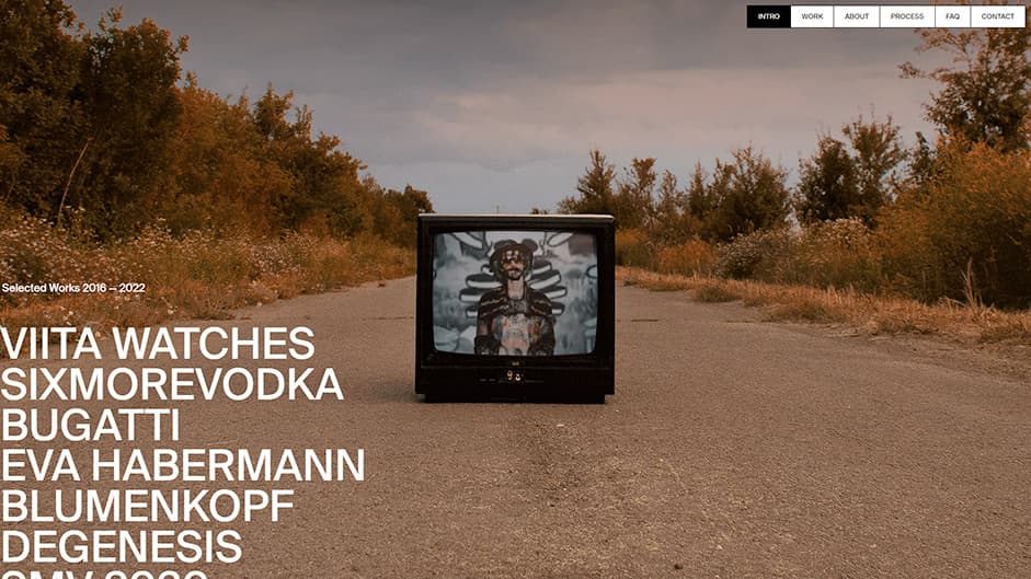
So I started writing down some well-known web design rules that designers seem to worship and stick to no matter what — only to break every single one of them by doing the exact opposite. On the screen capture below you can see the landing impression which doesn‘t really care about ‘Don’t overload the design‘, ‘UX over UI‘, ‘Keep it clean and simple‘ or any other typical web design rule:
The Landing Impression
Just to be clear, I’m not saying that these established design rules don’t make sense, I just wanted to see if one could pull it off the exact opposite.
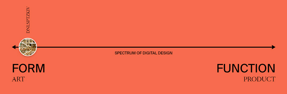
"In my opinion, digital design moves in a spectrum between form and function"
All the talk about UI and UX never really made sense to me: my personal take on this topic is that UI and UX are not separate things. In my opinion, digital design moves in a spectrum between form and function. They either lean toward one or the other, but even on both ends of that spectrum (art vs. product), UI and UX are one thing. If you look at them as separate things, it will probably result in poor design. I definitely went full ‘form‘ with my portfolio:
A journey through my head:
I put a lot of thought into each of the sections, so I want to take you on a journey through the entire site to give you detailed insights and tell you some things you may have missed:
INTRO (Landing impression):
The intro is the most important section for this project, as it sets the tone of the whole page and contains all the information you need to understand the design decisions: I really tried to create a first impression that looks 100% different to anything you have seen before. It is a synthesis of modern web design, contemporary art and classic art. This combination is intended to give the entire site a more artistic appeal and to make it clear to the user that this is not a typical portfolio.
Every single little element on the page has a reason: for example, the symbols (©®█§§ ¦ #░░▀▄░░©©©© ) are a joke about designers‘ obsession with copyright marks.
As mentioned in the hidden section of the website (guide to that below), the first version of the landing impression had a different image in the background and an additional element:
If you want to watch the original version, click on the link below:
The reason I had to change it can be found in the hidden section.
"I couldn‘t resist putting a ‘Design-Twitter’ sign on the fence of the garden where the ‘special’ kids play"
The custom illustrations on those masterpieces were also an important detail for me. I didn‘t want to just smack a nice picture into the background without adding my personal touch to it. So I drew modern devices (headphones, laptops, iPhones, etc.) on Michelangelo’s painting and even put myself and my studio (logo on the latrine) on the final version. I also couldn‘t resist putting a ‘Design-Twitter’ sign on the fence of the garden where the ‘special’ kids play:
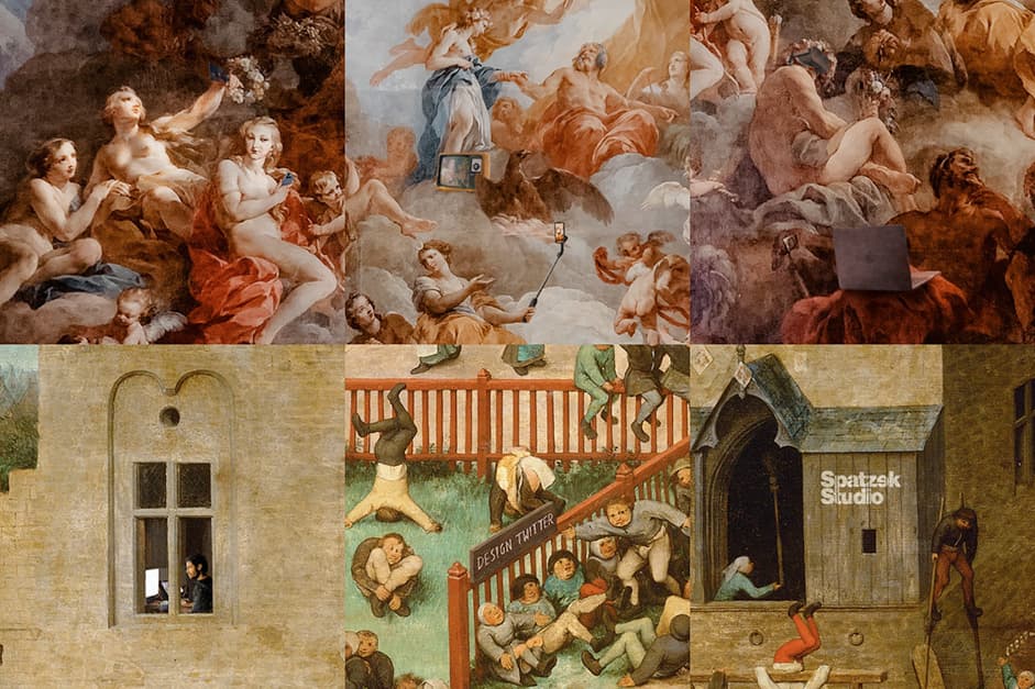
I guess literally nobody has seen it so far, but I even drew my office into the second window.
In design school we spent hours analyzing the geometric structure of well-known masterpieces by Michelangelo, Da Vinci, Bouguereau and many others. That‘s exactly what I did with both paintings (version 1 & 2) and look what I found:
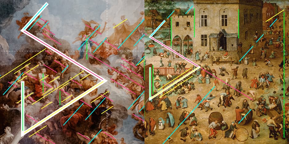
There are essentially four main angles used by Michelangelo and Bruegel. My personal logo, which I created in 2014, uses exactly these angles. I chose a position where my logo serves as a perfect visualization of the geometric structure within the paintings.
WORK Section
I didn‘t want to have a weird and unique landing experience and then fall back to a normal, clean and boring work section. That’s why I came up with the TV on the street. When I found the image, I immediately knew that it was absolutely perfect for my work section: unpolished, rough and weird - a perfect contrast to the showcased work:
The work presentation itself isn‘t too funky because I still wanted people to check out my stuff. I designed it in a way that I can use the same assets for Behance, my studio page, and my portfolio.
The transition into the monitor was the most challenging part, development-wise. It may look easy, but scaling and rotating a full screen PNG with huge dimensions to 800% is never a good idea. So I actually created this section from scratch three times and ended up doing the animation on canvas.
The numbers that appear on the screen (4 14 12 19 16 20 26 11) are important for the hidden section. The numbers are the position of the letters in the alphabet of my shortened name: dnlsptzk. E.g.: D = 4 and so on.
ABOUT section
I didn‘t animate anything here on purpose. This section is supposed to be the ‘normal’ one. Nothing too crazy, but a contrast to the previous two animation-heavy sections.
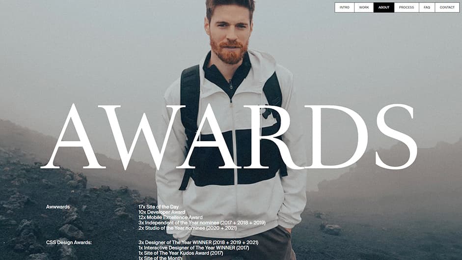
The image in the background is also deliberately unusual for a portfolio website. I wanted to avoid the typical ‘cool designer portrait’ in black and white with glasses, black turtleneck in front of a side lit wall. Instead, I just used a photo my wife took with her phone on our recent trip.
PROCESS section
The whole website is a mix of styles (modern, retro, funky, weird, brutal, playful, minimal, etc...) to show my range. For the process section, I chose a more modern graphic design style. I also used a side scroll to break the flow and emphasize the section.
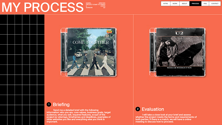
Each step of my process is represented by a CD cover of a matching song:
- Briefing: Come Together
- Evaluation: With Or Without You
- KickOff: Feuer frei (fire-free)
- Design: You‘re Beautiful
- Development: Build Me Up Buttercup
- Quality Assurance: What I‘ve done
Another thing that probably no one realizes is that the first CD was cracked and pretty much broken, but the CD cases gradually get better until the last one looks brand new and ready to ship. This visualizes my design process from the first rough idea to a 100% perfect end product.
FAQ section
The FAQ section has a retro brutalist look. It answers some serious questions I get asked quite a bit, but the further down you go, the more ridiculous it gets. The tone of this section is not serious at all and shows my edgy kind of humor.
The child in the picture on the wall is actually me and can be clicked to reveal a hint on how to find the hidden section:
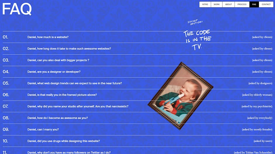
Another hint can be found in FAQ 12, where it says: “Asked by people without a keyboard”. This indicates that you may need to type something on your keyboard to access it.
The first iteration of the FAQ was much more controversial, and I probably would have been cancelled for the next 200 years if I had put it live ;)
CONTACT section
That last section is more of a meme than anything else:
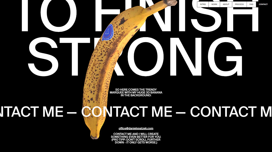
Many lazy designers these days just add a random 3D element to the background of their boring website to get free awards. That’s why I chose a banana. It stands for all those ‘bananas‘ websites out there with uncreative, useless WebGL elements.
The words “We need to finish strong” are meant to be sarcastic and won’t be understood by casual visitors who aren't designers - a meme only understood by those being trolled.
Guide to access the hidden section (spoilers):
- Hint 1: FAQ #12 indicates that you might have to enter something on your keyboard to access it.
- Hint 2: Click on the portrait in the FAQ section to find hint #2.
- Hint 3: If you open your console and type something, you will get a console.log message.
- Hint 4: The numbers in the TV (4 14 12 19 16 20 26 11). Type it on your keyboard without space.
Conclusion:
Overall, I wanted to create a fun piece of art that showcases my personality, skill, and work. Whether I’ve been successful or not is entirely up to you, the person who (hopefully) takes the time to spot the subtle messages and small details of the site.
Technologies:
Framework: nuxt.js
Animations: GSAP + ScrollTrigger.
WebGL: three.js
CMS: Storyblok
Hosting: Netlify
Company Info
Daniel Spatzek is an adaptive web/graphic designer and developer from Austria. Since 2019 he has owned his own web-design studio ‘Spatzek Studio’.