.jpg)
Introduction
Coqtail was once again challenged to push the boundaries of navigating an e-Commerce website. This time it was Nubikk who asked us to look at all the data gathered from the last 3 years of their e-Commerce platform, and come up with a solution that would increase conversion even more than the last few years.
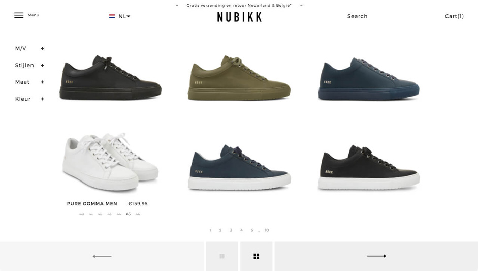
Imagine being guided through an entire online shopping experience without a single scroll. For the new Nubikk Webshop we made it happen; completely reinventing the standardised methods for browsing e-Commerce.
We followed all behaviours of the visitors (with Hotjar) and came up with the solution of having them follow our lead instead of trying to keep them entertained. By only focusing on the shoes without a single scroll we made sure we wouldn't lose visitors during their scrolling path. (Traditional e-Commerce websites lose a lot of visitors by overloading them with too much information, and depth in their product offering.)
Problem 1: The product detail page.
So the concept was awesome, the zero scroll experience went smoothly through our prototyping phase, but this was all designed without the real content present. When we received the content from the client we took a moment to take a breath. There was no "real-estate" for the product detail page to function as smoothly as we liked. There was too much copy to keep the presentation clean... back to the drawing board. After a few Vodkas the idea was born to create hotspots on a shoe where we could place all the copy. We made a backend framework where the e-Commerce manager is able to pinpoint the exact placement of the hotspot on the shoe and add the corresponding information.
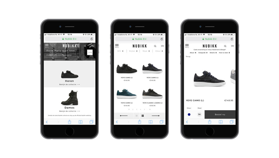
Problem 2: Great it all works out, how about mobile?
Over 70% of the traffic came from mobile devices. Therefore, it was paramount that we considered the mobile experience and created an intuitive flow across tablets and smartphones.
There is even less real estate on mobile phones so we needed a way to combine all features without overcomplicating the user experience and interface.
We wrote over 5,000 lines of CSS to create a fluid experience for every device and browser size. Because of our special way of development by separating the front and back-end from each other we are able to provide completely tailored different solutions for different screens.
So that's what we did, we put the emphasis once again back to shoes, for a visitor to checkout we need to grab 2 things: The color and their size. So that's what we focussed on for designing for mobile. The rest of the features we left them to be discovered by the curious shopper.
Problem 3: The checkout flow
Looking at data is important, really important. For the checkout flow we found out that the average order of a buying customer sticks to one pair at a time. This helped us kick out the cart. Voila, there is no cart. When a visitor decides to buy we move directly to the checkout page once the button is pressed. On the checkout page we removed all menus and distractions so that there is a focus on finishing that last part of the process.

Technologies - throughout the case study
The technologies we used to make this little magic happen is not a secret. You do need to have studied at the university of Coqtail to really grasp the whole project but here are the ingrediënts:
Frontend Frameworks and Libraries:
- CSS3
- Html 5
- jQuery
- Ajax
- Backbone.js (SPA)
- Marionette.js
- Underscore.js
Backend Technologies:
- Spree Commerce (e-Commerce CMS)
- Ruby
- Ruby on Rails
- ElasticSearch
Company Info
Hi! We are COQTAIL alive since 2011 - We design and develop tailor made state of the art e-Commerce platforms providing a strong relationship with your brand. We do this mainly for the fashion and lifestyle scene. Our team consists out of 16 humans, 2 dogs and 4 fish. The dogs and fish will not work on your project.