Benjamin Righetti is an acclaimed musician who plays the organ. He immediately knew what he wanted for his website as soon as he reached us.
The following quote comes from his very first mail: “I’d like to take my website towards a more high-end and modern experience, moving away from what most “classical” musician websites are offering today." During the project, we exchanged a lot as soon as we had an idea or an effect ready to be shown to the client. Design and development progressed almost simultaneously over the weeks.
Design by Gilles
Art Direction
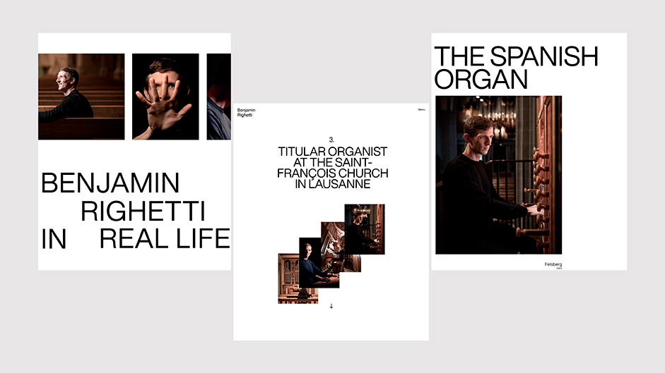
All the design of the site is based on the Swiss style, which says Swiss, says typography, therefore Helvetica and rigor in the graphic construction. From there we used Helvetica Now with a unique grease and worked on many graphic compositions. These screen compositions were thought of as posters and could be printed as such.
The challenge was to combine rigor and musicality throughout the experience. We wanted the user to perceive the musical notes at each visual event and text appearance. Sometimes vertical, sometimes horizontal, the storytelling develops in a soft way for easy reading, the letters seem to dance to the rhythm of the scroll. Surprise elements punctuate the progression and keep the user on the alert from the very beginning of the experience with the very first scroll that causes the enlargement of Benjamin's portrait.
The storytelling develops in a soft way for easy reading, the letters seem to dance to the rhythm of the scroll.
Animations
We exchanged a lot and iterated through storyboards in order to find the right balance between the composition, animation, and content, here are some examples:
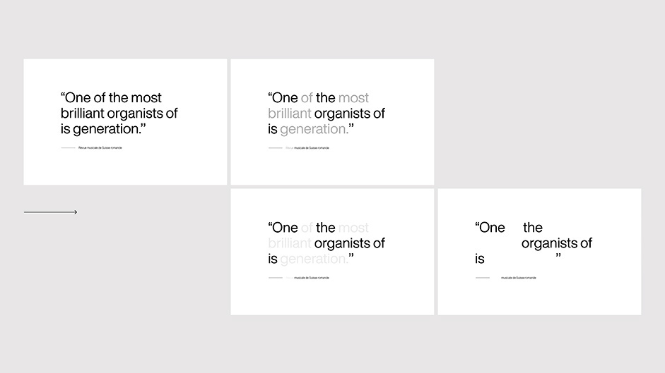
1) Gradual disappearance of words, like musical notes that follow one another.
2) Appearance and animation of organ points in accordance with the sounds, this musical interlude allows the user to pause in the progression of the story and produce his own musical composition with the few audio loops that are offered.
3) The "Chiaroscuro" being a recurrent theme in the compositions of classical music and those of Benjamin, we wanted to take advantage of it by proposing progressive transitions from a black background to the white background, in this example below thanks to a system of shutters whose height will vary in an individual way as the scroll goes on.
4) Once again the use of the organ point which is growing progressively to mark a transition between two paragraphs of the story. The musicality is found in the animation of the texts which appear in a cascade.
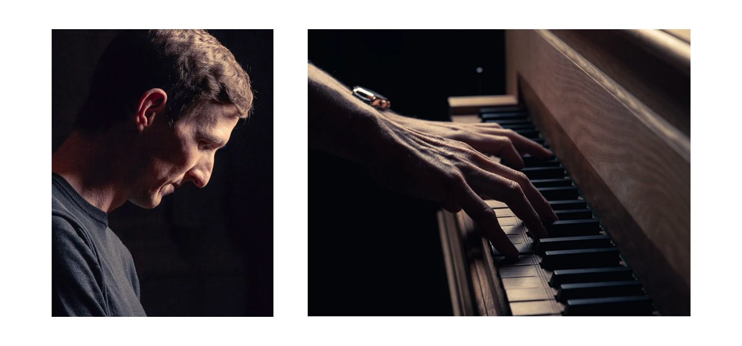
Photography
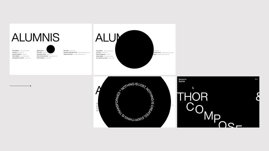
We were lucky enough to get quality photos from a close friend of Benjamin's, himself a musician and also a photographer. The visual tone of his pictures perfectly fits the minimalist style of the art direction. One of the photos has a particular interest in the progression and the sense of the content it supports, the mirror effect allows Benjamin to look at both his new students and the old ones (alumnos).
Mirror transition representing alumnis and new students
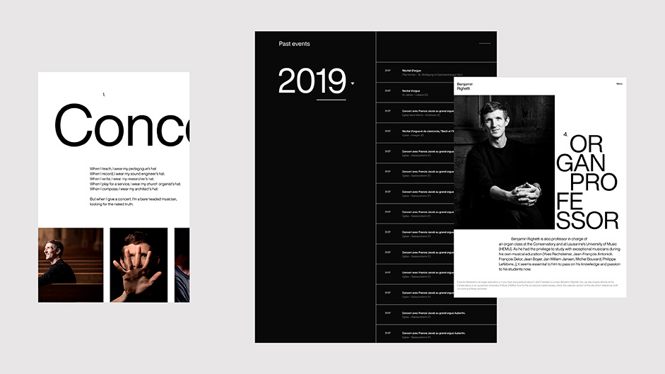
Progression (Menu)
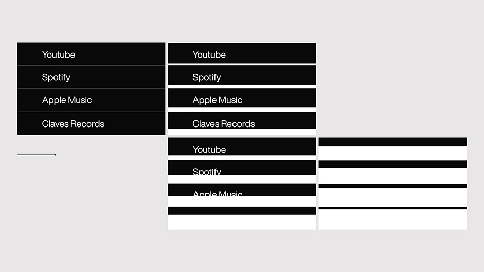
Given the density of the content, we needed to offer a way to "jump" from one chapter to another fairly quickly, so we used the menu to offer an anchor system so that the user could move forward at ease. The design of this menu, with a moving composition, takes the visual codes of the organ keyboard.
Menu appearance and behaviors
Development by Michaël
GSAP + ScrollTrigger
Since the website is composed of only one long page, we had to dynamize the elements as much as we could to keep the user captivated. To do so, I immediately considered using the combination of GSAP and ScrollTrigger. Indeed, I use GSAP on every project and ScrollTrigger is specially made to create scroll-related animations. It wouldn't have been possible to make such complex animations without this very powerful and solid technology.
Smooth scroll
Gilles and I made several tests with and without a smooth scroll during the development phase. When we decided what to do with the introduction of the website, we noticed that it was way more efficient and immersive with the smooth scroll.
In order to load as few libraries as possible, I thought it might be possible to create a smooth scroll based on the GSAP’s library. I went with a homemade solution: GScroll, an extension that reproduces the behavior of a smooth scroll using the GSAP’s methods.
The introduction with its scroll related animation
Web Audio API
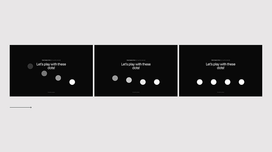
As soon as we first called Benjamin, we had the idea of creating a sampler so the website is as playful as possible. To do so, Benjamin recorded himself playing the organ and provided us with four tracks that cover the famous theme Toccata and Fugue in D Minor by Jean-Sébastien Bach.
The use of the audio methods quickly proved to be limited: the audio samples didn’t perfectly loop. There were jumps and a slight noise when the loop restarted. It was also difficult to synchronize the four tracks at the very same time. So I had to take a little dive into the web audio API. It also allowed me to recover the frequency of the sample and to make the dots move accordingly.
I had to take a little dive into the web audio API. It also allowed me to recover the frequency of the sample and to make the dots move accordingly.
Playful dots
Build
It wasn’t relevant to develop a back-office for Benjamin. For the files compression and minification, the loading of the dependencies, I used Codekit. Codekit offers a very clean and simple interface which avoids the use of a terminal (hallelujah). Once the website was online, the last optimizations were realized on Cloudflare.
Final words
Until the end, we were lucky enough to be able to entirely push our ideas on this project. This long phase of research and development will be useful for our next productions. We’re glad to have created this tailored website for this extraordinary client.
Who we are
Gilles Tossoukpé: French Digital Designer in love with multiple forms of Art
Michaël Garcia: Creative Developer willing to create the most immersive and clean experiences
We met during the creation of Gilles’s folio in 2018. Since then we’ve been regularly working together.