
If you haven’t visited the site for Matthew Fisher yet, what you find will surprise you. From the very first meeting with Matthew in the Fall of 2020, we found both the artist and his work to be incredibly thought provoking and insightful. With the help of T Mag by the New York Times, Matthew’s site launched in March of 2021 and has been viewed more than 50,000 times in the first 60 days, with some collections completely selling out.
Who is Matthew Fisher?
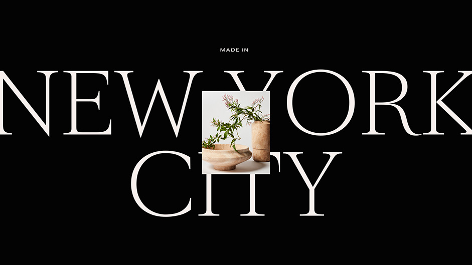
Matthew Fisher is a New York City-based artist whose practice is marked by a fascination with objects and their relationships with people. Deep material manipulation and formal research are at the foundation of his creative process. His work ranges from unique art objects to editioned productions and celebrates the union between heritage, natural materials, and refined craftsmanship.
His portfolio is realized through historically revered natural materials like marble, alabaster, granite, and onyx. Matthew designs and crafts his work with the support of talented artisans, fabricators and suppliers in New York and around the globe.
The Design
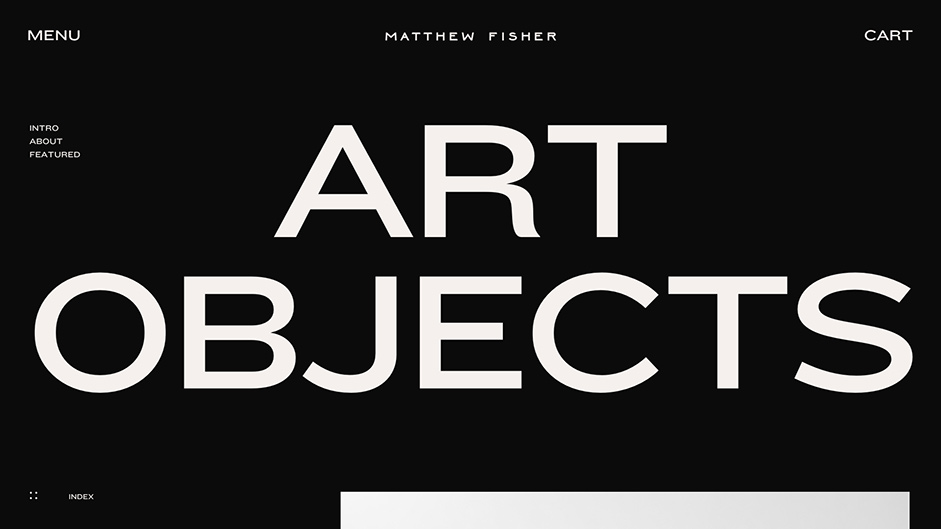
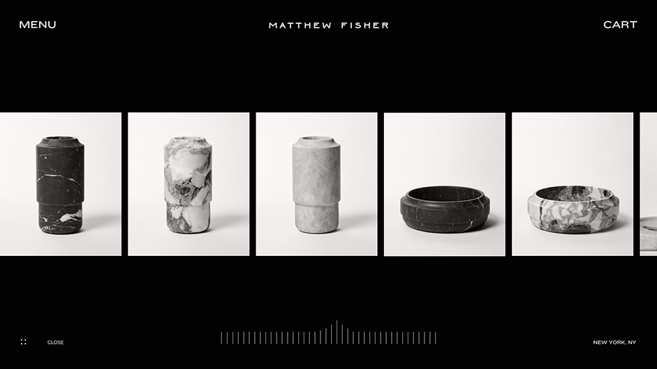
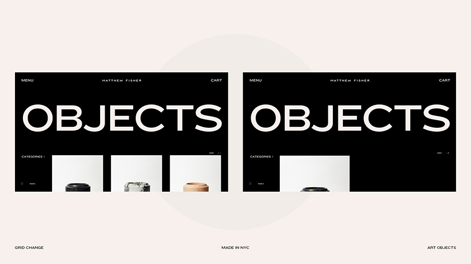
The final design for Matthew Fisher Art Objects is a classic case study in CUSP minimalist detail. At first glance, it is very clean with lots of white space, big type and original photography. Once you begin to interact with the site, the details come to life around the design elements. Hover states, small interactions and the Process Gallery harness the attention to detail for the visitor that Matthew lavishes equally on between his custom pieces and digital presence.
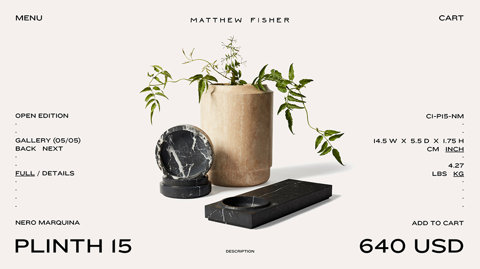
One of the highlights of the experience for us is the ‘Product Inner’, which features a fullscreen, 4k gallery of transparent product imagery on top of a custom shader. This page includes product cinemagraphs, a zoom function to see the intricate details in the stone, a beautiful swipe feature on tablet and all the standard eCommerce features you would expect, like ‘Add to Cart’ and ‘Request a Quote’ for out of stock items.
We’re obsessed with Matthew’s work. The narrative, textures and details make each piece special. A standard product page wasn’t going to cut it. These images needed to be crisp.
Josh Posty, Partner & Creative Director
Technologies
Approach
The technical development was done with the assistance of our friends at Salt & Pepper. When evaluating the technological stack for visually challenging sites like Matthew Fisher’s, we considered:- Flexibility to bring to life any idea presented to us by the design team.
- Technologies that help us to win the 60 FPS war across most of the devices.
- Structure that is easily machine readable, with quality SEO practices sitewide.

We have self-written custom approaches and solutions that help us to achieve visual challenges, including:
Custom scroll
At the core of the site we have a custom scroll component. We use it for almost every project while improving its performance iteratively. The custom scroll component helps us to: ensure flawless interactions between components; synchronise html blocks with the webgl elements; listen to the scroll events and control elements of the site and render only visible elements of the site to save the framerate where we can.
Rendering optimisation
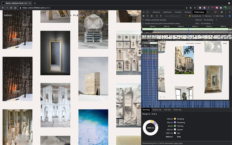
On this site we have product carousels and an interactive gallery. These elements are infinite by design and include content spreading outside the user’s viewport. To optimize general performance, we developed an algorithm that checks the elements of the site currently visible on the screen in realtime and stops rendering the rest of the blocks that are outside the viewport.

Our favourite part of this approach is our proprietary prediction algorithm. Based on the previous user's actions, it tells us which elements are about to enter the screen which enables user visibility. Not only does proprietary prediction help us to provide a smooth, seamless experience on every device, it’s especially important for fast-scrolling image galleries when the position of the items can change dramatically from frame to frame. Due to rendering time, there could be visual lags on sites like Matthew’s with 4K image assets. With our custom algorithm, no gallery item is left unseen even at a supersonic speed!

The inspiration gallery, “Process” on Matthew’s site, is a canvas with images the user can interact with. After optimization and implementation of these algorithms, we increased FPS dramatically. Now the gallery works like a charm at 60 FPS on most devices. Our favorite easter egg of all!
Throttling
Using WebGL on the site offers many advantages: unheard of visual effects in the pure html/js world, speed of work and endless fun! However, this approach does have some drawbacks. We have a WebGL carousel on the site containing images with links to the product inners. We could listen to the mouse events inside WebGL, but it’s not the optimum solution for us because we wouldn’t have links in our page as a result. To eliminate a potentially bad user experience and harming our SEO, we created invisible rectangular items (links covering corresponding images in WebGL) and moved these rectangles when WebGL images moved on scroll or drag. Obviously, that eats quite a lot of the framerate goal we’re fighting for. However, the solution was rather easy. We used throttling and moved our invisible elements once every few milliseconds. The result was amazing, and we felt we were on the verge of winning our FPS war.
Mobile
Most of the internet traffic these days is mobile and we are doing everything possible to ensure that our users will get the best possible experience on most devices. For us, it starts at the wireframes stage, and carries our user experience philosophy throughout the project. Thanks to Awwwards mobile excellence and Google’s mobile friendliness guidelines, we always follow checklists for our design and development teams. It’s important to always think about our user audience and tirelessly cultivate this culture with our team.
Tech Stack Overview:
- Frontend - React, GSAP for animations, PixiJS — the most flexible and fast 2d renderer and Shopify Storefront API for the e-commerce part.
- Backend/CMS - Shopify Plus
- Server - AWS with Node.js on it with SSR for better search engine optimization and faster first render time.
Server
AWS with Node.js on it with SSR for better search engines optimisation and faster first render time.
The Process
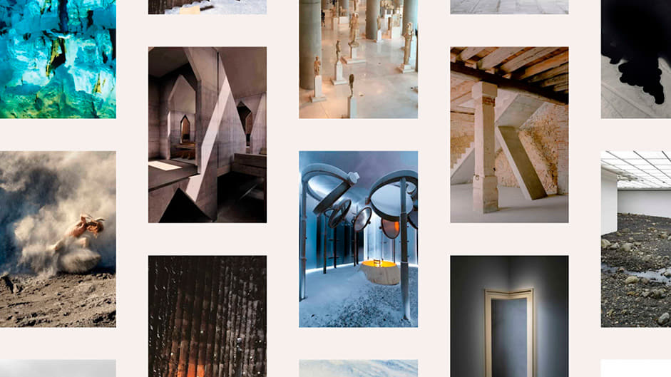
As with every project we work on, we first collected over 200 references in Savee.it via a collaborative moodboard shared with Matthew. These ranged from simple design references to involved motion references from many of the best sites from the Awwwards catalog. We benchmarked ourselves against the best in eCommerce design at the time and set out to build an incredible, experiential interface that lets the products be the hero.
It was important that we collaborated with both the artist and the photographers from the start. Together, we were all responsible for bringing this vision to life.
Brandon Levesque, Partner & Creative Director
The design phase was standard as far as eCommerce projects go. We started by designing desktop and mobile versions of the site around the core pages to set the art direction and tone of the site. Matthew worked closely with the photographers in New York to position and shoot his work in studio to ensure consistency across the entire collection - no small task! In total, more than 5,000 photos were taken. The Edited down to the final selects are now live on the site.
The Release
During the development phase of the project, we learned that Matthew and the crack PR team at NES Creative had landed a series of features in some of the highest profile publications in the world. He was featured in T Mag by The New York Times and Architectural Digest. The entire team stayed awake overnight to be sure that the site was ready for the 5am publishing deadline on NYT.com. Ultimately, they had a successful launch with no downtime! It’s one of those experiences we'll never forget. We can't thank Matthew and the team enough for entrusting us with this project. What an experience!!
Client
Matthew Fisher designs and crafts his work with talented artisans in New York and around the globe. He received his Bachelor of Arts in the study of Ancient Art and Architecture and received his Master of Fine Arts from the renowned Pratt Institute. His work has been featured in the group exhibition, On The Verge and The Noguchi Museum.
Company
CUSP is a global team of specialists, focused on crafting world-class digital solutions for today’s modern creators and companies. Our team of strategists, designers and developers are driven by passion and fuelled by curiosity. We aim to balance innovation with aspiration, emotion with logic, and create an original experience every time. Always fresh, always challenging what’s possible. That’s CUSP. See more at heycusp.com or on Behance.