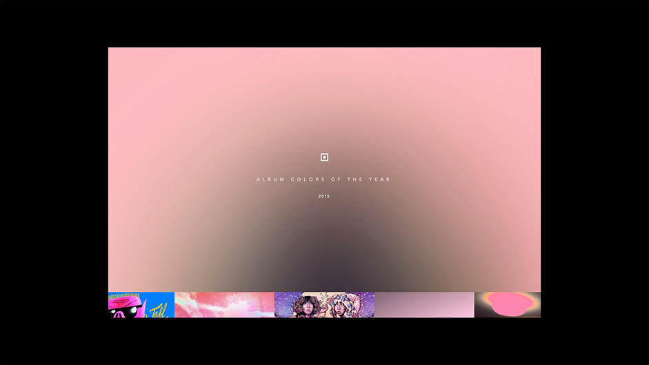
Album Colors started back in 2015 when we noticed that the majority of the albums in our library were black and white. Was that the 2015 trend? Not only that, we are all designers that love the artworks, so the question of that trend was real, together with our passion for them, were the things that motivated us to create the first version: Album Colors of the Year 2015. Released early 2016, the site attracted 10,000 views in the first week.
Fast forward 6 years and here we are. 2020 wasn’t the best year for so many reasons for so many people, but music was always there. Music kept us away from all that was happening in the outside world. Music created moments where we could breathe a little bit. So, we decided to give back a small colorful piece of happiness to the world- because who doesn’t love music?
This time was a bit different and thank god Figma exists. Each one of us was working from a different place. José Gasparian, in San Francisco, Marcos Rodriguez in São Paulo and Edgard Kozlowski in Rio de Janeiro. We wanted to keep the same concept from the 2015 version: 150 curated and meticulously selected albums of the year.
The process
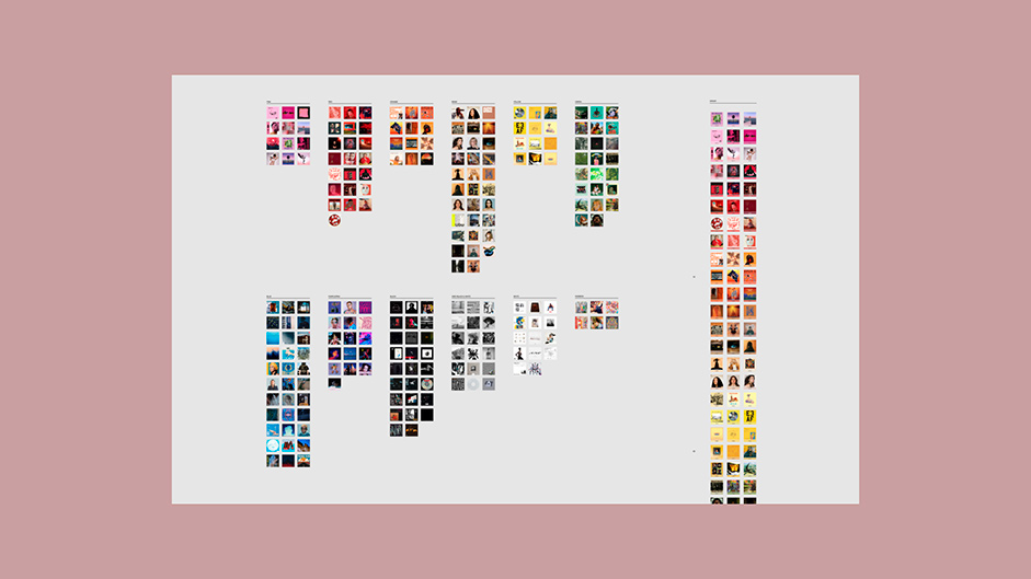
Since the beginning of the project back in 2015, we believed that the curation would be the main aspect of it. We picked everything that we listened to throughout the year. From EPs to LPs, we compiled more than 200 album covers. The next step would be the organization of the colors. We applied the same rule we had on the 2015 version: going from pink to purple and using purple as the anchor to start black then go to white.
(...) going from pink to purple and using purple as the anchor to start black then go to white.
One thing that we tried before and it didn’t work was the use of color algorithms to read the album cover and provide two main colors of it. When we organized based on what the algorithm provided, it didn’t work properly because, for example: an artwork can have more blue than red but it will stand out better around the red albums. Conclusion: the human eye won this time.
Yes, we decided to organize all of the albums manually. It was a long process but the results are totally worth it. We split them into 12 different colors including pink, red, orange, beige, yellow, green, blue, purple, black, gray, white and the special one: rainbow, cause there are artworks that don’t have one main color.
The design
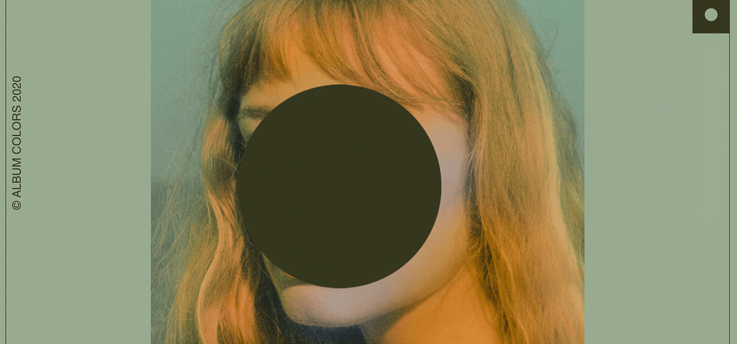
While we were choosing and organizing, we were also working on the page. The design direction for this version was more editorial, with a well established modular grid focused on the information from the album. We didn’t want to have hover state this time around and the only interactions that we wanted were the ability to switch from covers to colors, to copy the hex and to click on the album that would direct to its Spotify link.
We had some goals before the start of the project: create the page, an Instagram account and a playlist to go with the page. The way that we could reach the same visual identity to all of them was to create a modular grid taking aspects of our logo.
We didn’t want to lose the concept behind the logo that we created back in 2015, being the most simple form of a CD. And we really wanted to create a modular grid that could embrace 3 album covers per row but also highlighting a big one. So, the visual identity really pushed forward the most simple forms of the CD, being a square and the circle in the middle.
Design Process.
We chose 10 artworks that would guide the colors throughout the page. We really wanted the colors of 2020 to establish the identity instead of us providing them. And we had the idea to refresh the page and bring a new color/experience every time you access it.

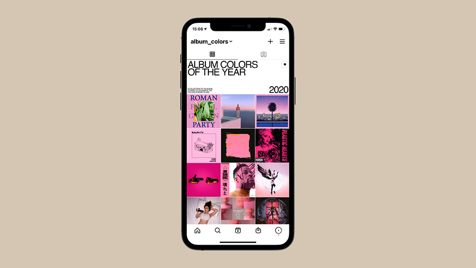
We used a 3x3 grid so that we could have more control and highlight some artworks while the user scrolls, in comparison with the responsive grid we did for the 2015 version going from 5x5, to 3x3 and 1x1 on mobile. And since we were going to create an Instagram account this time for the Album Colors, the 3x3 grid matched the Instagram profile.
The scrolling effect was another thing that we wanted to keep the essence as we did in 2015. If you scroll really fast it’s possible to see the rainbow effect that the album covers create. It’s beautiful.
The production
We created a Google sheet that we could input the title of the album, the artist’s name, the hex code, the main color and the Spotify link. Everything linking to the website, so whatever order we chose on the sheet, it would match with the page.
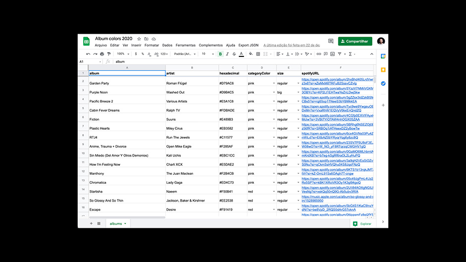
The creation of this sheet helped a lot specially during the QA phase because anyone from the team could make any corrections such as typo or wrong links on the go and it would apply instantly to the page. Meaning the developer wasn’t the only one responsible for making changes to the album’s info.
The social
This time we decided to create an Instagram account that would complement the experience of the website. We really wanted the people to share their favorite album covers and Instagram was the perfect media to do it.
While we were organizing the covers by colors, we were also applying the Instagram portrait ratio that we would use to post it as a “card” with the artist name and album title on top and the hex code at the bottom. With that, on our Instagram profile the card would be cropped exactly on the album cover square ratio and once you click it you would see the information. It gave that nice surprise moment to people that would be curious to click on them.
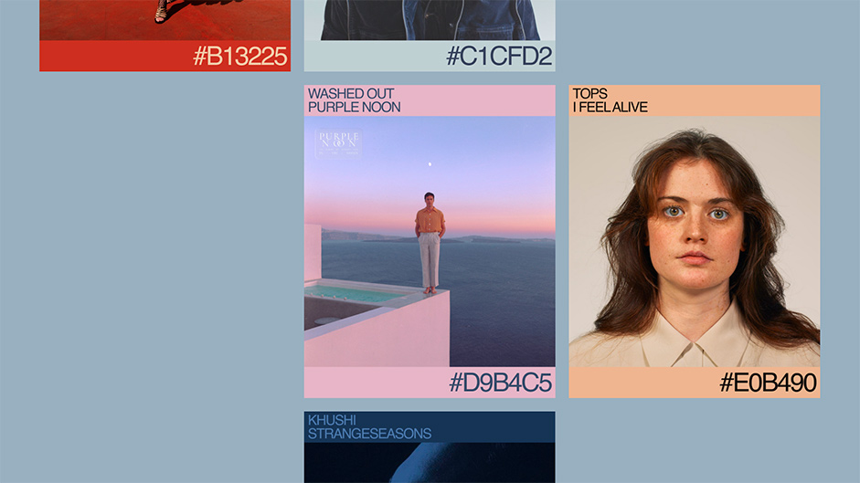
It was a good exercise to choose not only the prominent color but also the secondary color that would go on the text. We tested the opposite way — the text being the prominent color and the background being the secondary color — but it didn’t work as expected cause it was giving so much contrast and we really wanted everyone to be able to recognize really fast which color was the most prominent one.
The playlist
Album Colors wouldn’t live without a playlist. We had to remind ourselves that we didn’t only want to highlight the artworks, but also the music inside them, so to compliment the experience we created a playlist with one song from each album that would follow the same order as the page having the same scrolling effect feeling once you scroll through the playlist.

This also gave us the ability to create our own album covers made for Spotify and Apple Music and for people to quickly discover all the songs/albums available on our page. We really wanted people to embrace the experience: listening to the artworks and watching the songs.
(...) listening to the artworks and watching the songs.
The release
We decided to launch on a Friday since new albums release this day and we also created a video to go with it. First, we created a storyboard to identify the most important pin points that we wanted to showcase on the video: the branding, the interactions of changing colors, copying the hex, the cards created for Instagram and different heroes of the page to show the variety of colors.
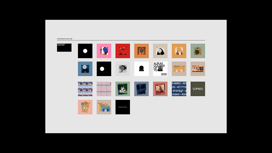
Second, we chose a song that was released in 2020 and that was selected on the website as well: “Affection” by Dreams Are Made To from the “Hungry” EP. The song matched perfectly with the storyboard and the motion was entirely created on Principle with a post production on Adobe Premiere.
Album Colors of the Year 2020 won Awwwards Site of the Day and reached 36,000 pageviews since its release. The most fun thing to watch is people from all over the world sharing our website on Twitter and Instagram.
The technologies
Regarding the development of the project, it was noted that the biggest issue would be the performance. The website is a simple page, but it has 150 album covers and we wanted it to have a good quality, but also not to make the project heavy.
To solve this problem, we used the Intersection API observer to load the images only when they appeared on the scroll, and we also decided to use the .webp format to have greater compression on the images, without loss of quality.
Using Intersection Observer in the project, in addition to solving performance-related problems, ended up creating an interesting effect on the scroll. First the user sees the color of the album, then the cover is displayed.
Site Scroll.
Another challenge encountered was also to create an environment where the management of the content was simple, and gave complete freedom to edit the information on the site. As mentioned earlier, we use google sheets as a content editor. To make this work, we used an NPM package called drive-db, which makes it easier to use google spreadsheets as a database.
In addition, to create the interface we used React, Styled Components and other cool things like CSS Grid, which greatly simplified the development of the project.
Another cool library used was the Locomotive Scroll, which was able to make the scroll smoother, in addition to implementing parallax in some elements in a very simple way.
As it is a static website, we use Netlify to host our website. Using a continuous deployment tool was also very important because everyone in the project was able to have a very clear vision of what stage of development the project was in.
Meet the team:
José Gasparian is a Brazilian Senior Designer and Photographer based in San Francisco, CA. He’s previously worked at Huge (Rio de Janeiro and São Paulo) and Globo.com (Rio de Janeiro) and it’s currently working at Elephant. Helped brands to build digital products from different areas such as Apple, Twitch, KitchenAid, Itaú, Estadão, and many more. Passionate about the relationship of design and music, he has created tons of personal projects involving them, and Album Colors was born from this passion.
Marcos Rodrigues is a Brazilian digital designer based in São Paulo, Brazil. Currently working at Work&Co. With almost 10 years of experience, he's been building brands and products focused on digital with clients like Havaianas, Coca-Cola, T-Mobile, Itaú, GOL, and many others. He’s also an activist for black people's rights in Brazil as a team member of Coletivo Negro Minervino de Oliveira (@minervino.sp), vegetarian, and music lover.
Edgard Kozlowski is a designer based in Rio de Janeiro currently working at Work & Co. During his career, he had the opportunity to work on projects for MailChimp, T-Mobile, Vistaprint, Descomplica and Itaú. Edgard likes to work on side projects in his free time, mainly to develop code skills and also have fun.