From San Francisco with love ❤
I started thinking of
my portfolio back at the end of September 2018 while I was still in San Francisco, pursuing an internship with the amazing folks from Upperquad. I was helping my roommate with his folio, working on some motion stuff, and thought I could give it a try on my own.
So here I was, crawling Pinterest, looking thirstily for some layout inspiration that could move me. After a few moments, I found a specific visual split in half and that’s basically where the whole concept came from.
It was an opportunity for us to challenge our creativity, without fixing any constraint or barrier.
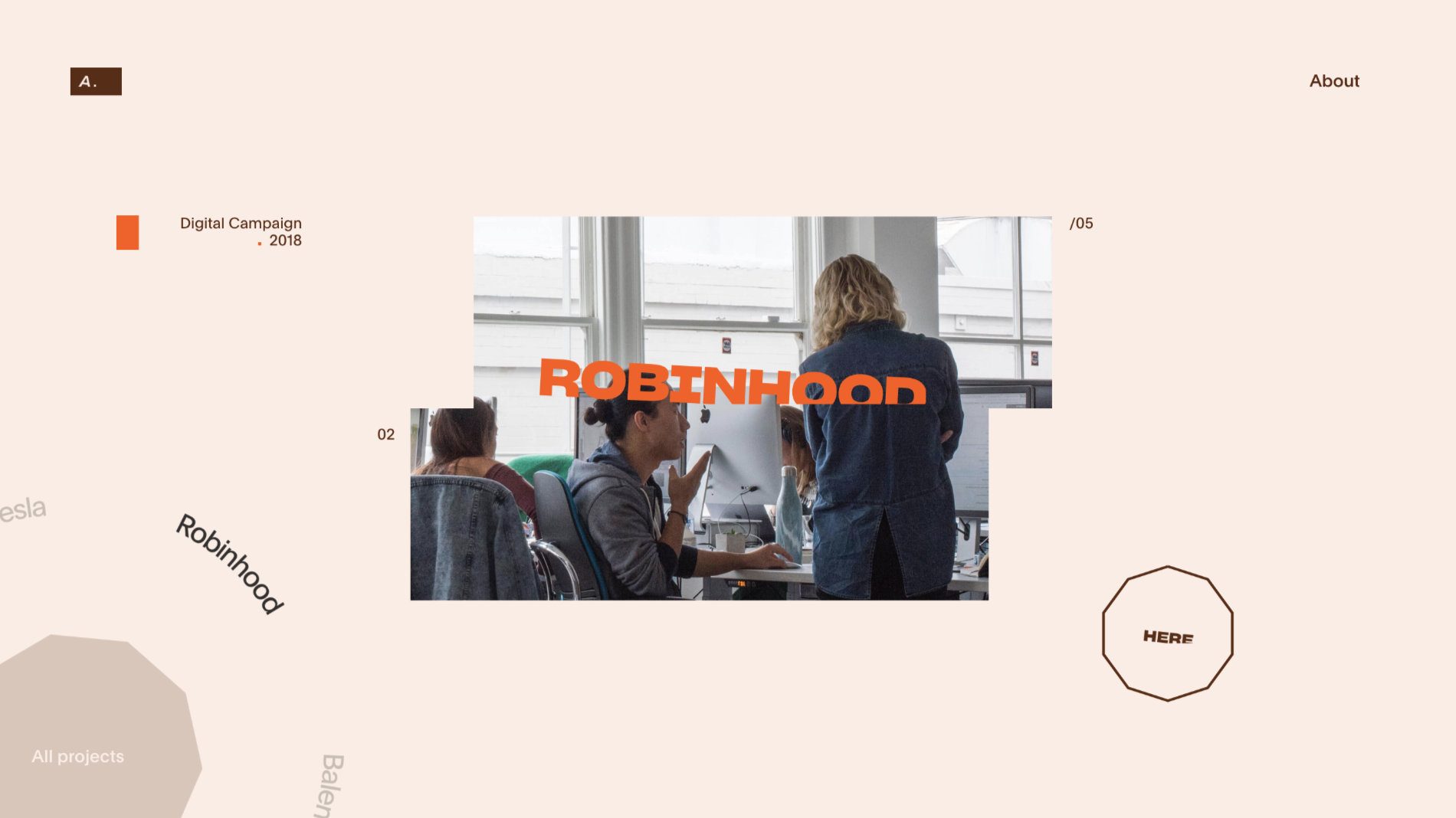
The purpose is to highlight the projects I've made so far, since I'm a webstudent. Grégoire and I are currently looking for an internship so the main goal, through this portfolio, was to convince worldwide digital agencies that we are the interns they are looking for.
Design stage
First things first, I wanted to give the homepage a special treatment. As the user is scrolling and following the movement of a wheel, the split visuals rotate through the screen. I knew what the visual identity should look like, so I spent more time testing out different types of interactions.
Home slider.
Once I got a first draw of the static pages, I quickly jumped to After Effects in order to figure out what the transitions should look like. The purpose was to check with Grégoire if the animations were doable, and to give him a reference for development. In the beginning, I was still in the United States and he was living his best life in Berlin so I was sending him animated UI so he could give me some feedback and have a look at the design progression.
Single project introduction.
Regarding page transitions, we managed to avoid using simple fade out animations that would look too different from the rest of the portfolio.
Moreover, throughout the overall website, I wanted those transitions to be really smooth so the navigation ensured a fluid user experience. So, Grégoire and I spent a lot of time refining the animation's duration and easing, working hard to hit the smoothness feeling just right.
There was also room for me, as a motion lover, to be creative through details and subtle interactions. It is so rewarding when everything comes together the way you imagined it.
About page hover state.
Moving from shapes to live pixels
Seeing what I had been working on for a few weeks, Grégoire was really excited to work on a live version of the new portfolio. Working remotely on two sides of the world could look like a big issue but coming from the same school, we knew each other enough to understand each other's goals, ambitions and potential issues.
After some digging, we could finally work on a live version.
Overall structure
We decided to go for Vue.js as our front-end framework, as its component-based structure fitted our needs. All the content from the website is coming from a JSON file and static assets are hosted on a Netlify project.
Animations
Deciding to use DOM elements or a canvas for all animations was a quite hard decision to take. Indeed, while using a canvas might be more efficient in terms of performance, DOM elements offered us a lot of simplicity, flexibility and speed of execution. GSAP was our tool of choice for animations and timelines.
Performances & Deployment
With modern tools such as Netlify, we were able to iterate and deploy my portfolio quite often to discuss performance issues, compatibility, etc. We spent quite some time optimizing all assets using ffmpeg and animations with intersection observers, transforms and svgs. In the end, I wanted the whole experience to feel really smooth and I think we did a quite decent job with this.
Credits
Adrien Laurent, adrienlaurent.fr, find him on Twitter @AdrienLaurent2.
Grégoire Mielle, greeeg.com, find him on Twitter @greeeg.