D ONE Solutions were approached by the Swiss Radio and Television company (SRF) to celebrate the 50 year anniversary of one of its most successful popular music shows. When D ONE Solutions, who specialize in analyzing large amounts of data and visualizing the outcome, dived into the many songs and charts, they realized that the data needed content to create exciting statements and visualizations, so they enriched the song data by linking it to Spotify's database - providing additional attributes such as danceability or mood (sad or cheerful).
The D ONE Team projected this multidimensional data onto a 2D chart, visualising additional vectors with size and color -leading to a graphical overview of all 10939 songs, helping the viewer to better understand the dataset over time. They approached Hinderling Volkart to transform this network of songs, rankings and attributes into a walk-in, interactive starry sky that addresses the common user. Hinderling Volkart tell us how they used their creativity and innovation to guide the users through the data universe 50 Years of Charts, evoking emotions and memories without contaminating its original analytical purpose.
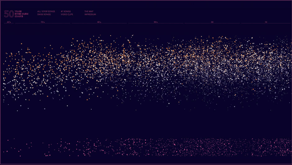
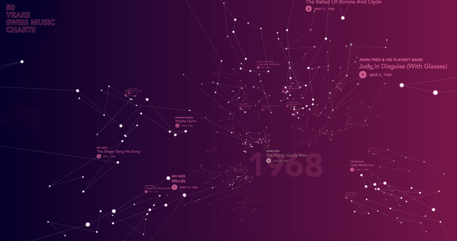
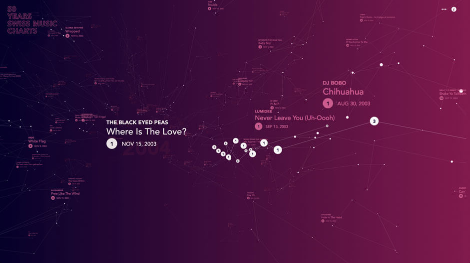
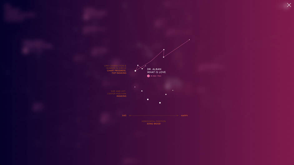
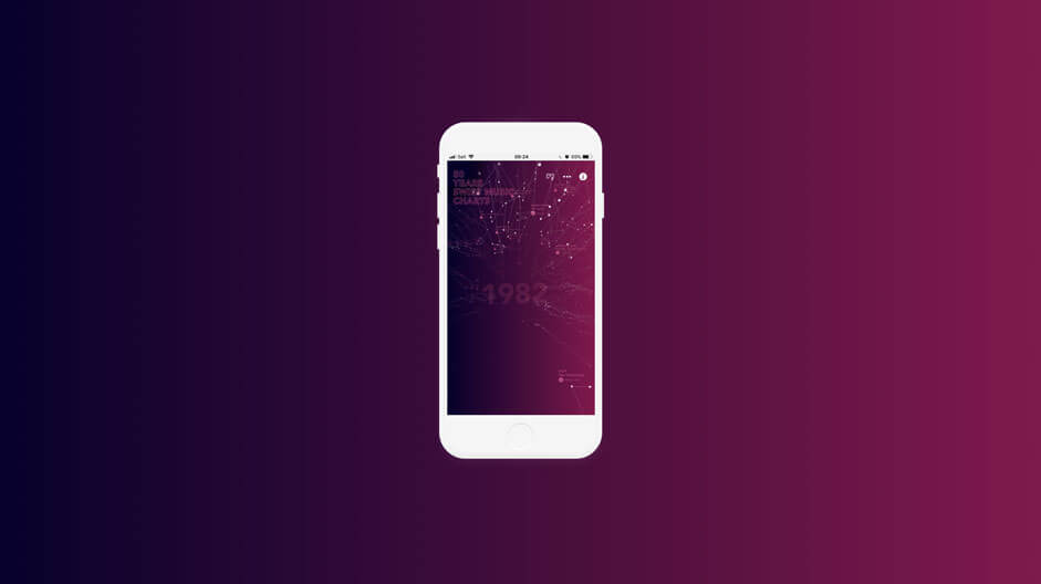
The starting position: a starry sky with 10939 songs in an interactive map - horizontal the time axis, vertical "danceability", color orange = cheerful, color blue = sad, size of the stars = ranking. Each star is clickable and can be listened to.
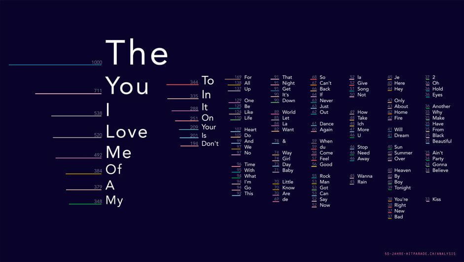
32'069 words for 10'939 song titles. These are the 121 most used.
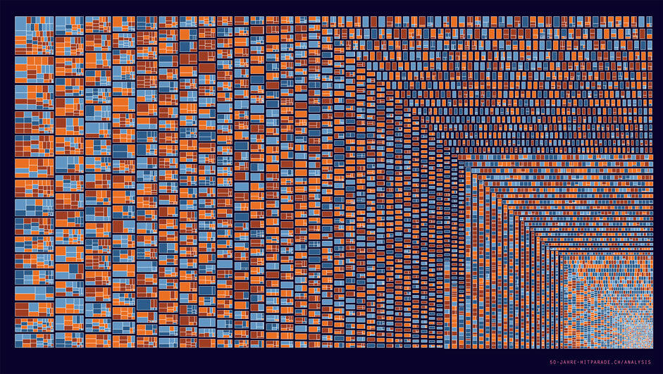
Tree map: all songs by artist (e. g. first rectangle group are all songs by Madonna) Size of the content fields = weekly presence of the songs, color means the mood (cheerful / sad)
All songs and placements.
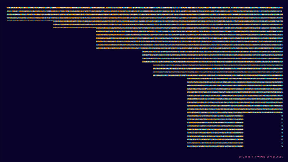
Until 1976 only places 1 to 10 existed, after which the chart show was continuously expanded to 100th place. All songs are rated by Mood: orange = happy, blue = sad/melancholic. Reading aid: In the 90s a musical depression is visible. At the turn of the millennium more joyful times are musically visible. From 2007/08 melancholic sounds are dominant again.
Christmas snow
We explored the idea of an interactive christmas card dedicated to our customers. It was all about playing around with snowflakes in a WebGL environment that would interact with sound input (like blowing into a device microphone). Confronted with those song charts and stars and universes it came to us: let's put this into a 3D world to have one more dimension at our disposal. To take people on a journey through time. The idea grew from there. We thought about moving away from stars to build a city landscape where song would become buildings, higher ranked would be become skyscapers and longer term chart toppers would become complexes. But we would have lost the simple metaphor of stars and a time universe.
"Sometimes the obvious and simple is just the right thing to go with".
Instead of the usual process where detailed design follows the concepts, we took the freedom to move right into a prototypical development phase where we'd explore the possibilities of this simple yet powerful conceptual approach.
A no-backend approach
D ONE provided us the data in some CSV files where each row would contain a chart rank. We wrote a Node script that imports this data and transforms it into a JSON object that only contains the data we'd need. This script proved very helpful for future data updates, when we were confronted with additional data or a slightly different source format. Adapting a script that does the heavy payload helps you avoid repetitive manual work and is so much more comforting. It also took over some additional data processing: We found out that the mood of the songs often corresponds with its danceability, meaning sad songs were rather slow and happy songs rather danceable. So we multiplied these two Spotify dimensions into one to further simplify the representation. It also made sense to leave this kind of processing to a build script instead of burden each and every client computer with computations that always lead to the same result. This is also the reason why we avoided a backend as such: we're dealing with static data, those charts won't change anymore and we will cover 50 years and no more.
There's absolutely no need for a backend script to fetch data from a database and process it on every request. This was much better handled in a build process similar to what you'd see for the JAM stack approach.
It also allowed us to go with simple yet highly performant hosting, putting our files in a S3 bucket and have them delivered through Amazon's powerful CDN network - an astonishingly powerful setup that perfectly fits our needs.
Of particles...
The first challenge was the sheer number of 3D objects resulting from such a large data set. 4192 songs with 36'215 rankings are included in the 50 years of Hitparade shown (we are only considering the first 15 ranks, because that is the consistent scope over all years). Every star in our 3D scene corresponds to a week's ranking and has been implemented as part of a particle cloud. Thus the rendering is handled by custom designed shaders that are optimized for performance. Also the lines are very rudimentary WebGL objects, which might be somewhat limited in their application, but show good speed.
We also took some burden from the 3D-Engine by using our specific knowledge of the data behind the objects: we know the period of time shown (i. e. the year 1973) and can decide very efficiently which objects might be visible or not (for example songs from 1984). Thus, the engine does not have to carry out the camera projection for every element (which always means multiple matrix multiplications per object) to calculate its visibility.
...and textures
We applied the same principle to the most complex objects, the text labels. As there is no text in WebGL, we're dealing with transparent textures that are created dynamically via canvas operations. Thousands of songs mean thousands of textures and many thousands of drawing operations. This is not possible with conventional 3D scenery. It would bring almost any computer to its knees. Instead, we create the textures "on the fly" and discard them when the object disappears from the visible area. Instead of creating and deleting the canvas elements required to create the texture each time, we use a pool that recycles the objects. For performance optimization, this pool returns a canvas that already has the correct size if available (the sizes are relatively uniform, since each dimension of a 3D texture must always be power of 2, i. e. 256x128. Only these measures allow smartphones to play a website so complex and rich.
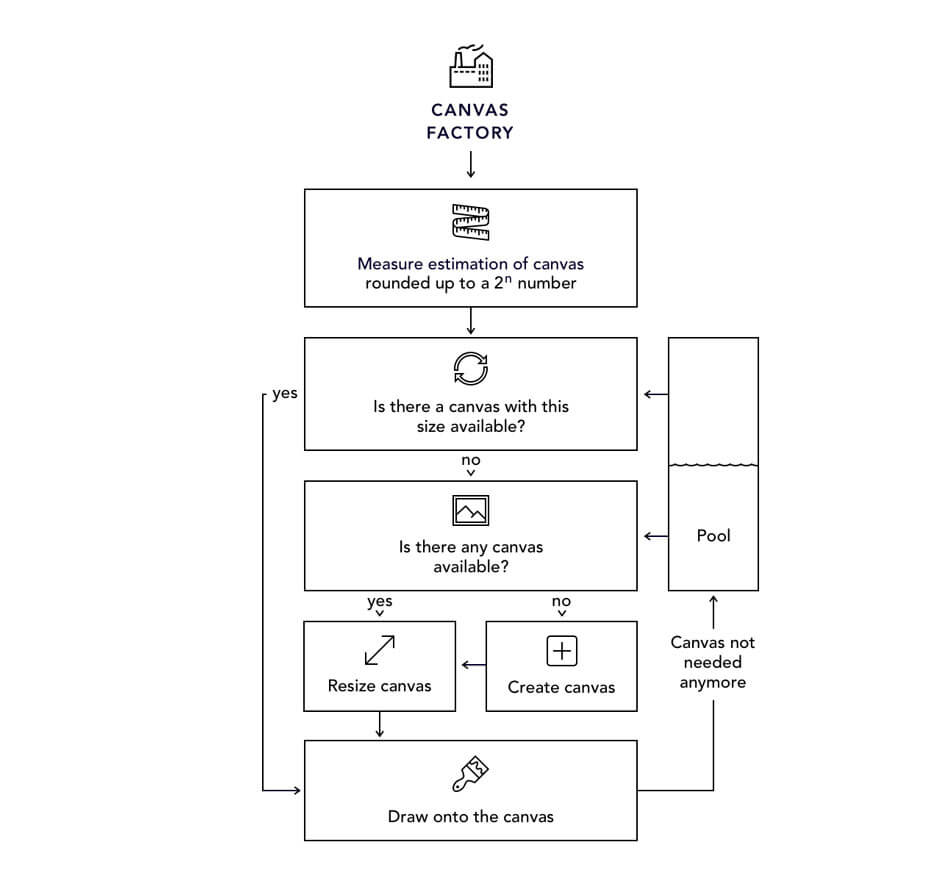
We've used a canvas pool for label rendering to minimize the memory footprint and maximize speed
What's under my finger?
The large number of objects is also responsible for another challenge: to find the object under the mouse, very complex calculations are necessary. A ray (Raycast) is placed in the scenery so that it lies right under the mouse from the camera's perspective. This straight line is now intersected with all objects in the scene: whenever an intersection occurs,it's added to the candidates - sorting by distance will eventually return the searched object.
Not only is such a raycaster approach slow, it's also not applicable to our stars which are points without dimension in our 3D space. For this reason, we've created optimized "hit testers" for both the stars and the labels. Those guys find the matching object (or the referenced song) very efficiently and allow working around limitations of a conventional raycaster. Like those labels that have a visual size that doesn't correspond with their object size, because the dimensions had to be rounded up to 2^n as already mentioned. We therefore calculate a sub geometry to carry out the test.
Smooth sound
While playing some MP3 with HTML Audio element most certainly is no witchcraft, we'd be confronted with some limitations with that approach: on iOS no sound would be played automatically, and we'd have abrupt switches between the songs.
The WebAudio API provides powerful tools to circumvent this: via audio nodes we can create complex audio routing graphs. Our graph is rather simple knitted with just a gain node to neatly fade between songs.
We've also had to make sure that the async loading mechanism (loading and decoding) would not interrupt the user flow. Still, if the browser supports no WebAudio API, but WebGL, we fall back to simple audio elements and do without nice transitions. This only concerns IE11.
Responsive interactions
Mobile devices not only have a smaller screen - we interact quite differently with a smart phone than we do with a laptop or desktop computer. The obvious game changer is touch vs. mouse, but there's also screen distance and the device position (in your hand versus on a table). Which is why in our 3D charts universe we'll use the mouse to scroll through time and to look around. We'll change this behavior on touch devices though: the user now scrolls with their finger (we really like to keep the native scroll experience) but looks around by moving the device. It feels a bit like you're really within the world. And it really just makes sense here to use those sensors. (We actually had quite a hard time getting our head around those Quaternion calculations.) Now a user may get lost because the orientation changes too much (like when you hand over your device to somebody else). To prevent this we'll have a little button appear whenever the viewport rotates too much away from the main axis. Clicking it will recenter the screen, resetting the base orientation (and we're back to quaternions).
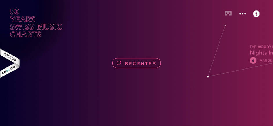
Prevent users from being lost when using sensors like gyroscope for navigation.
VR
We've added a small feature for users with a cardboard for their mobile phone: we let them switch to a VR mode where we split the screen and have two slightly different projections rendered. This is actually not very difficult to achieve - there's a neat extension for Three called «StereoEffectLibrary» which handles most of the magic here. You just have to make sure that all essential UI is within the 3D world. We also changed certain interactions in this VR mode (you would now press anywhere to move forward because that's often the only screen interaction possible with cardboards), allowing you to dive deeper into this rich universe of many songs.
Technologies
- Frontend Libraries: Three.js and Tween.js
- Server Architecture: none (JAM stack approach)
- Tools: Node
Company info
Hinderling Volkart creates outstanding web experiences, business portals, corporate platforms and digital products. D ONE Solutions - Data Driven Value Creation Data Science and Analytics | Data Management | Visualization and Data Experience